


![]() Google Analytics Logo PNG
Google Analytics Logo PNG
The Google Analytics logo is a bright, multi-colored bar graph that accurately reflects the platform’s purpose. We will lock in your growth, the Google Analytics logo promises. Counting and objectivity are contained in the yellow-orange symbols of the emblem. The company, together with its users, is experiencing growth and rejoices in its achievements. The logo symbolizes important processes, comparison and analysis, revealing the essence of the work, the processing of statistical data, and their generalization. How else can it be in the presence of such a well-thought-out system?
In 1995, in San Diego, Paul Muret, Jack Ancone, Brett Crosby, and Scott Crosby founded Quantified Systems, initially focused on web development and hosting. Client work exposed a bottleneck in traffic data processing. In 1997, Muret built Urchin, reducing analysis time from a full day to about 15 minutes. By 1999, the company rebranded as Urchin Software Corporation and began offering Urchin On-Demand for $500 per month.
On April 21, 2005, Google acquired Urchin. The deal value was undisclosed, though investors reportedly achieved returns of around 100x. At that time, CEO Eric Schmidt met with the team and identified potential integration with Google AdWords. On November 14, 2005, Google launched Google Analytics based on Urchin technology and made it free. Over 100,000 accounts were created in the first week, prompting temporary registration limits and an invite system until August 2006. Early tracking relied on urchin.js, and UTM parameters retained the Urchin Tracking Module name.
In 2006, Google acquired Measure Map from Adaptive Path and integrated its features. That same year, Analytics connected directly with AdWords, linking ad spend to user behavior. In 2007, new dashboards and reporting tools were introduced, and tracking shifted from urchin.js to ga.js.
Universal Analytics was announced in October 2012 and released in 2013, becoming the standard for years. Support for standalone Urchin software ended in March 2012. In 2020, Google introduced Google Analytics 4, which uses an event-based data model. In March 2022, Google announced the shutdown of Universal Analytics. Data collection stopped on July 1, 2023, and full access ended on July 1, 2024. Key competitors include Adobe Analytics and Matomo.
Meaning and History Google Analytics Logo
![]()
The analytics service is part of the Google Marketing Platform. It was launched in 2005 based on the Urchin program acquired from the Urchin Software Corporation. The new owner changed the name of the web service and its logo to align with Google’s overall product identity.
What is Google Analytics?
Google Analytics is a service for tracking website traffic. It allows users to monitor the popularity of different pages and collect user behavior data to optimize content and increase revenue. The web analytics service has been available since 2005 and is provided free of charge by Google.
2005 – 2012
![]()
In 2005, the designers developed the debut logo for Google Analytics. It was two-part lettering that combined different styles. The first word in the name resembled the classic multicolored Google icon, with each letter in a different color, and the second was set in a standard gray sans-serif font.
2012 – 2013
![]()
In 2012, the game of contrasts continued. However, badge creators have now made the word “Google” gray and moved it to the right, positioning it above “Analytics.” The vacant space was occupied by an icon in a square, divided into two parts by a white grid with dots. The bottom half of the geometric shape was red, and the top half was orange.
2013 – 2015
![]()
The usual schedule was replaced by a zigzag line that resembled a curved ribbon. The text on the right is now light gray, and the word “Google” is scaled up.
2015 – 2016
![]()
Another redesign brought new changes. The logo designers have brought the lettering to the fore by reducing the square’s size. The Google Analytics title is now in bold and on one line. The colors remain the same, only the orange and red are slightly brighter, and the gray a little darker.
2016 – 2019
![]()
The logo depicts a bar chart of three elements of different heights. On the left is the shortest column; on the right, the longest. Thus, the histogram accurately conveys the service’s purpose: to compare and analyze data. All elements appear as wide vertical rectangles. There is no free space between them; they are so closely spaced to each other. Different heights and colors convey the demarcation: the smallest element is light, the largest is dark. The text consists of the program’s name in a smooth, thin font. The letters are standard grotesque, consisting of uppercase (at the beginning of words) and lowercase (all other characters).
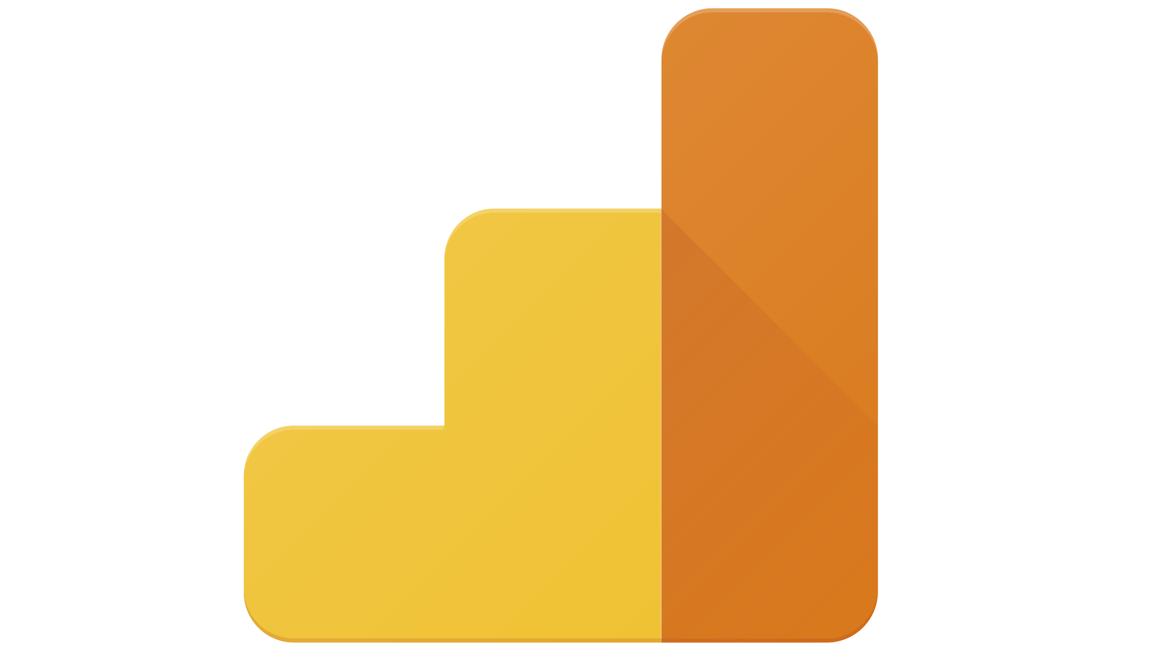
2019 – today
![]()
After the redesign, the logo’s columns changed shape. The developers rounded off the ends and spaced them apart to create free space between them. As a result, two diagram elements appear as elongated ovals, and one appears as a large point. The histogram’s color ratio has also changed: the lowest bar is now colored dark, and the highest bar is light. The previous palette has been preserved; it consists of yellow and brown. The lettering is slightly smaller than in the previous logo. Also, the designers have made the text light gray.
Font and Colors
The colorful logo, which complements the lettering, looks like a diagram. It reveals the essence of an analytical service that uses statistics to summarize data in graphs. In the current version, the diagram is stylized and lacks points.
In Google Analytics logos, the style of the first word is most often changed. At first, it was written using Catull, an old-fashioned serif typeface. The designers then switched to a geometric sans-serif typeface that is very similar to Futura, but not identical. To be more precise, the inscription is in Product Sans, a Google-created typeface based on Futura. It also vaguely resembles Windlesham Pro, Comic Sans, and Relish Pro.
The logo’s main colors are gray, dark gray, orange, white, and dark yellow. It is colorful enough to grab attention, but the developers used bright colors sparingly.