The Grammarly logo symbolizes a modern digital service that offers users extensive opportunities to receive support and achieve their goals in learning English. Every design element, as well as the chosen color scheme, emphasizes growth and continuous improvement of knowledge. The visual details of the emblem convey the service’s commitment to helping users on their journey toward more proficient and confident language use, supporting them in this ongoing process of learning and self-development. The logo reflects the core philosophy of the service — to promote progress and success for everyone striving to improve their skills.
Grammarly: Brand overview
The history of Grammarly began in 2009 in Kyiv, Ukraine, when three entrepreneurs—Max Litvin, Alex Shevchenko, and Dmitry Lider—joined forces to create a writing improvement tool. Before this, Litvin and Shevchenko had already worked on MyDropBox, a web application aimed at helping academic institutions detect plagiarism in student essays. Their experience with that project inspired the idea of a more comprehensive tool designed to assist users in improving their writing skills.
Initially developed for educators and students, the service was focused on checking grammar and spelling errors. The founders identified the need for a tool that corrected mistakes and explained why they occurred, fostering better writing habits.
In its early stages, the team worked on advanced machine learning and natural language processing algorithms to analyze text and offer suggestions for improvement. This was challenging and costly, but by 2010, the first product was launched—a web-based grammar and spelling checker. It quickly gained traction, especially in the education sector, helping the company grow its user base and secure early funding.
By 2011, the company had broadened its reach to professionals in various fields who required help with written communication.
A major milestone came in 2012 with the introduction of a browser extension, allowing users to check their writing directly within web browsers. This accessibility attracted a broader audience.
In 2013, the tool’s capabilities were enhanced to check writing style and context, offering more nuanced suggestions to improve clarity and effectiveness and correcting grammar.
The release of a mobile keyboard for iOS and Android in 2015 further expanded the user base, enabling people to use the writing assistant on smartphones while composing texts.
In 2016, the company secured a major investment of $110 million from venture funds, enabling the team to expand and accelerate the development of new products.
The integration with Microsoft Office in 2017 allowed users to access the tool’s features directly in Word and Outlook, making it more accessible to professionals.
In 2018, the company introduced GrammarlyGO, an AI-powered tool that suggested improvements in style and tone, marking a significant technological advancement.
A free version was launched in 2019, leading to a surge in its user base. The company also expanded its enterprise solutions, including a specialized business tool for corporate clients.
Despite global challenges in 2020, the company raised an additional $200 million, increasing its valuation to $13 billion.
In 2021, the team launched an API for developers, allowing them to integrate its functionality into their apps, opening new opportunities across various industries.
By 2022, the platform continued refining its algorithms and expanding its business offerings, further establishing itself as a key player in writing enhancement tools.
By 2023, the service had become one of the most widely used solutions for improving written communication worldwide. Its ongoing investment in machine learning and AI research continues to enhance the tool’s accuracy and functionality.
The journey from a small startup to a global force in transforming written communication reflects the company’s ability to evolve and adapt to changing user needs and technological advancements.
Meaning and History
What is Grammarly?
This AI-based platform goes beyond simple spell-checking and provides extensive writing support. It helps expand vocabulary, correct grammar, improve punctuation, and adjust the text’s tone. The platform integrates with various writing tools, such as word processors and email programs, serving as a sort of “silent mentor” for users, enhancing their writing. Its algorithms offer corrections and explanations of errors, helping users—from business professionals to students—improve their writing skills. Premium features allow for customizing style and clarity based on the audience and goals, ensuring more precise text adaptation.
2009 – 2015
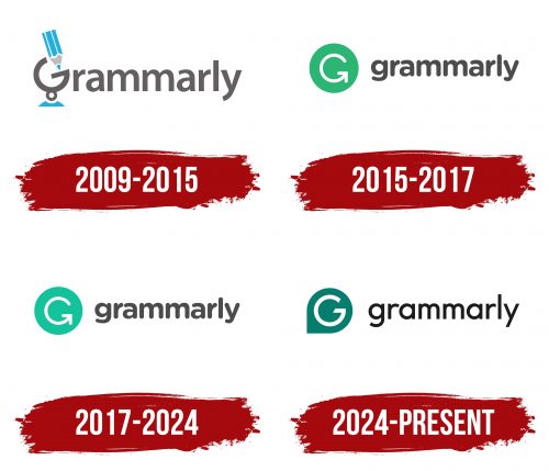
The service’s first logo represented the name, based on the word “Grammar,” reflecting the program’s main function. The platform was created to help improve written English, which is emphasized in the design.
Particular attention is drawn to the first letter of the name, which is transformed into a globe symbol on which a pencil is writing. This element symbolizes the program’s global reach, which supports improving written English in four dialects: British, Canadian, American, and Australian.
The gray font color was not chosen by chance — it is associated with the pencil’s lead. In most countries, learning to write begins with a pencil, highlighting the educational and supportive nature of the Grammarly service. This choice of design elements underscores the program’s role as an assistant in learning, providing users with tools to continuously improve writing skills.
2015 – 2017
The program introduced a new logo with the release of the Freemium version, which offers free features. It consists of a green circle, inside which the letter “G” is transformed into a download arrow, symbolizing the connection to an internet-based product. This element highlights the ability to update and improve the text, subtly suggesting that users make revisions.
The wheel in the logo’s center represents continuous improvement and enhancement, reflecting the program’s core principle of helping create clear, correct, and engaging texts, whether sentences, documents, or letters. The circle symbolizes harmony and perfection, emphasizing that the program’s advice aims to achieve high writing standards.
The green color of the emblem is reminiscent of the famous English language learning guide created by Raymond Murphy, where the green book was intended for advanced students. This color choice symbolizes the growth and development users can achieve with the program.
The program’s name, written to the right in calligraphic lowercase, emphasizes its supportive function. Avoiding capital letters demonstrates an unpretentious and user-friendly approach, reminding users that Grammarly is an assistant ready to make writing easier and more efficient.
2017 – 2024
The emblem retained its previous appearance, but the circle’s color became lighter to reflect the updated approach and emphasize the program’s ease. This step also symbolizes the accessibility and simplicity that became even more evident with the launch of the desktop version of the application. The change in shade highlights the convenience of interacting with the service, focusing on its intuitiveness and availability to a wider audience. The logo, while staying true to its roots, has evolved alongside the development of the program, drawing attention to its latest features and modern approach to assisting users.
2024 – today
The Grammarly logo highlights the service’s primary mission — helping users improve written communication. Its shape resembles a speech bubble icon, symbolizing interaction and communication, key elements of the service’s function. This element visually emphasizes that the company checks text and helps establish proper communication, focusing on the dialogue between the user and the text.
The logo’s main symbol, the green, represents reliability and calmness. This color reflects the extensive knowledge base the company uses for text checking. The dark green shade conveys confidence in the accuracy and trustworthiness of the information created by the user. The color is also associated with progress and development, highlighting the service’s continuous improvement.
The thin and elegant black font used for the service’s name resembles standard computer fonts, emphasizing the company’s connection to the digital world. The sans-serif font looks modern and simple, symbolizing the ease of using the program and making it accessible to everyone.
The Grammarly emblem reflects its role in the modern world: it is a grammar assistant, a digital tool capable of enhancing communication skills and helping users feel more confident in their writing, using the latest technology and artificial intelligence.
