 Hormel Foods Logo PNG
Every day, food products form a familiar part of the diet, from breakfast to family dinners. Canned goods, nut butters, and meat products are staples in regular shopping and are used in many situations. The Hormel Foods logo represents a company that produces food products under various brands and supplies them to retail chains and the ready-to-eat market.
Hormel Foods began operations in 1887. At that time, George A. Hormel opened a meat market in Minnesota and borrowed $500. In 1891, he founded his own plant called George A. Hormel and Company. By 1901, the enterprise had received corporate status and began exporting products to Europe.
By the 1920s, the company had implemented modern refrigeration technologies and expanded its distribution network throughout the United States. In 1926, it released its first canned ham. In 1937, the company introduced the product SPAM. It became known worldwide during World War II.
In 1933, the company implemented a guaranteed annual wage program. It was one of the first initiatives of its kind in American industry. After the war, the company established the Hormel Foundation and funded a research institute at the University of Minnesota.
In the 1950s and 1960s, the company expanded its product line. It included Dinty Moore and Cure 81 products. In the 1980s, expansion continued. The company acquired Jennie-O Foods and launched a line of microwave-ready meals.
In 1990, Hormel was listed on the New York Stock Exchange. In 1993, the company changed its name to Hormel Foods Corporation. During the same period, it created joint ventures in China and India. This helped strengthen its international presence.
In the 2000s, under Jeff Ettinger’s leadership, Hormel acquired the brands SKIPPY, Muscle Milk, and Applegate Farms. These steps strengthened the company’s position in the healthy food sector. In 2021, Hormel purchased the Planters business from Kraft Heinz for $ 2.8 billion. It became the largest acquisition in the company’s history.
The company remains a leading producer of meat and snack products. It continues to show sales growth and expand operations in Asian markets.
Meaning and History
What is Hormel Foods?
An American corporation based in Minnesota, Hormel Foods processes meat and produces food under many brands. It is known for its canned ham SPAM, which became popular during World War II. The portfolio includes Skippy, Planters, Applegate, Jennie-O, and Columbus Craft Meats. The company operates in four areas: grocery products, refrigerated foods, turkey products, and international operations.
1891 – 1901
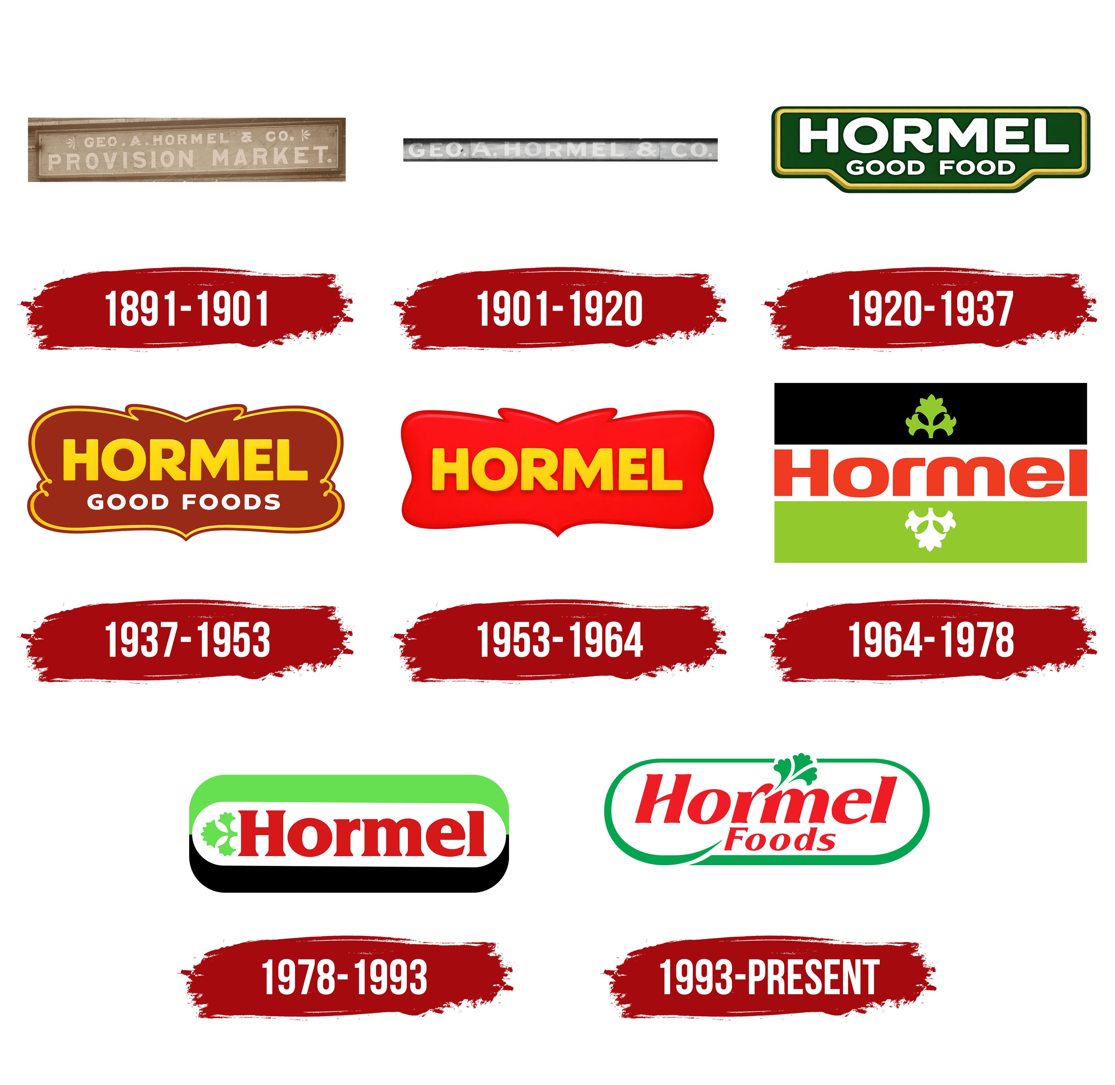
George Albert Hormel entered meat production after working in the wool and hide trade. In 1887, he opened a butcher shop with Albert Friedrich. After the partnership ended, Hormel leased a former creamery near the Cedar River in Austin, Minnesota. George A. Hormel & Company began operating there in 1891. The founder’s surname became part of the business name, which was later shortened to Hormel in public use.
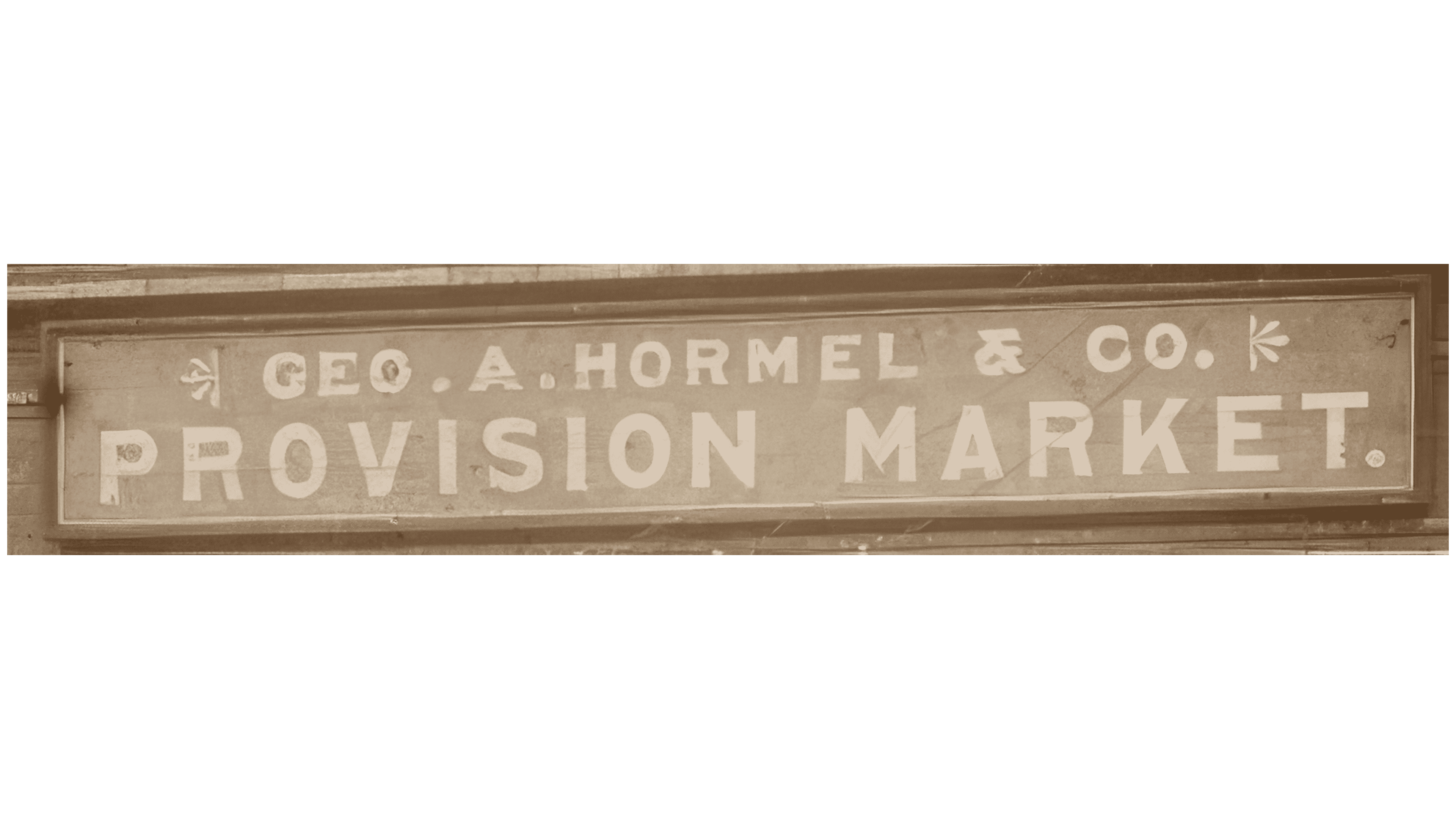
The early sign combined the owner’s name with a description of the food business. “GEO. A. HORMEL & CO.” appeared at the top, with large “PROVISION MARKET” lettering below. The lower line filled most of the space and explained the establishment’s purpose. This treatment followed the tradition of late-19th-century American signs, in which an entrepreneur’s surname connected products to their maker.
Both lines were placed inside a brown frame with a beige inner border. The letters were the same beige. The upper line was set in uppercase sans-serif type, retaining the abbreviations “GEO.” and “CO.,” the initial “A.,” and the ampersand. Small botanical ornaments resembling simplified flowers appeared at its ends.
The lower “PROVISION MARKET.” line consisted of large uppercase letters and ended with a period. The shared color and frame united the 2 lines. At the same time, the size difference separated the company name from the business description.
1901 – 1920
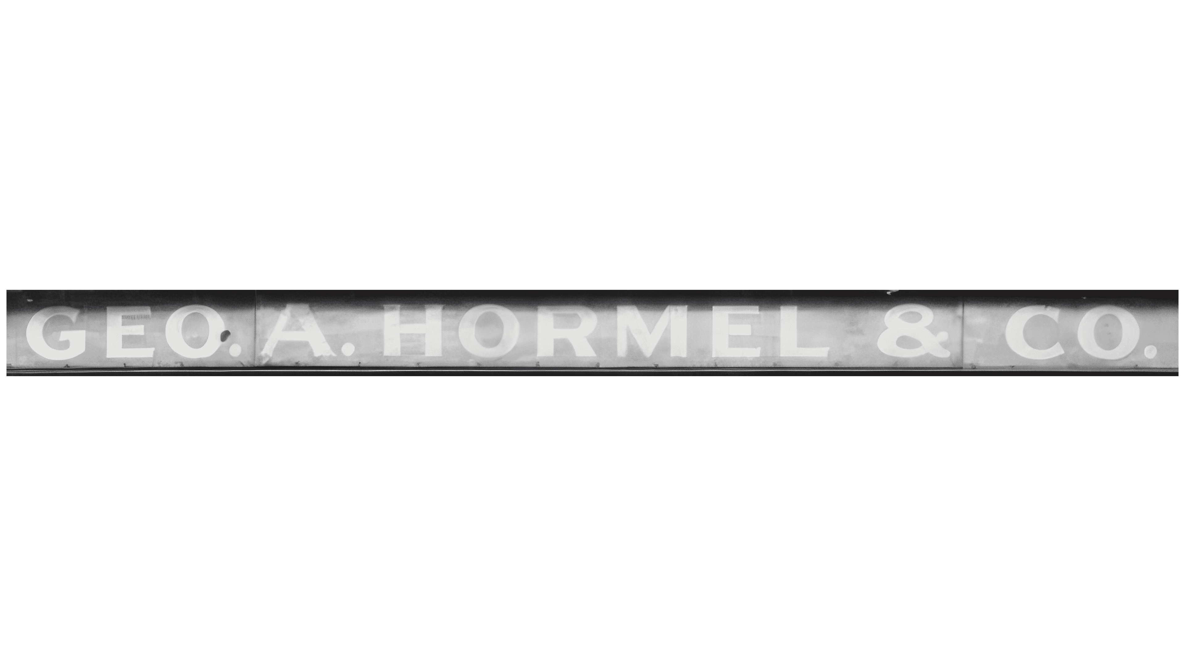
In 1901, Hormel opened its first sales branch in Minneapolis and began expanding its distribution network. The transition from a local butcher shop to a manufacturer with branches in several cities came with a shorter sign. The descriptor “Provision Market” was removed, leaving Geo. A. Hormel & Co. as the business name.
A single line reading “GEO. A. HORMEL & CO.” appeared on an elongated horizontal panel. Large uppercase letters occupied almost its full length. The abbreviations “GEO.” and “CO.,” the initial “A.,” and the ampersand preserved the established corporate name. The final period after “CO.” matched the rest of the punctuation.
Light, nearly white letters stood out against a gray background. The single-line arrangement gave the name most of the panel’s space, replacing the earlier split between the owner’s name and the establishment’s description.
1920 – 1937
On March 15, 1920, Hormel introduced a product logo featuring the phrase “Good Food.” The short promise of quality complemented the manufacturer’s name. It suited a range of meat products, bringing them together under a shared food brand.
Large “HORMEL” lettering appeared at the top, with “GOOD FOOD” on the line below. Both used white uppercase sans-serif letters with rounded edges. A dark shadow created depth. The size difference emphasized the company name, leaving the phrase beneath it in an explanatory role.
The lettering appeared on a dark green plaque with a gold border. Straight sides combined with a projection at the center of the lower edge, resembling the outline of a product label. The light letters stood apart from the green field, while the gold line framed the entire logo.
1937 – 1953
In 1937, Hormel introduced SPAM canned meat and unveiled an updated product logo. “GOOD FOOD” was replaced with “GOOD FOODS.” The plural indicated the variety of products sold under the manufacturer’s shared name.
Large “HORMEL” lettering still occupied the upper line, now in yellow. Smaller white “GOOD FOODS” lettering appeared below. The color and letter size emphasized the company name, while the lower line added a short product message.
A reddish-brown background replaced the green. A gold line followed the plaque’s edge and its symmetrically shaped projections. The border resembled a decorative packaging label.
1953 – 1964
In 1953, Hormel updated its logo as its range of prepared and refrigerated products expanded. Hormel removed the “Good Foods” line, leaving only the word “HORMEL” on the packaging. The shortened wordmark occupied less space and represented the products through the manufacturer’s name.
Large yellow letters appeared in the center of a bright red rectangular background. The name used a heavy uppercase sans-serif typeface with uniform stroke weights. A shaped border with flowing asymmetrical curves and irregular edges surrounded the lettering. Shadows and transitions between shades of red created depth.
1964 – 1978
In 1964, Lippincott & Margulies developed a new Hormel identity featuring a sprig of parsley. The plant became a lasting part of the brand and connected it to the presentation of prepared dishes. The greenery recalled a familiar garnish for meat products on packaging and in display cases.
The logo consisted of 3 horizontal bands. A white band containing large reddish-orange “Hormel” lettering ran between a black upper field and a bright green lower field. The name used heavy sans-serif lettering with uniform stroke weights. Only the “H” remained uppercase, while the other letters became lowercase. The shift from the previous “HORMEL” to mixed case softened the wordmark.
Matching sprigs of parsley with 3 leaves appeared in the center of the upper and lower fields. The sprig was green on the black background and white on the green background. Both sat on the same vertical axis, uniting the bands. Red and green replaced the brown tones of earlier labels, while white and black separated the logo’s colored parts.
1978 – 1993
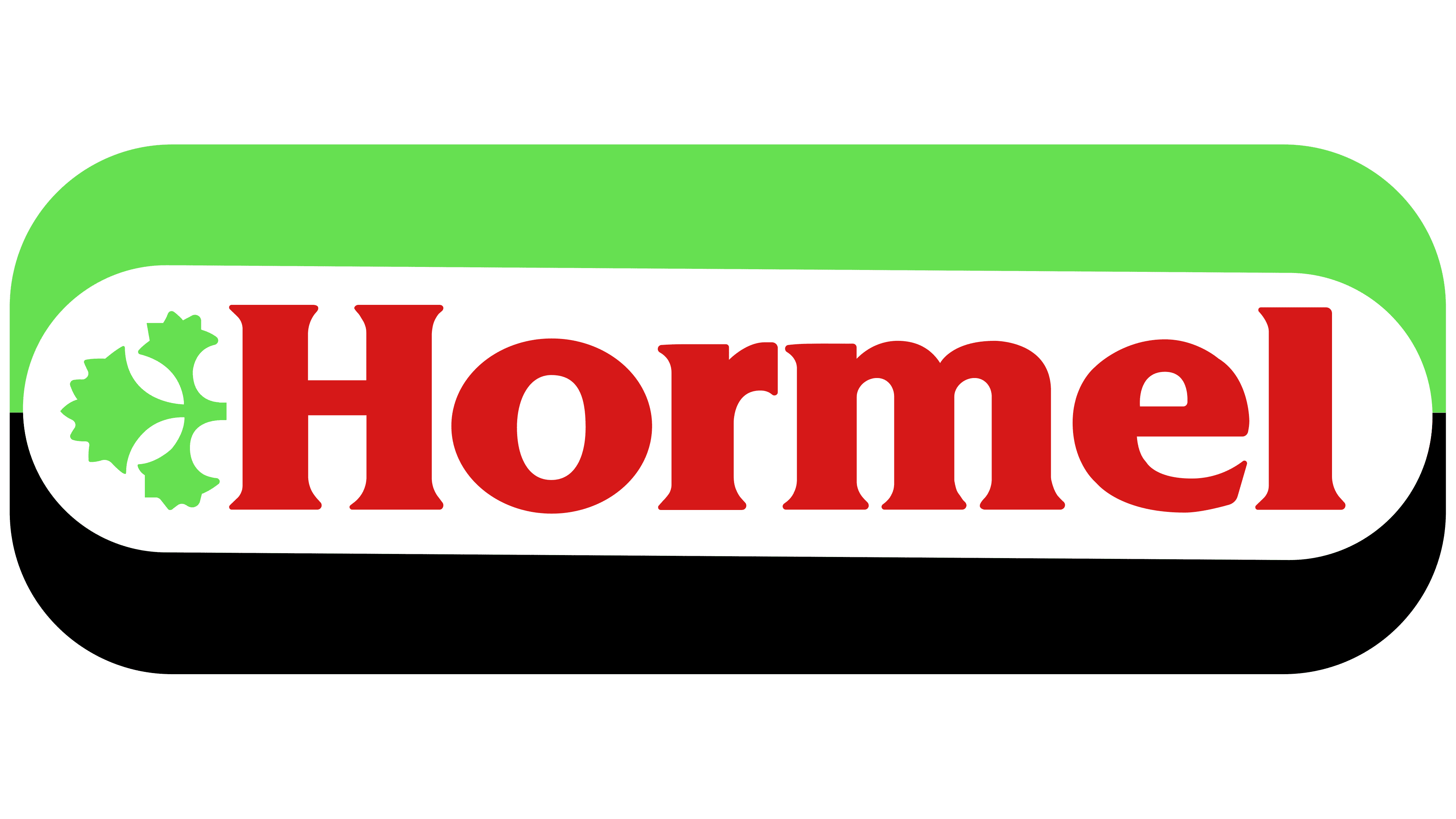
In the Hormel logo dated June 5, 1978, the name and parsley sprig appeared beside each other on a single band. The logo became more compact while retaining the plant motif and the red-and-green combination from the 1964 identity.
A broad white field in the middle contained heavy red “Hormel” serif lettering. The uppercase “H” rose above the remaining lowercase letters. A sprig of parsley with 3 leaves appeared to the left of the name in bright, lime-toned green. Both components occupied the same row.
The outer frame was an elongated rectangle with rounded corners. A bright green block ran across the top, with a black block below. The white band between them ended a short distance from the frame’s side edges. Rounded corners on the colored sections made the logo resemble a ready-made packaging label.
1993 – today
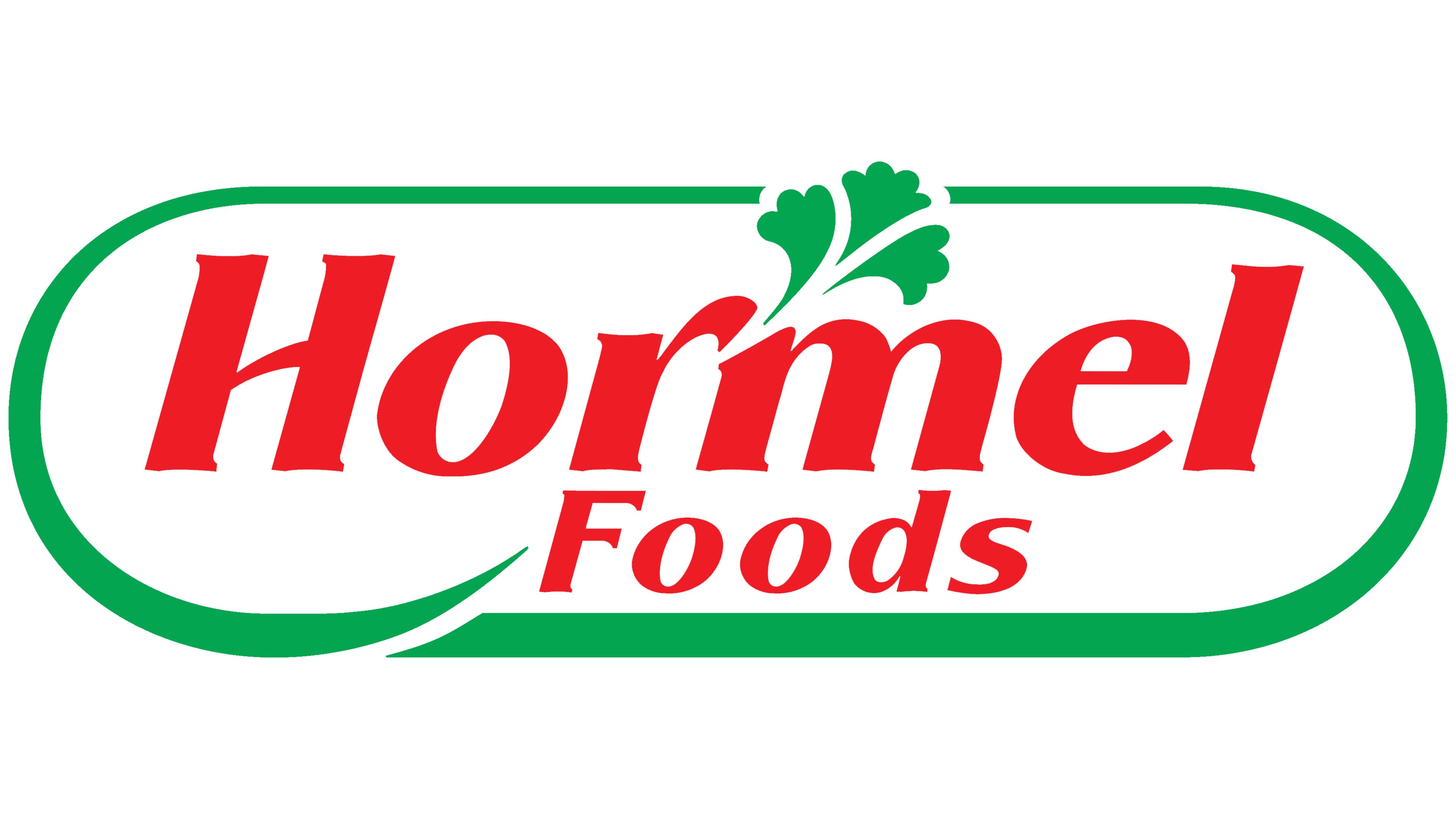
In January 1993, George A. Hormel & Company became Hormel Foods Corporation. President Joel Johnson explained that the renaming reflected the shift from meat processing to value-added consumer foods. The Schechter Group developed the new identity. The company introduced the logo on February 11, 1993, and planned to update packaging for nearly its entire product range by year’s end.
In the corporate logo, the word “Foods” appeared beneath the large “Hormel,” shifted to the right. It explained the expansion of the company’s activities. Both lines were red. The initial “H” and “F” remained uppercase, while the other letters were lowercase. Serifs and a rightward slant gave the wordmark the appearance of a personal signature. They maintained the connection to George Hormel’s surname.
The name appeared on a white field inside an elongated green outline with rounded ends, resembling a running track. At the lower left, the line curved into a long stroke beneath the words. The upper boundary was interrupted by a sprig of parsley above the “m.” Three green leaves continued the plant motif from the earlier identity. Removing the black band left red and green on a white background.
A separate product version followed. In 2005, lettering artist Ian Brignell worked on Hormel with Interbrand’s New York office. The result became part of a product-brand unification program introduced in January 2007. A red ribbon shaped as a seal appeared on packaging, featuring white “HORMEL” lettering and the date 1891, referring to the brand’s founding year.
For the first time, the shared product emblem was extended across the entire Hormel range. Packaging research measured how much less time customers needed to find products with the new identity. Shoppers associated it with quality and described it as modern and friendly. The transition began in February 2007, with the design extended to other product lines through 2008.
The red product seal was used alongside the corporate Hormel Foods oval. Full-color and single-color versions were provided for the corporate logo. Parsley remained part of the corporate logo and several product versions. In the Hormel Health Labs identity, the plant emblem indicated its connection to the parent company.