


 Imagine Entertainment Logo PNG
The Imagine Entertainment logo reflects the company’s journey from a small enthusiast-led project to a major player in film and television. The emblem’s design reflects growth, development, and the evolution of the company’s creative approach, showing how it found its unique niche. The logo’s style emphasizes professionalism and high production standards, highlighting serious intent and the creators’ determination.
Imagine Entertainment was founded in 1985 by director Ron Howard and producer Brian Grazer. Their partnership had already proved commercially strong with Splash in 1984, before the company formally began operating. The first official Imagine release was Howard’s comedy Gung Ho in 1986, which gave the new studio an early screen presence.
In 1989, Imagine reached a wider audience with Uncle Buck and Parenthood. Both films helped define the company’s place in mainstream Hollywood production. In 1991, Backdraft became a commercial success and received three Academy Award nominations. Apollo 13 followed in 1995 and became one of the studio’s key titles, winning two Oscars from nine nominations.
The company entered the 2000s with one of its biggest awards successes. A Beautiful Mind was released in 2001 and won four Academy Awards, including Best Picture. In 2002, Imagine expanded its television work with 24, a major series that later received several awards, including the Emmy for Outstanding Drama Series. In 2005, Cinderella Man earned three Oscar nominations, while Imagine deepened its television partnership with NBC Universal Television Studio, later known as Universal Media Studios.
In 2008, Frost/Nixon received five Oscar nominations. During the 2010s, Imagine continued working across film and television with Empire, Genius, Rush, and In the Heart of the Sea. In 2016, The Raine Group invested in the company, supporting new documentary and digital content. Pavarotti was released in 2018, Kids+Family launched in 2019, and by 2023 Imagine remained active across film, television, documentaries, digital projects, and family programming.
Meaning and History
What is Imagine Entertainment?
This well-known film company has built its reputation through impressive, diverse productions and plays a key role in the film and television industry. Its repertoire includes captivating documentaries, comedies, dramas, and blockbusters. The company’s success lies in combining artistic integrity with commercial appeal. The company frequently addresses complex themes and contemporary issues, making them accessible to a broad audience.
1988 – 2020

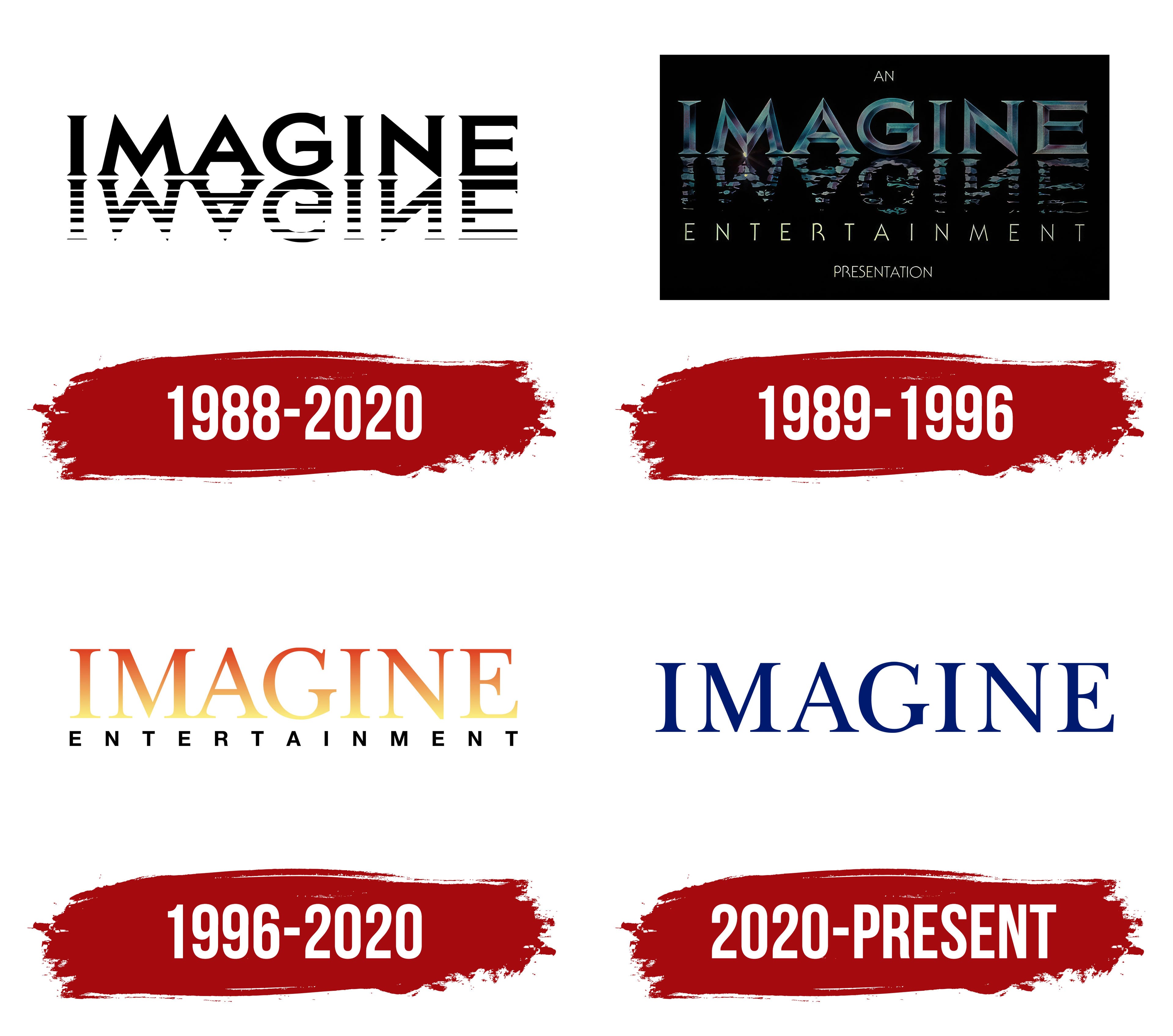
The film company’s first emblem features the name in thin capital letters. They appear grand, as if the inscription rises on the shore of a bay. This image recalls the famous HOLLYWOOD sign on the hillside, but with a more refined style. The letters are reflected in the gentle ripples of the water, adding another visual layer. This reflection connects the logo to the film “Splash,” about a mermaid, which inspired the studio’s creation. This design plays on the key idea of cinema as a mirror that reflects real life, adding magic and depth.
1989 – 1996
In 1989, the company released three theatrical films in collaboration with Universal Pictures. The studio updated its emblem and placed it on a black rectangle, symbolizing a movie theater screen before the show begins. The brand name is designed in metallic letters, each with depth created by a central groove. The inscription’s dark shades and shimmering colors create an atmosphere of anticipation, filling the space with tension and intrigue. Below the reflection in the water, the words “Entertainment” and “Presentation” are added in a simple white font. This design became the signature introduction for films and hinted at the agreement with Second City to produce a late-night comedy show for television.
1996 – 2020

After a brief hiatus, Imagine Entertainment returned to producing television programs by signing a contract with Disney. The updated emblem reflects the influence of working with a younger audience. The logo became brighter, featuring a gradient from yellow to red that makes the inscription look illuminated from below by spotlights. Adding the black word “ENTERTAINMENT” balances the bright colors, giving the logo a sense of seriousness and stability. The orange hues convey communication and creativity, hinting at the company’s active involvement in developing new television series.
2020 – today

The Imagine Entertainment logo features a concise, classic design in a formal style. The word “IMAGINE” is set in large, serif blue font, giving the emblem a sense of reliability and solidity. This font choice underscores the company’s professionalism, connection to tradition, and serious approach to projects.
Blue represents confidence and trust, aligning well with the company’s image, which focuses on creating high-quality content from feature films to serious documentary projects. The logo is free of excessive decoration, signaling that the company’s primary focus is on the substance and high quality of its work rather than outward showiness.
Stylistically, the visual mark reflects the company’s growth period when it became even more significant in media production, including documentaries. This minimalism and restraint have become symbols of the company’s professionalism, particularly following successful collaborations and brand expansion.