 Innisfree Logo PNG
The Innisfree logo reflects the brand’s positioning as a manufacturer of natural cosmetics. The simplicity and clarity of its design highlight the products’ purity, eco-friendliness, and accessibility, confirming the company’s commitment to sustainability.
Innisfree was founded in 2000 by South Korean cosmetics group AmorePacific, whose history dates to 1945. The brand name comes from W. B. Yeats’s poem “The Lake Isle of Innisfree.” At the same time, its identity centers on ingredients linked to Jeju Island. AmorePacific spent more than 15 years testing over 3,300 green tea varieties before selecting Jangwon No. 2 and No. 3 for the brand’s formulas.
The first Innisfree store opened in 2005, and the Korean network reached 100 locations by 2007. A Jeju green tea line followed in 2008, while annual sales passed 100 billion won in 2009. That year, Girls’ Generation member Yoona became the brand’s ambassador and remained in the role for 11 years. Later campaigns featured Lee Min-ho and Twice, and the Jeju Volcanic line launched in 2010.
International expansion began with a Shanghai store in 2012, followed by Singapore and India in 2013 and Malaysia in 2014. Innisfree entered the United States in 2017 with stores in New York, Los Angeles and San Francisco. All US stores closed by the end of 2020, and Canadian locations followed in May 2021. However, the brand remained in North America through retail distribution.
In March 2024, Innisfree relaunched in the US with new packaging, a revised logo, and reformulated products. Distribution expanded to more than 1,200 locations, including Sephora at Kohl’s. The change replaced the earlier standalone-store model with broader partner retail coverage nationwide.
Meaning and History
What is Innisfree?
It is a South Korean cosmetics brand inspired by Jeju Island’s natural resources. The company emphasizes the use of natural ingredients, including green tea, clay, and seawater. Products are affordably priced, with minimalist green packaging and lightweight textures. Stores feature nature-themed decor that resembles small green oases. Popular products include cleansing and hydrating face masks. The brand targets the budget segment while offering high-quality products.
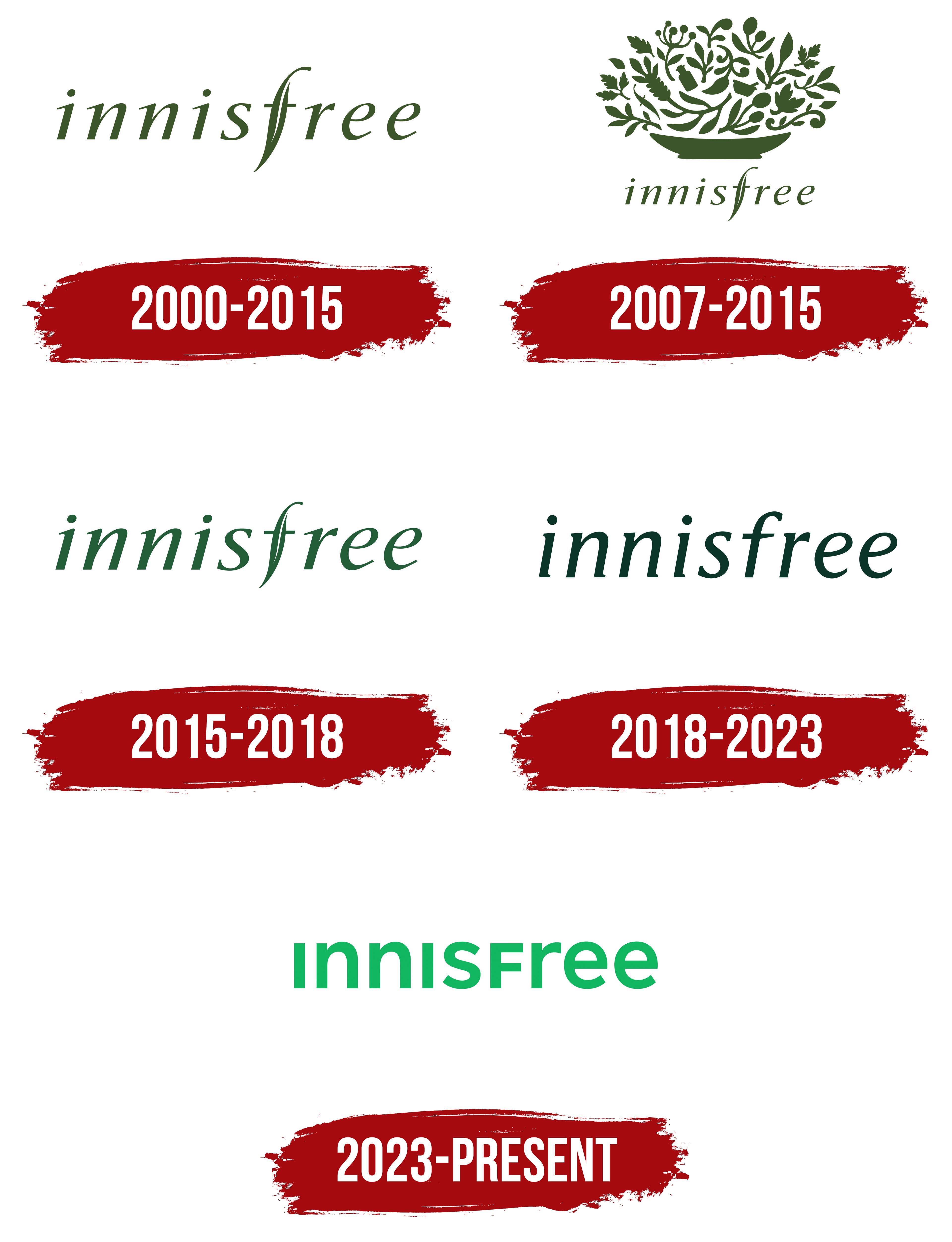
2000 – 2015

The original Innisfree brand logo served as the foundation for the brand’s visual identity through 2015. Its design was developed in tandem with the packaging design and the agency Duffy & Partners’ overall visual communications system.
The inscription is set in lowercase, rendered in a consistent italic sans-serif typeface. The unusual element is the letter “f,” whose stroke elegantly extends to the right, visually intertwining with the neighboring letters. This evokes the smooth movement of a branch, underscoring the brand’s philosophy rooted in nature and its use of natural ingredients. This stylistic device was a deliberate step to establish an emotional connection between consumers and the plant-based origins of Innisfree products, whose foundation is Jeju Island-sourced ingredients.
The logo’s shade is forest green. It was chosen as a symbol of purity, tranquility, and the natural origin of cosmetics. The color served as the brand’s main identifier, distinguishing it from competitors and associating it with the company’s ecological principles.
The logo’s visual style has no analogs among standard commercial fonts. It represents an original typography created specifically for Innisfree. The font features smooth forms, moderate stroke thickness, and a slight slant, giving the logo a dynamic, delicate character.
The logo’s design effectively embodies the company’s strategy, focusing on environmental responsibility, connection with natural resources, and fostering an atmosphere of organic simplicity and naturalness.
2007 – 2015
In 2007, Innisfree supplemented its visual identity with a new emblem and expanded its typography with a more detailed symbol to reinforce the brand’s natural origin. This became the next step in developing the concept originally set by Duffy & Partners, which continued to oversee the brand’s overall style.
The introduced symbol is a composition of plant elements: leaves, spiral tendrils, and plant shoots. They are united into a single form reminiscent of a vessel filled with natural ingredients. The silhouettes in the drawing outline bottles, serving as a deliberate metaphor for cosmetic products. Each element of the botanical emblem carries a symbolic meaning, underscoring the use of Jeju Island ingredients in cosmetics.
The emblem is executed in the corporate palette, emphasizing the brand’s eco-friendly nature and creating a recognizable association with natural cosmetics. The plant forms are carefully detailed, giving the image an organic, natural feel and stylistic refinement. The emblem was integrated into packaging and communication materials, reinforcing the brand’s central idea: harmony with nature and environmental responsibility.
The previously used “innisfree” typography was preserved in the emblem, rendered in italics with an elongated “f” that visually connects the letters into an unbroken line.
2015 – 2018

In the next update, the brand returned to a strict minimalist logo, abandoning the botanical symbol. The change was driven by the company’s pursuit of visual simplification and by strengthening associations with the products’ purity and naturalness, without additional metaphorical images.
The new logo features only the brand name typography in lowercase, in the same signature dark green shade. It may appear that the original font remains unchanged, but the strokes are slightly thinner, and the lines are smoother and more elegant.
The detailed work on the font demonstrates the brand’s effort to fine-tune its visual identity without radical changes, focusing on enhancing aesthetic precision.
The abandonment of the symbolic emblem with botanical motifs aligns with the company’s overall strategy: to remove unnecessary elements and strengthen communication with consumers by relying solely on the power and clarity of typography.
2018 – 2023

In 2018, Innisfree introduced a redesigned logo to reflect the brand’s modernization and address evolving expectations in the natural cosmetics market. The transformation of the visual identity was part of Amorepacific’s rebranding, aimed at strengthening the brand’s international presence and moving away from outdated stereotypes associated with “green cosmetics.”
In the new logo, the brand name is presented in lowercase, italicized. Still, the previous decorative elements and emphasis on individual letters were eliminated. The main changes affected the font’s structure: a custom typeface was applied that closely resembles European humanist italics (particularly Adobe Garamond Italic), with smooth stroke endings and slanted characters. Through this, the brand sought to visually convey a sense of naturalness, freshness, and fluid forms associated with natural ingredients, but in a more modern, restrained style.
The dominant design element became a muted shade of green inspired by the Bija forest on Jeju Island. The color tone was chosen as the company’s signature mark, symbolizing the origin of the ingredients. It emphasizes an eco-friendly cosmetics philosophy without resorting to visual clichés from earlier decades.
In the new visual concept, the elongated “f” form characteristic of earlier versions disappeared. It was replaced by a standard letter harmoniously integrated into the overall lettering.
2023 – today

Following Innisfree’s rebrand, launched at the end of 2023 and implemented in 2024, the brand updated its visual identity with a new logo designed for the Asian and US markets. The changes were accompanied by an expansion of its international presence, including more than 1,200 Sephora retail outlets in the United States, underscoring the brand’s ambition for global reach and strengthening its environmental positioning.
The updated logo features a concise lowercase inscription. The visual composition is based on a minimalist geometric font. The glyphs are characterized by strict linearity, uniform stroke thickness, and neat rounding. The lettering angles are balanced, ensuring ease of visual perception and conveying the products’ purity and naturalness.
The new logo’s palette features a bright green shade called “Active Green,” developed by the brand and inspired by the green tones of the Bija forest on Jeju Island. The color symbolizes nature’s vital energy and the brand’s aspiration to unite sustainable development with advanced technologies in cosmetics production.
The logo’s font became the central tool for implementing the new strategy to communicate the company’s ecological and technological values. The use of the logo is closely tied to the new slogan and product packaging, complementing the overall visual concept and strengthening the brand’s recognition internationally.