


 Invader Zim Logo PNG
The Invader Zim logo is designed in a cartoon style with dark undertones, perfectly reflecting the show’s appeal to teenagers and older viewers. The emblem’s visual design captures attention by playing on themes of humanoids, alien technology, rockets, and robots. These elements create a dynamic and intriguing atmosphere, giving the logo a sense of cosmic invasion. The theme of invaders and robots, combined with a dark color palette, adds a sense of mystery, making the logo appealing to fans of unusual and thrilling adventures.
Invader Zim began in the late 1990s, when Nickelodeon approached Jhonen Vasquez, known for dark comic books, and asked him to develop an animated series. Vasquez proposed a story about Zim, an incompetent alien invader sent to conquer Earth. Production started in 1999, with the team mixing black humor, science fiction, and a distorted visual style. The main cast centered on Zim, paranormal-obsessed schoolboy Dib, and GIR, Zim’s unpredictable robot assistant.
The series premiered on March 30, 2001, and quickly stood apart from regular children’s animation. Its comedy was darker, its themes were stranger, and its look felt closer to alternative comics than standard TV cartoons. The show earned positive reviews and built a loyal audience. Still, it ran into problems because of high production costs and a tone that did not match the channel’s usual programming model.
The original run ended in 2002 after 27 episodes, with the final episode airing on March 10, 2003. Reruns continued until August 2006, helping the show stay visible after cancellation. Media Blasters released the series on DVD in 2004, giving fans access to episodes again and introducing the show to viewers who had missed it on television.
The franchise continued through comics. Slave Labor Graphics published new material in 2006, and Oni Press launched a new comic series in 2015 with Vasquez involved. In 2017, a television film titled Enter the Florpus was announced, then released on Netflix on August 16, 2019. Its reception renewed interest in Invader Zim, followed by new merchandise in 2020. By 2023, the series remained active mainly through comics and fan culture.
Meaning and History
What is Invader Zim?
This animated series stands out for its dark humor and unique sci-fi plot. At the center of the comedy is an incompetent alien invader from Irk, who is sent on a fake mission to Earth by his rulers, hoping he will perish in the process. However, the main character plans to conquer the planet while trying to blend in with humans, aided by his malfunctioning robot assistant, GIR. The series skillfully uses absurdist humor to address topics like consumerism, alienation, and environmental issues while remaining accessible to a young audience.
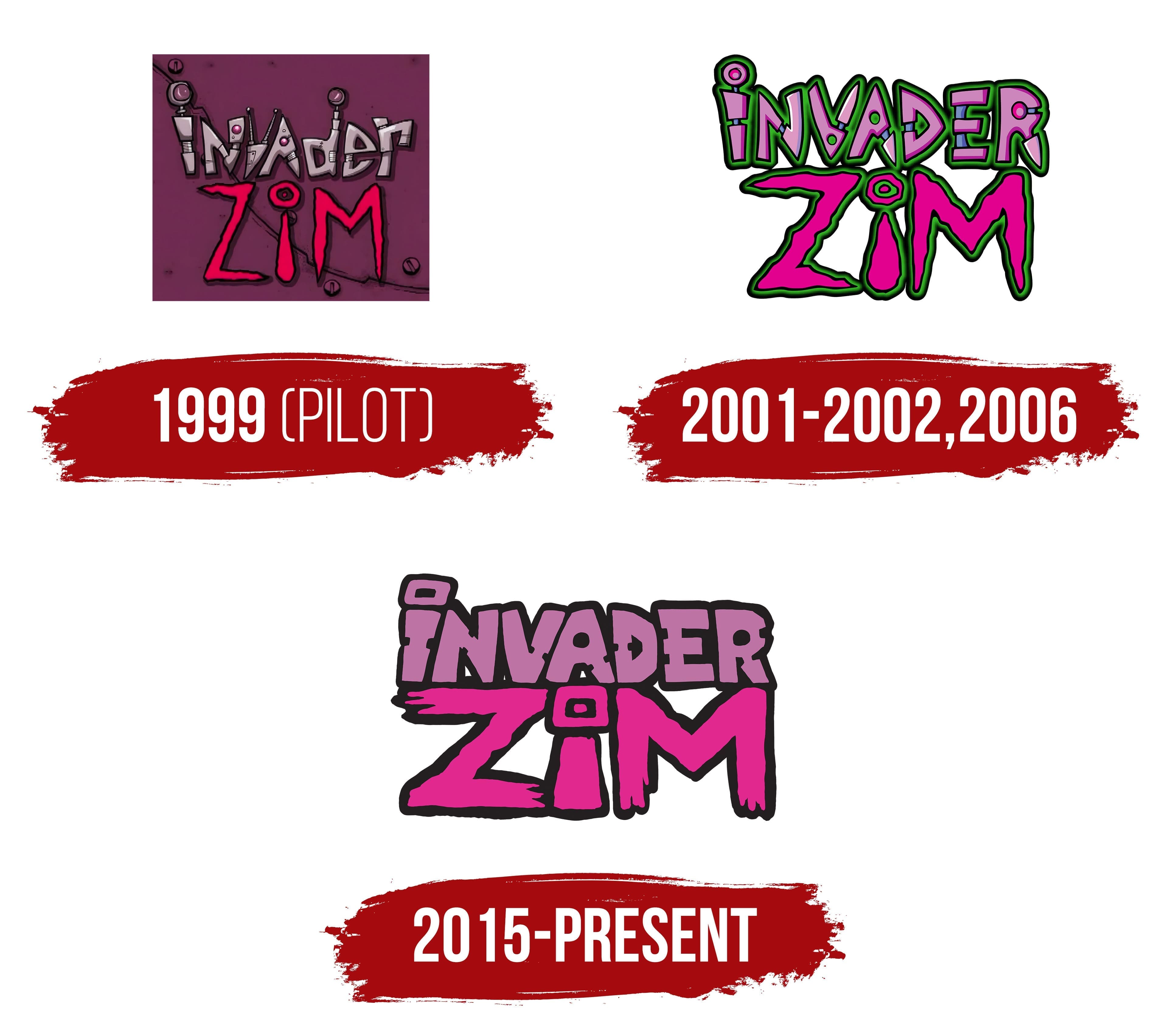
1999 (Pilot)
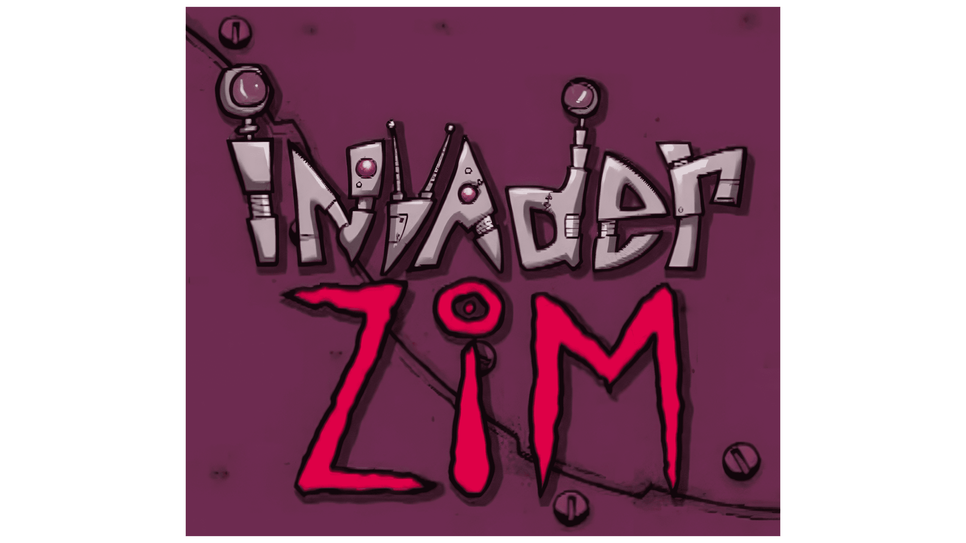
The pilot logo consists of the title on a metallic background held together by rivets. This element resembles the alien ship on which the main character, Invader Zim, arrived on Earth. The title is rendered in two different styles, creating contrast and highlighting the layered nature of the characters.
The word “Invader” has a metallic look, with each letter resembling a mechanical part, like a telescopic handle or a screw, with patches and rivets. This style is reminiscent of the robot GIR, Zim’s companion, created from junkyard scraps, emphasizing his imperfect state and operational instability. GIR (an abbreviation for Rosearik Rikki Simons) adds individuality to his chaotic nature. The letters “d,” “v,” and “i” feature helmet-like elements with antennas, evoking associations with characters in spacesuits and hinting at their extraterrestrial origins and mission.
In contrast to “Invader,” the word “Zim” is larger and highlighted in magenta, symbolizing the main character. Its font differs from the metallic style, appearing more “alive” with sharper edges, reflecting Zim’s aggressive, bloodthirsty ambition to conquer Earth. Combining these two visual styles emphasizes the characters’ duality: despite their alien origins, they are forced to pretend to be human on Earth.
2001 – 2002, 2006
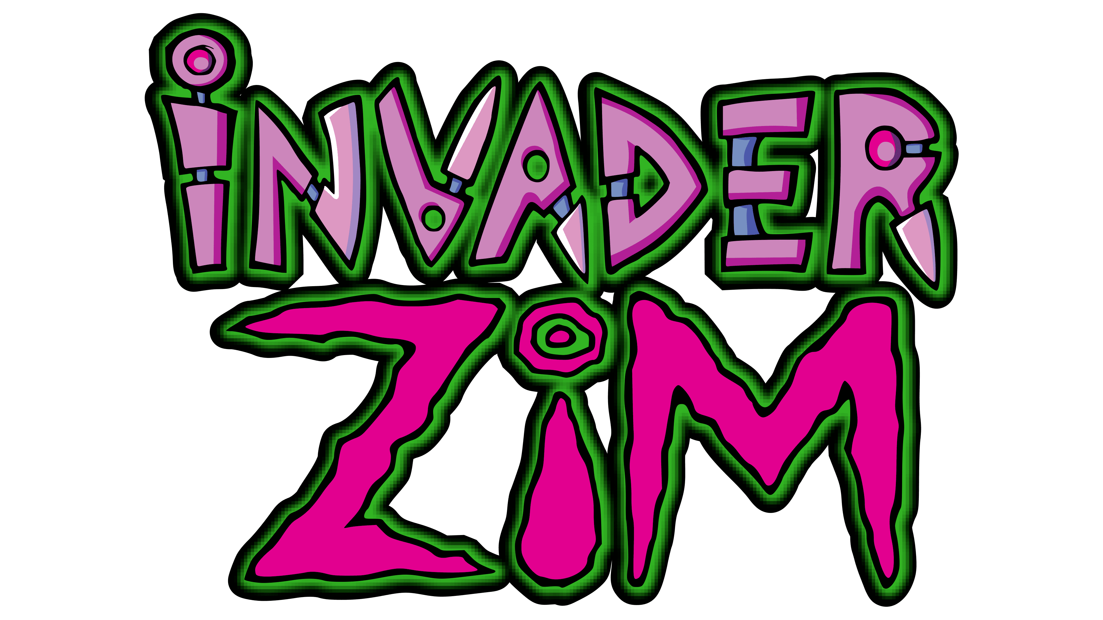
The logo changed for the series’ release on Nickelodeon in 2001 and Nicktoons in 2006, adding elements that highlight the characters’ traits. Now, the letters are surrounded by a green glow, symbolizing cosmic energy. This shade also ties into the hero’s disguise, as he claims his green skin results from a disease upon arriving on Earth.
The word “Invader” took on sharper, more mechanical shapes, hinting at the alien’s intent to invade and establish a base on Earth. The metallic base of the letters is covered with purple detailing, symbolizing the aliens’ camouflage and their efforts to hide their true origins. This also emphasizes the characters’ duality as they try to blend into the human environment.
“Zim” retained the magenta font from the pilot version, but the letters became lighter and shorter. This design choice draws attention to a key feature of the main character, his small stature for a member of his race.
2015 – today
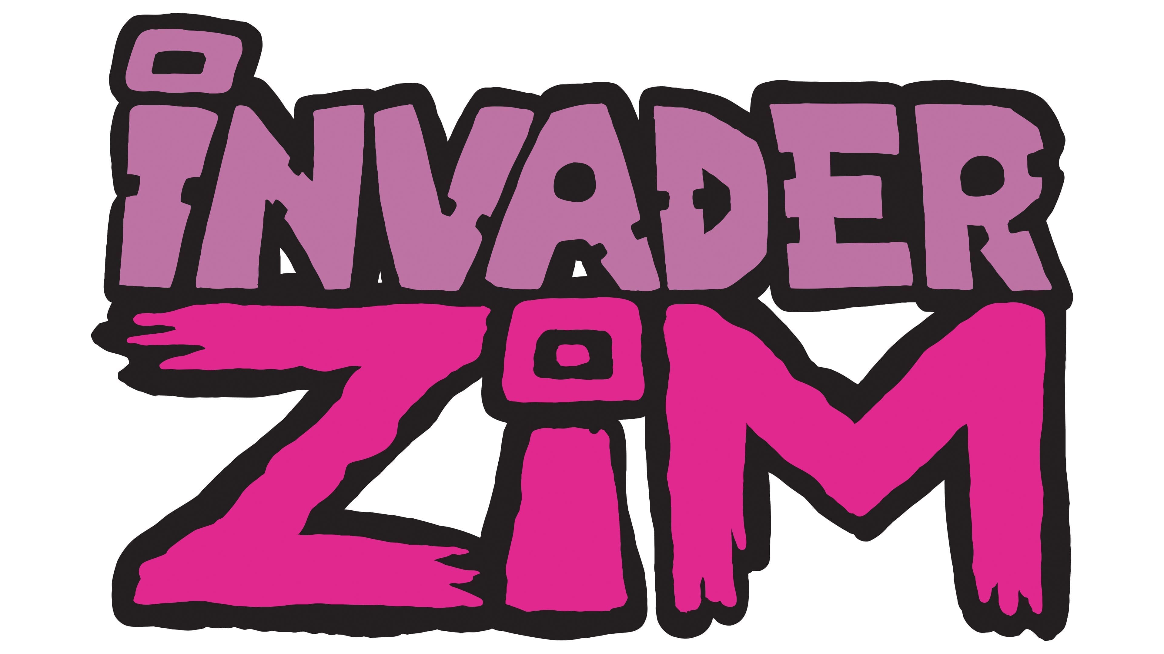
The logo of the “Invader Zim” series conveys the spirit of rebellion and dystopia that runs through the storyline. The font is designed in a rough, almost hand-drawn graffiti style. This approach emphasizes the chaos and unpredictability of both Zim himself and the events happening around him. Each letter appears angular and deliberately messy, enhancing the impression of the main character’s unconventional nature.
The logo’s color scheme includes purple and magenta shades on a black background. This contrast symbolizes the darkness and, at the same time, the energy of the world Zim enters. The dark elements add a sense of gloom, while the bright colors create tension and the madness that defines the character. The purple hue of the letters in “INVADER” and the bright magenta of “ZIM” draw attention, highlighting the main character and his uniqueness among the other figures.
This style aligns with the show’s time period and themes, which challenged the norms of cartoons at the time. The story of an alien invader attempting to conquer Earth reflects defiance against norms and rules mirrored in the project’s visual design.