 Japan Post Logo PNG
The postal system handles daily tasks such as sending letters, delivering packages, and transferring money between cities. Behind these operations lies an extensive network of branches, transport routes, and sorting centers. The Japan Post logo represents Japan’s national postal and financial service, which handles mail and parcel delivery and provides basic financial services.
Japan Post dates back to 1871. During that period, Japan’s modern postal system emerged after the Meiji Restoration. The first routes connected Tokyo and Osaka. In 1875, a postal savings system began operating, allowing citizens to keep their money in post offices. By the early 20th century, the postal network had covered the entire country and had become an important part of the financial infrastructure.
In 1916, the company began offering life insurance. After World War II, the organization became Japan’s largest deposit holder. In the 1970s, the postal system’s savings exceeded the assets of the largest banks, helping finance government projects.
In the 2000s, the government decided to reform the large state structure. The process was completed in 2007. The government created the holding company Japan Post Holdings, which included three companies. They were Japan Post, Japan Post Bank, and Japan Post Insurance.
In 2015, the company held an IPO. The government sold about 11% of each company’s shares. Japan Post continued to manage twenty-four thousand branches, providing access to postal and financial services, especially in rural areas.
In 2017, Japan Post acquired the Australian company Toll Holdings for $ 6.5 billion. Later, it wrote off most of the value due to losses. In 2019, an investigation into the improper sale of insurance policies began. It resulted in fines and a temporary suspension of new sales.
Japan Post Holdings remains under state control. The holding includes three areas of operation. These are postal, banking, and insurance services. The company serves tens of millions of clients through Japan’s largest network of branches and ATMs.
Meaning and History
What is Japan Post?
One of the world’s largest financial conglomerates combines postal, banking, and insurance operations under state management. It manages about $2.1 trillion in personal savings and over $1.2 trillion in insurance assets. The network includes more than 23,000 branches and 32,000 ATMs, providing postal, financial, and insurance services.
2003 – 2007

The history of Japan Post dates back to the government-run postal system established in Japan in 1871 at the initiative of Hisoka Maejima. The first routes connected Tokyo, Kyoto, and Osaka, and the postal network later expanded nationwide. In 1875, its facilities received the common name 郵便局 (yūbinkyoku), meaning “post office.” The English name Japan Post corresponds to the Japanese 日本郵便 (Nihon Yūbin), meaning “Japan Post.” Japan Post Co., Ltd. operates within Japan Post Group as a postal and logistics company continuing the history of the 19th-century service.
The symbol 〒 has represented the Japanese postal service since 1887. The Ministry of Communications (逓信省, Teishin-shō) approved it as the agency’s official emblem. Postal flags had previously displayed a red circle with a horizontal bar. The new symbol consisted of two horizontal lines and one vertical stroke. It appeared on employee uniforms, mailboxes, signs, and other materials. It remained in use as government agencies changed, later became part of the corporate group’s identity, and continued after privatization.
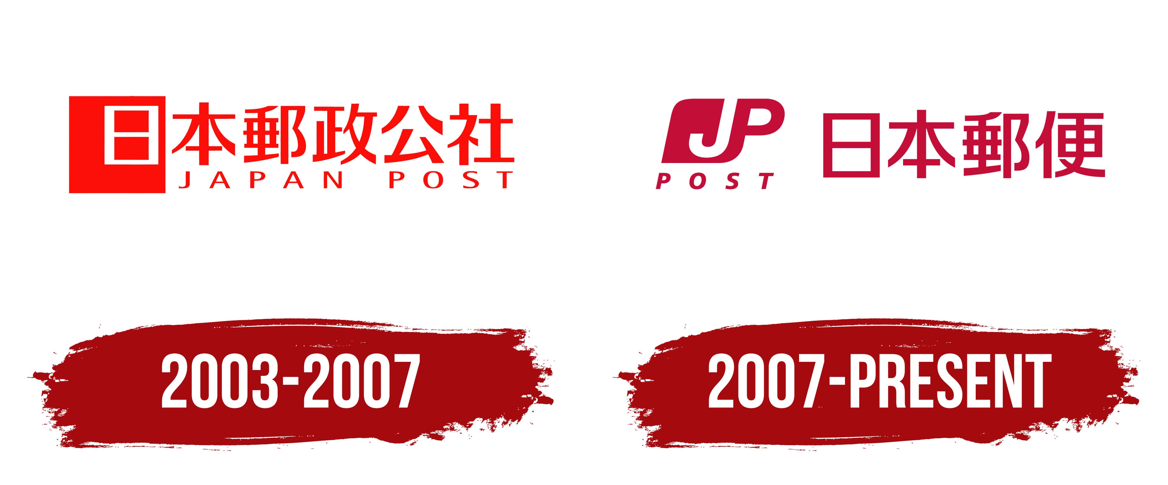
Japan Post created a separate corporate logo in 2003. The identity was unveiled on February 7, and the government-owned corporation 日本郵政公社 began operations on April 1. It replaced the Postal Services Agency and took over postal, savings, and insurance operations. The organization created a red square emblem. The postal service and its post offices kept the historic symbol, preserving a familiar identifier for visitors and maintaining a connection to the network’s past.
In the new logo, the square emblem appeared on the left. Red geometric sections surrounded a white interior space, separated by open gaps. The square’s four directions represented nationwide coverage and access to services across regions. The red color continued the tradition of earlier postal symbols and the color of Japanese mailboxes.
The name of the government-owned corporation, 日本郵政公社, appeared on the right. The English words “JAPAN POST” were placed beneath the large Japanese inscription for an international audience. They were set in uppercase letters using a sans-serif typeface with thinner strokes than the line above. Wider spacing between the Latin letters extended the English wording beneath the Japanese name.
The launch was accompanied by the phrase 真っ向サービス, Makkō Service, expressing the idea of open and honest service. The network incorporated the new identity into its daily operations. Employees received new uniforms, while post offices displayed colored bands and updated signs. The government-owned corporation used the 2003 version until it restructured under the postal privatization program.
2007 – today
On October 1, 2007, the government-owned Japan Post Corporation was dissolved, and its functions were transferred to five companies. The group included Japan Post Holdings, Japan Post Service, Japan Post Network, Japan Post Bank, and Japan Post Insurance. They were united under the shared “JP” brand. Their logos followed the same basic format, while individual colors distinguished their areas of operation.
The connected letters “JP” received an official interpretation. The “J” represented customers in Japan and abroad, while the “P” represented Japan Post Group. The connection between the letters expressed support for customers and society through a nationwide network and universal services.
In the emblem, the large slanted letters “J” and “P” merged into a dense shape with rounded corners. Its outer contour resembled a tilted quadrilateral, while the strokes of the “J” flowed into the shared form of the “P.” The small word “POST,” set in uppercase sans-serif letters, appeared beneath the monogram. The letter-based emblem replaced the previous logo’s square background.
In the postal version, the burgundy-red “JP POST” emblem appeared to the left of the Japanese name. Depending on the company and application, the company used either 郵便 or 日本郵便. The inscription 日本郵便 means “Japan Post.” Its vertical and horizontal strokes had equal thickness, and its form followed the sans-serif tradition of Japanese lettering. The Japanese characters stood upright, unlike the slanted Latin letters. The small word “POST” remained beneath the monogram within the left section.
The red shade was called Yūsei Red. Japan Post Service used the name Yūbin Red for the same color value. Japan Post Holdings associated the rich red with the postal business’s heritage and the new private group’s reliability. Japan Post Network received orange, Japan Post Bank used green, and Japan Post Insurance used light blue. The shared “JP” form maintained a connection among the companies, while the colors identified their respective areas of operation.
On October 1, 2012, Japan Post Service and Japan Post Network merged to form Japan Post Co., Ltd. (日本郵便株式会社). The postal company retained the 2007 emblem and continued placing the red “JP POST” mark next to the name 日本郵便.
The historic 〒 symbol, used since 1887, remained on post offices, mailboxes, and other postal facilities. It identified the postal service and connected it with its history as a government institution. The Latin “JP” monogram represented the corporate group and the companies created during the 21st-century restructuring.