


 Jinjer Saw Logo PNG
The Jinjer Saw logo reflects the fury of music conveyed through the harsh sound of metal. It represents the boundary between the inner and outer worlds, expressed in notes. The emblem conveys the resilience of a nation fighting against the darkest evil on the planet.
Jinjer formed in Horlivka, Donetsk region, in 2009, with vocalist Maksym Fatullaiev and guitarist Dmytro Kim. The early lineup included drummer Oleksandr Koziichuk and bassist Viacheslav Okhrymenko. In 2010, the band recorded a four-track demo and performed across the Donbas metal scene, gradually gaining recognition within Ukraine’s underground community.
A major lineup change came in 2011 when Tatiana Shmayluk became the vocalist. Her ability to move between clean singing and growls became a defining part of the band’s sound. Jinjer recorded Inhale, Don’t Breathe that year. Roman Ibramkhalilov replaced Dmytro Kim on guitar in 2012, while bassist Eugene Abdukhanov joined in 2013. The Inhale, Don’t Breathe EP followed during the same period.
Cloud Factory, released in 2014, brought wider attention and opened the way for European tours and festival appearances. After the conflict in eastern Ukraine began, the members relocated from Horlivka to Lviv. In 2016, Jinjer signed with Austrian label Napalm Records and released King of Everything, expanding its audience outside Ukraine.
The Micro EP arrived in 2018, followed by Macro in 2019 and Wallflowers in 2021. During these years, the band toured extensively across Europe and the United States. By 2023, Jinjer had become one of Eastern Europe’s most visible metal groups, combining groove metal, progressive metal, jazz elements, clean vocals, and growls in studio recordings and live performances at major festivals worldwide.
Meaning and History
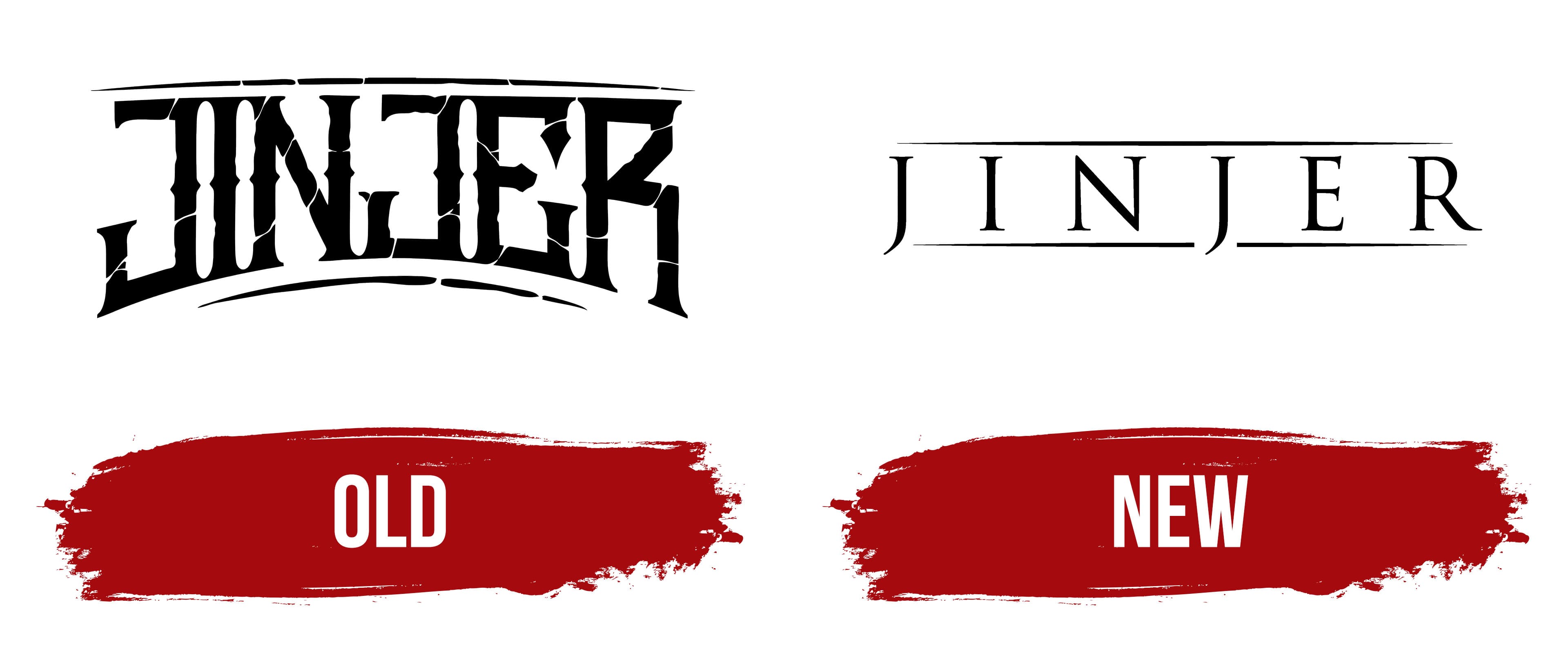
What is Jinjer Saw?
This Ukrainian metal band is known for creating unique music that blends progressive metalcore, djent, and jazz. Their sound is characterized by Tatiana Shmaylyuk’s powerful vocals, which effortlessly switch between melodic singing and deep guttural growls. The band’s music combines intricate instrumental parts, vivid emotions, and high-level performance artistry.
Old
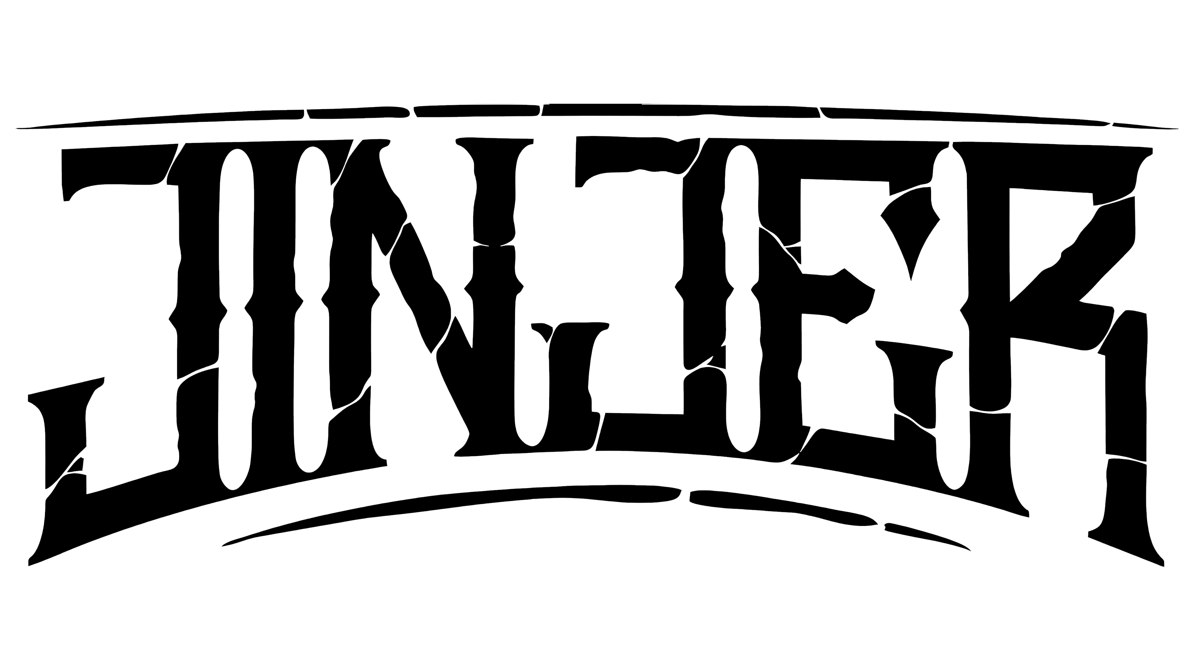
The arched inscription evokes fear, as the letters resemble fractured finger phalanges. This is an allegory of torture, emotionally intense, accompanied by an unbearable scream that cracks walls. This is exactly how Ukrainian music reveals its wounded soul. These wounds were inflicted long before the full-scale invasion by the enemy, as it has long carried the heavy stone of protest hurled at adversaries since the Revolution of Dignity.
In essence, the Jinjer Saw logo reflects the hardcore band’s musical direction and national essence, which has endured relentless persecution by enemies throughout its existence. Ukrainian art confirms this. The emblem itself resembles cracked ancient pillars, symbolizing resilience.
The inscription is crafted in an informal style, featuring vintage-style letters with serifs resembling the heads of half-driven nails and bone-joint spikes. The tops of the letters are straight, while the bottoms are concave, making the name resemble a stone bridge with a boat passage.
The edges of the text are outlined with dashed lines ending in sharp points. The composition is completed with black, which perfectly fits the rebellious design. The monochrome palette adds severity to the emblem and infuses it with mystery, captivating the band’s fans. In this way, the design’s mysticism intertwines with the music’s mysticism, creating an oppressive atmosphere.
New
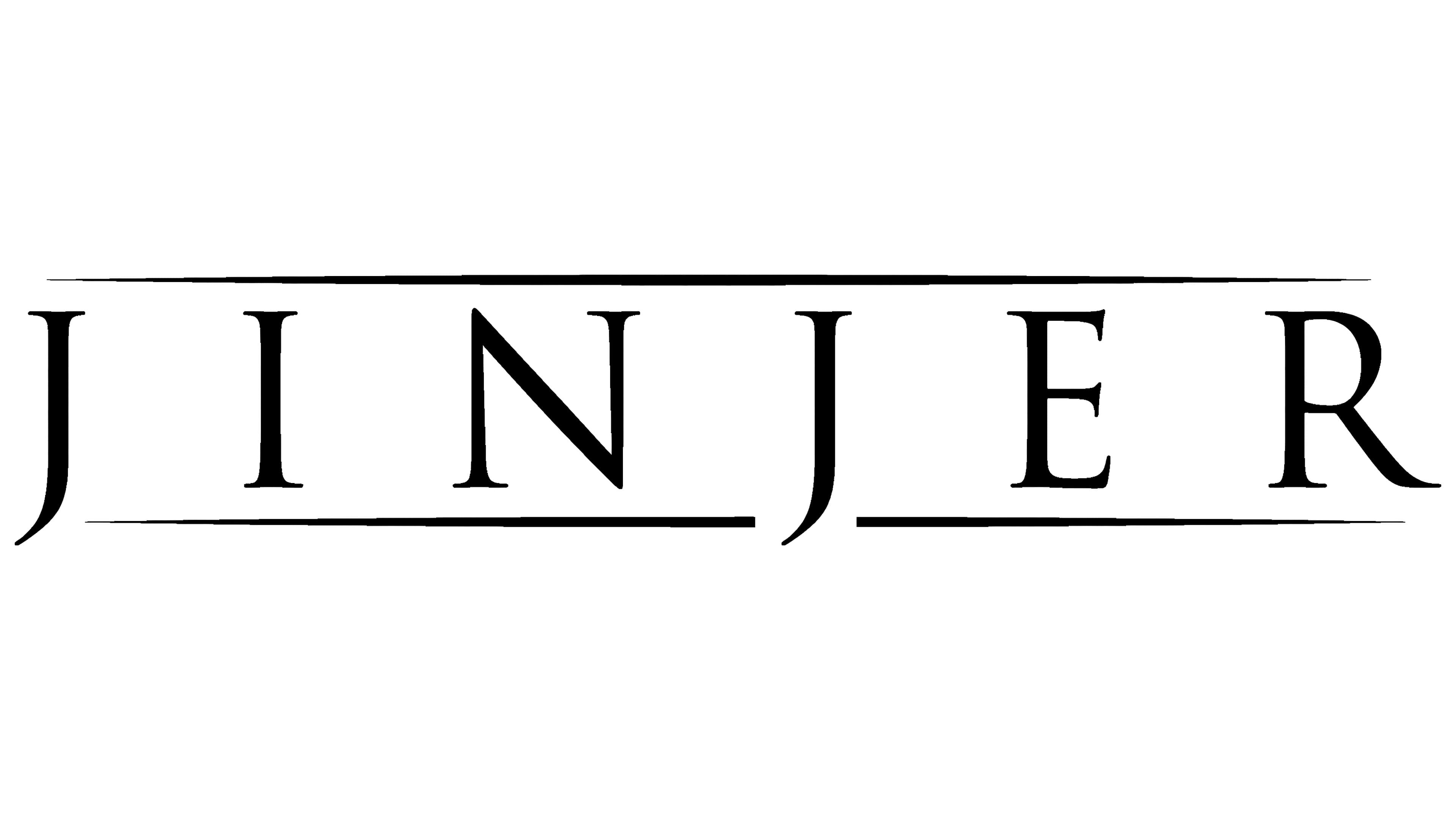
The transformation of the Jinjer Saw logo introduced a new style, light, airy, and elegant. It incorporates ample space, hinting at freedom of thought and action. However, the structure has retained its original elements: the name and two border lines. This signifies consistency, resilience, and rebirth despite the challenges that have completely reshaped the band’s lineup.
The inscription is executed in an uppercase typeface with thin strokes. All the letters are serifed, featuring small yet expressive serifs. These can be described as conceptual, replacing the heavy elements of the previous emblem and conveying the essence of the songs performed.
The semi-bold glyphs are spaced widely apart, giving the logo a sense of lightness and airiness. Combined with the narrow strokes at their ends, the letters also carry a mystical quality, resembling runic symbols. The overt aggression has disappeared; it was left behind in the past when the band struggled to survive and make it to the stage.
The border lines above and below the text have remained, but their style has changed. They are now much thinner, shedding their visual heaviness. Two graceful lines glide along the inscription. Their pointed ends seem to pierce both time and the heart. The line beneath the name intersects the glyph “J,” adding energetic resistance and dynamism to the emblem.
The color palette remains unchanged: black, symbolizing dark forces that hinder the music from breaking through to the light. However, this color no longer creates an oppressive atmosphere, as the thinner letters reduce intensity. Additionally, the wide letter spacing significantly diminishes the concentration of black.
Jinjer Saw Symbol
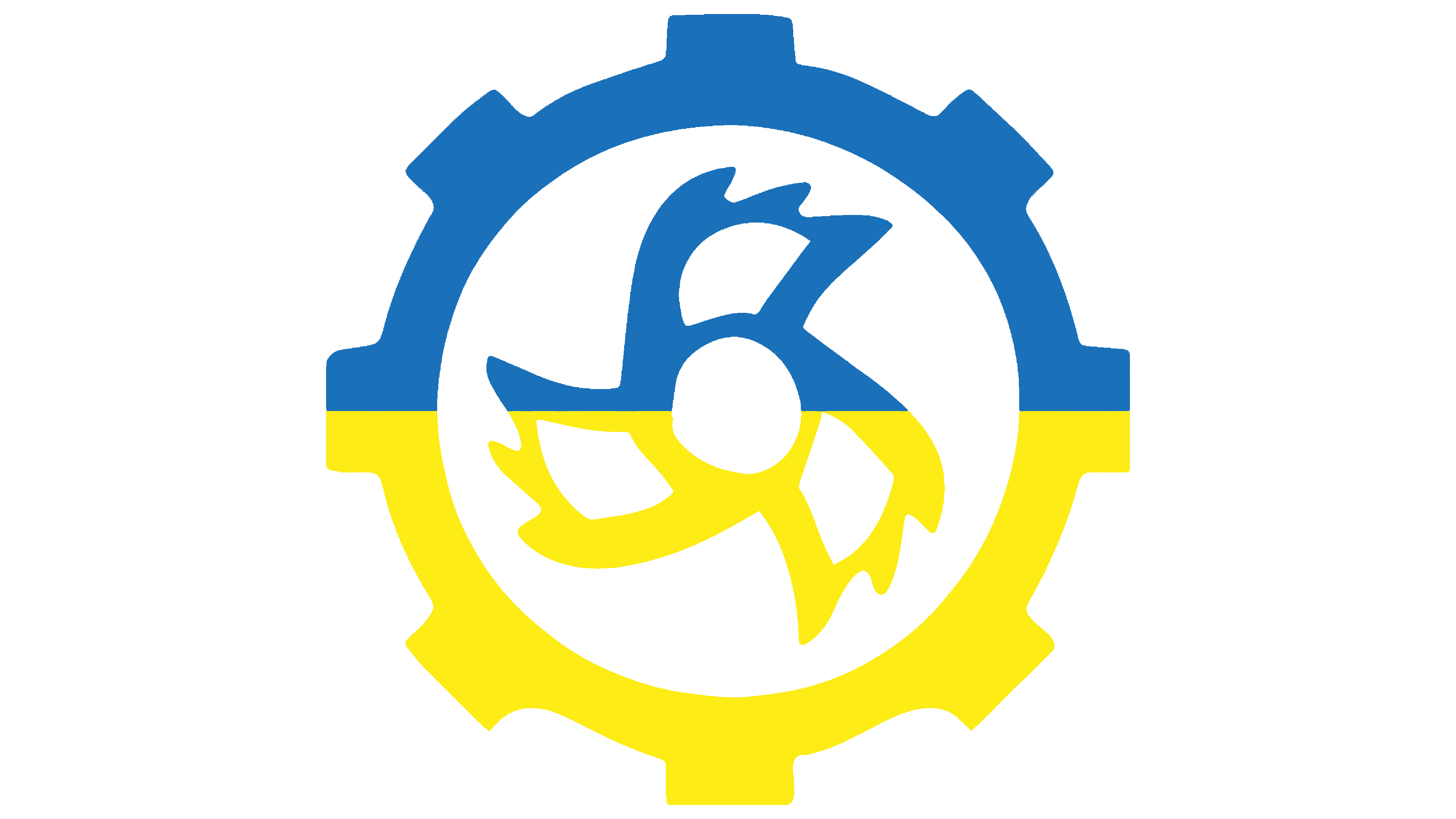
The Jinjer Saw icon is a miniature gear with a clock mechanism that drives its movement. This profound symbol is a traditional element of the visual identity of creative groups. It represents eternity, progress, forward motion, the cycle of life, and, essentially, time itself.
However, the internal element resembles a classic shuriken, a Japanese throwing weapon. This evokes associations with rebellion and defiance, qualities reflected in the rock band’s songs. The musicians seem to challenge society, promoting the idea of spiritual independence.
The main element is a circle drawn with a bold line and eight alternating protrusions. A shaped piece resembling a toothed mechanism with sharp ends is at its center. These details also suggest the infinity of time and the fragility of the soul. The icon’s color palette varies and depends on the background, context, and placement.