 Kirin Logo PNG
Beverage production includes brewing, manufacturing non-alcoholic products, and developing the food division. These products accompany meals and leisure activities, creating steady market demand. The Kirin logo is associated with a Japanese company that produces beer and other beverages and manages brands in Japan and beyond.
Kirin began operations in 1885 in Yokohama. American entrepreneur William Copeland, of Norwegian descent, founded it as Japan Brewery. In 1888, Kirin beer appeared. It was brewed according to German standards and brought the company recognition in Japan. In 1907, the enterprise was renamed Kirin Brewery and joined the Mitsubishi industrial group.
In the first half of the twentieth century, the company expanded production. After the 1923 earthquake, it restored its facilities and created its own research laboratories. In the 1950s, the company became Japan’s market leader. In the 1970s and 1980s, international cooperation began with Heineken and Seagram. The partnership enabled the introduction of new beer styles and modern brewing technologies.
By the 1990s, Kirin’s domestic market share had declined from 60% to 47%. This led to restructuring. The company increased exports and began licensing production in the United States, China, Australia, and other countries. It acquired stakes in breweries in New Zealand and the Philippines.
In 2007, Kirin Holdings was established. It included brewing, beverage production, pharmaceuticals, and biotechnology. The holding structure consists of Kirin Brewery, Kyowa Kirin, Kirin Beverage, and Kyowa Hakko Bio.
In 2011, the company acquired Schincariol, a Brazilian company, for $4 billion. In 2017, Kirin sold the asset to Heineken. After that, Kirin began optimizing its portfolio, focusing on key markets and innovation.
By 2022, the company’s revenue reached 1.989 trillion yen. Profit amounted to 0.111 trillion yen. In 2023, results grew 7.3 percent to 2.134 trillion yen. Beer sales and Kyowa Kirin pharmaceuticals drove growth.
In 2024, the company introduced an electric spoon that enhances the taste of salt using a weak electric current.
The company launched a device called the Electric Salt Cup, designed for soups. The new technologies generated interest in the domestic market. The company announced plans to bring them to Asian markets in 2026.
Meaning and History
What is Kirin?
A Japanese corporation based in Tokyo, originating from William Copeland’s brewery and later becoming part of Mitsubishi, operates in the beverage and pharmaceutical sectors, with annual revenue of about $ 18 billion. Its beer, featuring the image of a qilin, once held 60% of the market. Still, it later shifted production toward happoshu, mineral water, and overseas projects in New Zealand, China, and the Philippines. The group includes Kirin Brewery (36% of revenue), Kirin Beverage (14%), Lion (16%), Kyowa Kirin (17%), Mercian, Myanmar Brewery, and Coca-Cola Beverages Northeast. It invests in the Indian company Bira, in joint pharmaceutical projects with Amgen, and in research on genetically modified plants.
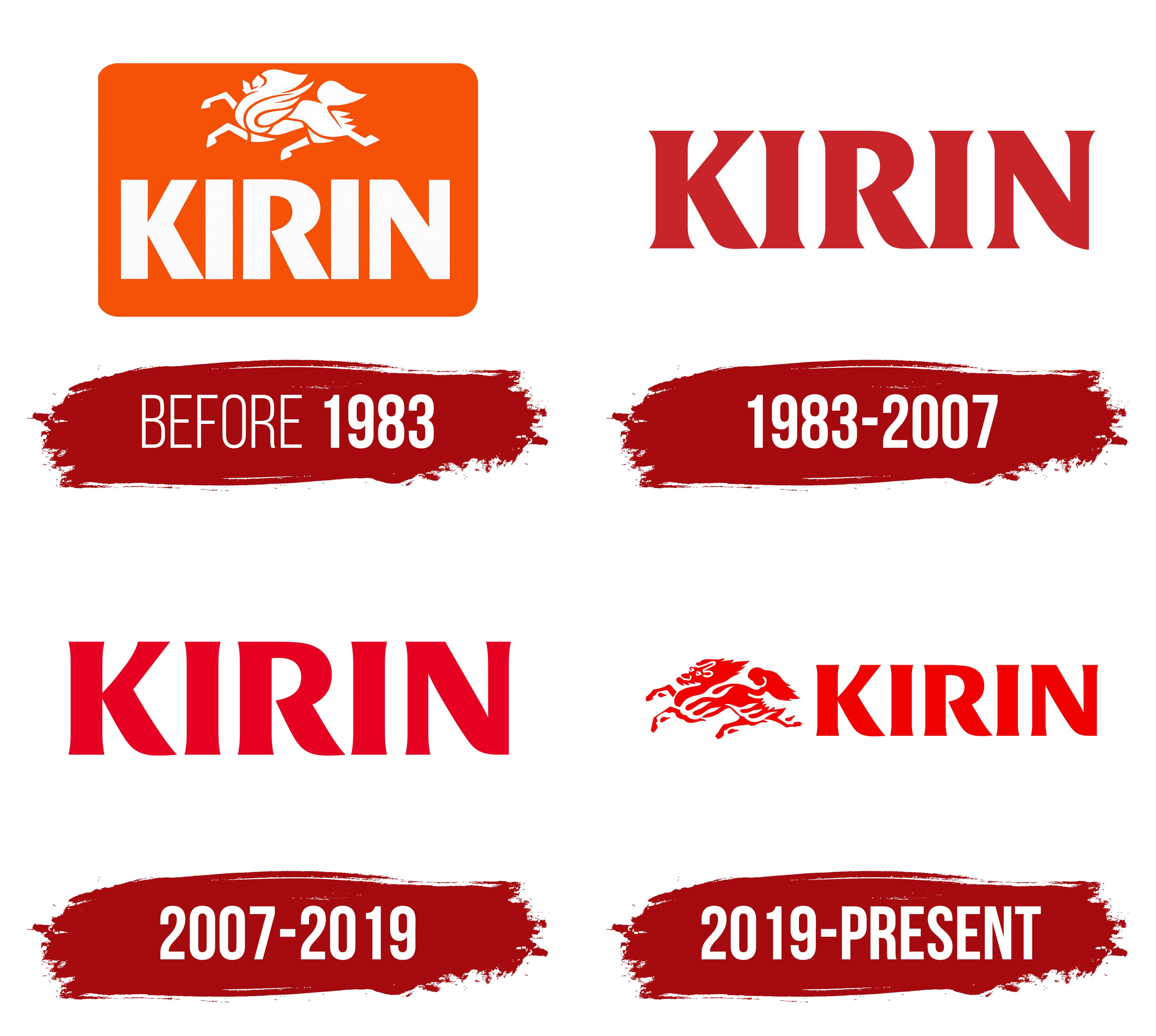
before 1983
Before Kirin adopted a unified corporate identity, it used an emblem featuring a flying mythical creature above the large word “KIRIN.” The white figure and name appeared inside an orange rectangle with rounded corners. Several decorative lines formed the kirin’s head, horn, back, legs, and tail. Heavy uppercase letters with even strokes appeared beneath the illustration. The dense wordmark balanced the elongated figure in the upper part of the composition.
The name Kirin comes from the characters 麒麟, pronounced “kirin.” In East Asian tradition, the name refers to a mythical creature associated with peace, good fortune, and favorable events. The company’s history credits Mitsubishi executive Shoda Heigoro with proposing the creature as a trademark. He drew inspiration from the popularity of animals in Western brewery branding.
The brand traces its history to Japan Brewery Company, established in Yokohama in 1885 from the assets of Spring Valley Brewery. The company used German equipment, imported ingredients, and employed German brewers. It introduced Kirin Beer in May 1888. In 1907, Japan Brewery’s business was transferred to the newly established Kirin Brewery Company, turning the beer name into a corporate name.
The mythical creature occupied a small area among the many decorative elements on the first Kirin Beer label in 1888. In 1889, Japan Brewery board member Thomas Blake Glover proposed revising the label and enlarging the kirin. The updated animal had an elongated body, one horn, hooves, a long tail, and an elaborate coat pattern. The illustration became the basis of Kirin labels for many years.
The kirin later appeared on Kirin Black Beer, Kirin Stout, and other company products. The katakana characters “キ,” “リ,” and “ン,” spelling Kirin, were hidden within the mane pattern. In the simplified emblem, the mythical creature retained its flying pose. Still, the detailed illustration from the early labels became a system of short white lines against an orange background.
1983 – 2007
Kirin updated its corporate identity in the early 1980s. The orange panel and separate mythical kirin figure were replaced by the dark red word “KIRIN.” Five uppercase letters formed a compact horizontal line and retained an upright orientation. The company name became the complete corporate signature.
Work on a shared identity system began in 1983. An expanding product range and new business areas created a need for one mark representing the entire group. Japanese consulting company PAOS developed the 1984 project. The agency built the logo around the KIRIN name, replacing the previous arrangement with a white kirin inside an orange rectangle. A unified wordmark could serve various divisions and product categories.
The lettering was based on the serif typeface Friz Quadrata. Its structure combined thick and thin strokes, wedge-shaped terminals, and large counters. The pointed edges of the “K,” “R,” and “N” reinforced the geometric appearance. Heavy letterforms and even spacing created a dense five-letter wordmark.
Dark red replaced the orange background of the previous emblem, shifting the emphasis to the corporate name. The mythical creature remained present through the name KIRIN, preserving the brand’s historical connection. The wordmark became a common signature across the company’s growing range of products and business areas.
2007 – 2019
Kirin Brewery Co., Ltd. became Kirin Holdings Company, Limited on July 1, 2007, becoming the group’s parent company. Beer production was transferred to a new Kirin Brewery Company. Corporate management and brewing operations were therefore split between the two companies.
Kirin Holdings introduced its corporate logo on the day of the restructuring. The red KIRIN name connected the new organization to Kirin Beer’s history. The holding company retained a name established long before the businesses separated.
The 2007 version preserved the previous logo’s wordmark foundation. Large uppercase serif letters remained based on Friz Quadrata. The inscription kept its horizontal arrangement. The letter proportions, forms, and spacing followed the earlier version’s typographic structure.
The color was the main change. A red tone one or two shades lighter replaced the previous dark red. The letterforms and overall structure remained unchanged. The brighter color marked the transition to a holding company model. At the same time, the KIRIN name continued to represent the group after brewing operations moved to a separate company.
2019 – today
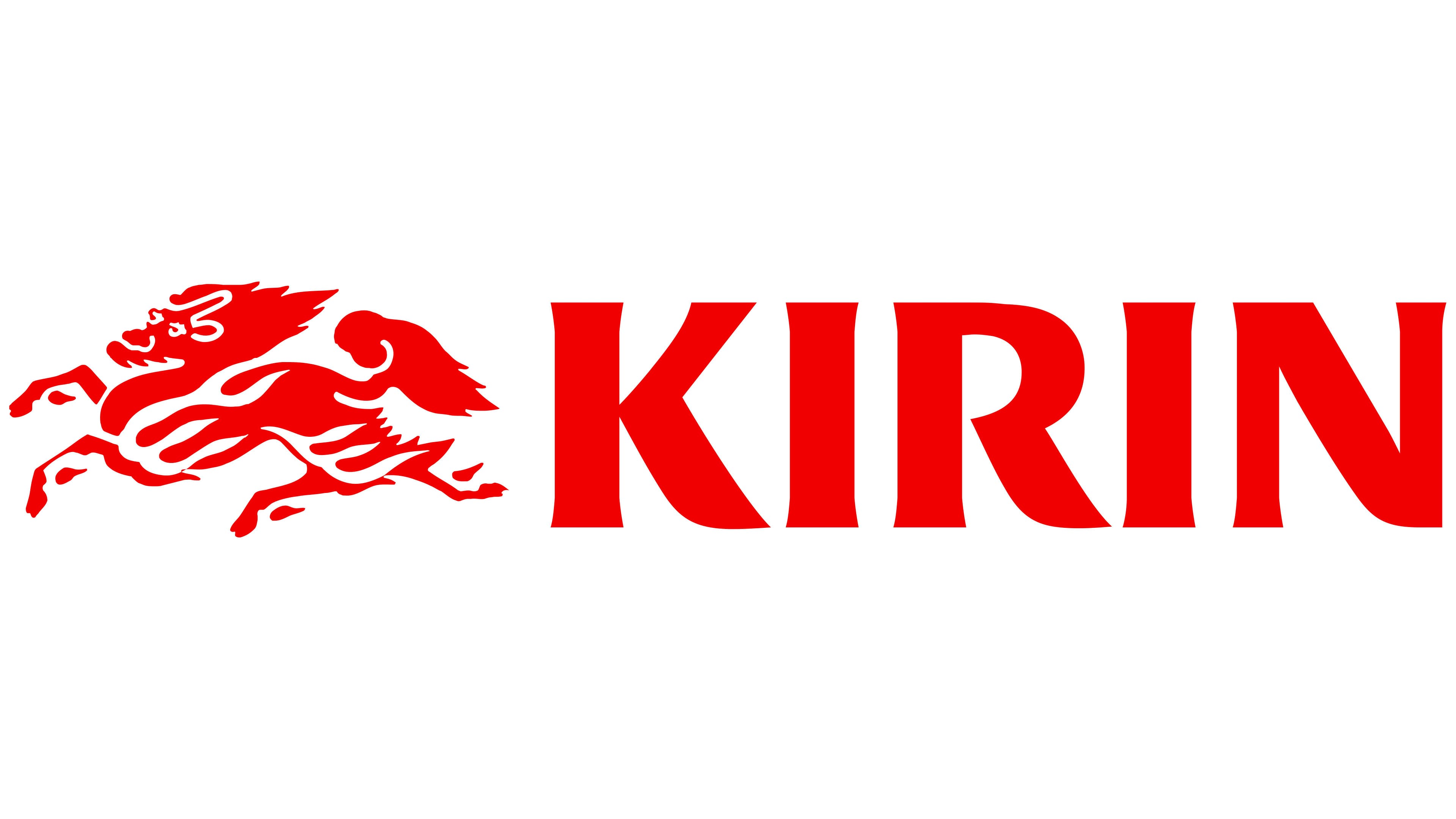
After using the company name and historic creature separately for many years, Kirin Group returned the mythical animal to its corporate logo. The updated identity took effect on April 1, 2019, and the company presented the complete composition on May 16. A red kirin appeared to the left of the KIRIN wordmark in the same color.
Previously, the wordmark served as the corporate identity logo. At the same time, the mythical figure appeared mainly on products and in materials about the brand’s heritage. Kirin Holdings extended its use across the entire group in 2019. The company connected the image with the idea of “bringing happiness and being close to joy.” The creature became a shared symbol for Kirin’s beverage, pharmaceutical, and health-related divisions.
The figure was based on the illustration from the 1889 Kirin Beer label, revised for corporate use and single-color printing. The red Kirin appears in mid-leap with raised legs and an elongated body. Its appearance combines traits of a lion, dragon, and horse. The head faces left, the mouth is open, and the long tail stretches backward. Curved legs end in claws. A fiery mane and coat patterns resemble bursts of flame. Sharp angles, diagonal strokes, and curves form the outline.
The red word “KIRIN” appears to the right of the creature. Its typography is based on Friz Quadrata and continues the corporate identity introduced in the 1980s and retained in the 2007 version. Uppercase letters with wedge-shaped serifs form a dense horizontal line. The red became one or two shades lighter, while the shared color united the lettering with the detailed Kirin illustration.
Kirin Holdings Company, Limited and its principal brewing subsidiary, Kirin Brewery Company, Limited, use the logo. The creature represents the entire group, while the KIRIN wordmark maintains continuity with the corporate identity used during previous decades.