


 La Lechera Logo PNG
The La Lechera logo declares that there is no sweeter and more delicious product. The exquisite taste of the unique, high-quality product reveals the full charm of the recipe. Customers appreciate not only the taste but also the product’s health benefits. The brand breaks stereotypes by offering a product that combines excellent taste with health benefits.
La Lechera began in 1910, when Nestlé entered the condensed milk market in Latin America. The name means “the milkmaid” in Spanish and was created to connect the product with dairy farming and make it familiar to local consumers. At first, the milk was produced in Switzerland and shipped to Latin American countries, where its long shelf life suited hot climates and limited refrigeration.
In the 1920s, growing demand led to local production. The first La Lechera plant opened in Brazil in 1921, helping the brand adapt to regional tastes and supply needs. During the 1930s and 1940s, the product expanded in Mexico, Argentina, Chile, and other markets, becoming widely used in baking and dessert recipes.
Marketing grew stronger in the 1950s through radio and print campaigns centered on family cooking. The milkmaid image also took shape during this period. In the 1960s and 1970s, the line expanded beyond traditional condensed milk with flavored and low-fat versions. In the 1980s, production reached North America, driven by demand among Hispanic communities in the United States.
From the 1990s onward, La Lechera added portion cartons, tubes, ready-to-use desserts, and condensed milk sauces. In the 2010s, the brand moved into social media, cooking blogs, and recipe videos. Later updates included low-sugar condensed milk in 2020; an organic version and an online recipe platform in 2021; recycled-material packaging and dairy farm support programs in 2022; and wider expansion in Asia, vitamin-enriched products, nutrition education programs, limited regional flavors, and chef collaborations in 2023.
Meaning and History
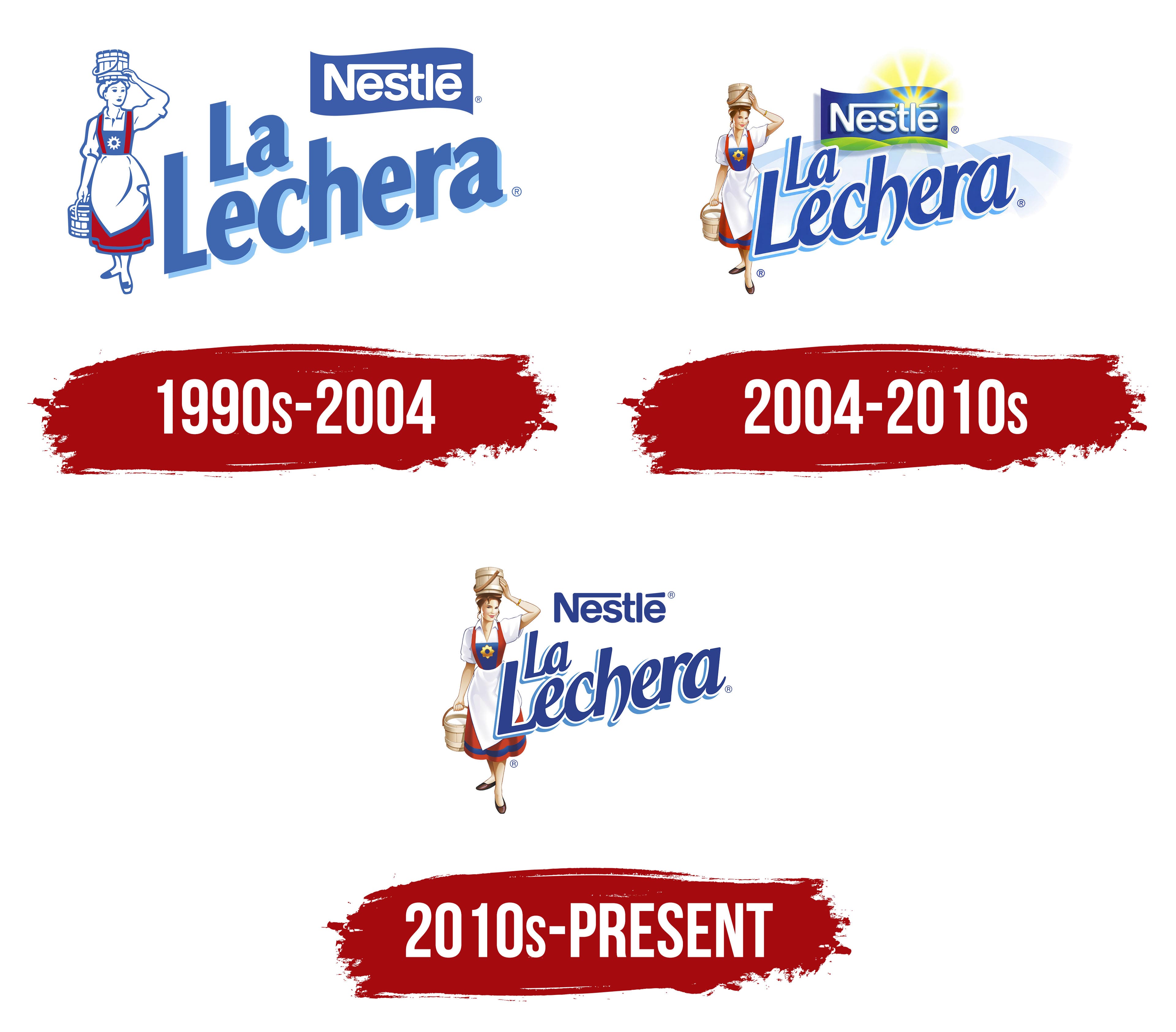
The designers’ main task was to create a logo that clearly and impressively highlighted the superior features of the sweetened dairy product. The identity reflects fidelity to its recipe and a high mark of quality chosen by the customer. The logo evokes associations with home comfort, harmony, and absolute tranquility. Starting its journey in the Spanish market, the brand is now recognized worldwide.
What is La Lechera?
It is a Nestlé-owned brand specializing in dairy products, primarily sweetened condensed milk. It is a popular choice for desserts, beverages, and other sweet treats, providing a rich, creamy texture and sweet flavor. The brand’s product line includes condensed milk, dulce de leche, and other dessert toppings. The brand is widely used in traditional Latin American recipes and is prized for its quality and consistency. The products are available in supermarkets, grocery stores, and online retailers, making them a convenient option for both everyday cooking and special occasions.
1990s – 2004
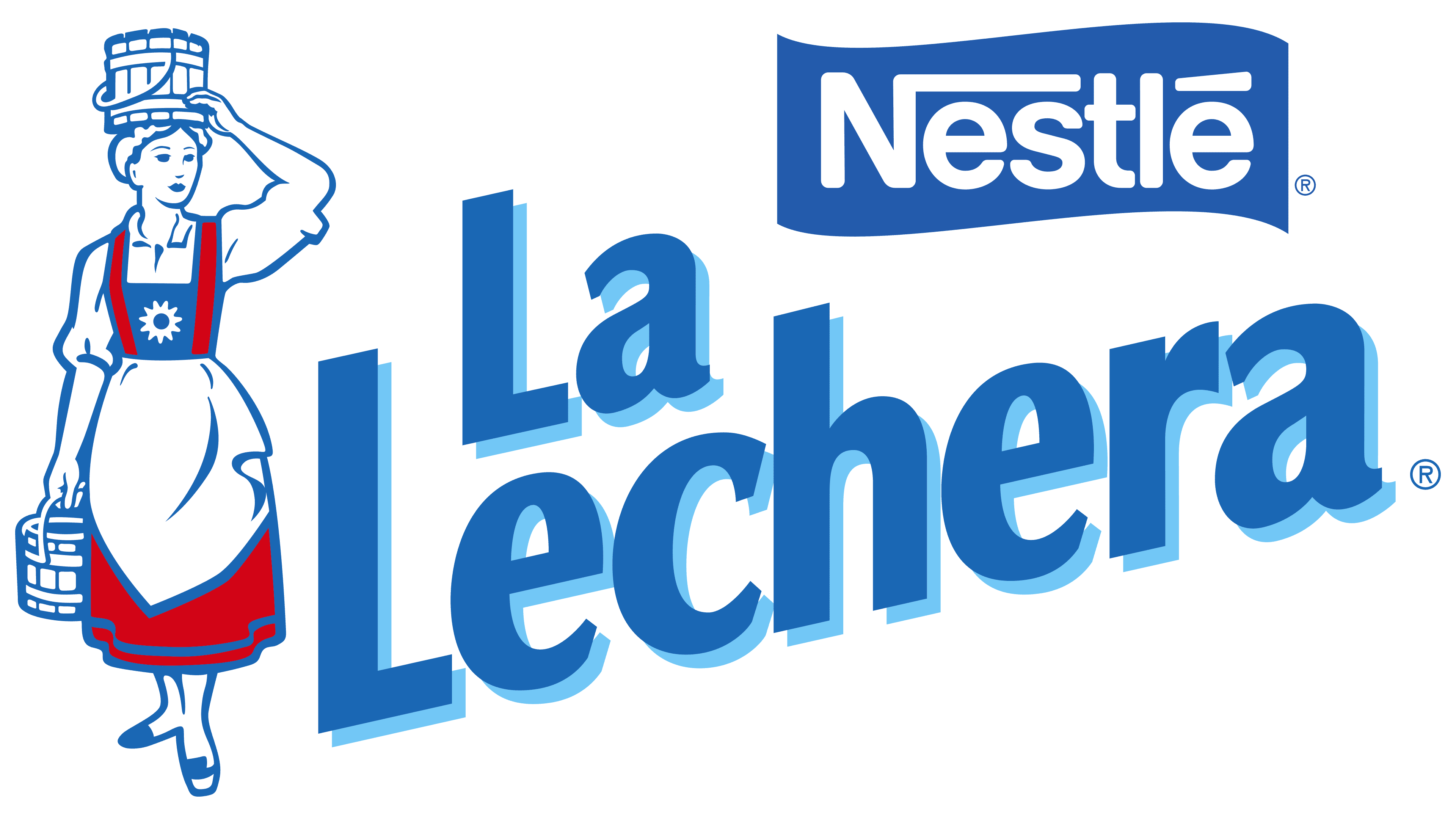
The brand’s first logo reflected tradition and fidelity to the recipe. It was simple but had individual charm. On one hand, the logo conveyed the product’s uniqueness, while on the other, it showcased its variety. Each element of the identity emphasized the importance of the next, creating a clear description of delicious dairy products that everyone understood.
Clarity and precision were the main themes of the logo. The “Nestlé” inscription in the right corner inspired trust. Large white letters with elongated elements, aligned in a single line, indicated that the consumer was holding a product from a reliable producer of high-quality goods. The blue background enhanced the effect, making the text easy to read.
Contrast always played an important role in forming logos, and it was used again here. The brand name was displayed in large, bold letters, rising from the bottom-left corner. The connection between the brand and the company was visible, highlighting their joint creation of an interesting product. Sky-blue letters with a shadow element on a white background looked impressive.
Special attention was drawn to the image of a feminine and sweet milkmaid. This element embodied the warmth of a woman’s soul and maternal care. Milk cans filled with warm milk evoked the desire to try the sweet product. The intertwining of red, white, and blue colors created a spectacular visual effect. Accents were distributed evenly and harmoniously.
2004 – 2010s
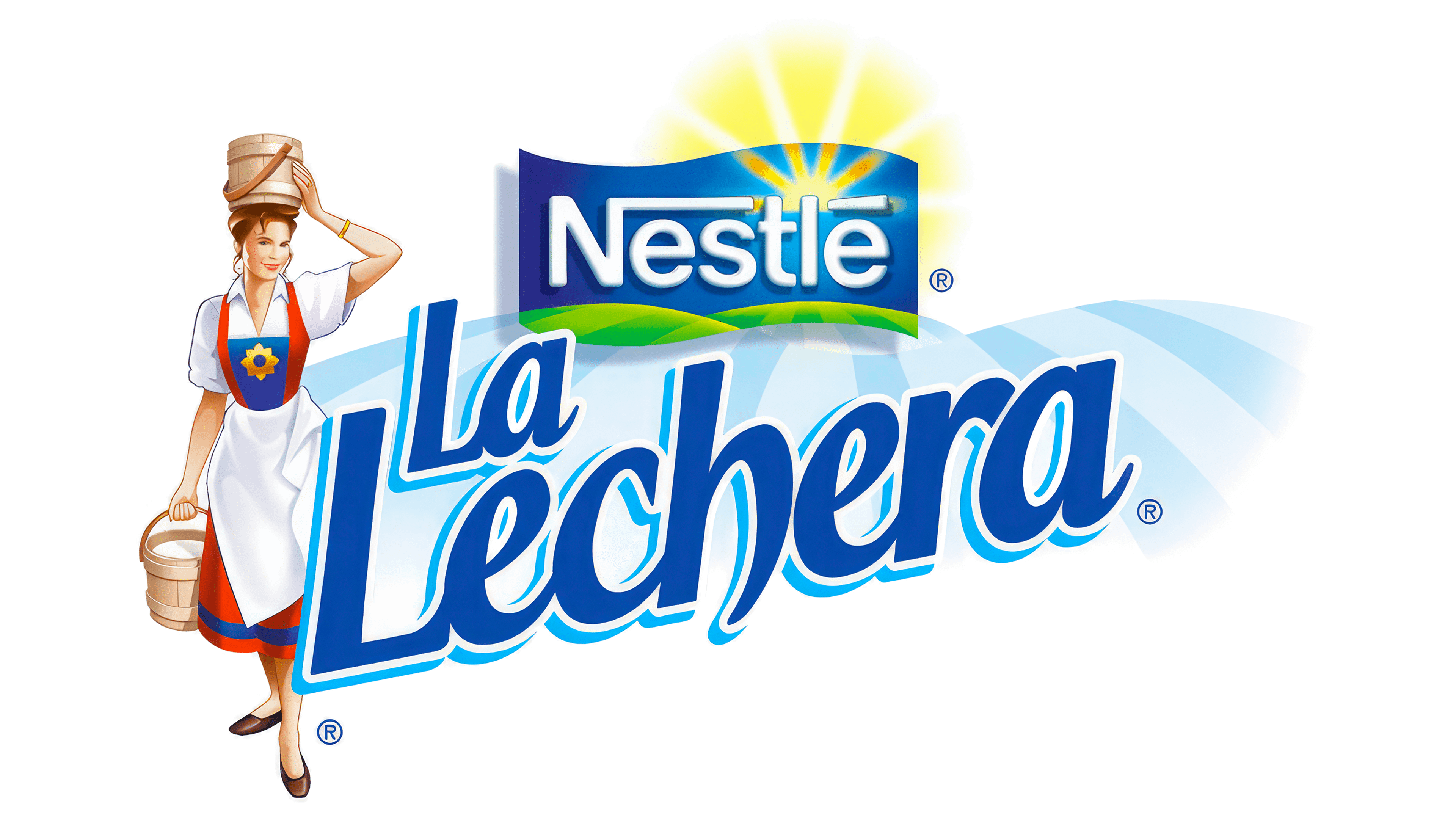
The image of the milkmaid changes and transforms, but always remains a part of the company’s logo. Some elements of the woman’s portrait disappear, others appear, but her presence and position on the logo remain unchanged.
Since 2004, the beautiful lady has become increasingly realistic. Her clothing gains a new style and vibrancy. A bracelet appears on her hand, emphasizing the beauty and delicacy of her hands. Her shoes acquire color, showcasing the charming milkmaid’s excellent taste. Her figure becomes even more refined, and the clear depiction of her slim waist looks very attractive. The primary colors are blue, white, and red.
The company name “Nestlé” looks expressive. The color scheme remains the same: a light blue background and white letters. New elements appear. Beautiful green fields create space for imagination, emphasizing the product’s eco-friendliness. A yellow element, the sun behind the “Nestlé” inscription, indicates the producer’s incredible potential. The sun’s rays, shining and shimmering in glossy yellow, evoke warm feelings. A blue ribbon unites the text and illustrations into a single whole, highlighting one of the key informational blocks of the identity.
The name “La Lechera” is designed in a playful style. Kindness, movement, and dynamics are embodied in the cursive font with a gradient. The white background is replaced with vertical light blue lines alternating with white streaks.
2010s – today
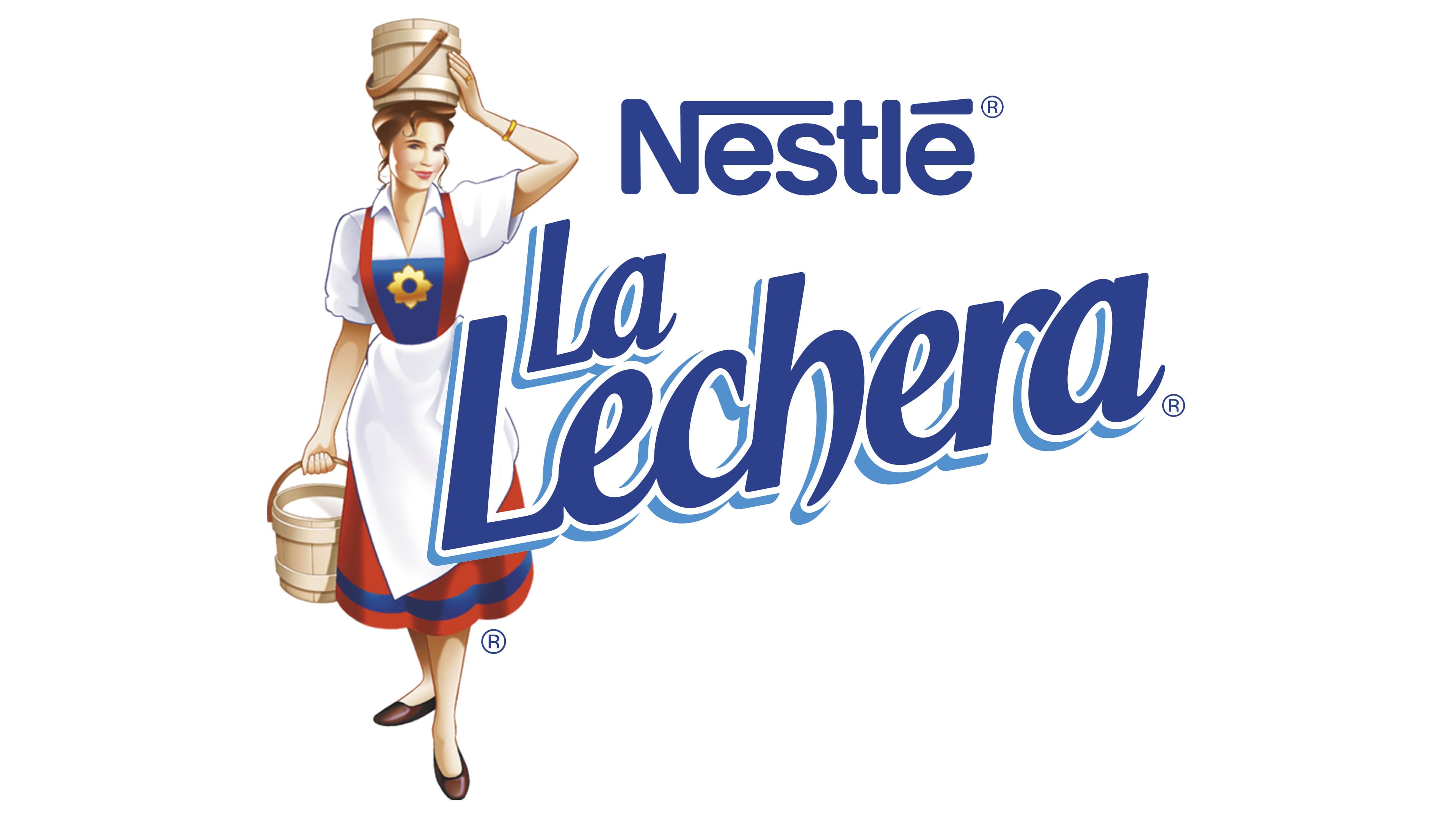
The modern logo, created in 2010, remains in use today. It retains the brand’s core concepts but includes updates to align with contemporary trends.
The female image has become even more appealing. A beautiful hairstyle, stylish clothing, and a triangular collar on her shirt create motifs of beauty, perfection, and warmth. This image immediately draws attention. To avoid the perception of three separate elements, the new logo brings the two text elements closer to the charming lady.
The phrase “La Lechera” is written in two lines, again in cursive. The background is white, and the text is a rich blue with a gradient. The letters have shape and shadow, creating a 3D effect.
For consistent perception, the company name is now written in blue on a white background, in a single line, and placed in the top-right corner.
The new logo conveys a sense of home comfort directly associated with delicious baked goods. It emphasizes that sweet dairy products should be readily available in every kitchen. This reflects reality, as bakers and homemakers always use La Lechera products to create unrivaled culinary recipes.