 LeapFrog Logo PNG
The LeapFrog logo emphasizes the brand’s creativity, focusing on making learning enjoyable and accessible for all children. The emblem’s unique design is associated with a progressive approach to education, as the company offers interactive educational games.
LeapFrog began in 1994, when Mike Wood, a lawyer and father of three, started looking for a better way to help his son learn to read. He created a phonics-based tool that encouraged children to pronounce letter sounds and called it the Phonics Desk. Wood later worked with technology specialist Robert Lally, and the two built the company around interactive education for children.
The first Phonics Desk was released in 1995 after testing and discussions with education specialists. Feedback from parents and teachers pushed the company to expand its range. By 1998, LeapFrog had introduced LeapPad, an interactive book system made for young readers. In 1999, investment linked to Michael and Lowell Milken’s Knowledge Universe helped the company increase production and prepare for wider sales.
In 2000, the LeapPad learning system became a major product in the educational toy market. LeapFrog went public on the New York Stock Exchange in 2001, giving it funds for new devices and international expansion. In 2002 and 2003, the company entered the European and Asian markets. Then it released the FLY Pentop Computer in 2004, the Tag Reading System in 2008, the LeapPad Explorer in 2010, and the LeapPad2 in 2012.
In 2016, LeapFrog was acquired by VTech Holdings Limited. The brand then continued as part of a larger educational electronics business, releasing LeapPad Ultimate in 2017, LeapBuilders in 2018, LeapFrog Academy in 2019, RockIt Twist in 2020, Learning Friends toys in 2021, and an updated LeapReader with speech recognition in 2022.
Meaning and History
What is LeapFrog?
It is an educational entertainment company known for creating interactive toys, games, and educational aids for children. The company focuses on combining fun and learning by developing products that engage children in educational activities through technology. The product range includes e-learning systems, tablets, books, and educational games. The brand is known for its approach to education, aiming to make learning enjoyable and effective for children of different ages. The products are designed to support children’s early development and help them build basic skills in a fun, interactive way.
1994 – 1998
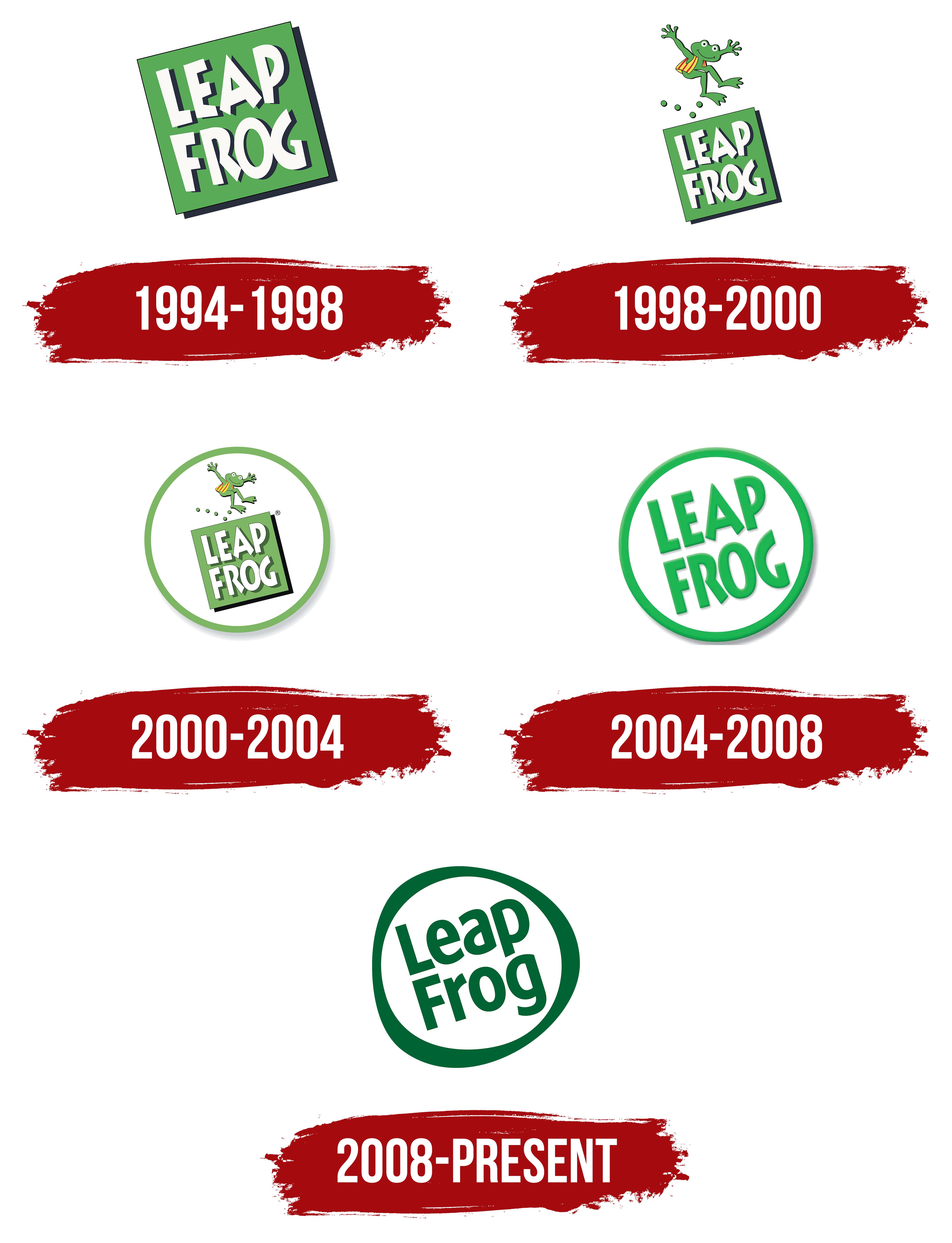
The LeapFrog company has proven that learning doesn’t have to be boring and exhausting. The company uses a bright green logo with an informal design without a hint of dull didacticism to capture children’s attention with its educational games. This logo adorned its first product, the Phonics Desk prototype, released in 1994.
The brand name is written diagonally, creating a sense of instability. This symbolizes how LeapFrog turns conventional education on its head, offering a fun alternative to traditional textbooks. The playful style of the text hints at the company’s main products, educational games that have become invaluable tools for parents, caregivers, and teachers.
The font appears somewhat messy due to uneven stroke thickness, irregular letter spacing, and asymmetrical cuts at the ends of glyphs. Adults might find it unsuitable for an educational brand, but this playful style is precisely what appeals to children. In other words, the LeapFrog logo primarily aims at preschoolers and school-aged children rather than their parents. The company aims to engage children, motivating them to learn numbers and letters in a relaxed, playful manner.
Designers split the brand name into two parts, allowing the text to fit perfectly within the green square. The right side of the quadrilateral is also tilted diagonally, though not to the extent that it could be considered a full rhombus. This arrangement creates a sense of lightness, symbolizing the ease of learning with LeapFrog’s interactive games. The emblem also evokes associations with progress, growth, and development.
The green color has a calming effect, helping children get into the right mindset to acquire new knowledge. Despite the challenging font, the white text stands out well against this background. The black outlines around the letters and the square base create an illusion of depth, making the logo visually interesting and capturing the target audience’s attention.
1998 – 2000
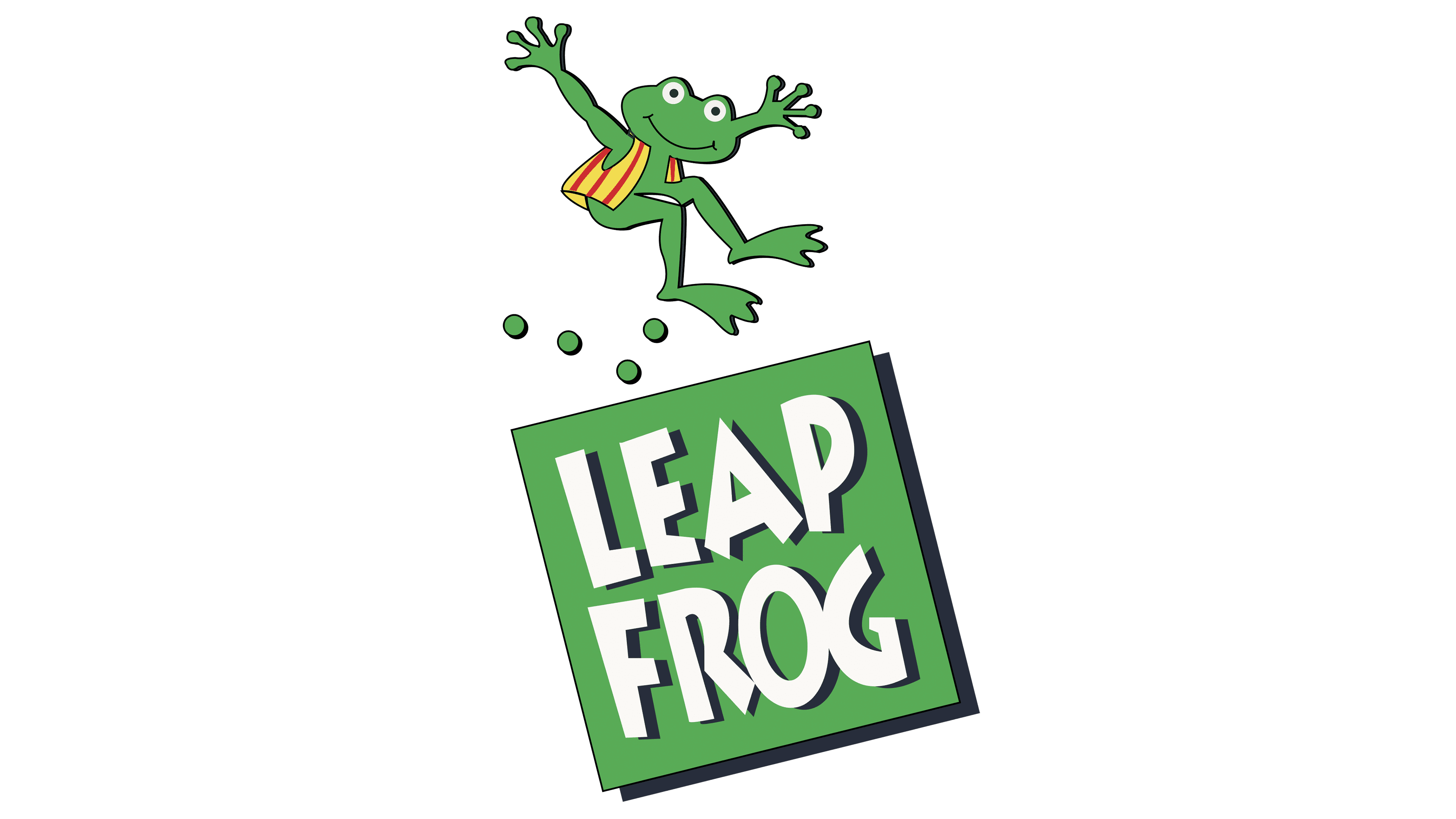
The brand’s identity evolved alongside it to reflect the modernity of its educational games. Designers retained the green square and white lettering with black shadows, as they had become a recognizable hallmark of LeapFrog. Their playful, dynamic, and slightly bold style effectively conveys the company’s concept of engaging children in learning through interesting educational devices.
The quadrilateral was reduced to make room for a new element: a playful jumping frog in a red-and-yellow vest. This frog illustrates the brand’s name and creates a fun atmosphere, as children enjoy discovering the world with LeapFrog’s tablets, gaming consoles, “reading” styluses, programmable plush toys, and other products.
The frog is depicted mid-jump, as the dynamic pose is associated with determination. It moves confidently forward as if inviting children to join this exciting journey. The frog is accompanied by four green dots representing its path. These dots are arranged in the shape of a checkmark, a symbol of agreement and a correct outcome. Additionally, the checkmark confirms the high effectiveness of the educational games.
Green continues to dominate the logo and is associated with stability, growth, renewal, and safety, all of which are crucial for a children’s product manufacturer. To create a sense of fun, designers introduced new colors: red and yellow. This hints that LeapFrog makes the learning process bright and joyful.
2000 – 2004
The developers retained the old emblem concept because it effectively captured the brand’s playful nature. However, a few details were modified to give it a more modern look.
- The frog was reduced in size and shifted to the right, making it clearer that it wasn’t just jumping up but leaping forward across the quadrilateral, having already covered a significant distance.
- A fifth dot was added to the line representing the frog’s trajectory, making the checkmark shape more distinct.
- The thick black shadow was kept only for the quadrilateral, while the letter outlines were changed to gray. As a result, the text appears less bold than before.
- The logo was enhanced with a green ring-shaped border and a light gray shadow at the bottom, giving it a sticker-like appearance.
- Some elements of the letters were aligned, and a dividing line was added between the “O” and “G.” The text became clearer and more legible despite its pale color.
The designers intentionally styled the emblem to resemble a round sticker, as children enjoy playing with them. This positions LeapFrog as a brand focused on preschoolers and early elementary school students. The frog leaping forward symbolizes energy and a desire to explore new horizons.
2004 – 2008
The company’s name was getting lost among other elements, so the designers removed unnecessary details. As a result, the phrase “LEAP FROG” was left without its square base and placed inside a white circle with a green border. The letters were also changed to green, making them more visible against the light background.
Removing the square and the leaping frog allowed the text to be enlarged, focusing attention solely on it. Despite these changes, the logo remains recognizable because the font has not changed. It still features:
- Clear, bold lines;
- Vertically elongated letters;
- Uneven cuts at the bottom of the “A” and “R”;
- An unconventional “G”;
- Small inner letter spaces.
All of this, combined with the diagonal placement of the text, makes the logo dynamic, reflecting the brand’s focus on progress. This progress relates to the invention of new educational devices and the development of children, who can learn letters and numbers and explore the world around them through LeapFrog games.
The text and border both have semi-transparent gray shadows, concentrated on the right and bottom, creating the illusion of an invisible light source. The three-dimensional effect turns the round emblem into a sticker-like appearance, which is a successful choice since children love stickers.
2008 – today
The developers changed the logo’s concept but kept everything in place. The company name remains inside a white circle, split into two lines with a diagonal tilt. However, all the letters, except for the “F” and “L,” have been converted to lowercase and have completely lost their original appearance. Most text is now lowercase to make the brand feel approachable and friendly. This makes the emblem appealing, especially to LeapFrog’s primary audience, children and their parents.
The font has changed, but it remains informal. It is characterized by simple, clear lines that appear dynamic due to the combination of sharp angles, smooth curves, and uneven cuts. The new text style creates a sense of playfulness and ease, aligning with the image of a company that produces educational toys.
The diagonal tilt infuses the logo with energy and captures visual interest. It embodies activity, cheerfulness, and a positive mood, as LeapFrog products evoke only positive emotions. The tilt also reflects the brand’s playful nature, geared toward school-aged children and preschoolers.
The logo’s border has lost its perfectly even shape and now looks like a whimsical ring with three thickened areas. This asymmetry enhances the sense of fun and casualness because children enjoy an informal style. It lacks the strictness that suggests rigid adherence to rules. This reflects the company’s approach to instilling a love of learning through engaging interactive games rather than boring textbooks.
The emblem remains green but has taken on a new dark shade. Its modern and fresh appearance emphasizes the innovative nature of LeapFrog’s products. The dark green color has a calming effect, fostering trust among customers. It also symbolizes energy, vitality, and growth, which aligns with children’s development.