


 Life Savers Logo PNG
The Life Savers logo symbolizes reliability, family values, tradition, freshness, and coolness, reflecting the famous candy that made the brand popular over a century ago. Restrained in its palette yet contrasting in design, it conveys the brand’s long history and the reliability of a product chosen by American families for generations. The brand remains a leader, striving for development and innovation while staying true to its heritage.
Life Savers began in 1912, when Cleveland confectioner Clarence Crane created a hard candy shaped like a lifebuoy. He wanted a sweet that could survive summer heat better than chocolate, whose sales fell in warm weather. The first version was peppermint and was sold as a breath freshener. Crane wrapped each piece in foil to keep it fresh and easy to carry.
In 1913, Edward John Noble bought the rights from Crane for $2,900. He developed stronger promotion and introduced the cylindrical roll pack, which became closely tied to the brand’s image. During the First World War, American soldiers helped make the candy better known because it kept well, was portable, and had a refreshing taste.
In the 1920s, the range moved beyond mint. Fruit flavors were introduced in 1924, including the Five Flavors line: lemon, lime, orange, cherry, and pineapple. Through the 1930s and 1940s, the company expanded production and used the slogan “the candy with the hole.” In the 1950s, Wild Cherry and sugar-free versions were added, while the 1956 purchase of Beech-Nut Packing Company gave the business new room to grow.
Nabisco acquired Life Savers in 1981. In 2004, Wrigley bought the brand from Kraft Foods, and Mars, Incorporated took control in 2008. Later launches included Fusions in 2005, new sugar-free formats in 2010 and 2022, chewy ring-shaped candies in 2015, Collisions in 2019, and a 2021 digital campaign using Instagram and TikTok. In 2023, a limited nostalgia line used flavors inspired by the 1980s and 1990s.
Meaning and History
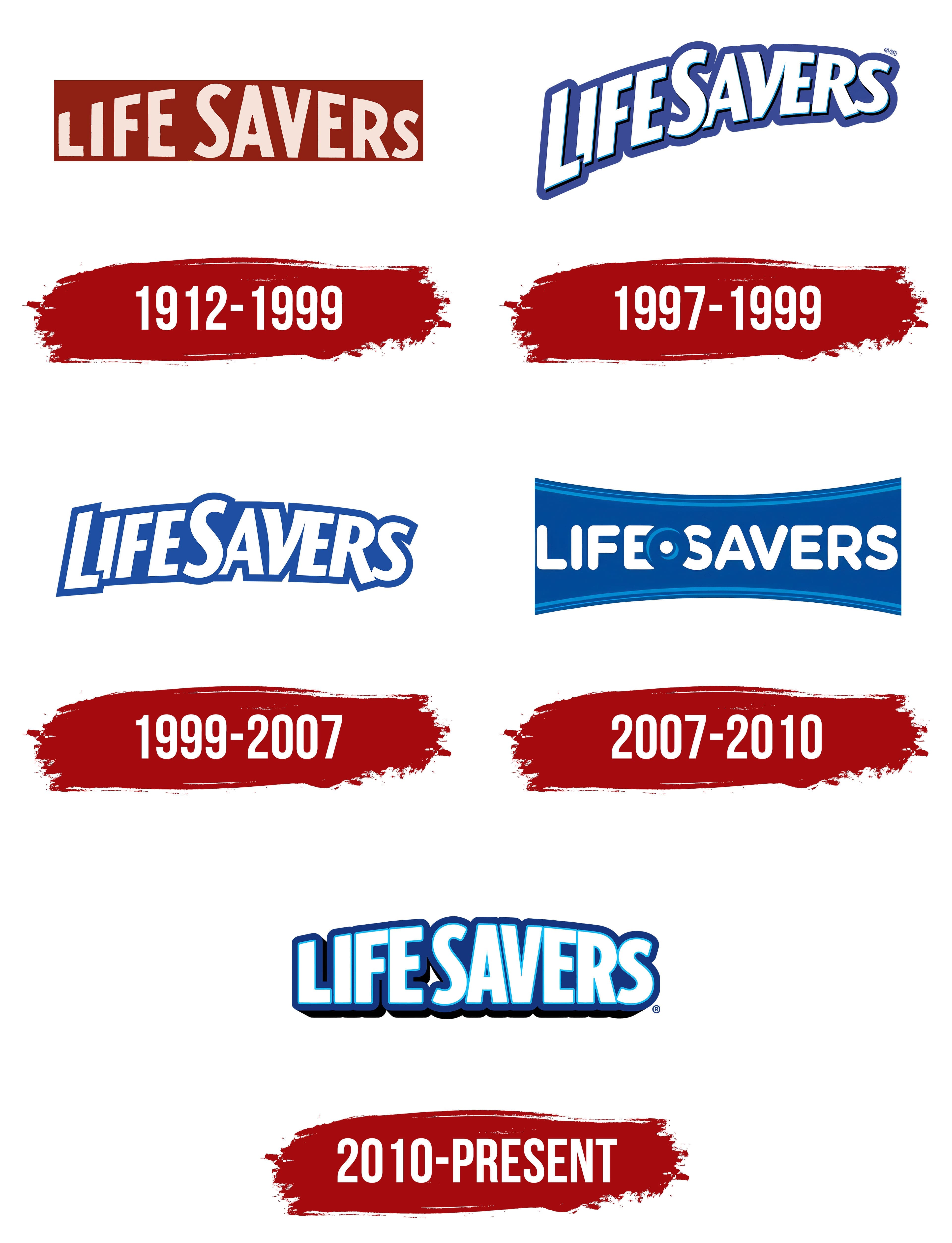
What is Life Savers?
This well-known American brand of ring-shaped mints and hard candy is distinguished by its unique design with a hole in the center. Mars makes the candy in several fruit and mint flavors. The most well-known item is the Five Flavors roll. The candy has been a beloved treat for generations because of its distinctive lifeline-like structure. They are available in several forms, such as mints, gummies, and hard candy rolls. The brand has expanded its product line to include sugar-free options and seasonal flavors. The candies are well-liked as a breath refresher and a quick sweet treat. They have established themselves as a legendary candy brand because of their small size and long-lasting flavor.
1912 – 1999
The 1912 logo reflects the early 20th-century aesthetic: simple and contrasting, with uneven, hand-drawn letters. The logo is a dark red rectangle with the brand name in light beige. The interesting font choice and color contrast attract the customer’s attention.
The dark red color has two meanings. Combined with beige and the rectangular shape, it conveys the brand’s reliability and fidelity to traditions. The second meaning is celebration, joy, and the sweetness of the candy’s fruit flavors. The well-chosen color combination keeps the logo from looking aggressive, with the beige working visually like white, helping to highlight the primary meanings of both colors.
The brand name’s font is simple yet intriguing. The bottom is aligned in a straight line, while the top forms an arc, creating an interesting optical effect that attracts and retains attention.
1997 – 1999

The 1997 logo represents a complete redesign to stay current while maintaining its roots. The contrast of dark blue and white was chosen to evoke the same sense of brand reliability, energy, and coolness, referencing the iconic mint candies.
The dynamic letters in the new Life Savers logo are still arranged in a semicircle, but now with a soft, thick outline instead of a background. The font is slightly more angular, but combined with the soft, thick outline, it adds liveliness and energy appropriate for a confectionery company logo. The font now interacts more, with capital letters overlapping smaller ones, some letters blending or protruding slightly, creating a sense of energy like a compressed spring ready to expand.
This redesign gave a new form that would be refined in the future, with the chosen colors influencing the industry today.
1999 – 2007
During this period, the logo became more subdued and concise while retaining the authentic elements of its branding. This visual solution references the original logo, uniting the brand’s history and preserving its core messages.
The logo maintains the same shape and font but with softer angles and contrast. The dark blue and white colors emphasize freshness and reliability, working together harmoniously. Despite the changes, the composition retains energy, brightness, and a sense of reliability and coolness. The slight arc in the composition maintains brand recognition, symbolizing its traditions and drive for innovation.
2007 – 2010
Following the trends of the time, Life Savers boldly modernized its logo. The new logo is full of fresh, bright solutions. White rounded letters on a blue background with an elegant concave shape create an interesting visual effect that draws attention. The three-dimensional image of a hollow round candy references their iconic product, emphasizing their commitment to innovation.
This composition used a new font with soft, rounded letters to highlight the candy image in the center. This was a bold experiment, and this logo significantly differs from its predecessors, as if the brand was searching for an authentic logo that matches the spirit of the new era.
2010 – today
The modern Life Savers logo combines the brand’s history with contemporary trends. Bright, energetic, and contrasting, it retains the brand’s signature colors, white and dark blue, conveying the same meanings: reliability, family traditions, a sense of celebration, and freshness.
The brand returned to bright and contrasting designs in this new visual solution. The thin blue outline inside the letters conveys a sense of freshness and coolness, like the mint candies, adding energy. Inside the letters, a darker outline creates a layered color effect that makes the brand name seem to “pulse.”
The composition and font deserve special attention: they have become more static, but the curved upper part of the letters adds a unique touch and visual interest. The company reverted to an older, more angular font, emphasizing its commitment to tradition. Except for some details, the font itself remains virtually unchanged.
Effective work on the logo’s color and shape has preserved the brand’s history, allowing it to keep pace with the times, offer innovative solutions, and maintain a leading position in the market.