


![]() Mario Kart Logo PNG
Mario Kart Logo PNG
The Mario Kart logo emphasizes the arcade-racing atmosphere, where players compete on various tracks with their favorite Nintendo characters. The visual elements symbolize the game’s dynamic and fun spirit. Bright colors convey the energy of the gameplay, reflecting the joy of competition in exciting races.
It’s hard to imagine a time when characters from popular video games didn’t try to outpace each other on colorful tracks. The Super Mario heroes were the first to get behind the wheel of cars, thus giving birth to a new racing genre. The first 16-bit installment in the Mario Kart series was released in 1992 for the Super Nintendo Entertainment System (SNES). Four years later, its sequel appeared, this time with 3D graphics elements. Each subsequent game differed from the previous ones, with additional modes, power-up items, tracks, cars, and drivers. In 2014, Mario Kart 8 was released in HD, allowing players to defy the laws of physics and ride on walls and ceilings. In 2020, in honor of the 35th anniversary of the original Italian plumber franchise, a Home Circuit mixed-reality race was released.
Launched in 1992, Super Mario Kart revolutionized gaming by combining racing with the adventure and characters from the Super Mario universe, introducing a novel gaming experience on the Super Nintendo Entertainment System (SNES). More than just a game, Super Mario Kart became a foundational phenomenon, pioneering multiplayer modes that turned gaming into a social event, sparking competition and joy among friends and families.
As Nintendo’s consoles evolved, so did the Mario Kart series. It ventured into 3D with Mario Kart 64, enriching the franchise with new characters and expanded tracks. Subsequent releases, such as Mario Kart: Super Circuit, Mario Kart: Double Dash!!, and Mario Kart DS, continually pushed the boundaries of racing gameplay, integrating innovative mechanics that kept the series fresh and exciting.
2008’s Mario Kart Wii marked a pivotal moment, introducing motion-controlled steering that widened the game’s appeal, evidenced by over 37 million global sales. This success story continued with Mario Kart 7, Mario Kart 8, and the critically acclaimed Mario Kart 8 Deluxe on the Nintendo Switch, further enhancing the series with new gameplay modes, customization, and online features.
Expanding its reach, the Mario Kart series entered mobile gaming with Mario Kart Tour in 2019, making the beloved racing experience accessible to an even broader audience. This move underscored Nintendo’s commitment to growing the franchise while preserving the cherished elements that have made it beloved by fans worldwide.
Decades since its inception, the Mario Kart series has cemented itself as a pillar of video gaming culture, cherished for its entertaining gameplay, colorful characters, and compelling multiplayer modes. With over 150 million units sold worldwide, Mario Kart stands not only as one of the top-selling game franchises but also as a shining example of Nintendo’s legacy of creativity and fun.
Meaning and History
![]()
When the debut Mario Kart game with 16-bit graphics was released, its logo looked quite simple, even though designers used a trendy gradient at the time. As the series expanded, the emblems evolved, particularly in their fonts, since the brand name served as the basis for all wordmarks. At some point, there was a transition from an informal cartoonish style to strict futurism. This may be related to the maturation of the target audience, as more than two decades have passed since the first part was released. Moreover, the strict geometric letters are more associated with modern technologies than the colorful “jumping” inscriptions. Progress had to be shown, considering the developers’ pursuit of innovations such as stereoscopic 3D graphics and mixed reality.
What is Mario Kart?
Mario Kart is a series of kart racing games associated with the Super Mario franchise. The first was released in 1992, and the fifteenth in 2020. Despite noticeable differences in modes, tracks, and other elements, all parts share a common gameplay. Users control a character who drives a car, trying to overtake other drivers and collect various power-ups along the way. The developer and publisher of the video games is the Japanese company Nintendo.
1992 – 1996
![]()
In 1992, Nintendo released the game Super Mario Kart, in which characters from the popular franchise took to the track for the first time. Its name became the basis for the logo: the initial word took the top line, while the second and third occupied the bottom. However, there is no wide gap between “MARIO” and “KART,” so they merge. The inscription is centered and designed in an unconventional style: all letters are uppercase, uneven, and angular, even the “O.” The emblem is colored in a silver-gray gradient. A horizontal line runs through the center of each glyph, dividing them into two parts: dark and light.
1996 – 2003
![]()
For Mario Kart 64, designers refined the logo, adding bold black shadows to the letters to give them a three-dimensional appearance. This relates to adding 3D elements to the game to make the racing track more impressive. The inscription itself became colorful: the gradient now starts with green (at the top), smoothly transitions to yellow in the middle, and then to orange and red at the bottom. This “upside-down traffic light” matches the playful style of the font, which still lacks symmetry: glyphs merge, lean in different directions, and have uneven thickness. Despite the childish style, the word mark looks massive due to its high boldness and numerous angles.
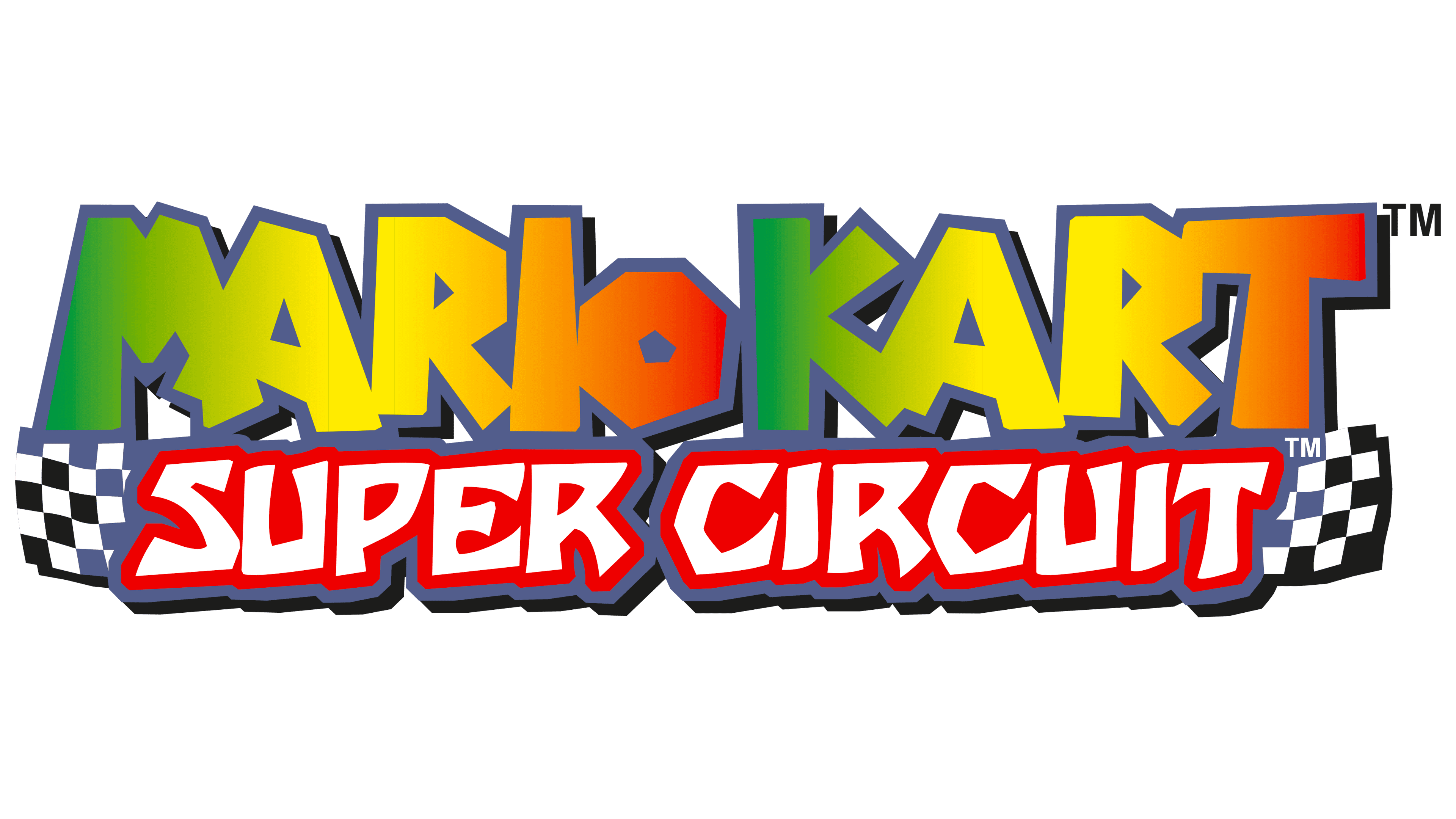
2003 – 2005
![]()
The updated logo retained its shape but lost the green color. The gradient type also changed: the center of the inscription is now a bright yellow, with the palette gradually transitioning to red on the left and right. The already narrow space between the words was reduced to almost none, leaving almost no gap between the last “O” and the first “K.” This logo was officially discontinued after the release of Mario Kart Wii in 2008. However, it could still be seen at the finish line in some games.
2005 – 2013
![]()
In 2005, a new wordmark was introduced, differing from all previous ones with its strict geometric shape. It uses a futuristic font with straight and symmetrical letters. The most notable are the uppercase “A” s without horizontal strokes. Glyphs touch but do not merge as before. The color became silver-gray with a green tint. The emblem appears shiny due to its uneven gradient, which is divided diagonally into light and dark parts. This version appeared in the Mario Kart DS game.
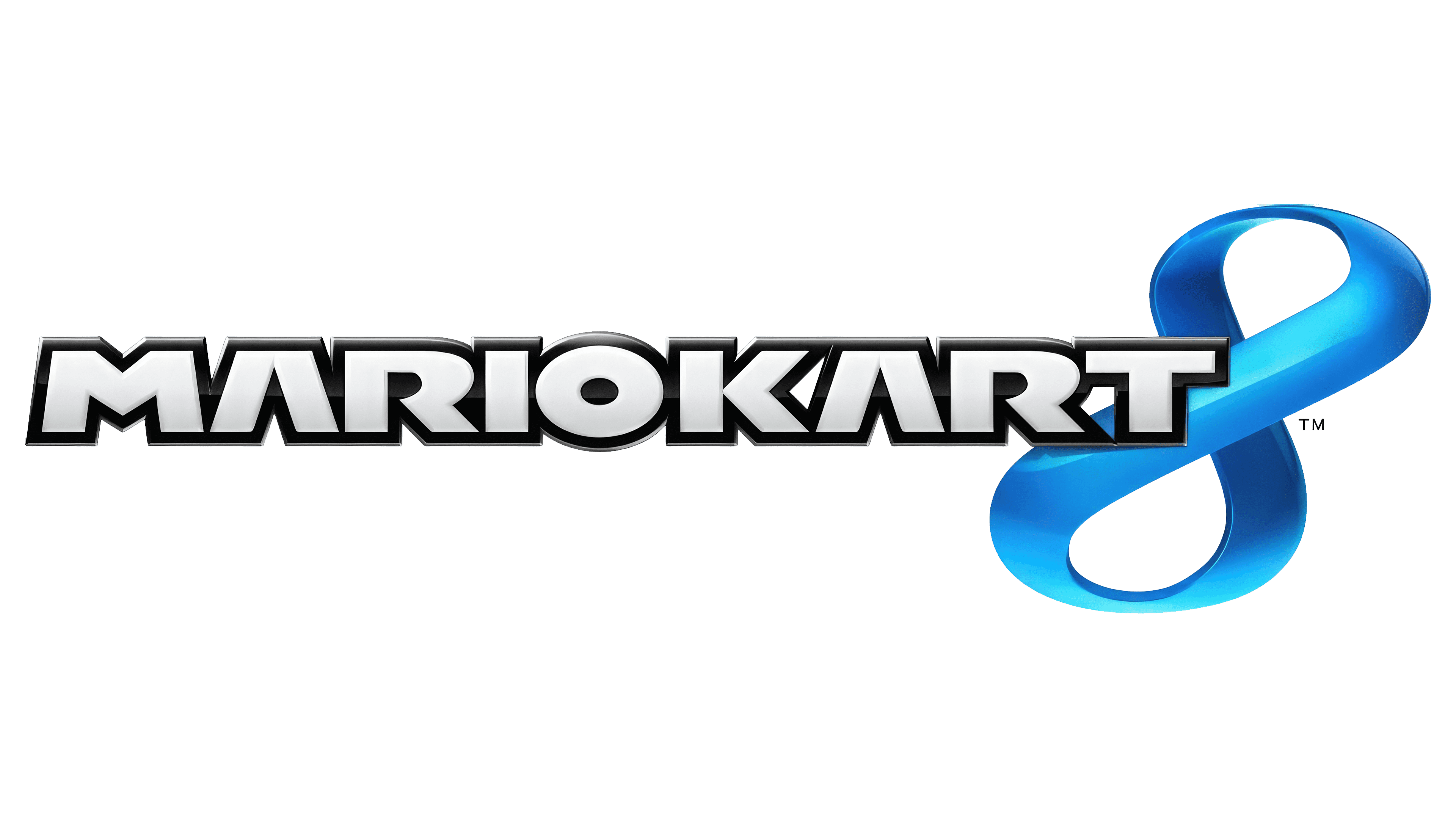
2013 – today
![]()
Since 2013, the logo with a light-gray “MARIO KART” inscription has been used. There is no hint of a separating interval between the two words. As a result, the letter “O” is in the spotlight, as it is exactly in the middle and the only one with a round shape. The two “A” s without crossbars continue to make the emblem futuristic. Glyphs are outlined with black bands with a barely noticeable gradient, creating a three-dimensional effect.
Font and Colors
Over the years, the Mario Kart logo has undergone significant changes, reflecting the game’s evolving style and identity. At first, the logo’s font was fun and quirky, much like the fonts used in the Super Mario series. It fits well with the game’s playful and adventurous vibe. But in 2005 and again in 2013, the logo got a sleeker, more polished look. The developers made a new font for these changes, using a bold, geometric style. This new font had a unique feature: the letter “A” lacked a crossbar, which made the text stand out and look modern.
The logo uses DF Gothic for its big, bold capital letters. This font is known for its clean lines and strong shapes, which add to the logo’s powerful impact and highlight the game’s excitement and competitive spirit.
The logo’s colors have also evolved. The early logos were full of bright, fun colors that fit the game’s lively world and races. However, after 2013, the colors changed to black, white, and light gray, making the look simpler and more modern. This wasn’t by chance; the designers wanted the game to feel up-to-date and appealing to today’s players.
These careful choices in font and color show how the Mario Kart series has matured. By updating its look, Mario Kart has stayed popular and relevant, mixing its long history with a modern style that gamers love.