


 Michelin Logo PNG
The company’s visual mark seems to come alive and speak to the customer. The Michelin logo demonstrates the tire manufacturer’s friendliness, broad customer support, and willingness to create the most convenient conditions for cooperation.
Michelin traces its origins to 1832, when Aristide Barbier and Édouard Daubrée founded Barbier-Daubrée in Clermont-Ferrand to produce rubber goods. By 1886, the struggling business passed to André and Édouard Michelin. On May 28, 1889, they renamed it Michelin et Cie.
A turning point came after a bicycle tire repair took 15 hours. In 1891, the brothers patented a detachable pneumatic tire that could be fixed in minutes. That same year, cyclist Charles Terront won the Paris–Brest–Paris race using Michelin tires.
In 1895, they built the L’Éclair car for the Paris–Bordeaux–Paris race, proving pneumatic tires could support automobiles. Rival Dunlop had patented similar technology in 1888 but had not yet shifted fully to cars.
In 1898, artist Marius O’Galop created the Bibendum mascot. In 1900, Michelin launched its first guide, initially free, later paid from 1920, with restaurant stars introduced in 1926.
Expansion followed. In 1904, Michelin entered Russia. In 1912, it proposed national road numbering in France. In 1946, it introduced the Michelin X radial tire, setting a new industry standard ahead of Goodyear.
In 1988, Michelin acquired Uniroyal and BFGoodrich, strengthening its US presence. By the late 20th century, it ranked as one of the two largest tire producers, alongside Bridgestone.
Meaning and History
For many years, the brand changed its logo several times but always remained faithful to its mascot. This is a hand-drawn little man named Bibendum, made up of tires of different sizes. He came from the founders’ vivid image of a stack of tires, which, at an 1894 exhibition in Lyon, they noticed resembled a man missing only his hands. Four years later, the brothers decided to design their own logo. They took the O’Galop beer logo as a basis, replaced the giant with their tire man, and left the phrase “Nunc est Bibendum” unchanged.
What is Michelin?
It’s a French company that makes tires and wheels for everything from bicycles to airplanes. It is also known for its Culinary Star Rating, which honors the world’s best chefs and restaurants for their culinary excellence. The Michelin brothers, Edouard and André, founded the company in 1889 in Clermont-Ferrand, where they owned a rubber factory.
1889 – 1925
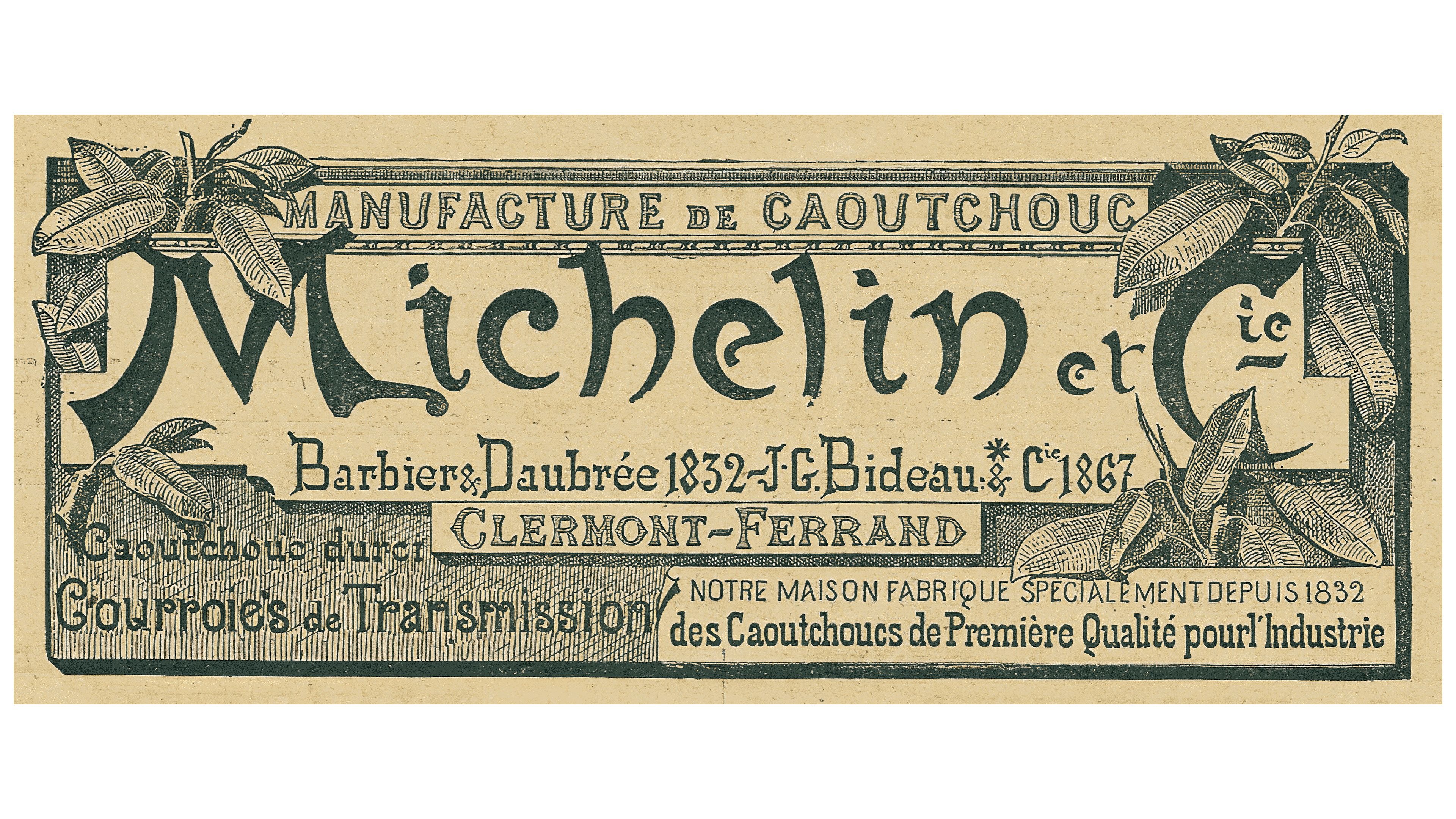
At the beginning of its history, even before the iconic Bibendum mascot appeared, Michelin used a logo resembling a flyer. It looked like a horizontal rectangle with a border decorated with rubber tree branches and leaves. Michelin’s early years as a rubber producer explain the choice of floral ornamentation. This, by the way, was indicated in the top line above the brand name. The bottom half contained many other inscriptions, including “CLERMONT-FERRAND” (the city where the company was founded). All of the text was presented in French. The designers chose different fonts for the different phrases, both serif and sans serif. The most original was the set of glyphs used for the word “Michelin.”
1936 – 1968
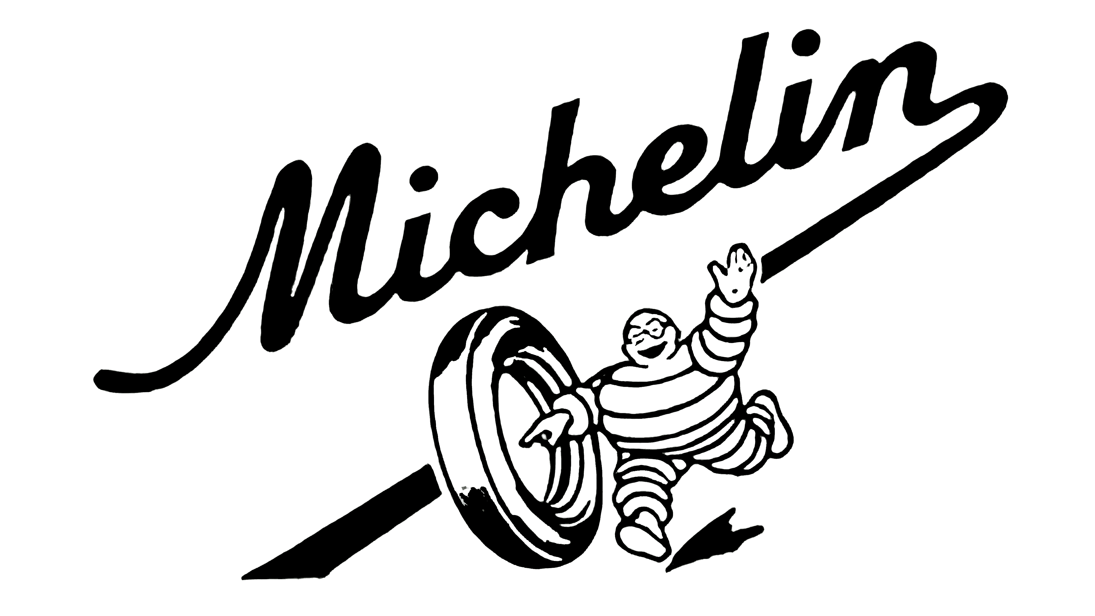
The debut logo features the brand’s mascot. He runs after a tire on a road formed by the outstretched leg of the letter “n” in the brand name. The word “Michelin” is placed diagonally on the side.
1968 – 1997

During this period, the developers used the logo’s brand name, which made it simple and minimal. Strictly geometric, wide, smooth, uppercase letters are spaced at a minimum distance from each other.
1997 – 2017

Since then, the brand has finally brought Bibendum back into its logo, making it friendly. Next to it, the word “Michelin” appeared on a blue background. In parallel, in 1997, another variant appeared: a slanted company name. It is still used today, harmoniously complementing the graphic sign.
2017 – today
Currently, there are two versions of the emblem with the brand mascot. They depict a smiling man who waves in a welcoming manner. Underneath it is the word “Michelin”. In one modification, there is a yellow line; in the other, a blue one.
Font and Colors
The company designated its mascot a world “ambassador” for the famous tire and disk manufacturer. Bibendum introduces new products, consults, and helps customers.
Several designers worked on the logo over time, each offering a different interpretation. As a result, Bibendum evolved from a beer character to a product selection manager.

In the current version, the trademark name is set in solid italics in a sans-serif font. All letters are capitalized. The emblem’s color palette is monotonous: until 1997, it was black and white, and then blue was added. More recently, designers added light yellow.
FAQ
What does the Michelin logo represent?
The Michelin logo depicts the company’s mascot, an anthropomorphic character named Bibendum, as a stack of tires of different sizes. In the modern version, he is half-depicted, waving his hand over the brand name, which is separated by a yellow stripe.
Why is the Michelin logo white?
The Michelin logo is white to better distinguish the outline of the tires that make up the Bibendum mascot. In addition, this color does not inspire fear as black does, so the emblem looks attractive and attracts more customers. In addition to white, the emblem features yellow (the dividing line) and blue (the manufacturer’s name).