


 MTM Logo PNG
The MTM logo is an image that evokes warm, kind feelings. The central element of the symbol is a live cat, making the emblem recognizable and distinguishing the brand from many other companies. This friendly symbol brings comfort and a sense of naturalness, highlighting the studio’s uniqueness. It invites viewers to immerse themselves in a world of light, casual entertainment, and relaxation. The emblem evokes associations with pleasant leisure time, promising cozy and fun stories created with heart.
MTM Enterprises was founded in 1969 by actress Mary Tyler Moore and her then-husband Grant Tinker. The name came from Moore’s initials and reflected her public profile at the time. The company was created to give Moore and Tinker greater creative control over television projects linked to her work.
Its first major production was The Mary Tyler Moore Show, which premiered on CBS in September 1970. The sitcom focused on an independent working woman and became the company’s breakthrough. Its success led to spin-offs including Rhoda in 1974 and Phyllis in 1975, helping MTM build a strong position in American comedy.
By the late 1970s, the studio had moved into drama. Lou Grant debuted in 1977 as a dramatic spin-off of The Mary Tyler Moore Show and won multiple Emmy Awards. MTM then produced WKRP in Cincinnati, Hill Street Blues, and St. Elsewhere. At the same time, Hill Street Blues changed the form of police drama with layered storytelling and a more realistic tone. In 1984, Tinker left to become chairman and CEO of NBC, and Moore became more involved in the company’s management.
MTM continued with Newhart, Remington Steele, miniseries, and TV movies. Thames Television bought the company in 1988 for $320 million, then sold it to International Family Entertainment in 1993 for $68.5 million. In 1997, News Corporation acquired IFE for $1.9 billion and folded MTM into 20th Century Fox Television. After Disney bought 21st Century Fox in 2018, the MTM library became part of Disney’s collection.
Meaning and History
What is MTM?
A powerful television production company named Mary Tyler Moore played a significant role in transforming the sitcom industry in the United States. The company established itself as a creator of smart, character-driven comedies that often address relevant social issues with warmth and humor. The programs were known for their witty scripts, strong casts, and focus on urban and working life. A signature element of the company was the logo featuring a meowing kitten, a parody of the MGM lion, which became a symbol of high-quality television. In addition to sitcoms, the company produced several critically acclaimed dramas that pushed the boundaries of traditional television storytelling.
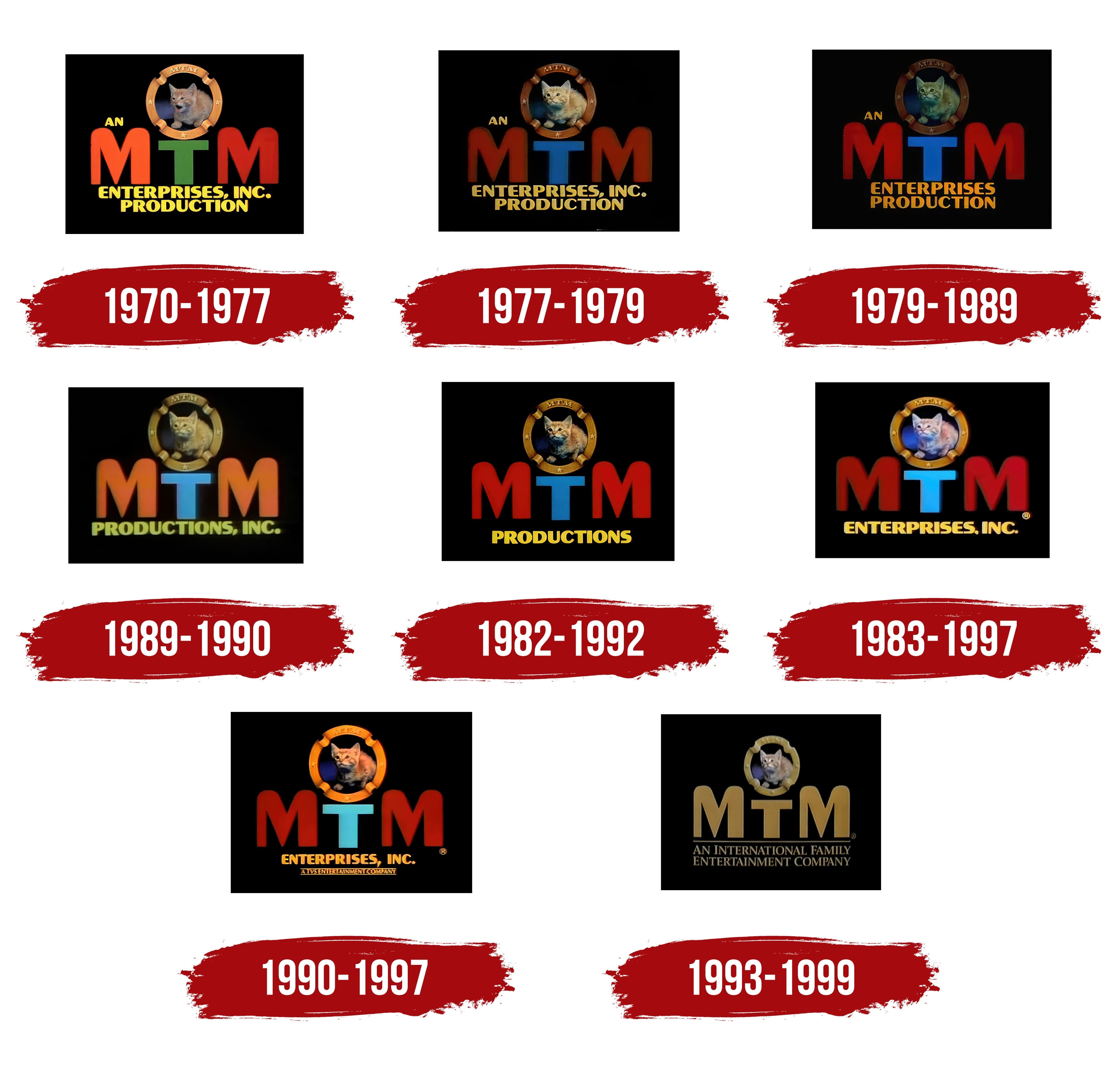
1970 – 1977
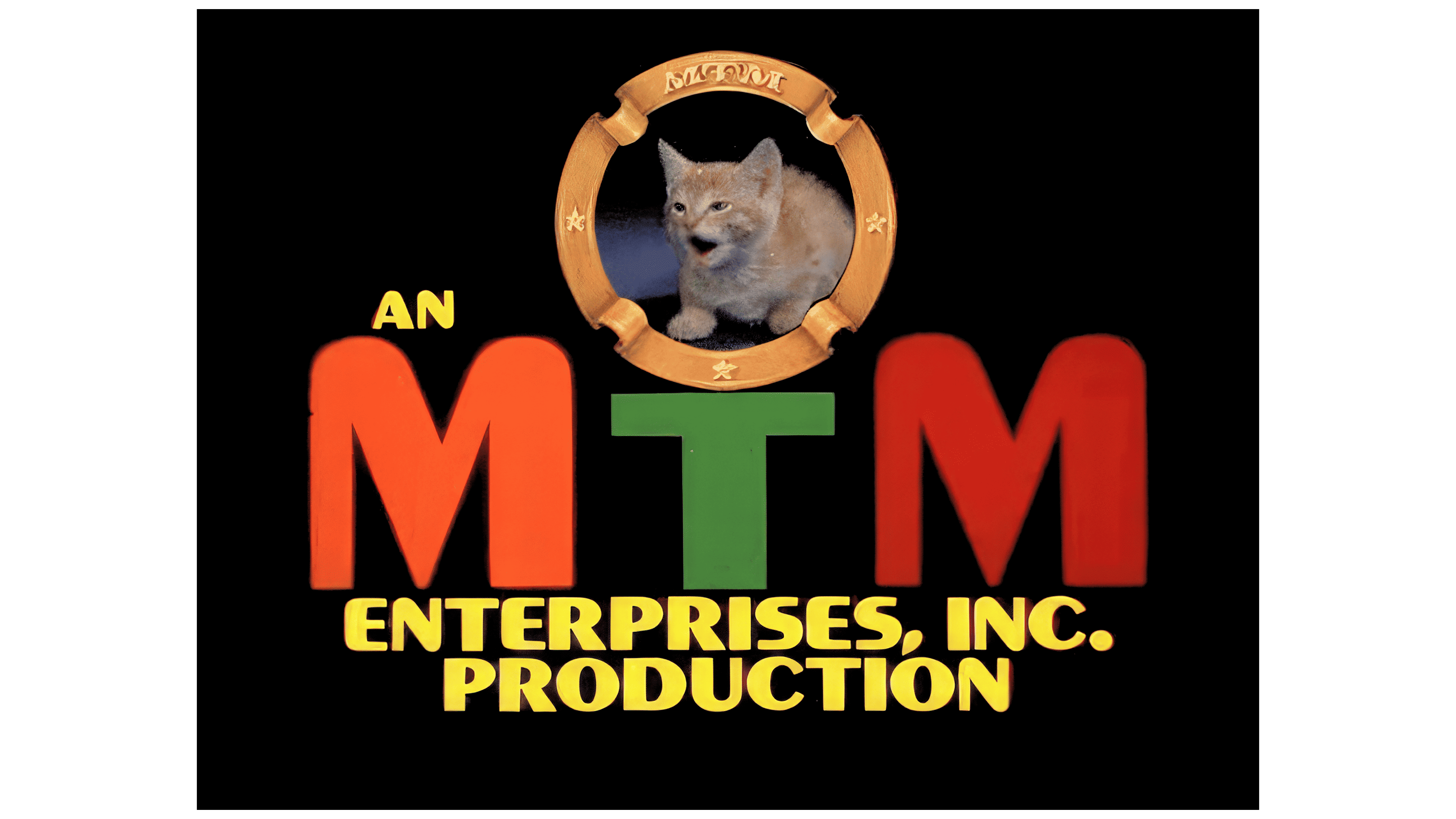
The company’s first logo was created a year after its founding. A striped ginger cat sits in the center of a circle, designed as a ribbon with stars. This symbol was chosen as a parody of the famous Metro-Goldwyn-Mayer lion emblem. The heroine is played by a real cat named Mimsie. The choice of this symbol may also have been connected to the company’s founder, Mary Tyler Moore, whose initials (MTM) are placed beneath the improvised wreath. The bright, multicolored letters of the logo add a sense of lightness and humor, perfectly conveying the brand’s spirit. The emblem is tied to the studio’s first comedy show, The Mary Tyler Moore Show, which aired on CBS and reflects the show’s relaxed, playful atmosphere.
1977 – 1979
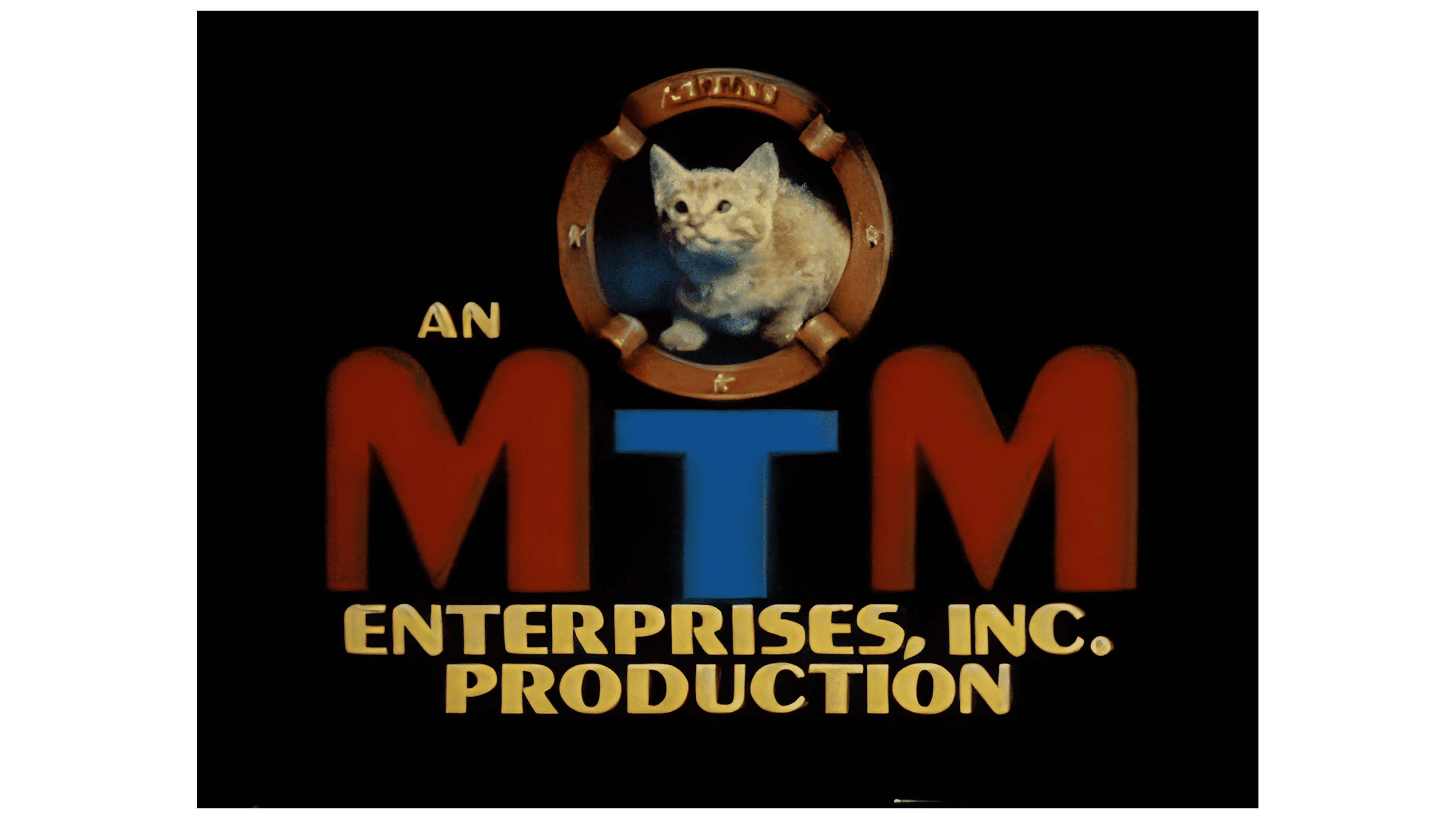
The 1977 MTM logo received an update that gave it a fresh look while retaining the elements that made the studio recognizable. The main focus of the emblem is, of course, the famous cat Mimsie, who had already become a company symbol. In this emblem version, she is depicted in a gold frame, seemingly gazing upward as if mesmerized, creating the impression that she is watching what is happening on screen, highlighting viewer engagement.
In this updated logo, Mimsie no longer makes her usual meowing sound; instead, she adopts a calm, curious expression, making her image more serious and focused. This choice symbolizes the company’s shift toward more mature and complex projects, which became essential for its continued success.
The letter “T,” previously green, has taken on a blue hue. This gives the entire composition a more formal and professional appearance, emphasizing the studio’s transition from entertainment programs to a broader range of projects, including serious and prestigious television shows. The red and blue colors create a visual contrast that distinguishes the emblem from other studios of that time.
The phrase “An MTM Enterprises, Inc. Production” is set in a strict, solid font, emphasizing the company’s seriousness and stability.
1979 – 1989
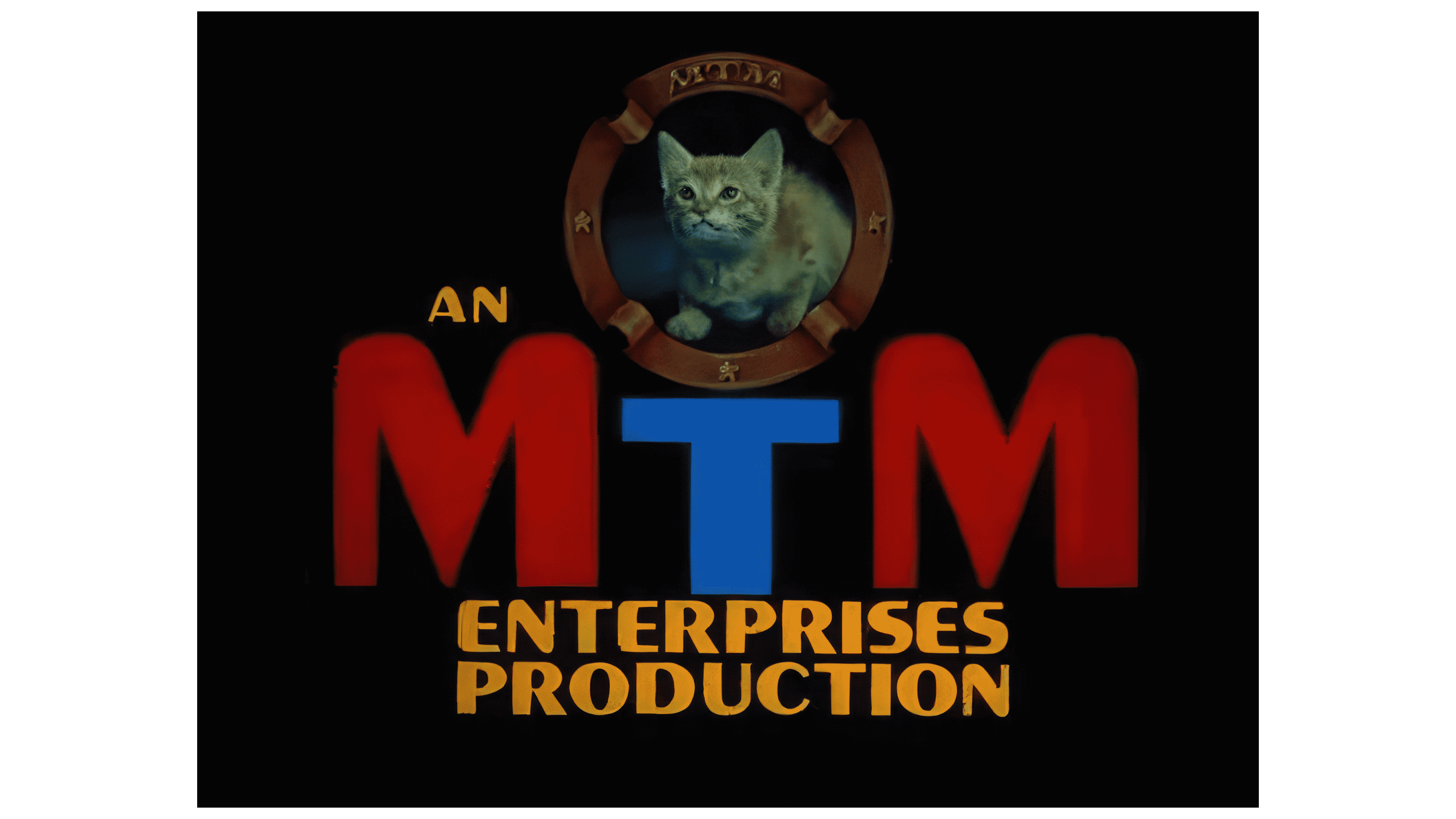
The company underwent internal changes due to a shift in personnel, which led to an update in its brand identity. These changes were reflected in the logo, which adopted a darker tone, evoking the atmosphere of a quiet theater before a film screening. The phrase “Enterprises Inc. Productions” was shortened to “Enterprises Productions,” making the emblem more concise and modern. The font changed to dark orange, giving the logo a warmer, more energetic character and hinting at the company’s creative approach and ambitious new projects.
1989 – 1990
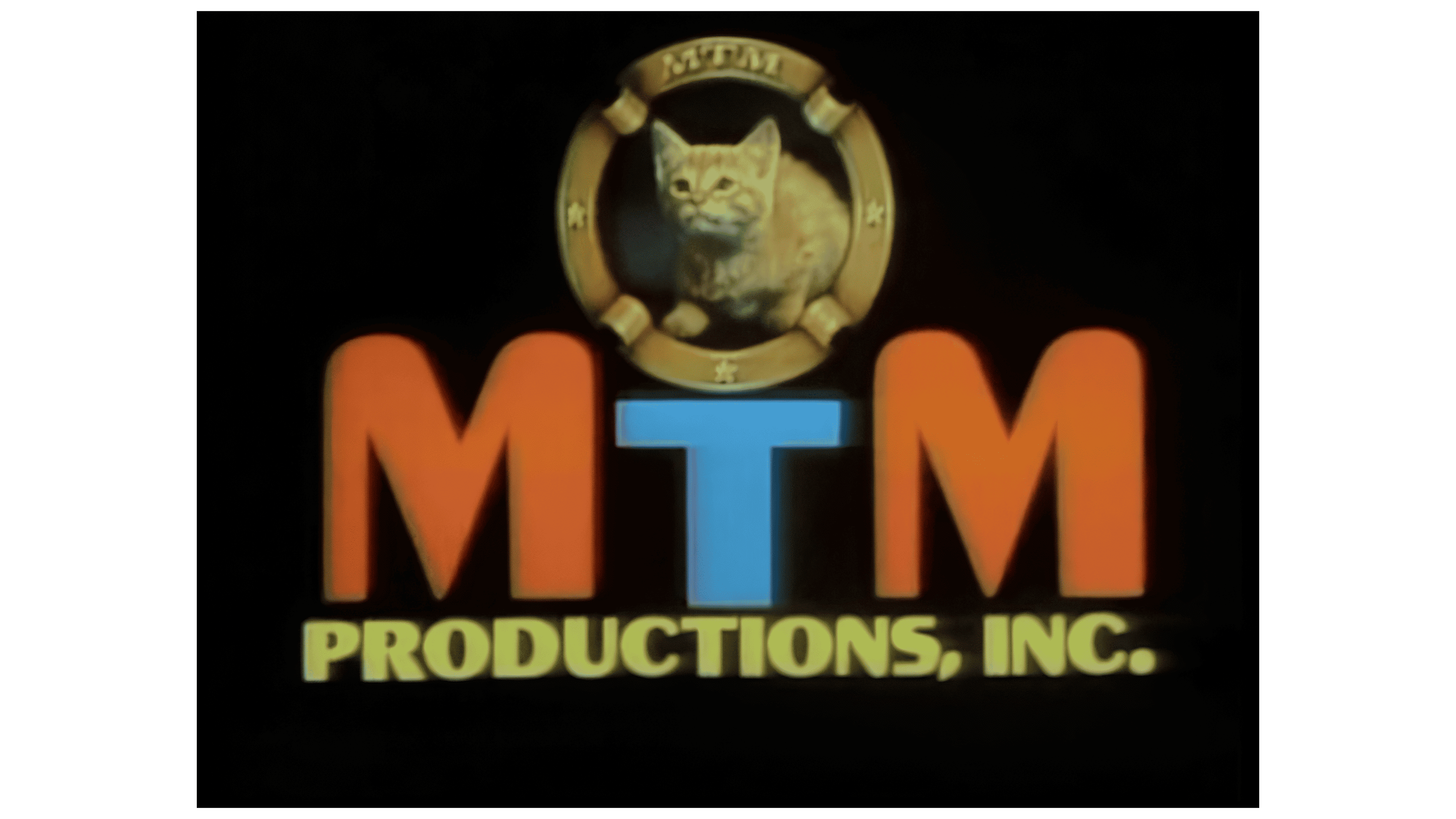
The brand focused on creating program content and expanding its operations by establishing a separate distribution division called MTM Television Distribution. In connection with this, the inscription under the logo was shortened to “Productions Inc.,” reflecting the company’s narrower specialization. The logo’s color palette also changed: “MTM ” is now orange and blue, highlighting its focus on entertainment shows and giving the emblem a more cheerful, vibrant character.
1982 – 1992
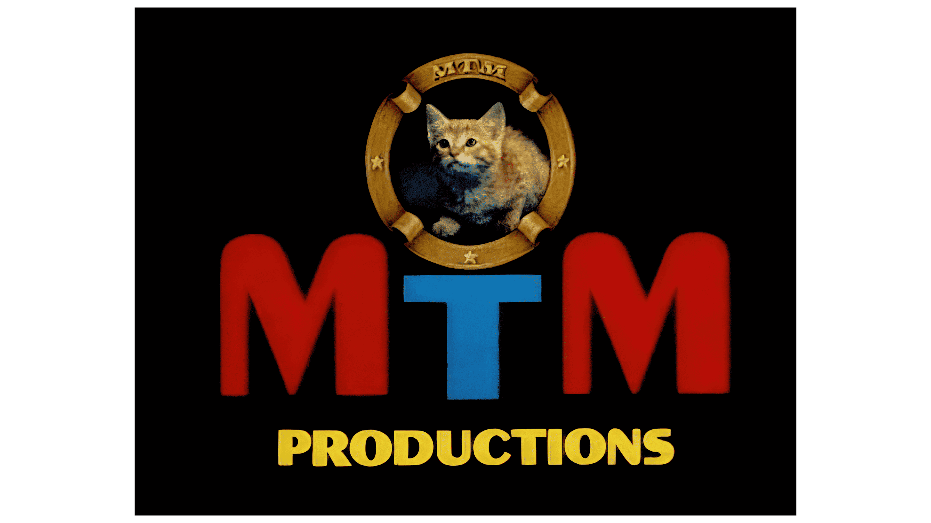
In addition to using the main logo, the company implemented an alternative version for certain shows, in which the inscription was shortened to a single word, “Productions.” This decision was likely driven by a desire to test viewer reactions and evaluate how the audience would receive a more minimalist design. This experiment may also have highlighted the brand’s flexibility and readiness to adapt to changing trends in television production and distribution.
1983 – 1997
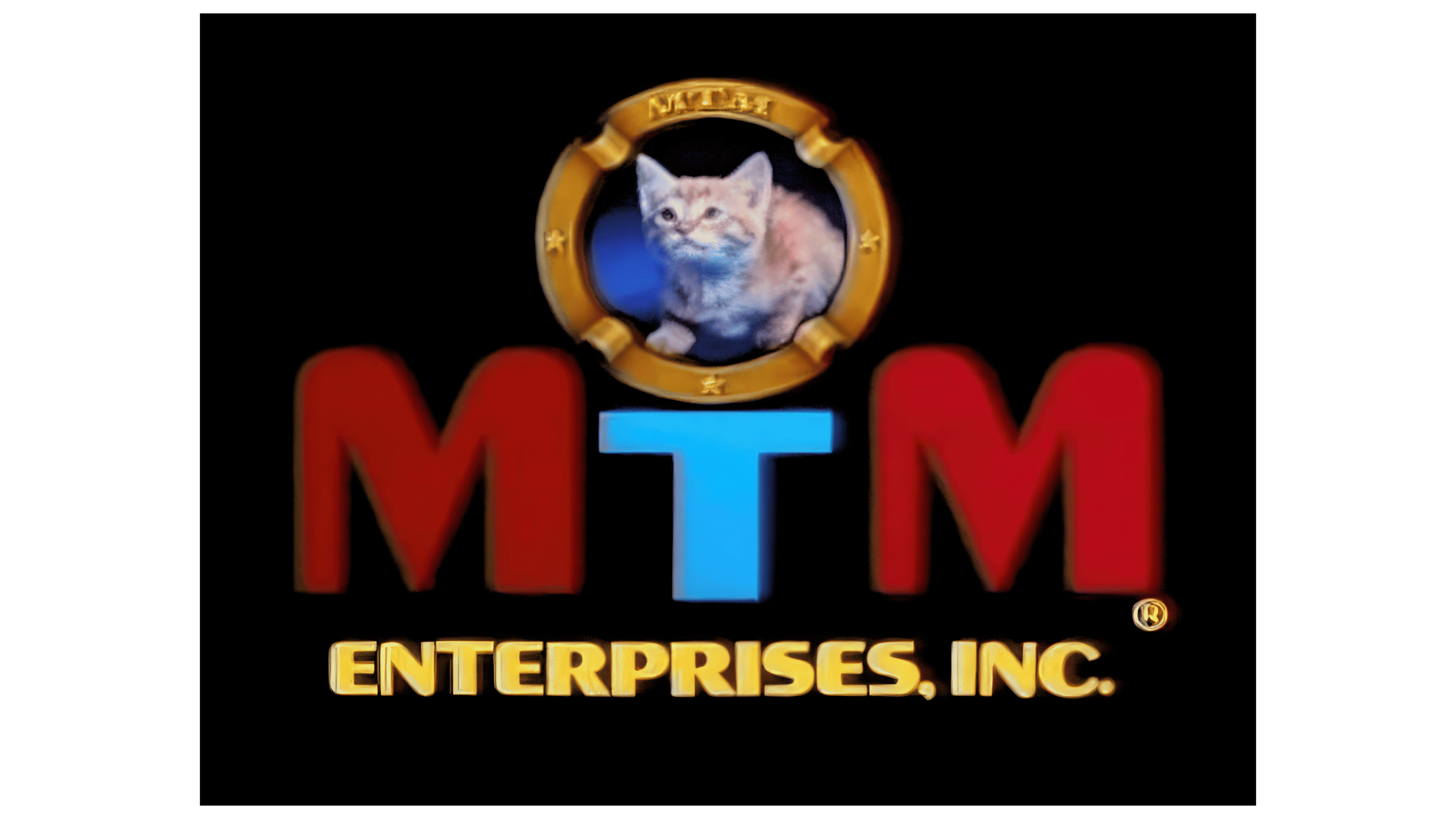
The emblem was updated: the window with the kitten was enlarged, and a soft glow from a television screen appeared in the background. This addition reinforces the idea that the cat watches TV, emphasizing the brand’s connection to entertainment. An alternative version of the inscription, “Enterprises Inc.,” was added at the bottom of the logo, giving it a more formal appearance. The letter “T” is highlighted in a rich blue shade, drawing attention to the central part of the composition and giving the logo a sense of freshness and dynamism.
1990 – 1997
After the studio was acquired by the British company TVS Entertainment, the logo underwent significant changes, becoming brighter and more vibrant. The orange ribbon framing the emblem and the cat’s detailed fur animate the image, making it more dynamic and appealing to viewers. These changes visually symbolize a new chapter in the brand’s history. With the support of its new owners, the studio expanded its operations, beginning to produce its programs for syndication, leading to significant revenue growth. An elegant inscription, “A TVS Entertainment Company,” was added at the bottom of the logo, highlighting the brand’s new status as part of a major company.
1993 – 1999
The MTM logo, created after the company transitioned to International Family Entertainment, stands out for its elegance and symbolism. The emblem is gold on a black background, evoking a sense of solidity and exclusivity. The company has made a significant contribution to the world of film and television, earning viewer recognition over the years.
The central element of the emblem remains the cat, appearing within a golden circle. This refers to the company’s original emblem, in which a lion was replaced with a softer, friendlier symbol, a cat. Although the cat, which served as the model, passed away in 1988, its image was preserved as a tribute to the studio’s past and legacy.
The large capital letters “MTM” are rendered in a bold and confident style, symbolizing the brand’s strength. Below them is the inscription “An International Family Entertainment Company,” indicating the new ownership and the company’s focus on family-oriented content. This slogan adds a modern touch to the logo and emphasizes the changes the brand was undergoing.
This visual mark was the last in the company’s history, as MTM ceased operations in 1998 following multiple sales and ownership changes.