 MTR Logo PNG
The city’s metro system runs daily routes, connecting neighborhoods and moving passengers throughout the day. Trains, stations, and transfer hubs operate as a unified system, supporting mobility in a dense urban environment. The MTR logo is associated with a Hong Kong transportation company that operates a rail network and provides passenger services.
Mass Transit Railway Corporation was founded in 1975. The main goal was to build Hong Kong’s first subway line. Before that, residents used surface transport. Population growth required new solutions. Construction began in November 1975. In October 1979, the first section was opened between Shek Kip Mei and Kwun Tong stations. Soon, the line was extended to Central. This became an important stage in the development of urban infrastructure.
In the 1980s, the subway network expanded. The Tsuen Wan and Island lines were built. They connected remote areas with the city center. MTR introduced an automated train control system. In 1997, the contactless Octopus card was launched, becoming a technological innovation in passenger transportation.
In the 1990s, the company opened the Tung Chung and Airport Express lines. They connected the city with the new airport. At the same time, it developed commercial real estate projects near stations. In 2000, MTR began trading on the Hong Kong Stock Exchange. The government retained a shareholding in the company.
In 2007, it merged with Kowloon-Canton Railway Corporation. After that, MTR became the operator of almost the entire railway network in Hong Kong. In the following years, the company obtained contracts to operate lines in London, Melbourne, and Stockholm. This helped strengthen its international presence.
In the 2010s, it opened new lines, including the South Island and Kwun Tong Extension. In 2018, it began high-speed service to mainland China. In 2021, the Tuen Ma line was commissioned, becoming the largest in the system.
The company operates a network of over 200 kilometers. The system includes about 100 stations. The subway carries millions of passengers every day. The company continues to upgrade rolling stock and build new lines. MTR remains one of the world’s largest urban transport operators.
Meaning and History
What is MTR?
As Hong Kong’s leading urban rail operator, it manages a network of subways, commuter trains, and trams across 11 lines, plus the Airport Express. Daily ridership exceeds 5 million passengers. The business model is based on “Rail + Property,” where development near stations, including Lohas Park, Metro Town, Sorrento, The Arch, and Festival City, finances the expansion of the transport network.
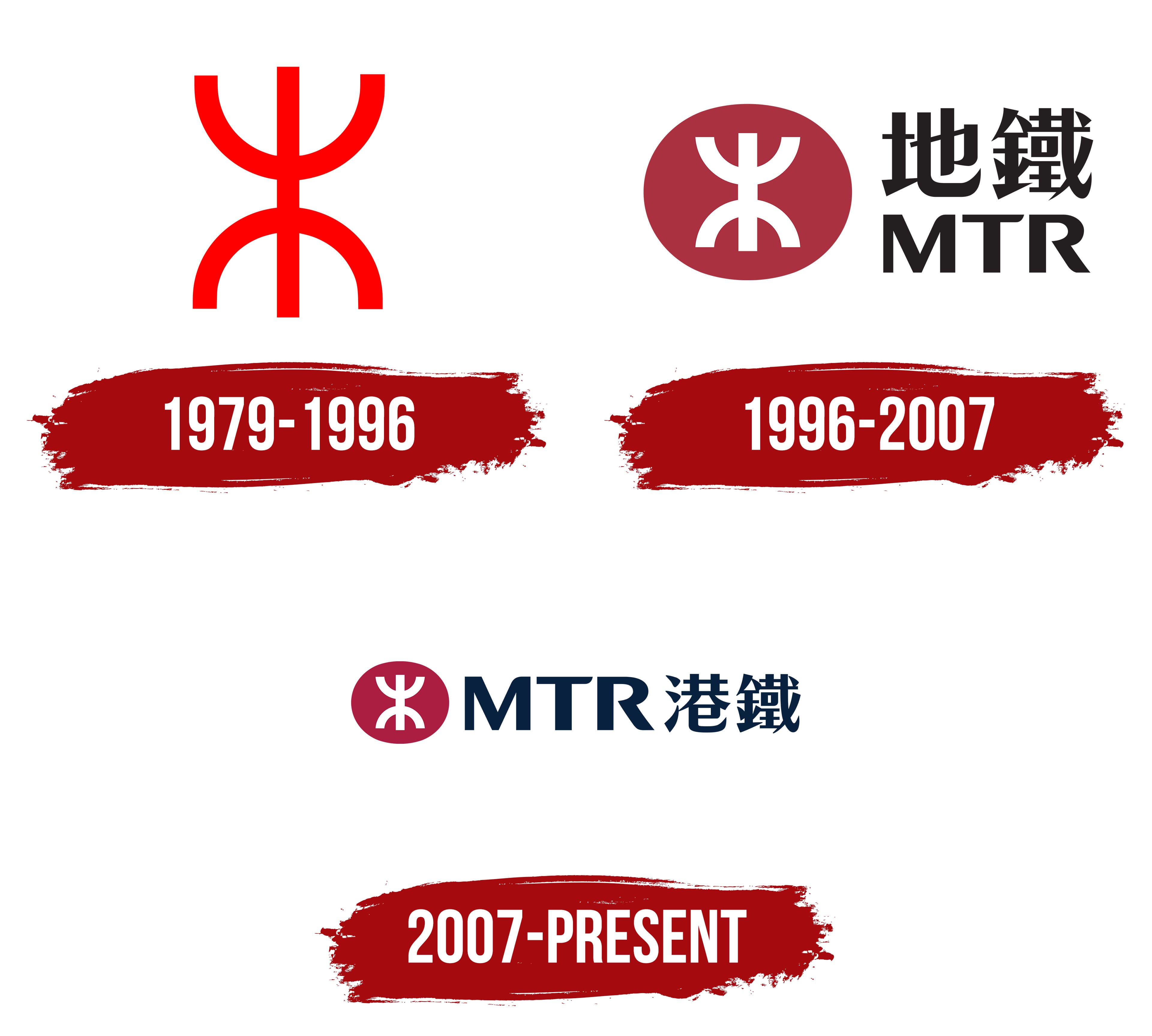
1979 – 1996
When the first section of the system opened on October 1, 1979, the red MTR emblem appeared on station signs, entrances, and trains throughout Hong Kong. The British firm Design Research Unit developed it after being hired to design the future subway system. The compact figure became an urban landmark for passengers. Its basic structure continued into later versions of the brand.
A vertical line of uniform thickness runs through the center of the emblem. Two curves facing opposite directions connect with it. The upper curve opens upward, while the lower curve points downward. Their ends and the vertical stroke form a symmetrical three-line construction. In the early version, the symbol was bright red and appeared without an oval background.
John Lloyd, who later helped update the brand, linked the original concept to Hong Kong’s two shores. The upper curve represented Kowloon, the lower curve represented Hong Kong Island, and the vertical line depicted the transportation link between them. Lloyd described the emblem as abstract. The original concept drew on Chinese artistic tradition, but its form did not represent a specific Chinese character.
The emblem appeared alongside the Chinese name 地下鐵路公司 and the English name Mass Transit Railway Corporation. These inscriptions provided the operator’s full name. The red figure represented the subway on applications with limited space. Its symmetry, uniform line thickness, and large details made it suitable for maps, station facades, and train cars.
The Hong Kong government established the Mass Transit Railway Corporation on September 26, 1975, to build and operate the city’s rapid transit rail system. Construction began on November 11, 1975. The English name Mass Transit Railway described a railroad intended for high-volume passenger service. The abbreviation MTR later became the network’s primary international name.
In 2000, the government-owned corporation became MTR Corporation Limited through a partial privatization. Its shares began trading on the Hong Kong Stock Exchange on October 5. The red emblem continued to represent the transportation system after the corporate restructuring and shortened name were introduced.
1996 – 2007
A red oval appeared in MTR’s identity in 1996 and became the permanent background for the earlier emblem. The white figure developed by Design Research Unit retained its two opposing curves and connecting vertical line. The red background made it more visible at stations, on trains, and throughout the transportation system. A two-level corporate signature with the Chinese name and the MTR abbreviation appeared beside it.
The update coincided with the network’s growth through the mid-1990s. MTR hired the British consulting firm Lloyd Northover, founded by John Lloyd and Jim Northover. The project developed from 1995 to 1998. Tommy Li prepared the emblem for the new system as part of the agency’s work. John Lloyd explained that the Design Research Unit retained the original figure because of its quality work and long-standing recognition among passengers.
In the new version, the white emblem appeared inside a horizontal red oval. Two dark blue lines of text stood to its right. The upper line featured two Chinese characters with dense strokes, angular terminals, and forms resembling traditional calligraphy. The heavy sans-serif Latin letters “MTR” appeared below. The corporate colors were named MTR Red and MTR Blue.
Lloyd Northover developed the logo as part of a unified system for navigation and corporate communications. The project covered station signs, maps, passenger information, train exteriors and interiors, business materials, and station environments. The oval provided a permanent colored background for the white figure. The Chinese and Latin inscriptions addressed residents and international passengers.
The government-owned organization became MTR Corporation Limited in 2000 through partial privatization. The red oval with the white emblem remained in use after the legal change. The corporate signature adopted the name MTR Corporation Limited, while the 1996 version continued to represent the rail system.
2007 – today
The merger of MTR and Kowloon-Canton Railway Corporation turned the 2007 update into a large-scale replacement program across the transportation network. The combined system began operating on December 2. Management retained the established MTR emblem and extended it to the KCRC rail lines. The transition continued using a brand already familiar to passengers from Hong Kong’s stations and trains.
The red oval and white Lloyd Northover figure remained unchanged. Tommy Li prepared the emblem as part of the agency’s project. It drew on the geometry the Design Research Unit created for the early MTR identity. Two opposing curves connected by a vertical line continued to represent the rail network. The red field provided a permanent background on stations and rolling stock.
The English name MTR entered the combined system with its established spelling. The Chinese name became 港鐵, associated with the phrase “Hong Kong Railway.” The complete corporate signature included the red-and-white emblem, the dark blue “MTR,” and the Chinese name 港鐵. In the abbreviated version, the Latin initials “MTR” appeared on one line beside the oval. The Chinese characters were reserved for the complete arrangement. Dark blue replaced the previous black lettering.
Preparations for the launch covered the entire transportation environment of the combined network. MTR’s annual report states that more than 6,000 sets of new uniforms and more than 150,000 logos and signs were prepared for the unified brand. According to the South China Morning Post, the program included 147,500 signs and maps. During the night before the opening, employees replaced identifiers at stations, on maps, and aboard trains. Employees installed new emblems on 77 KCRC trains before passenger service began.