


 Newgrounds Logo PNG
The Newgrounds logo perfectly conveys the platform’s dynamic and innovative spirit. Its design exudes energy, creativity, and warmth, fully aligning with the concept of a portal created to inspire and support creative people. The emblem symbolizes a modern digital space that is actively evolving, attracting more users ready to share their ideas and projects.
This visual symbol represents the platform’s vibrant, inspiring atmosphere for its participants, making it a place where creative individuals can connect, grow, and bring their ideas to life.
Newgrounds began in 1995, when teenager Tom Fulp created New Ground Atomix as an AOL newsletter about video games and the Neo Geo system. In 1996, he moved the project to Newgrounds.com and began publishing his own animations and games, including the Assassin series. The 1997 release of Club a Seal drew a larger audience and pushed the site toward Flash content.
In 1998, the Portal allowed users to upload animations, turning a personal project into a community platform. Ratings and reviews followed in 1999 and 2000, while the Audio Portal opened in 2001 for music used in games and cartoons. Tank Awards and forums arrived in 2002, followed by stricter quality rules and moderation in 2004.
From 2005 to 2007, Newgrounds improved uploads, social tools, creator features, and introduced revenue from advertising and sponsorships. Support for new formats expanded in 2008 and 2009, and the site reached 2.5 million users in 2010. HTML5 support appeared in 2011 and 2012 as Flash’s future became uncertain.
The Art Portal launched in 2013 and 2014, adding illustrations and static images. Mobile updates, creator tools, search functions, and recommendation changes followed in 2015 and 2016. After Flash support was scheduled to end in 2017 and 2018, Newgrounds developed its own player and later an emulator. A broad modernization from 2019 to 2020 preserved older games and animations, while new formats continued to appear in 2021 and 2022.
Meaning and History
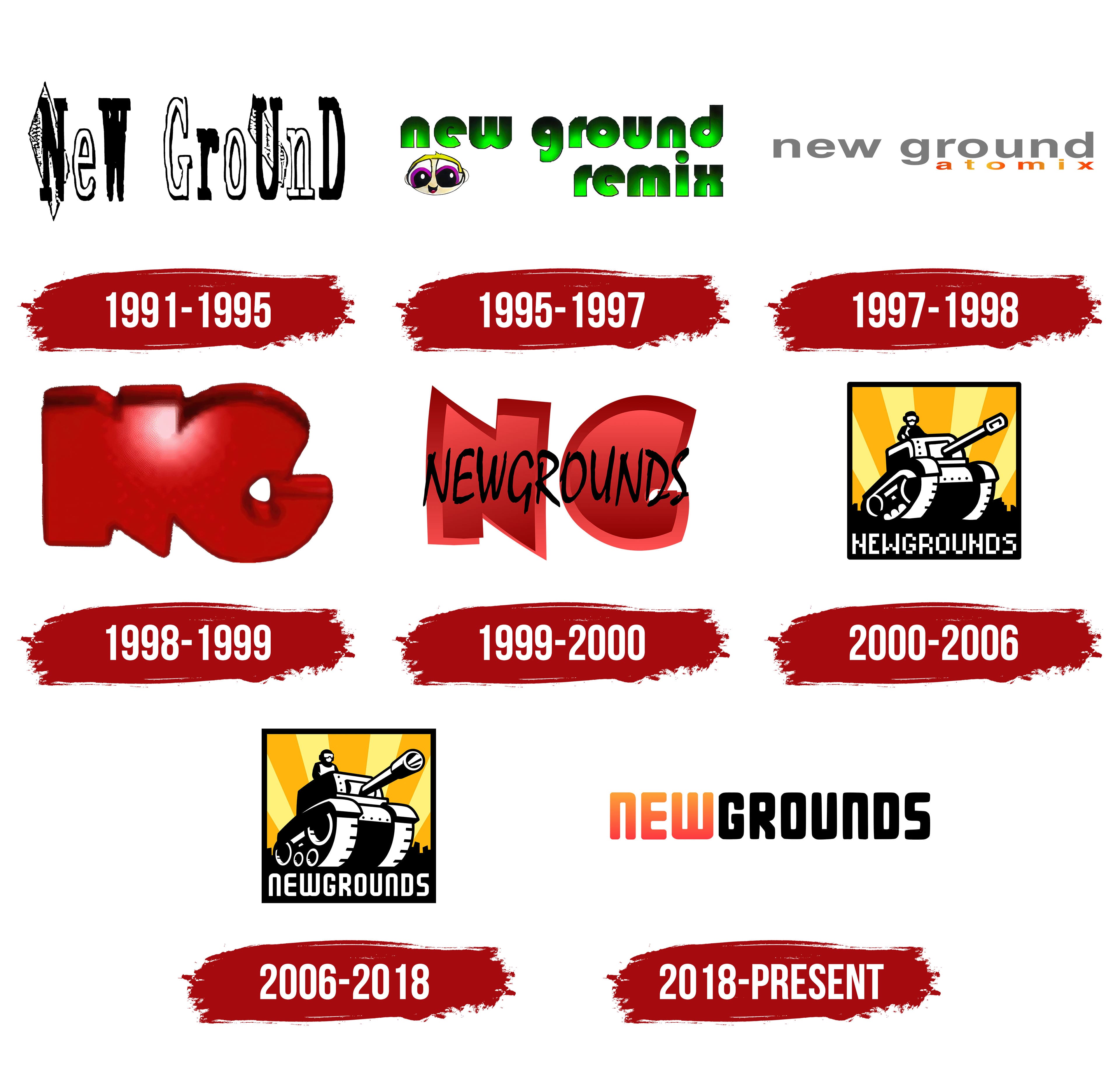
What is Newgrounds?
This is an innovative entertainment platform and creative community where artists, animators, musicians, and game developers share their original works, from amusing Flash animations to indie games and music. The platform serves as a launchpad for emerging digital artists and a repository of user-generated content. Community ratings and comments help highlight the best works and encourage collaboration among creators.
1991 – 1995
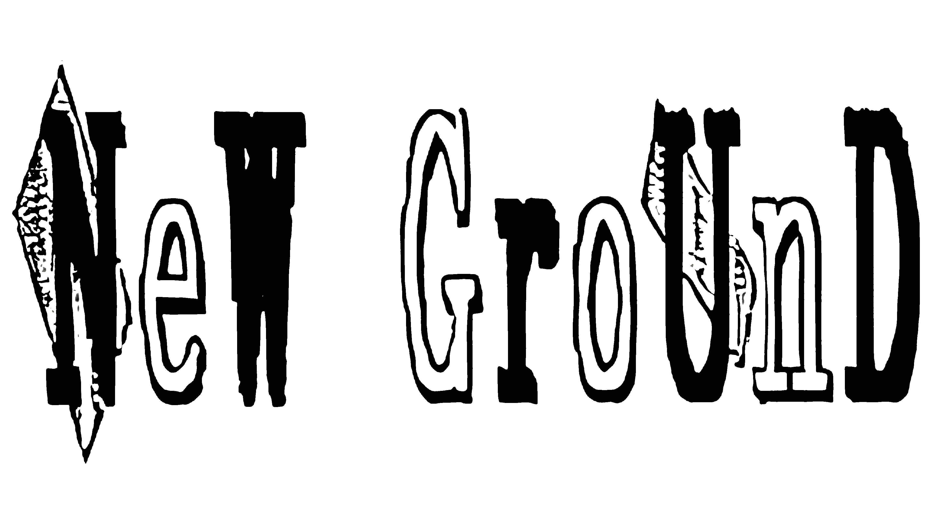
The logo is rendered in black-and-white tones with grotesque, grunge-style letters, giving it a bold, rebellious character. The name suggests creating a new world, a new “ground,” where entertainment and creativity reign. It first appeared in 1991 when the future founder of the platform, at just 13 years old, sent it to the subscribers of his amateur online publication.
The logo’s text alternates between white and black, large and small letters, symbolizing the contrasts of life: ups and downs, light and dark moments, victories and defeats. This style emphasizes the variety of content featured on future platforms.
Behind the letters “N” and “U” are rectangles resembling banknotes or mirrors. These elements highlight the platform’s two main areas of focus: games and animation, emphasizing the importance of each and creating an association with creative possibilities and financial independence.
1995 – 1997
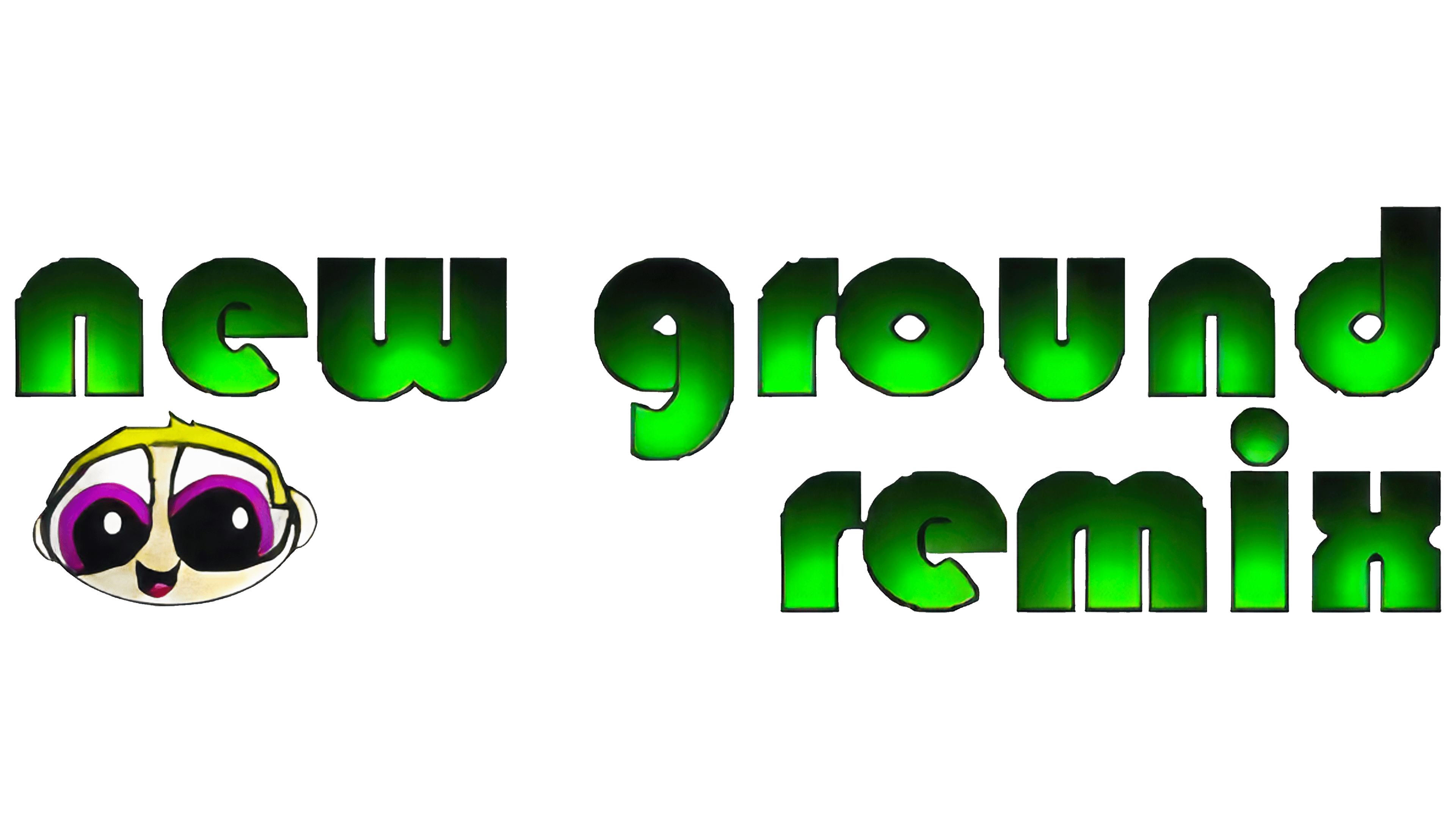
In 1995, an official professional website, New Ground Remix, was launched, continuing the development of the original idea. At the time, college student Tom Fulp aimed to create a platform for games, which would become the foundation for the project’s future success.
The site’s emblem is designed in a UFO style, adding a touch of fantasy and mystery. The green text, set against a light gradient, looks like it’s made of cosmic slime, giving the logo a unique and playful feel. In the bottom-left corner is a cheerful humanoid head that resembles a cartoon seal. This character is connected to one of the platform’s earliest games, “Club a Seal,” highlighting its historical significance and a sense of nostalgia for early projects.
1997 – 1998
As the site gained recognition and popularity, the first and second parts of famous games like Club a Seal and Assassin were released. These projects played a key role in establishing the platform, providing a space for creativity among other developers. Riding this wave, New Ground Atomix hosting was launched, allowing creators to upload their games and applications. This platform quickly became a space where developers could share their ideas and projects, promote them, and receive feedback.
The hosting emblem was minimalist and strict, giving it a unique elegance. The lowercase gray inscription “New Ground” symbolized the foundation, the very space where work on games and applications took place. This name metaphorically conveyed the idea of soil or a platform on which ideas are nurtured and developed, eventually becoming final products. Below this reserved inscription was the word “Atomix,” designed with a fiery red-orange gradient. This bright element symbolizes the creative impulse, the spark from which new ideas and inspiration for unique projects are born.
1998 – 1999
The animated logo, composed of large initial letters of the name, looks impressive and commanding. The red color emphasizes its creative potential and highlights the platform’s growing popularity. This image is closely connected with the development of the game *Pico’s School*, which amazed users with its complex structure and meticulous attention to detail. This project became a significant milestone for the platform, solidifying its position in the market as a serious player in the gaming industry. The emblem vividly reflects this achievement, showcasing New Ground’s importance in-game and application development.
1999 – 2000
The red letters look like they were cut out of clay, giving them a distinctive texture. This unusual presentation emphasizes the emblem’s uniqueness and adds a sense of style and avant-garde qualities. Above these large letters, the full brand name is neatly written in thin black font. This design evokes the aesthetics of superhero comics due to its dynamism and expressiveness. The changes directly relate to merging the site and hosting under a single domain name. This fact is vividly demonstrated by a unified inscription that connects the two background letters, symbolizing a new era for the brand.
2000 – 2000
In 2000, The Portal appeared, allowing users to automatically upload their games and allowing every visitor to rate them. This innovation made the platform more accessible and interactive for a wider audience. Along with the launch of The Portal came the brand’s symbol, the superhero Tankman (Sergeant John Captain), who became the face of the project. Andrew J. Brozyna created the logo, which is a square icon featuring a tankman riding a tank amid the sun’s rays. Over time, this image evolved into the main character of the web series “Tankman,” further strengthening its connection to the brand.
On a black background, the bottom of the square icon is a white inscription with the portal’s name written in capital letters. This design aligns with the visual aesthetics of games, giving the logo a game-like feel. All these elements create a recognizable, striking image that has established itself as the symbol of the platform and its community of developers and players.
2006 – 2018
In 2006, the series “Tankman,” created by Johnny Utah, was released, and the iconic logo underwent minor changes. The image of the tank became closer and larger, giving it a more powerful visual impact. The tank’s turret is slightly turned towards the viewer, creating a sense of movement. The character on the tank continues to stare intently forward, fully focused on his direction, emphasizing determination. The tank’s barrel has been rendered with greater detail, clearly showing the muzzle, adding a sense of threat and power to the image.
Additionally, the number of wheels inside the tracks increased, making the tank taller and giving the machine a more imposing appearance. The composition now looks majestic, highlighting the project’s scale and significance. The emblem evokes a sense of grandeur and strength, fully reflecting the platform’s development and progress. The portal’s letters have become smoother and neater, reflecting the site’s evolution as it continues to improve, with the quality of uploaded content consistently rising. These changes convey that the project has become more mature and professional while retaining its core idea and spirit.
2018 – today
The portal’s logo has become more modern and relevant with the transition from Flash to HTML5 game formats. The new emblem takes on a textual form, where every detail holds significance. The first part of the inscription is designed in a red-orange gradient, symbolizing the freshness of ideas and the creative potential of all project participants. This gradient highlights the energy that fuels the platform and inspires developers to create new solutions.
The color of the word “Ground” is associated with the earth, symbolizing a solid foundation for growth. The letters have rounded yet strong and confident shapes, visually reflecting the balance between the accessibility of innovations and the platform’s user-friendliness. These shapes symbolize openness to new ideas and technologies and a simplified interaction process with the resource, making it appealing to a wide audience.
These changes to the Newgrounds logo reflect the platform’s technical updates and evolution, making it more flexible and modern while remaining true to its core mission of supporting creativity and innovation.