![]() Noom Logo PNG
Noom Logo PNG
The Noom logo expresses boundless enthusiasm, helping millions lead healthy lifestyles and develop beneficial habits. While the emblem may seem deceptively simple, it carries a deep meaning that becomes fully apparent only when used with innovative wellness products.
In 2008, two businessmen, Saeju Jeong and Artem Petakov, decided to collaborate to develop a novel approach to health and well-being. This decision marked the beginning of the company’s Noom existence. Petakov, from Ukraine, and Jeong, originally from South Korea, met at Princeton University.
The business was founded as WorkSmart Labs and initially focused on creating mobile applications for fitness and health. The CardioTrainer app was the firm’s debut offering, launched in 2009. One of the earliest fitness apps on Android, it lets users track their workouts.
WorkSmart Labs received its first $2.6 million investment from several venture capital funds in 2010. Thanks to these finances, the company was able to grow its workforce and expedite the creation of new items.
In 2011, a significant shift occurred in the company’s history. Jeong and Petakov decided to concentrate on developing a complete weight-management and wellness solution. They started working on a brand-new app that would eventually be called Noom.
The business formally changed its name to Noom in 2012 when it released its flagship iOS and Android app. Rather than just tracking calories, the new weight loss software changed eating patterns by taking a psychological approach.
The app’s user base significantly increased in 2013. Additionally, the business began collaborating with major medical associations to evaluate the efficacy of its weight-management strategy.
In 2014, the firm secured a $7 million Series A investment, which was used to expand marketing initiatives and develop the technology platform.
The Noom Coach service, introduced in 2015, provides users with individualized diets, fitness regimens, and coaching from qualified coaches.
The company started aggressively entering foreign markets in 2016 and customized its software for users from various nations and cultural backgrounds.
For the business, 2017 was a year of major technological advancements. The firm began using machine learning and artificial intelligence to provide consumers with more accurate, tailored recommendations.
In 2018, the company secured $58 million in Series E investment. Thanks to these investments, the firm was able to rapidly create new software features and grow its workforce.
It was noteworthy that new programs were introduced in 2019 to manage chronic illnesses, including diabetes and hypertension. Additionally, the business sharpened its focus on scientific research and began publishing program outcomes in peer-reviewed medical journals.
In 2020, the company continued to expand despite global problems. The business updated its curriculum to reflect the current climate, focusing more on mental health and reducing stress.
The firm experienced notable financial success in 2021. In a fresh fundraising round, it raised $540 million, valuing it at $3.7 billion. These funds were used to explore new markets and broaden the scope of services provided.
2022 saw the introduction of Noom Mood, a new program that increased the company’s product options. This program aims to help users improve their emotional health and manage stress. While focusing on mental wellness, Noom Mood used the same scientific methodology as the company’s main weight-loss program. Daily classes, mindfulness exercises, and coach support were all part of the curriculum.
The business also released an upgraded version of its flagship weight-loss app that same year.
The firm experienced a substantial global expansion in 2023. The business aggressively entered markets across various European nations, customizing its offerings to fit the region’s gastronomic and lifestyle norms. As part of this growth, several other languages were added to the app, and local experts in healthy living and nutrition were hired.
Additionally, in 2023, the company started working with significant US insurance providers to include its services in health insurance policies. Through this collaboration, many customers could access services via their insurance policies, greatly increasing the company’s user base.
In 2024, the firm unveiled new AI technology included in its apps. Based on a thorough analysis of user data, this technology enabled even more precise tailoring of advice for physical activity and diet. The business stressed that AI augments human coaches rather than taking their place.
The company continued refining its strategy for health and well-being by introducing new services, entering untapped sectors, and leveraging cutting-edge technology to improve the user interface.
Meaning and History
![]()
What is Noom?
It is a health and wellness platform that offers a mobile app designed to help users achieve their weight loss and fitness goals through personalized coaching, behavioral science, and interactive tools. The app combines daily food intake, exercise, and other health metrics tracking with educational content and personalized support from qualified coaches. The company’s approach focuses on building sustainable healthy habits and addressing the psychological aspects of weight loss and wellness. The program aims to provide users with the knowledge and motivation to improve health and wellness.
2014 – 2021
![]()
The old Noom logo resembles an orange in both shape and color. This is a clever marketing tactic, as fruits are associated with freshness and natural qualities. An orange, a valuable source of vitamins, perfectly reflects the company’s mission, motivating clients to lead a healthy lifestyle and eat right to manage their weight.
The orange emblem symbolizes vitality, energy, and positivity, aligning with the brand’s goal of inspiring people to make active changes. The bright palette infuses optimism and evokes positive emotions, which fits the wellness platform’s concept. Another purpose of the orange color is to attract attention, as at the time this logo was created (in 2014), Noom was a little-known startup focused solely on weight loss. Later, it transformed into a multipurpose company offering comprehensive solutions to improve the quality of life.
The perfect circle is associated with completeness, wholeness, and cyclicality. It symbolizes continuous self-improvement, as Noom’s digital products are designed to help individuals consciously manage their health. The circular shape of the emblem emphasizes that weight-loss programs are not temporary solutions but tools for forming lasting, beneficial habits.
The logo also symbolizes the professional support the company’s clients receive, as each is guided by a team of coaches who provide psychological encouragement. At the same time, the emblem’s simple geometric shape hints at the platform’s accessibility, the idea that anyone can easily change their life by following straightforward recommendations.
The brand name immediately stands out due to the color contrast: the white lettering pops against the bright orange background, leaving no doubt about the logo’s identity. The letters are made up of tiny circles, creating a textured effect similar to the surface of an orange peel. The dotted font gives the text a perforated appearance, which is Noom’s signature feature.
Using paired dots instead of solid lines gives the logo a modern, tech-savvy look, emphasizing the company’s innovative approach to client health. Additionally, this design embodies the brand’s philosophy of gradual habit change. Each white circle represents a small step toward the goal; if even one is removed, the result will be incomplete.
2021 – today
![]()
The transition from striking brightness to black-and-white monochrome might seem abrupt, but it reflects the company’s evolution, where substance has become far more important than style. While the platform initially offered only weight loss programs (focused on maintaining outward appearance), it shifted to comprehensive health management (focused on improving the body’s internal state) over time.
These changes are mirrored in Noom’s logo, where visual appeal has taken a back seat to usefulness and practicality. The new design is concise and simple. Without additional elements, black letters signal a company’s maturity and its role as a guide to health and well-being. By abandoning the bright orange circle, it stepped away from an image of lightness and playfulness to present clients with a more solid, professional appearance.
The old logo attracted the attention of younger audiences and those who favored a casual style. The new wordmark is more universal, as the minimalist design is aimed at a broad audience of all ages. The black lettering evokes simplicity and functionality, aligning with Noom’s primary goal of making the path to health accessible, easy, and convenient.
Even without the bright, eye-catching colors, the emblem remains creative. This was achieved by using an unconventional font characterized by smooth curves in places where sharp angles are typically expected. The visual softness conveys a sense of safety, the most important promise the brand makes to its clients through personalized weight-loss programs.
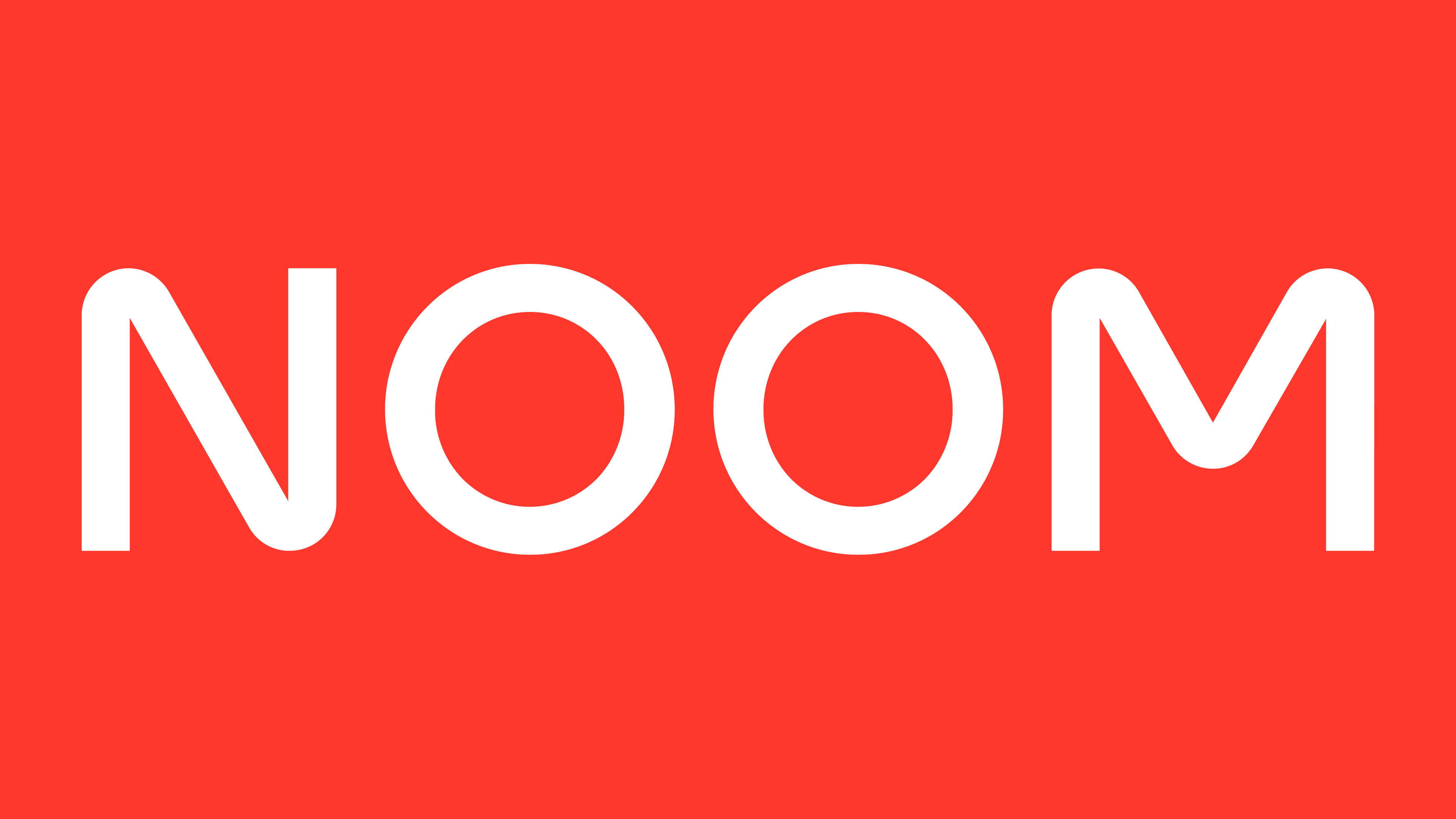
The unexpected rounding of the letters “N” and “M” harmoniously complements the two “O” s in the middle. This is a clever design choice, as the balance of forms reflects a balanced approach to health. At the same time, the restrained black color turns the logo into a timeless classic and creates maximum contrast against the white background.