


 Pinkfong Logo PNG
The Pinkfong logo instantly captures the attention of a young audience with its bright animated character and playful letter design. Every emblem element looks fun and dynamic, creating an atmosphere of joy and excitement. The cartoon character, a key figure in the logo, symbolizes children’s curiosity and carefree joy in learning. The cheerful, vibrant colors and smooth lines enhance its appeal to little ones, inspiring a desire to play, explore, and learn. The emblem conveys a sense of lightness and adventure, making it a perfect symbol for content aimed at children.
Pinkfong began in 2010, when Kim Min-seok founded SmartStudy in South Korea. The company first worked on educational apps for children, then developed Pinkfong as a separate brand for songs, stories, and learning content. In 2012, SmartStudy launched Pinkfong! Kids’ Songs & Stories on YouTube, moving from app development into short-form video for preschool audiences.
From 2013 to 2014, the company expanded its animated songs, characters, and simple educational formats. The brand became more recognizable in South Korea and gradually reached viewers abroad. In 2015, SmartStudy began a larger international push, releasing content in multiple languages. In 2016, Baby Shark became its breakout hit, based on a traditional children’s song with a repetitive melody and easy dance gestures.
The song became a global phenomenon in 2017, helped by translations, local versions, and heavy online sharing. In 2018, Baby Shark entered the Billboard Hot 100, bringing an unusual level of mainstream attention to a children’s song. The success pushed Pinkfong into toys, books, and merchandise. In 2019, the company partnered with Nickelodeon to develop Baby Shark’s Big Show! It expanded its catalog with educational games and apps.
In 2020, Baby Shark passed Luis Fonsi’s Despacito as the most-watched video on the platform. The animated series premiered in 2021, moving the franchise beyond short music videos. By 2022, Pinkfong was adding new characters and learning series about the alphabet and basic science. In 2023, the brand continued building its presence through streaming platforms, interactive videos, virtual reality, and augmented reality formats.
Meaning and History
What is Pinkfong?
This well-known children’s entertainment brand gained global popularity through vibrant animations and fun educational songs that captivate young viewers. At the brand’s heart is a charming pink fox mascot that guides children through educational adventures, covering topics from the alphabet to basic science. The brand’s content stands out for its colorful, high-quality animation and catchy tunes that combine learning and entertainment. The company achieved worldwide fame with the viral hit “Baby Shark,” which became a cultural sensation, attracting attention from children and adults alike. The brand’s success lies in its ability to create content that engages kids and their parents or caregivers, making the learning process enjoyable for the entire family.
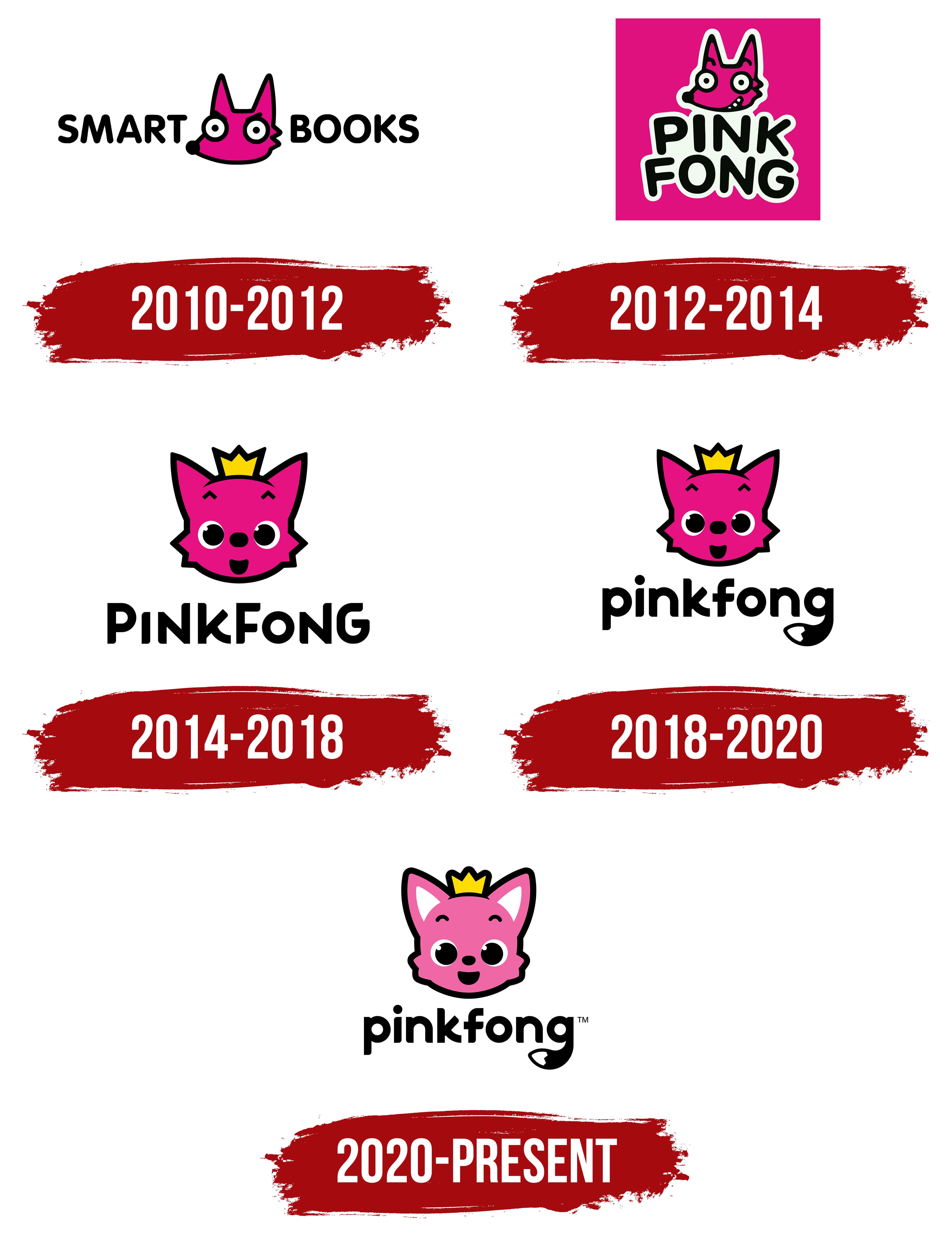
2010 – 2012
The brand’s first logo consists of the name and its signature mascot. Initially, the company was called Smart Books Media and was founded as a subsidiary of Samsung Publishing Company Ltd, focused on children’s literature. Between the two words of the name is the head of a bright pink fox, chosen intentionally: the fox symbolizes intelligence, cleverness, cunning, and playful qualities that appeal to children. This character became a guide for young ones into the world of knowledge. The fox originally appeared as a dancing character in digital adaptations of children’s songs. The simplicity of the font, combined with the fun, unique mascot, creates a friendly atmosphere that emphasizes the company’s focus on children’s content.
2012 – 2014
The company’s logo became an app icon as the platform developed and launched children’s games. The central element of the pink square became an image of a little fox, with the platform’s name placed at two levels. The image and text are set against a white background, creating a wide border around the edges and giving the logo a resemblance to a children’s sticker. These stickers are often given to kids as rewards or incentives in preschools, making the logo feel even more friendly and associated with positive experiences and learning.
The fox’s face also changed; now it smiles, and the raised eyebrows, expressing surprise, add a playful touch to the character. While in the first logo, the little fox appeared serious, even stern, it now radiates joy and curiosity, reflecting the fun and discoveries awaiting children on the platform. The fox was named Pinkfong, a combination of “Pink” and “Fong.” Though “Fong” isn’t an actual word, it symbolizes an explosion of joy and fun and resonates with “phone,” emphasizing the digital nature of the content. Interestingly, before the final choice of the character’s name, it went through several iterations: Kick-kick, Bebifong, and finally, Fong.
2014 – 2018
The image of the fox cub has been changed, and now its surprised face is directed straight at the viewer. The raised checkmark-shaped eyebrows and slightly open mouth reflect key character traits of curiosity and surprise. The fox cub might be singing, which underscores the connection to songs uploaded to the platform and hints at the upcoming release of the first version of Baby Shark.
A crown has appeared on the fox cub’s head. The golden attribute highlights its increased status and is tied to the character’s image development. Legends surrounding the character say that it arrived from the planet Staria, a magical star kingdom where it is a prince. This element adds a fairytale-like quality and mystery to the mascot’s story.
For the first time, the platform’s name and the fox cub’s name are written together, but the capital letters at the beginning of each word are preserved, giving the inscription dynamism. Symbols resembling musical notes of varying heights echo the name’s phonetic sound, making the logo even more memorable and vibrant.
2018 – 2020
With the release of the Pinkfong Wonderstar cartoon, the logo was updated while retaining the fox cub’s recognizable image, which had already become a brand symbol. The name “Pinkfong” is now written in lowercase letters, with the last letter “g” transformed into a small fox tail, giving the emblem playfulness and dynamism. This element visually strengthens the connection to the character, adding a sense of liveliness and fun that attracts a children’s audience.
The switch to lowercase letters also makes the logo friendlier and more approachable for young children, creating a feeling of warmth and accessibility. This change is tied to the fact that Pinkfong is now the main character’s name and the company creating children’s content. The new design reflects the brand’s evolution, making it even more relatable and understandable to young audiences and parents.
2020 – today
The Pinkfong logo stands out with its bright, friendly design, which grabs children’s attention. The central element is a character named Pinkfong, a pink fox cub with a cute smile and large eyes, which has become the brand’s symbol. The fox cub wears a small yellow crown, highlighting its playful, cheerful nature and indicating the main character’s special status among other figures.
The fox cub’s face is done in pink with a black outline, which adds clarity and sharpness to the image. Large eyes, white ears, and simple black lines create the illusion of a friendly character who always seems ready to play. The smile and expressive eyes convey a sense of joy and openness, which is especially important for capturing the attention of younger children.
Below the fox cub’s image is the word “Pinkfong.” The font is large and rounded, with smooth lines, creating a sense of softness and approachability. This stylistic choice harmonizes with the character’s visual theme, a friendly, fun-loving fox cub. Special emphasis is placed on the letter “g,” which adds a small tail, resembling the fox cub’s tail, tying the text to the brand’s main symbol.