Piraeus Bank Logo PNG
Financial services include accounts, loans, savings, and business services that support customers’ daily needs. The banking system facilitates fund transfers and access to financial products. The Piraeus Bank logo represents a Greek bank that serves individuals and companies, including lending and payment transactions.
Piraeus Bank was founded in Athens on July 6, 1916. By 1918, it was listed on the Stock Exchange and began expanding. From 1975 to 1991, the state controlled the bank. After privatization, the bank began to grow internationally.
In the late 1990s, the bank expanded its operations in Europe. In 1999, it opened a London branch. In the early 2000s, the bank made a series of acquisitions in Greece. In 2000, it acquired Chios Bank and Bank of Macedonia-Thrace. In 2003, it joined with ETB Bank. Later, in 2012, the bank acquired ATEbank and Geniki Bank. In 2013, it acquired Millennium Bank, and in 2014, Panellinia Bank joined. These steps made Piraeus Bank one of the country’s largest banks.
In 2007, the bank entered the Ukrainian market by purchasing the International Commercial Bank, which was renamed Piraeus Bank ICB. After the 2008 crisis, the bank entered a recovery period. By the end of 2015, the Hellenic Financial Stability Fund owned two-thirds of the bank’s shares.
On December 30, 2020, the bank underwent a large-scale restructuring. Piraeus Bank became a holding structure called Piraeus Financial Holdings S.A. Its subsidiary retained the name Piraeus Bank. From that point, development focused on digital technologies.
In 2024, the bank rebranded and updated its logo. The bank modernized 217 branches. The bank implemented an electronic document management system and launched 45 digital initiatives, including a new business app and a brokerage services platform.
Piraeus Bank invested 200 million euros in artificial intelligence development. It created a chatbot, a sentiment analysis system, and a personalized recommendation platform. In 2024, the loan portfolio reached €33.7 billion, and deposits totaled €51.2 billion. The bank served 5.5 million clients and employed 9,800 people.
Meaning and History
What is Piraeus Bank?
A Greek-rooted financial institution, it has operated for more than a century and remains one of the country’s leading banks. It serves corporate and private clients, offering loans, deposits, investment products, leasing, and real estate transactions. After periods of nationalization and privatization, the bank strengthened its position during the eurozone crisis by acquiring several local institutions. The network covers Southern and Eastern Europe, including Ukraine, Romania, and Bulgaria.
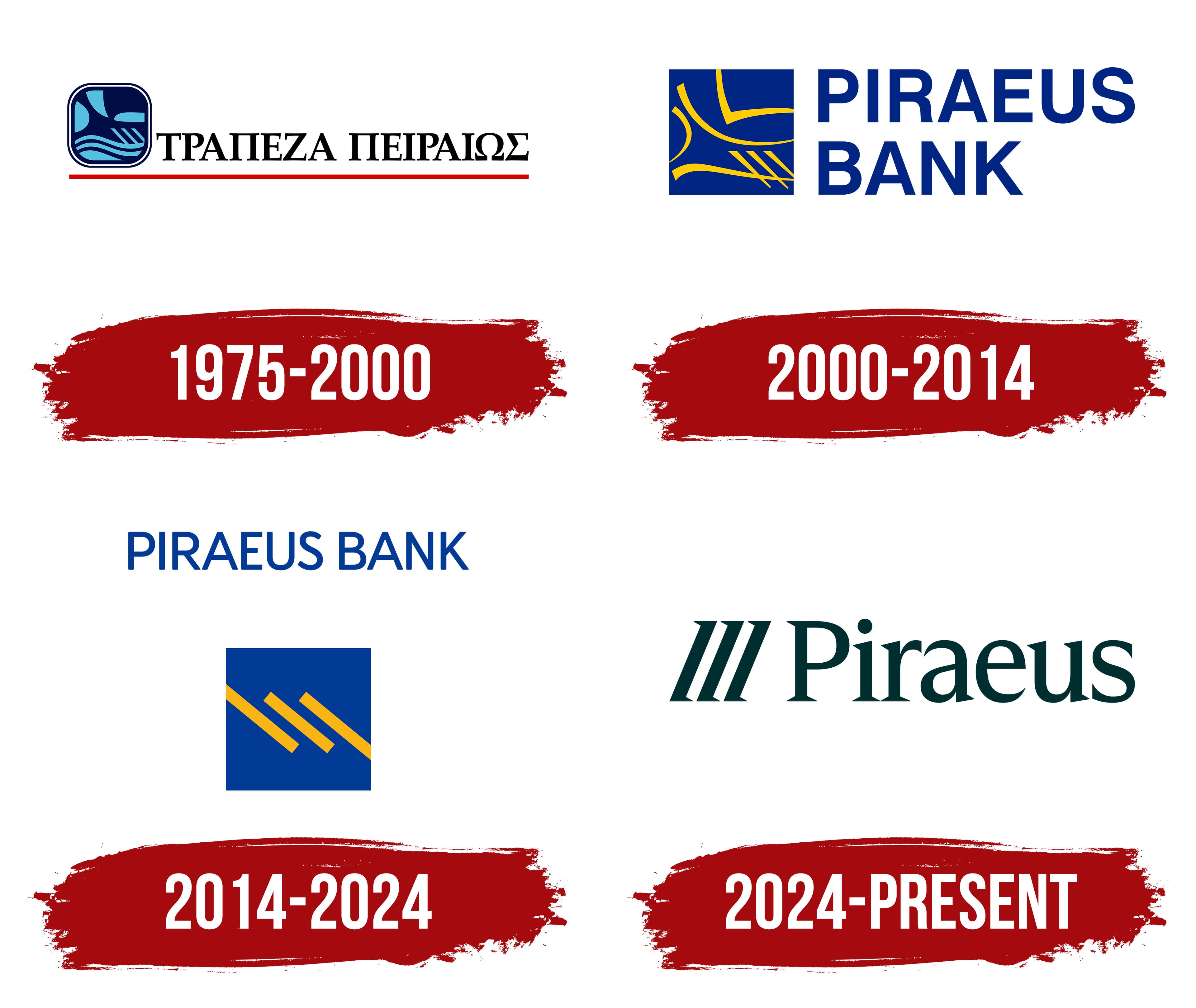
1975 – 2000
Piraeus’s maritime history appears in the bank’s early logo as a trireme, an ancient Greek rowing vessel with 3 banks of oars. The Piraeus Bank name comes from the port city near Athens. The Greek name Τράπεζα Πειραιώς means “Bank of Piraeus,” and the English name conveys the same meaning. The ship connected the banking group to Greek shipping and trade.
The bank was founded in 1916. In 1975, the state took control of it as part of the Emporiki group, and in 1991, it was privatized. Its branch network subsequently expanded, and its branding was updated. In the 1990s version, the trireme appeared to the left of the Greek name.
The ship sat inside a dark blue frame with rounded corners and a double border. The inner border was white. Turquoise and light blue strokes depicted the sail, curved hull, and 3 slanted oars. At the top of the illustration, a semicircular shape appeared on the left and an elongated shape on the right. Between them, the sail formed a sharp downward-pointing bend. Wavy lines ran below, with a horizontal hull stroke beneath them. On the right, above the waves, 3 diagonal lines represented the oars.
ΤΡΑΠΕΖΑ ΠΕΙΡΑΙΩΣ appeared in black serif capitals. The letters had formal proportions and were closely spaced. A thin red line extended beneath the full width of the name, marking the lettering’s lower edge.
2000 – 2014
The English name took a prominent position in the next Piraeus Bank logo. To the right of the emblem, it was divided into 2 lines, with PIRAEUS above BANK. The blue capitals were left-aligned and set in a sans-serif typeface resembling Helvetica or Univers. The design remained in use for over 12 years as the bank’s branch network expanded.
The trireme stayed to the left of the name, but it grew larger. A blue square replaced the rounded frame, and the turquoise lines became yellow. A large section of the ship remained inside. At the top, straight segments joined curved lines. Below, left-slanting oar strokes crossed the curved hull. The red underline was removed.
The maritime imagery maintained the bank’s connection to Greek trade and its reach beyond the country. Blue and yellow represented the sea and the sun. Kouros applied the identity to branch signage, using an illuminated yellow background with blue lettering and symbols.
2014 – 2024

In Piraeus Bank’s 2013 logo, 3 oars became a symbol of coordinated work. MNP explained the idea through rowers whose combined efforts carry a ship across the water. The maritime motif helped the bank present the consolidation of branch networks brought together through a series of acquisitions. Those branches needed a shared name and identity.
The previous trireme image was reduced to 3 yellow diagonal bars of equal length and width. They occupied a blue square, preserving the oars’ direction. The hull and sail were removed, while the blue-and-yellow combination maintained a connection to the earlier emblem. The square was also used as a standalone symbol. Subsidiaries adopted the shared identity.
PIRAEUS BANK appeared in blue capital letters on a single line above the square. A custom sans-serif typeface was developed for the name, with even strokes, close spacing, and rounded corners. The softened terminals were intended to give the lettering a friendly appearance. The shared blue connected the name to the geometric emblem.
2024 – today
In the May 28, 2024 update, the public-facing name was shortened to Piraeus. The group wanted the brand to encompass more than traditional banking services. The launch followed the state’s exit from ownership. The identity was intended to reflect the changes following a period of recovery and Piraeus’s readiness for its next phase of development. Mucho created the project in collaboration with The Newtons Laboratory.
The logo retained 3 parallel strokes to the left of the name. The blue square was removed, and the angle of the bars changed. They now rise from left to right. The lines became thicker, with flared ends that echo the letters’ serifs. The symbol and capital “P” are the same height, creating a unified horizontal arrangement. Mucho associated the 3 strokes with progress, innovation, reliability, and openness.
The all-capital PIRAEUS BANK lettering was replaced by Piraeus, with an initial capital “P” followed by lowercase letters. The large serif letters received custom shapes and moderate spacing. Type designer Jordi Embodas expanded the logo’s lettering into the Piraeus Open Serif typeface. Its forms were intended to convey calm and trust.
Dark green unified the name and emblem. It replaced blue and, according to the designers, represented growth and environmental responsibility. Yellow remained in the updated identity in a brighter shade. Gray became an additional color.