 POSCO Logo PNG
Steel production involves smelting, processing, and supplying metal for construction, shipbuilding, and industry. This material is used to build bridges, buildings, and machinery that require strength and consistent performance. The POSCO logo is associated with a South Korean steel company that produces steel and supplies products for infrastructure and industrial projects.
POSCO was founded on April 1, 1968, in Pohang on the initiative of President Park Chung Hee. At that time, South Korea was recovering after the war and aimed to build its own steel industry. The company’s first head was engineer Park Tae Joon, who had studied in Japan. Japan financed the project as part of compensation for the colonial period.
Construction of the first plant began in 1970. In July 1973, the first blast furnace began operation with a capacity of over one million tons of steel per year. By the end of the decade, the company had increased its output and launched new production lines. In 1981, construction of the Gwangyang Works began. By 1985, it had become one of the world’s largest steelmakers.
In 1988, the company was listed on the Korea Stock Exchange. By the early 1990s, POSCO was producing more than 20 million tons of steel and had strengthened its position among the global industry leaders.
After full privatization in 2000, the company expanded its international projects. In 2005, it signed an agreement to build a plant in India. In 2007, it acquired stakes in nickel mines in Indonesia. In 2010, POSCO acquired Daewoo International for $ 3.7 billion. This made it possible to expand its product range. That same year, it launched a joint plant with Nippon Steel in Mexico.
In 2015, construction began on a plant for producing electrical steel in Myanmar. It was commissioned in 2017. In 2022, the company restructured and established a holding company, POSCO Holdings. By 2023, production capacity reached 42 million tons of steel per year. The company operated in key regions of Asia, the Americas, and Europe.
Meaning and History
What is POSCO?
A South Korean corporation and one of the world’s largest steel producers. Its plants in Pohang and Gwangyang produce more than 40 million tons of steel per year, including rolled products, stainless steel, and high-strength steel for shipbuilding, automotive manufacturing, and construction. About one-third of sales come from the domestic market, while the rest is exported to more than 50 countries. The structure includes POSCO International, with terminals in Ukraine and Myanmar; the construction company POSCO E&C; and energy and carbon divisions.
1990 – 1994

POSCO had long represented South Korea’s Pohang Iron and Steel Company internationally. The abbreviation combined “PO” from Pohang, “S” from Steel, and “CO” from Company. The circular emblem used the letters “P,” “I,” and “S” from Pohang Iron and Steel. The name and image drew on different parts of the same full name.
The company was established in Seoul on April 1, 1968, to develop the national steel industry. Park Tae-joon became its first president. The English name Pohang Iron and Steel Company, Ltd. corresponded to the Korean Pohang Jonghap Jecheol Jusikhoesa. Pohang was selected as the site for an integrated steelworks. The original plan for support from an international consortium gave way to government financing. The government allocated part of the funds received under the 1965 agreement normalizing relations with Japan to the project. Japanese companies provided technology, equipment, and loans. The first blast furnace began operating on June 9, 1973.
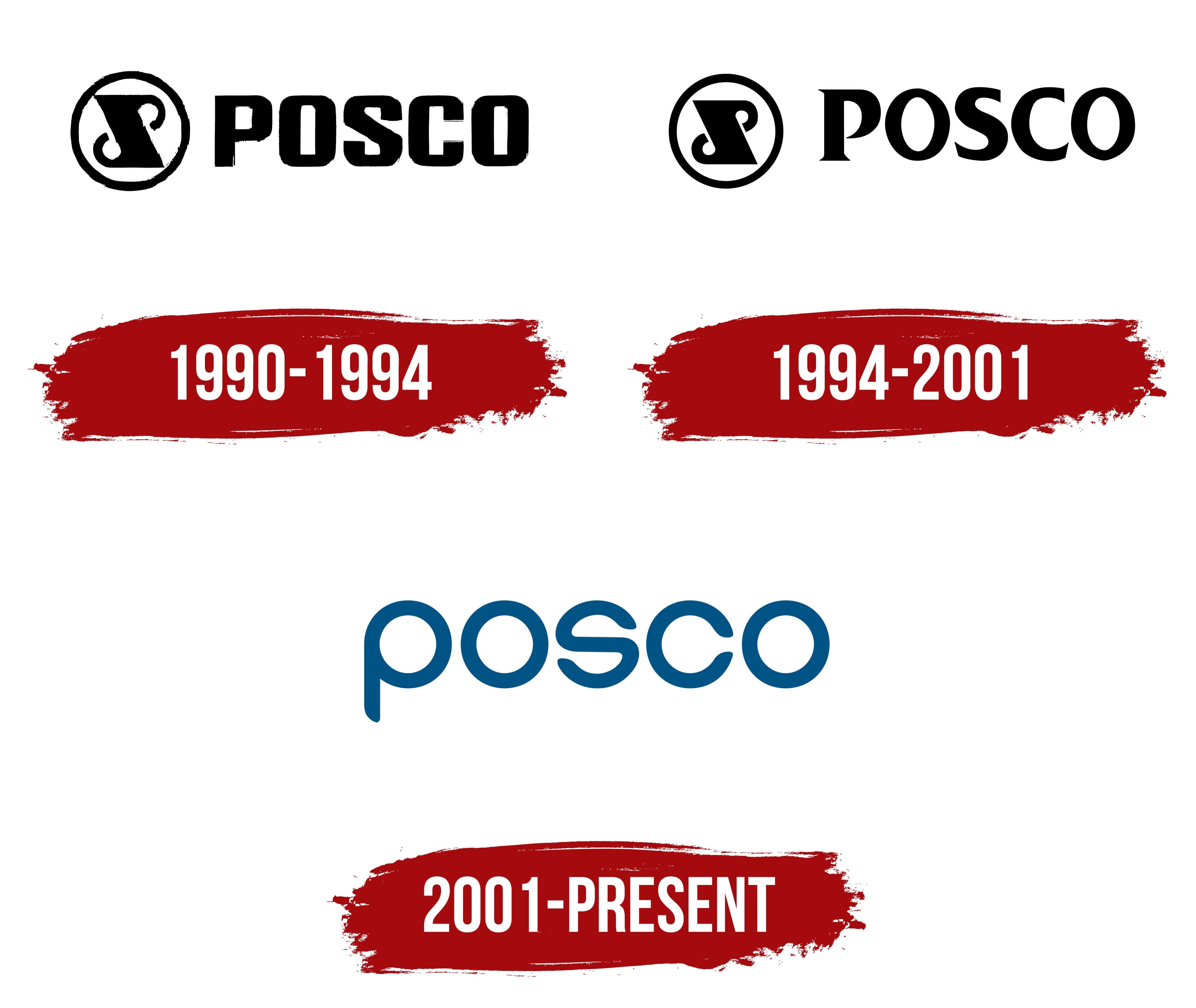
The emblem appeared in April 1968, when the company was established. A black diagonal band inside a ring resembled a tilted steel billet. It represented the “I” and connected 2 facing shapes with hook-like ends. White curls at the edges suggested the outlines of the “P” and “S.” The interwoven design resembled a slanted “S” within a circular frame.
In the early 1990s, black “POSCO” lettering appeared to the right of the emblem. The heavy uppercase letters had straight sides, rounded outer corners, and narrow counters. Thick strokes resembled a metal stamp. The horizontal logo was used when the Gwangyang complex was completed. In October 1992, the company completed its multiyear construction program for 2 integrated steelmaking sites.
In Korea, Pohang Iron and Steel Company, Pohang Steel, and the abbreviation Po-cheol were used alongside POSCO. Following privatization, the group began bringing these names together under a shared international form. On March 15, 2002, shareholders approved POSCO as the company’s legal name.
1994 – 2001

In 1994, Pohang Iron and Steel Company updated the POSCO wordmark as it expanded its presence in overseas financial markets. On October 14, it became the first South Korean company to list depositary receipts on the New York Stock Exchange. A London listing followed in 1995.
The POSCO letters were redesigned. They gained serifs and thin connecting strokes, and their counters became larger. Smooth curves combined with slightly flattened contours. The wordmark became lighter than the previous heavy lettering while retaining substantial main strokes. The circular PIS emblem remained to the left of the name, continuing the previous version’s arrangement.
In September 1997, the design of employee lapel emblems changed. Silver lines became gold, and green replaced the black background. The new colors represented workplace safety and environmental protection. The lighter combination softened the lapel emblem’s formal appearance. The primary logo with PIS inside a ring and the POSCO wordmark remained in use until the next corporate identity update.
2001 – today

The privatization of Pohang Iron and Steel Company was completed on October 4, 2000. The group needed a shared identity for its continued international operations. Changes also affected company management. On July 2, 2001, the company launched the integrated POSPIA system, and on September 28, it introduced a new logo. The logo appeared under the previous legal name, several months before POSCO was approved as the company name in the spring of 2002.
Lowercase “posco” replaced the circular PIS emblem. Five letters with rounded contours and uniform stroke weights formed a horizontal wordmark. The sans-serif lettering combined outer curves with similarly shaped counters. A redesigned “s” occupied the center of the word, with the remaining letters arranged symmetrically around it.
The company associated the logo’s construction with harmony and cooperation among employees, divisions, and external partners. The concentric forms conveyed an ability to adapt to change and develop production through continual innovation. The short name served as the shared brand of an international industrial group.
The primary color became dark blue POSCO Blue, specified as Pantone 302 C, CMYK 100, 35, 0, 40, and RGB 5, 80, 125. It represented the company’s technological capabilities and efforts to reduce environmental impact. We specified the secondary POSCO Light Blue as Pantone 299 C, CMYK 85, 10, 0, 0, and RGB 0, 165, 229. We prepared dark gray, light gray, black, and white versions for different backgrounds.
Shared identity guidelines covered steelmaking operations, research organizations, and divisions in Korea and abroad. We paired subsidiary names with the blue “posco” wordmark to indicate group membership.