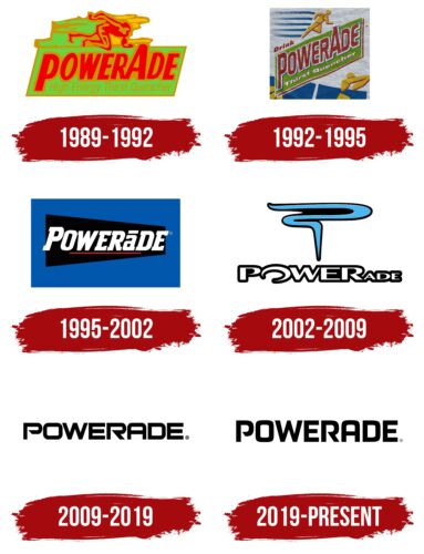
The Powerade logo is like a battery full of charge. The slender symbols of the emblem inspire confidence and confidence in restoring strength thanks to a balanced mineral complex. There is nothing superfluous in the sign, as well as in the optimal composition of water.
Powerade: Brand overview
| Founded: | 1988 |
| Founder: | The Coca-Cola Company |
| Headquarters: | United States |
| Website: | us.powerade.com |
Powerade is a brand of isotonic sports drinks that includes four minerals in addition to water to restore energy balance after intense physical activity quickly. Its developer, manufacturer, distributor, and owner is the Coca-Cola Company. It is mainly made in the U.S., but there are production subsidiaries in many countries around the world – closer to potential consumers. The time of the launch of this brand is 1988.
It all started with the 1988 Olympic Games, one of the official sponsors of the Coca-Cola company. For the significant event, it produced Powerade, a “theme” drink intended to restore the energy expended by sportsmen. It immediately became the main competitor for the energy product Gatorade produced by PepsiCo.
The parent company was constantly improving its composition to remain perfect, healthy, and safe for health. Especially for this, it created a progressive formula where the components that play the primary role in restoring the energy balance of the human body were included. These are B vitamins 3, 6, and 12. The manufacturer introduced the novelty in 2001.
A year later, producing a low-calorie sports drink with corn syrup saturated with sucralose, fructose, and acesulfame potassium was established. It is for those who try not to overindulge in sugar. Other branded products have also appeared: as of now (2022), there are 16. In addition, there are six low-calorie energy drinks.
In 2002, Coca-Cola redesigned the standard bottles, offering a version that is more in line with progressive trends. The result was a container with an ergonomic handle. At the same time, the label was revised, and an updated logo style was approved. In 2009 the producer bought the specialized company Glacéau, thus confirming his intention to produce non-carbonated drinks. Now the owner of the brand Powerade has placed it under the total control of the newly acquired company.
Meaning and History
For Powerade, the logo is one of the main advertising tools. The company enters into agreements with various professional athletes and sports organizations to use its products. And each bottle of isotonic drink is adorned with a label that depicts a memorable brand logo.
Once, this sign was colorful, complex, and multi-component. But as it evolved, it was reduced to a laconic black-and-white inscription “POWERADE.” The word is filled with inner strength and energy. This is an allegorical reflection of the energy that people get after drinking isotonic drinks.
What is Powerade?
Powerade is a popular brand of isotonic that replenish lost salt, water, and glucose. Athletes use these drinks to restore the body’sbody’s resources after intense training. The brand is owned by the American food company Coca-Cola.
1989 – 1992
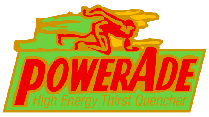
The debut logo had a completely different design than all subsequent variants. It was notable for its colorfulness and its component parts. Life-affirming colors – red, blue, yellow, green – stood for dynamics, sky, sun, lawn. The emblem depicted a running man rapidly moving through the hilly terrain. The stripes evidenced this next to the athlete and the slant of the rectangle with the name of the energy drink. The lettering was grotesque, bold, with accented “P’s” and “A’s.” The former had a stalk going down, while the latter had a point going up, towering over the rest of the letters.
1992 – 1995
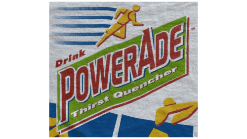
This variant featured “POWERADE” in dark red with an enlarged “P” and “A,” which were the only ones of letters to have triangular serifs. For the text, a massive bold font was used. Each glyph was outlined in a wide white outline and further embellished with blue shadows. Beneath the brand name was the white phrase “Thirst Quencher” with the capital “T” and “Q.”
The background for the inscriptions was a large light green parallelogram raised upwards at an angle of about 30 degrees. Due to this arrangement, it seemed like it and the elements contained in it were flying upwards. This is a symbol of development, perseverance, energy recovery, and movement.
Above “POWERADE” was the red word “Drink,” left-aligned. It was in bold italic sans-serif. In addition to the main logo, the label was decorated with abstract athletes. The figures of people in orange did not just stand still – the artists depicted them in motion, complemented by blue speed lines.
1995 – 2002
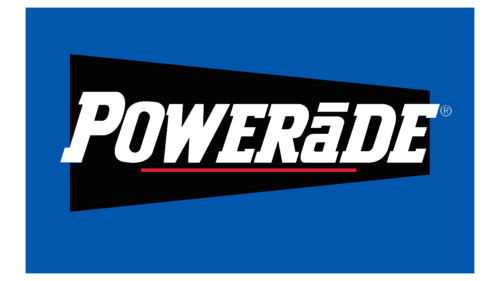
For a long time, the brand used a textual logo with a minimum of elements. The designers turned the slanted rectangle (almost a parallelogram) into a trapezoid with different widths of the opposite ends. The lettering on it was changed: it received geometric serifs, italics, and white color. In addition, the name was transferred to upper case, except for the letter “a,” above which a short stripe appeared. The developers placed a long line below, as an underline in the middle of the word “Powerade.” The background was a bright blue rectangle.
2002 – 2009
The redesign, conducted in 2002, brought a major overhaul. The emblem had just one line, curly like a ribbon, representing internal energy. At the same time, it resembled a question mark stretched out to the sides. The name of the sports drink was written in a modern geometric typeface, with unevenly spaced letters that had sections of different widths combined. The main focus was on the “P”: it had only one line with pointed ends, unclosed.
2009 – 2019
In 2009, the designers proposed a minimalist Powerade logo. They removed the graphic part, leaving only the name of the brand. It was massive and strict lettering, made in black characters on a white background. The font was square, bold, and chopped. The outlines of some of the letters were enclosed – in particular, the “P” and the “R” had narrow gaps where the curved line would touch the vertical foot. Although “O,” “A,” and “D” had roundings at the corners, they were more like slices, which added to the seriousness of the text.
2019 – today
The modern version of the emblem reflects masculinity and inner energy. The developers used a bold font with uppercase letters stretched upwards to do this. Now they convey the ability to withstand difficulties and the full recovery of strength because the symbols are as if overflowing with hidden dynamics.
Font and Colors
The evolution of the logo of this brand is conventionally divided into two periods: before 1994 and after. At that time, a decisive breakthrough was noted in its stylistics: it moved from a non-permanent design to a permanent one. This is due to the emergence of a concept that harmoniously represents the energy drink. Inner fullness, restoring strength, maintaining balance, a sense of determination and strength – this is what is most important for those who constantly experience high physical exertion. Minimalistic logo as if proclaims: this is a serious drink for serious people in serious circumstances.
The text in the Powerade logo is in Gears of Peace – powerful, bold, with half-cut corners that are slightly rounded at the same time. The two letters have no joints, so they have a pointed inner line. The color palette is monochrome. But the brand did not come to black and white right away: first, it tried on bright colors consisting of red, green, yellow, and blue.
Powerade color codes
| Black | Hex color: | #000000 |
|---|---|---|
| RGB: | 0 0 0 | |
| CMYK: | 0 0 0 100 | |
| Pantone: | PMS Process Black C |

