


 RB Leipzig Logo PNG
The RB Leipzig logo reflects a soccer club that has risen to the elite through clear organization and an aggressive playing style. The team emphasizes dynamism and efficiency, disrupting traditional football rhythms.
The history of the football club RB Leipzig began in May 2009, when the Austrian company Red Bull acquired the amateur team SSV Markranstädt from Germany’s fifth division. The project’s goal was to reach the Bundesliga within eight years and establish a competitive club in eastern Germany, where football had been in decline for many years.
Renamed RasenBallsport Leipzig and given a bull-themed emblem, the club was promoted to the fourth division after its first season. By 2014, the team reached the second Bundesliga, despite protests against the owners’ commercial influence and difficulties obtaining licensing.
In 2016, RB Leipzig advanced to the Bundesliga, immediately finishing second and qualifying for the Champions League. In 2020, the club reached the semifinals of that tournament for the first time. Under coach Domenico Tedesco, the club won its first major trophy, the German Cup, in 2022.
In August 2023, RB Leipzig won the German Super Cup against Bayern Munich. Despite ongoing criticism for its ties to Red Bull, the club remains a leader in German football and a regular participant in European competitions.
Meaning and History
What is RB Leipzig?
It is a German soccer club from Leipzig, founded by a major commercial company. The club advanced to the elite league through skilled recruitment and aggressive on-field pressing. It faces mixed reactions due to its commercial model, but is known for talented young players trained in its academy.
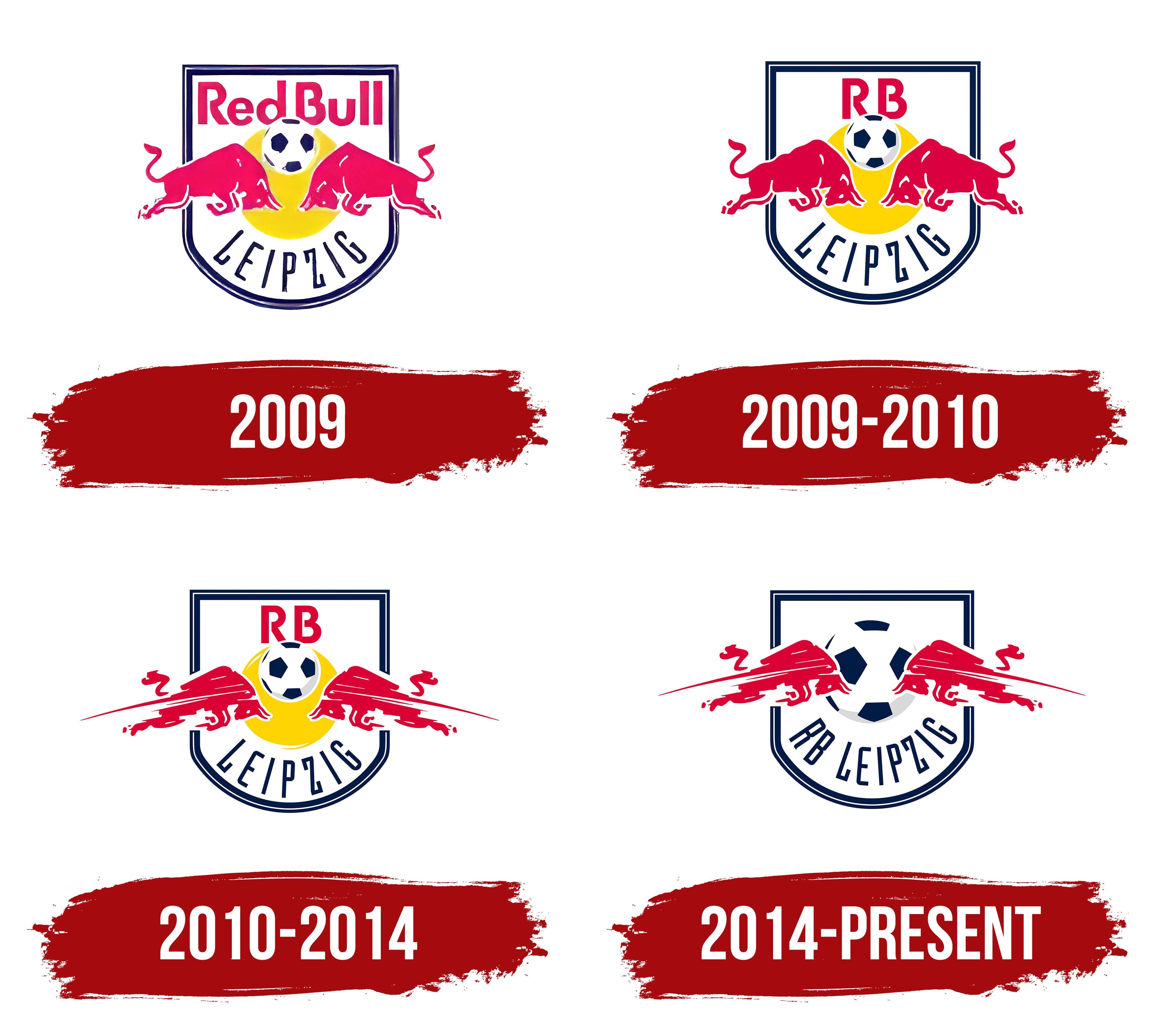
2009
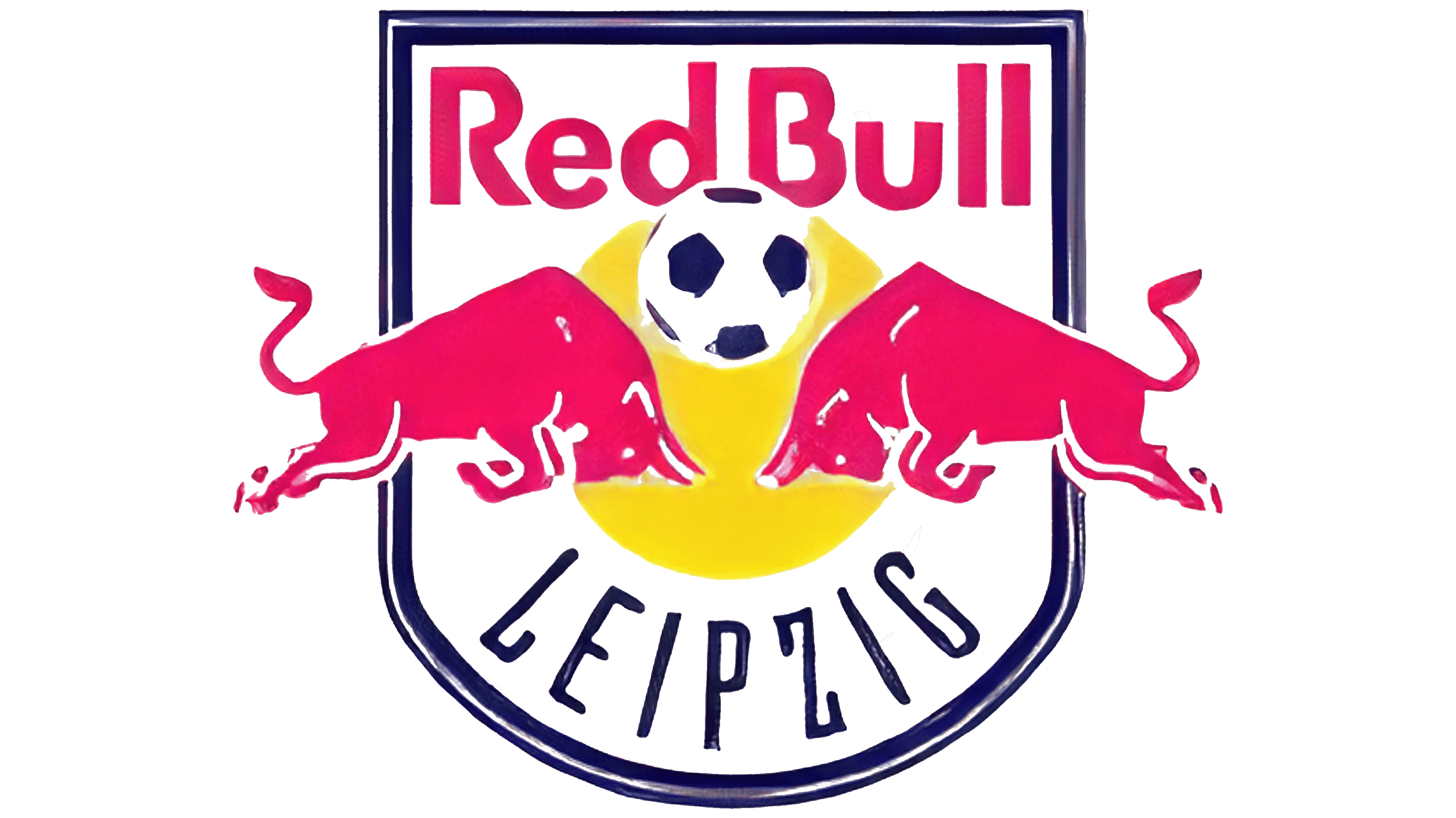
The first RB Leipzig logo appeared after the club was founded. Red Bull’s design studio created it and is responsible for all the company’s sports branding. The emblem was shaped as a shield with a white background and purple outline, symbolizing protection and stability.
In the center were two red bulls facing each other, representing Red Bull’s core image of power, energy, and competition. Between them was a yellow sun containing a soccer ball, symbolizing the team’s unity and the game itself.
The lettering used a unique typeface combining straight lines and rounded edges, colored Crayola red to match the bulls. The lower part displayed the curved word “Leipzig” in narrow black letters, emphasizing local identity.
Crayola red and yellow were Red Bull’s corporate colors, used throughout its sports branding.
2009 – 2010
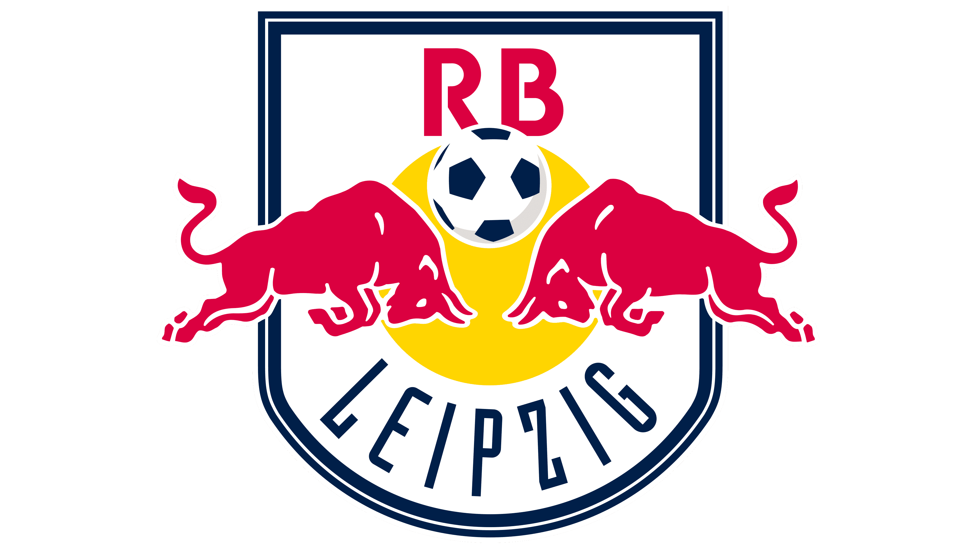
The updated RB Leipzig logo has been slightly modified from the previous design. Red Bull’s studio handled the redesign, adjusting the top part: the words “Red Bull” were replaced by the shorter “RB,” rendered in a font with angular geometric proportions.
The bulls were entirely redrawn to increase their aggressiveness and dynamism, with sharper outlines. The classic color palette remained, featuring bright red for the bulls and the “RB” text, a white background, and a vivid yellow sun.
The soccer ball received realistic graphic detailing. The lower “Leipzig” lettering retained its style, while the emblem’s shield was outlined in blue to emphasize the sports aspect.
2010 – 2014
In 2010, another subtle redesign enhanced the sporty aspect. The bulls formed dynamic lines, creating a sense of motion that emphasized confrontation.
A minimalist approach eliminated small details, making the bulls appear more modern and realistic. The club’s name and “RB” lettering remained unchanged, but the new style added overall dynamism.
2014 – today
In 2014, the club updated its logo for the second time, making a soccer ball one of its key elements for the first time and replacing the previous yellow sun symbol. The change in symbolism reflected the club’s desire to meet the strict requirements of European football tournaments, including UEFA regulations governing advertising on team uniforms and equipment.
The composition continues to be based on a shield with a rounded lower part. The color is dark blue, with a double outline along the edges. The central area is occupied by a ball of classic form, executed in a traditional style with a white surface and blue pentagonal panels.
On either side of the ball are symmetrical figures of two bulls rendered in red. The animals are depicted mid-jump, facing one another, with their lines extended and tense. The image conveys the sport’s inherent struggle and emphasizes the team’s competitive mindset on the field. The bulls’ drawing style was preserved from earlier versions of the emblem.
An important change concerned the placement of the club name. The inscription “RB,” previously located in the upper area of the shield, was moved downward. In the lower inscription “RB Leipzig,” the letters are large, written along an arc that follows the curve of the shield’s lower edge. A geometric sans-serif typeface was chosen for the design, reminiscent of strict, concise fonts such as DIN or Helvetica Condensed.
The color scheme remained unchanged and is based on bright red, dark blue, and white.
Font and Colors
The logo features a unique sans-serif typeface with elongated letters that convey athletic rigor. The geometric lines resemble Pixeloza 01 Regular or Agency Gothic Condensed, with minor modifications. Rectangular glyph shapes convey strength while maintaining contemporary aesthetics.
The color scheme mirrors Red Bull’s corporate branding. Red dominates, symbolizing energy, complemented by deep blue, which represents seriousness and stability. White provides a neutral background. Yellow was removed after the redesign to achieve a simpler, cleaner look.