 Rec Room Logo PNG
The Rec Room logo is associated with a virtual space where users can communicate and play freely. It’s a platform that connects people without strict rules and restrictions, making interaction lively and natural.
Rec Room’s history began in 2016 when six Microsoft employees working on HoloLens left the company to found the startup Against Gravity. Initially developed for virtual reality headsets, the project featured simple mini-games, such as paintball and dodgeball, with an emphasis on social interaction.
The first version was released after just 99 days of development and was available for free to HTC Vive users. The rapid addition of content and creative tools transformed the Room into a platform for creating user-generated virtual worlds and games.
After launching on PlayStation VR in 2017, the project expanded to other platforms, including consoles, PCs, and mobile devices. In 2020, Rec Room’s audience surged after versions for Xbox and iOS launched. By 2021, the company had raised over $100 million and had become the first VR project valued at over $1 billion.
By 2024, Rec Room had over 100 million users across ten platforms, including Nintendo Switch. Despite staff reductions in 2025, the platform continues to develop, adding professional tools, monetization options for content creators, and specialized accounts for younger users.
Meaning and History
What is Rec Room?
It is an online gaming platform combining social interaction and virtual entertainment. Users create cartoon-style characters and explore virtual worlds with friends. Each participant can design their mini-games, adventures, and levels. The platform is available on VR devices, computers, consoles, and smartphones. Revenue is generated from virtual items and character clothing.
2016 – today

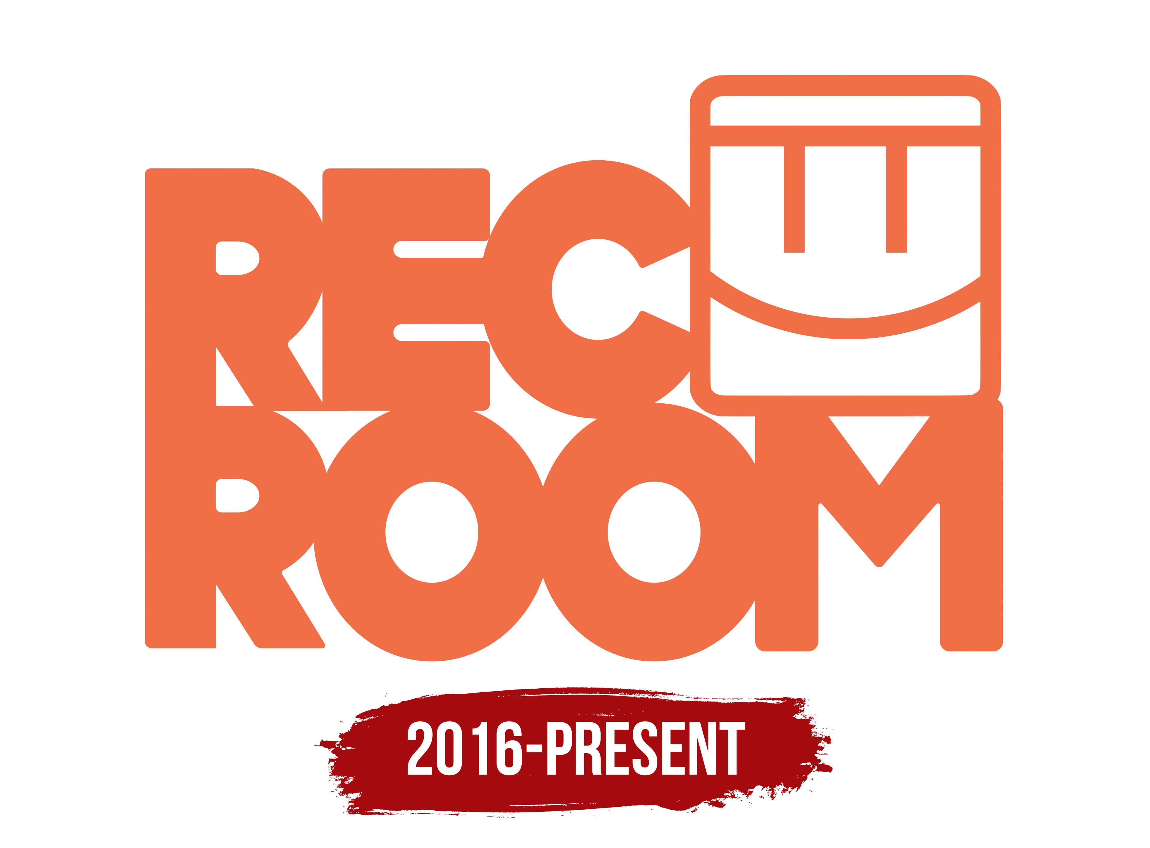
When the Rec Room platform launched, there was a need for a logo that could convey its gaming atmosphere and social focus. The new image was built around a bright, massive inscription conveying the spirit of live communication and user interaction.
The name Rec Room is arranged on two levels, forming a dense, visually unified rectangle. The letters are massive, rounded-edged, and placed tightly next to one another. The typeface used is sans-serif and geometric. In style, the characters are close to popular fonts such as Cooper Black and VAG Rounded, yet they appear even heavier and more dimensional.
The inscription was colored an energetic orange shade called “energetic coral.” It evokes positive associations and emphasizes the brand’s friendly, light atmosphere. This is the mood the platform’s creators aimed to convey: uniting people through shared virtual games.
On the right side of the inscription, a symbol resembling a smiling face is integrated. Its shape is executed as a square with rounded corners. Inside the figure, two short vertical bars represent the eyes, and the lower line depicts a smile. The symbol resembles a digital avatar or game character, underscoring the service’s main idea: communication between players.
The symbol is organically integrated into the overall text block and is perceived as a natural continuation of the letters.