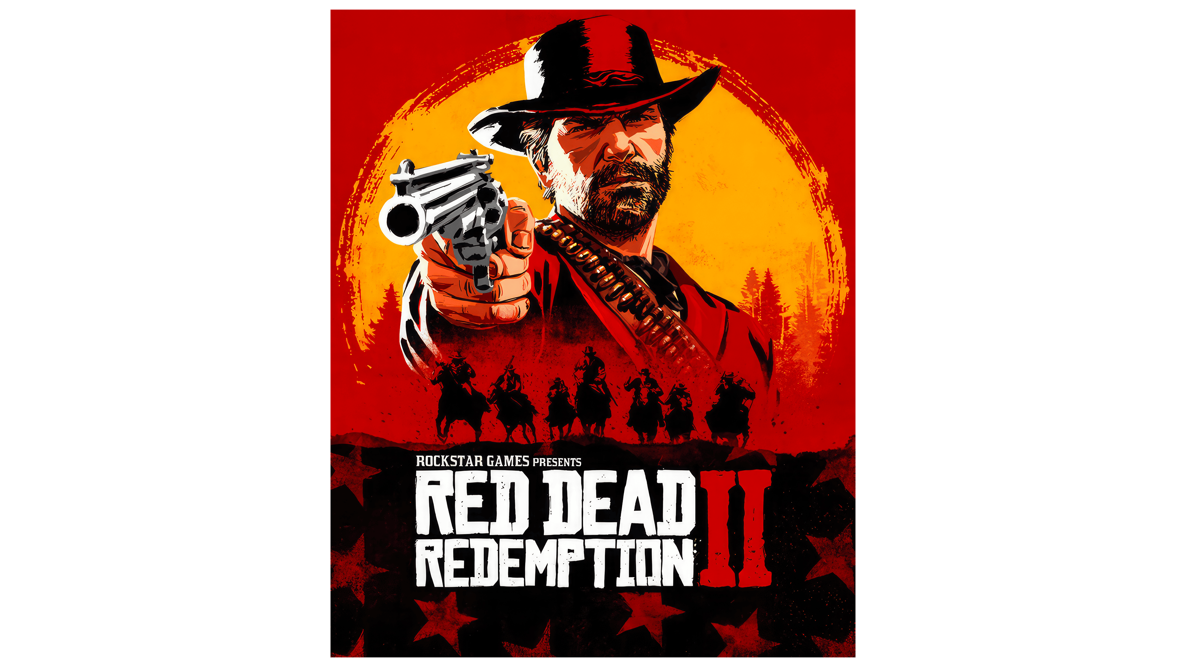
 Red Dead Redemption Logo PNG
The Red Dead Redemption logo represents an adventure video game set in the American Wild West. The emblem hints at third-person action, containing general storyline characteristics without specifying exact events.
Development of Red Dead Redemption began in 2004 as a western project inspired by Red Dead Revolver. By 2006, Rockstar San Diego was building an open world around the decline of the American frontier, drawing on films, literature, and historical sources. Work on the RAGE engine advanced in 2008, supporting changing weather, detailed animation, realistic characters, and the honor system.
More than 800 people tested the game in 2009, focusing on performance, technical issues, voice acting, and music. Rockstar Games released the title on May 18, 2010, for Xbox 360 and PlayStation 3. Undead Nightmare followed in October with a zombie storyline and new missions. A Game of the Year edition arrived in 2011, when sales had passed 12 million copies worldwide.
A sequel was announced in 2016 and developed across several studios. Red Dead Redemption 2 launched on October 26, 2018 for Xbox One and PlayStation 4, selling almost 17 million copies during its opening weekend. The PC version followed in November 2019 with improved graphics, extra content, and new customization options.
Red Dead Online expanded the series with multiplayer modes and regular updates through 2020, 2021, and 2022, while players created their own modifications. By 2023, the franchise had sold more than 50 million copies worldwide across console and PC releases and had received awards for its design, storytelling, character work, historical setting, and open-world technology.
Meaning and History
What is Red Dead Redemption?
This is an action-adventure video game in which players control John Marston, a former outlaw, on a quest to track down his former gang members. The game takes place in an open world that faithfully recreates the atmosphere of the American Wild West. Players can explore deserts, mountains, towns, and wilderness, engage in various missions, and follow a storyline that delves into themes of loyalty, redemption, and the tension between law and chaos. The game features an honor system, interactions with other characters, and numerous side activities like horseback riding, hunting, and gambling. It offers an immersive world that reacts to player choices, creating a unique gaming experience.
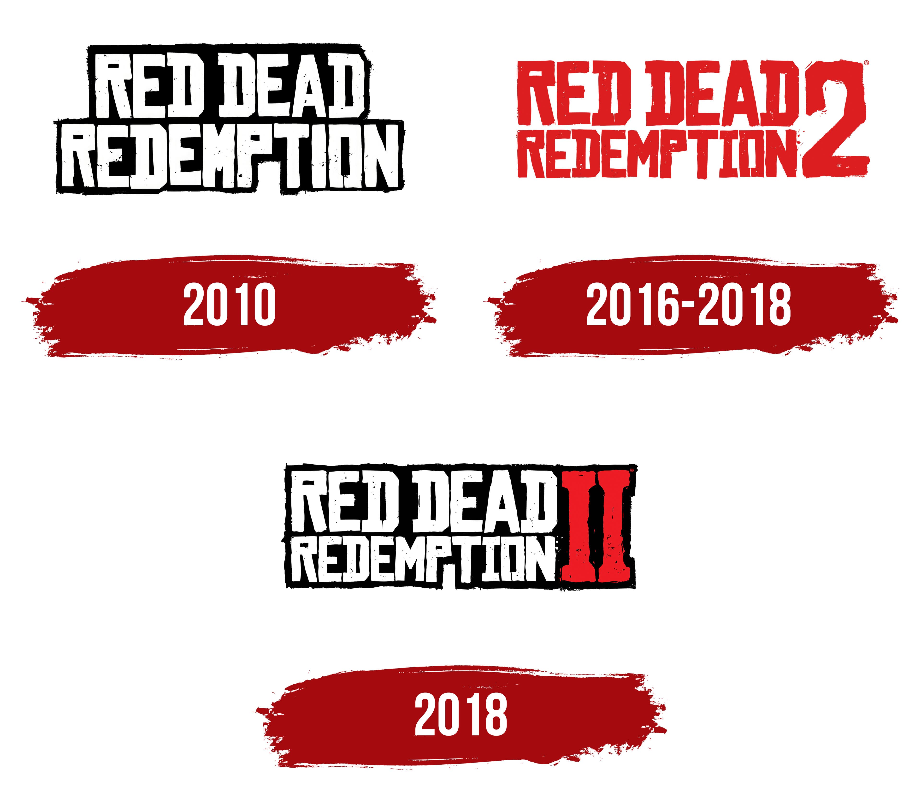
2010
The Red Dead Redemption logo is extremely simple yet aggressive, reflecting the storyline, which demands that the protagonist take active measures to rescue his wife and son from captivity. Its simplicity lies in several aspects:
- Roughness
- Monochrome
- Massiveness
The emblem’s key feature is its simplicity, as the hero cannot afford to waste time on unnecessary details; he must act urgently to complete his mission. This is reflected in the intentional roughness of the inscription, rendered in uppercase letters with a worn texture: scratches, dirt splatters, and torn edges are visible throughout.
The monochrome design perfectly complements the geometric glyphs, emphasizing the seriousness of the game’s events and the protagonist’s binary perception of everything happening: black and white. The emblem underscores his view of the world as divided into light and dark, good and evil.
The massive font highlights the events’ significance, destiny-shaping nature, and tremendous importance to the characters. The inscription appears unbreakable, yet the damage to the letters suggests fragility, as though it could crumble to dust with any impact.
The title is split into two centered lines, rendered in extra-bold sans-serif font. The irregularity of the glyphs amplifies the sense of inner emptiness, anger, and danger: each is unique. Even paired letters differ in the width of their inner space, the roughness of their edges, and other details. The only uniform aspect is the background, which is consistently black and textured.
2016 – 2018
In this case, the Red Dead Redemption logo appears like a wall inscription painted with a broad brush, suggested by various details. These include uneven letter ends, paint drips, splatters, inconsistent lines, and unpainted areas. The red color palette heightens the sense of danger, as it resembles blood. The text is split into two levels:
- The phrase “Red Dead” is on the top line.
- The word “Redemption” is at the bottom.
This time, both parts are justified rather than centered, as they are equal in length. To achieve this effect, the designers reduced the glyphs’ size in the second line while maintaining their rough style.
Next to the title, on the right side of the logo, is a large number “2” designed in the same geometric style as the text. It is uneven, rough, and covered in drips and splatters. Like the letter “D,” one upper corner of the “2” is cut off to balance the elements visually.
2018
This version of the Red Dead Redemption logo retains the title’s two-level structure. It is based on the 2016 pre-launch design, which precisely replicates the letter sizes, appearance, line lengths, font style, splatters, unpainted areas, uneven lines, jagged edges, and other details.
At the same time, the designers added a black background, linking it to the design of the first video game. They even preserved the white gap between the “P” and “T,” which gives the logo its unique character. Since the lines are justified, the background appears solid and forms a horizontal rectangle. Its edges are uneven, featuring indentations and protrusions, as if it were a torn piece of cardboard.
The logo’s red color prevents it from being monochromatic. It appears to the right of the text, coloring the Roman numeral “II,” which replaces the Arabic numeral, making the emblem more expressive and professional. The single glyph is vertically elongated, spanning both lines. It features massive serifs and bold strokes.
The Character Red Redemption Logo