 ResMed Logo PNG
Nighttime sleep for people with breathing disorders requires special support to maintain a steady airflow. Apnea therapy devices and related equipment help control breathing at home and maintain a normal sleep pattern. The ResMed logo is associated with a company that develops and manufactures medical equipment for treating respiratory disorders, including CPAP machines and patient monitoring systems.
Engineer Peter Farrell founded ResMed in Sydney in 1989. The goal was to commercialize CPAP technology developed by Professor Colin Sullivan in 1981. The device delivered pressurized air to prevent breathing interruptions during sleep apnea. It became the first noninvasive treatment for this disorder.
In the 1990s, the company focused on developing compact and low-noise devices for home use. In 1995, ResMed listed its shares on the Australian Stock Exchange. In 1996, it opened a headquarters in San Diego to serve the American market. In 2000, the company entered the New York Stock Exchange.
In 2005, the company introduced the AutoSet model with automatic pressure adjustment. In 2010, the company launched the AirView platform to enable remote monitoring of physician-therapist interactions. In 2016, ResMed acquired the company Brightree. The deal was valued at $ 800 million.
Since 2018, ResMed has developed miniature, smart solutions, including AirMini and AirSense 11, using machine learning technologies. In 2019, the company acquired MatrixCare to serve nursing homes. In 2021, it purchased Propeller Health, a manufacturer of digital inhalers.
ResMed remains a global leader in producing CPAP systems, masks, and cloud platforms for sleep therapy. Patients in more than 140 countries use the company’s products.
Meaning and History
What is ResMed?
An international medical corporation headquartered in San Diego, it was founded after the invention of the first CPAP device for treating sleep apnea. The company produces equipment for non-invasive lung ventilation, including CPAP, BiPAP, automatic home-use systems, masks, and digital solutions for remote monitoring. Its range includes the compact AirMini device, the UltraSoft seal mask, and the cloud-based AirView platform for storing medical data. Production centers operate in Australia, the United States, Singapore, and France, and it supplies products to 140 countries. The company employs more than 7,500 people and has an annual turnover of about $3 billion.
1995 – 2014
ResMed grew out of a device developed to treat sleep-related breathing disorders. In 1981, University of Sydney professor Colin Sullivan demonstrated the use of continuous positive airway pressure for obstructive sleep apnea. Air delivered through a nasal mask kept the airway open and helped maintain breathing during sleep.
The development interested chemical engineer Peter Farrell, who headed Baxter’s Australian research division. When Baxter discontinued work in the field, he acquired the technology rights. On May 29, 1989, Farrell founded ResCare in Sydney. In the original name, “res” referred to “respiratory,” while “care” indicated medical care.
In 1995, the company was renamed ResMed. The name was formed from “Respiratory Medicine.” It preserved the connection to treating breathing disorders and accompanied an expanding product range. Masks, humidifiers, and other sleep therapy products joined the original positive airway pressure device. The uppercase “M” separated the name’s 2 components. The legal name later became ResMed Inc.
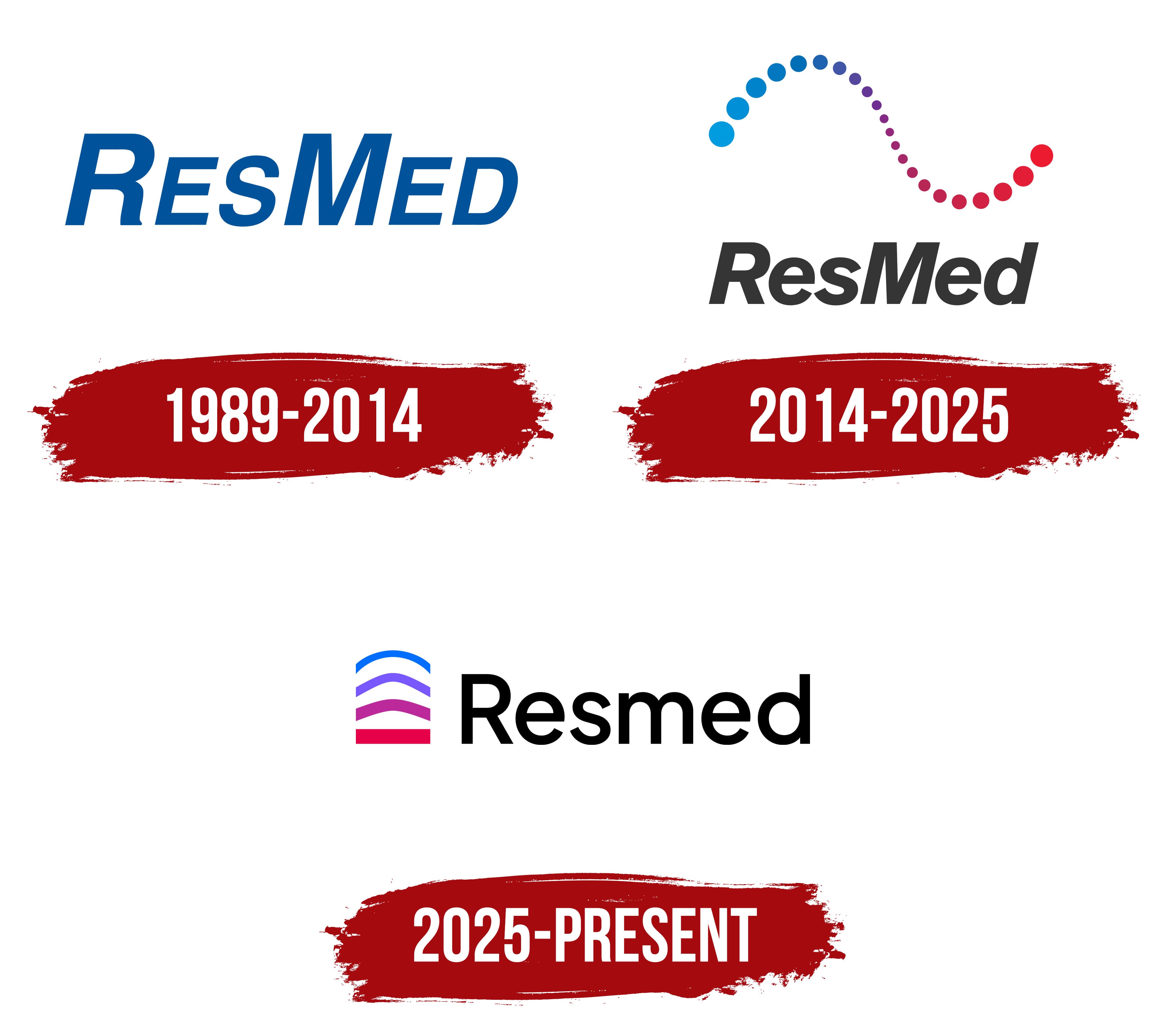
An early known logo dates to the period following the 1995 name change. It consisted entirely of the name in slanted blue letters. The wordmark occupied a single horizontal line. Tight spacing brought the letters together in a dense block, while custom lettering presented the company’s new name.
The initial “R” and “M” rose above the other letters, marking the beginnings of “Respiratory” and “Medicine.” The remaining letters resembled small capitals. The bold sans-serif lettering shared a rightward slant. The repeated angle connected letters of different heights and gave the wordmark a technical appearance suited to a medical equipment manufacturer.
The entire wordmark was blue. The components of the name were distinguished by letter height while retaining a single color. The one-color logo suited use on device housings and masks, as well as in instructions, packaging, and technical documentation.
2014 – 2025
By 2014, ResMed was expanding beyond sleep apnea therapy. The company addressed other breathing disorders and chronic conditions, including chronic obstructive pulmonary disease. It was developing software products and preparing the Air10 series with cloud connectivity. The updated identity aimed to unite medical equipment, digital development, and patient communication around the shared theme of treatment outcomes.
The company unveiled the new logo on March 10, 2014, alongside the tagline “Changing lives with every breath.” The phrase connected patient care with breathing and changes in everyday life. The company described the update as its first rebranding in its 25-year history. A separate pulse-curve emblem was added to the wordmark, and the name’s color changed.
The slanted ResMed wordmark retained uppercase “R” and “M” letters with lowercase letters following them. The heavy sans-serif treatment further developed the previous letterforms. Dark gray replaced blue, giving the name a subdued role beneath the multicolored emblem. The shared rightward slant connected the letters in a single horizontal line.
The pulse curve was composed of circular dots of different diameters. They formed a smooth S-shaped line. Large circles at the left edge shrank as the curve descended toward the middle, then grew again on the right. The changing sizes conveyed phases of the breathing cycle and pulse. Gaps between the dots divided the line into individual sections and gave the medical signal soft contours.
Bright blue transitioned through purple into a rich red. In the emblem’s interpretation, the color sequence represented blood oxygenation and the connection between breathing and heart function. The blue section indicated the beginning of the process, while red marked its completion. The colors and dot sizes worked together to convey the image’s medical theme.
The tagline “Changing lives with every breath” appeared beside the logo on an additional line. It referred to therapy’s ongoing impact on a patient’s life. It paired the breathing-process image with a promise of care.
The rollout began in the U.S. business and continued across international markets during 2014. The pulse curve appeared on ResMed equipment, in digital products, and in company materials alongside the dark, slanted wordmark. The tagline was added in designated applications.
2025 – today
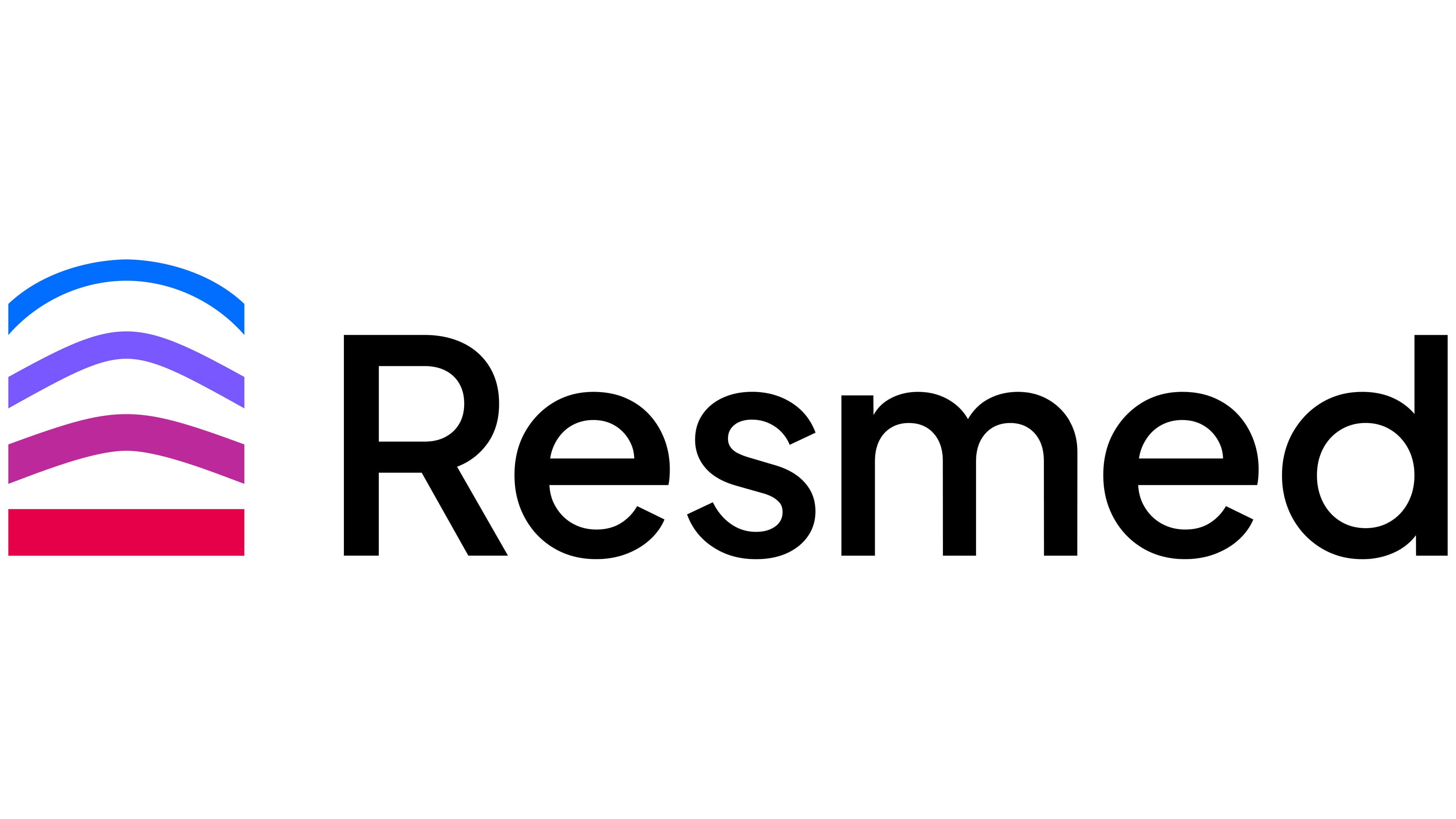
In 2025, ResMed updated its brand to unify the visual identities of its products and services. By then, the company was producing CPAP machines, masks, and cloud-connected devices while developing software, digital platforms, and home care services. Its divisions presented the brand in different ways. A shared identity was intended to connect them under one name for healthcare professionals, patients, and software users.
Monigle introduced the new system on March 11, 2025. Monigle developed it around the brand platform “Rise to your highest potential.” The phrase connected restful sleep and easier breathing with improved well-being and the ability to fulfill one’s potential. The project covered the brand name and visual identity, brand architecture, and audience communication guidelines. ResMed’s businesses were to transition to the shared system in stages.
The spelling changed from “ResMed” to “Resmed.” Only the initial “R” remained uppercase, while the internal “M” became a lowercase “m.” The name now continued in uniform lowercase, and the emphasis on “Med” gave way to a unified presentation of the company in consumer health technology.
In the logo, the name was placed to the right of the multicolored emblem. The black sans-serif letters became upright and rounded. An upright wordmark replaced the previous slanted treatment. The single-color text separated the name from the color transitions in the image on the left.
Four bands stacked one below another replaced the dotted pulse curve. The upper 3 curves form arches of different heights and thicknesses. The upper blue band is thinner than the others and has a rounded peak. The lower red section forms a base with a straight upper edge. Together, the bands form a compact vertical figure.
The shape was inspired by medical diagrams of alveoli showing oxygen and carbon dioxide exchange during inhalation and exhalation. The layers and curves conveyed the breathing process in a simplified form. The rising arches continued the “Rise to your highest potential” theme and connected the emblem to improved well-being.
The color sequence maintained a connection to the 2014 logo. Electric blue appears at the top, followed by purple and magenta, with rich red at the bottom. In the brand’s interpretation, the transition from cool to warm shades conveys oxygenation. Gradients add intermediate tones within the bands while keeping their contours separate.
We named the primary colors Blissful Blue, Peaceful Purple, Majestic Magenta, and Renewing Red. We added Galaxy Gray, black, and lighter versions of the main shades. On a light background, the colored emblem is paired with black “Resmed” lettering. On a dark background, the wordmark becomes white while the arches retain their colors.
The full logo combines the emblem and name horizontally. The arches are used separately for app and profile icons. Monigle’s work received a silver award at the Transform Awards North America 2025 in the “Best brand evolution, business” category.