 Ryder Logo PNG
Logistics and transportation encompass fleet management, freight delivery, and vehicle maintenance, ensuring goods move along designated routes. Companies in this sector must meet deadlines, maintain vehicle condition, and organize shipments. The Ryder logo is associated with a company that provides truck rental, fleet management, and logistics services for businesses.
Ryder was founded in 1933 by nineteen-year-old James Ryder in Miami. At first, he owned one Ford Model A truck and delivered concrete for hotel construction on Miami Beach. In 1938, the company received its first major contract: leasing five trucks to Champagne Velvet Beer, a beverage distributor. This agreement became the starting point for building the truck-leasing business.
In 1952, the company launched a pioneering operation called “piggyback.” It combined trucking and rail transportation. In the same year, Ryder acquired Great Southern Trucking Company. In 1955, Ryder System, Inc. was established. It consolidated all business activities and became public.
By the late 1950s, the company had entered the Canadian market. In the 1960s and 1970s, it began developing distribution and supply chain management operations. In the 1980s, Ryder entered aircraft leasing. It acquired Aviation Sales and Aviall. By 1987, the company had implemented the Just-In-Time system designed for the automotive industry.
In 1999, Greg Swienton became president. In 2000, he became CEO and led the company’s digital transformation. During this period, Ryder established a transportation management center in Dallas. In 2001, Ryder entered the Asian market and acquired Ascent Logistics in Singapore.
In 2003, Ryder purchased General Truck Leasing and RUAN Leasing. That same year, it began operations in Chile. In 2005, the headquarters moved to a new building in Miami. In 2006, Ryder received the Award of Excellence.
Since 2012, the company has implemented telematics technologies under the RydeSmart brand. From 2015 to 2018, Ryder transformed its business toward less capital-intensive logistics solutions. In 2022, the company strengthened its e-commerce position by acquiring Whiplash and Midwest Warehouse. It acquired Whiplash and Midwest Warehouse.
In 2023, the company completed one of its largest acquisitions, buying Impact Fulfillment Services. In January 2024, it acquired Cardinal Logistics, strengthening its dedicated transportation segment.
The company continues to strengthen its position in logistics and supply chain management. It is developing a diversified business model and operating in global markets.
Meaning and History
What is Ryder?
An American holding company headquartered in Miami, operating in logistics and transportation. Its main activities include truck rental and leasing, maintenance, and supply chain management. The company operates in three segments: Fleet Management Solutions, Supply Chain Solutions, and Dedicated Transportation Solutions. The first covers fleet leasing and service, the second includes warehousing, distribution, and last-mile delivery, and the third provides customized solutions with dedicated driver teams.
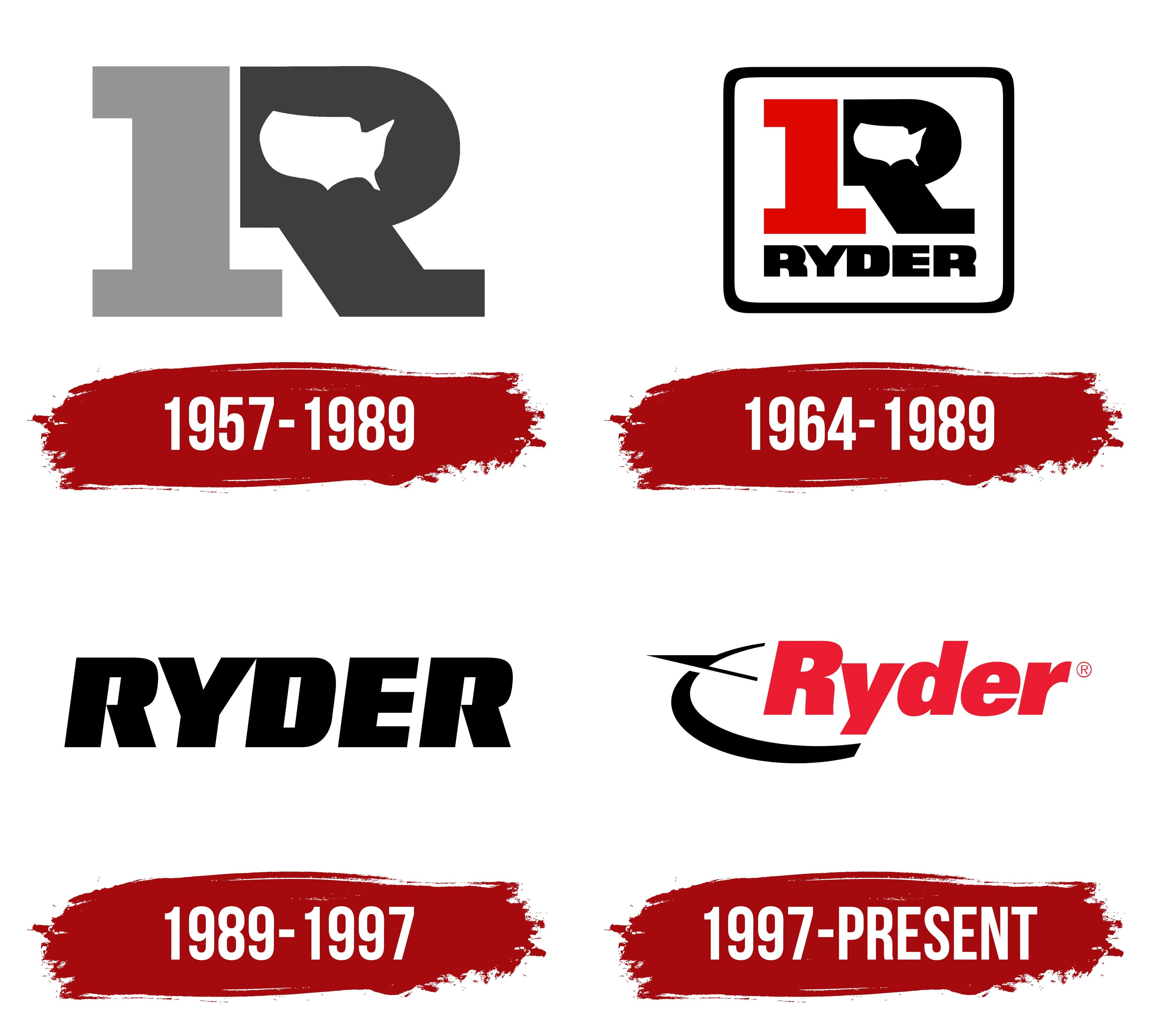
1957 – 1989

A white silhouette of the contiguous United States inside a large “R” connected Ryder’s early emblem to its nationwide transportation operations. The map showed the West and East Coasts, with Florida extending from the lower portion. Design Research, Inc. developed the version introduced in February 1957. It consisted of 2 adjoining parts. A light gray numeral “1,” with broad horizontal extensions at the top and bottom, served as the letter’s left stem. A dark gray rounded section with a diagonal leg completed the “R.” Together, they formed a solid, nearly rectangular silhouette.
The letter referred to founder Jim Ryder’s surname. In 1933, he bought a used Ford Model A and began hauling concrete in Miami Beach. Five years later, the company signed an agreement with Champagne Velvet Beer to lease 5 trucks. Leasing became a separate line of business alongside transportation. Ryder later expanded into truck maintenance and warehouse logistics.
The path toward a shared fleet identity began in 1952, after Ryder acquired Great Southern Trucking Company. As the business expanded nationally, it began using the “Big R.” In the 1957 version, the first letter of the founder’s surname remained the leading element, with the numeral “1” and the U.S. map incorporated into the design.
1964 – 1989
In the 1964 version, Ryder’s emblem was enclosed in a thick black frame with rounded corners. The large monogram appeared at the top, with the full surname below. RYDER added the company’s name to the existing combination of the numeral “1,” the letter “R,” and the U.S. map.
A red numeral “1,” with broad horizontal strokes, forms the monogram’s left stem. A black rounded section with a diagonal leg sits beside it, completing the “R.” Within its opening is a white silhouette of the contiguous United States, including the coastlines and the Florida peninsula. Heavy black sans-serif capitals spell RYDER beneath the monogram. Tight spacing lets the surname fit within the frame. Red distinguishes the numeral from the black portion of the “R” and the lettering below.
1989 – 1997

The next logo consisted of the Ryder name. In April 1989, the company introduced a black RYDER wordmark with 5 large letters, replacing the frame, numeral, and U.S. map. Bright & Associates developed the new identity. In the late 1980s, Alan Rellaford, the agency’s senior design director, helped develop it and led the project.
All the letters were uppercase, heavy, and slanted to the right. The sans-serif lettering used thick strokes and small interior spaces. The letters were closely set. The name served as a standalone logo that required only black ink to reproduce.
On trucks, the black lettering appeared on a yellow body with a red stripe beneath it. The vehicle color and stripe complemented the logo as part of the fleet’s identity. When used separately, the RYDER wordmark retained the same lettering.
1997 – today
After selling its consumer truck rental business for household moves, Ryder focused on commercial customers. The business changes were accompanied by an updated logo and fleet colors. On August 23, 1997, the company introduced red Ryder lettering with a black compass. Landor Associates created the project, with designer Lindon Leader associated with its development.
The compass sits to the left of the name, extending partly beneath the letters. An open arc defines its body, with a broad lower section and a thin upper tip. A pointed needle runs above it. The design reduces the navigational instrument to its basic outlines. The name retained heavy, slanted sans-serif lettering. A capital “R” followed by lowercase letters replaced the previous all-capital wordmark. The “y” descender extends below the baseline. The lettering uses Univers. Red, previously used in the stripe beneath the name, became the letter color.
In 2014, the company added the tagline “Ever better.” In versions that include it, the short line appears beneath the red name. The phrase promised to improve customers’ fleet and supply chain operations. It helped communicate Ryder’s business offerings beyond the familiar association with truck rental.