The Sanrio logo is filled with warmth, kindness, and genuine care. The emblem symbolizes sharing joy and positive emotions through unique souvenirs with cute characters created in a children’s anime style. The visual design conveys a sense of carefree love that the brand shares with every fan. The use of signature fonts and soft colors emphasizes the company’s mission to spread positive feelings, bringing light and happiness to people’s hearts worldwide.
Sanrio: Brand overview
Sanrio’s history began in 1960 when Shigeo Tsuji founded Yamanashi Silk Center Co., Ltd. in Tokyo, Japan. Initially focused on silk manufacturing and retail, Tsuji soon expanded the company’s offerings to include floral-patterned rubber sandals.
In 1962, the company introduced its first line of character products—affordable gifts and accessories featuring strawberries. The success of these items led Tsuji to focus on creating “kawaii” (cute) products. A major milestone occurred in 1973 with the creation of Hello Kitty, designed by Yuko Shimizu. The white cat with a red bow quickly became a cultural phenomenon and the face of the brand.
In 1974, the company officially changed its name, combining the Spanish word “san” (saint) with the English word “rio” (river) to symbolize freedom and purity.
The brand experienced rapid growth in the late 1970s and early 1980s, expanding internationally with U.S. and European stores. Hello Kitty’s image was soon featured on millions of products worldwide.
In 1990, the company opened Puroland, its first theme park in Tokyo, dedicated entirely to its characters, which became a popular tourist destination.
Throughout the 2000s, the business continued growing, partnering with major companies and designers to create products for children and adults. Hello Kitty appeared on everything from electronics to high fashion.
In 2008, a new character line called “Boys” was introduced, aimed at appealing to a male audience and broadening the market.
2010, the company celebrated major anniversaries: Hello Kitty’s 35th and 50th. Special events and limited-edition merchandise marked these milestones.
2013, the brand expanded into themed dining by opening the first Hello Kitty restaurant in Hong Kong. The next year, in 2014, a spokesperson revealed that Hello Kitty is not a cat but a young girl. This surprising statement sparked debate among fans and in the media.
2015, the company ventured into entertainment with the animated series Hello Kitty and Friends Supercute Adventures. By 2018, it launched a line of pet products, further diversifying its market reach. In 2019, plans for a feature-length Hello Kitty movie were announced, marking another step in the brand’s media expansion.
Despite challenges in 2020, the company adapted by enhancing its digital presence, launching new online initiatives, and engaging with fans through mobile apps and games.
As of 2023, the brand remains a global leader in adorable products. The company continues introducing new characters while maintaining the charm of beloved figures like Hello Kitty. By expanding its digital offerings and engaging fans online, it has successfully adapted to modern trends, all while staying true to its core motto: “A small gift, a big smile.”
Over 60 years, the business has evolved from a small silk company into an internationally recognized brand, beloved for its charming characters and cute merchandise.
Meaning and History
What is Sanrio?
This is a Japanese leader in kawaii culture, well known for its cute characters that have captured the hearts of fans worldwide. The central symbol of this empire is Hello Kitty — a white cat with a simple yet expressive design, which has become an international icon of sweetness and charm. The brand’s brilliance lies in its ability to give seemingly minimalist characters unique personalities and stories, creating a wide range of beloved characters that attract people of all ages. The brand includes characters like the gentle My Melody and the sassy Badtz-Maru, each living in their small world yet integrated into the brand’s universe. The appeal of these characters is their ability to convey universal emotions through simple visual designs, making them popular across different cultures and age groups.
1960 – 1970
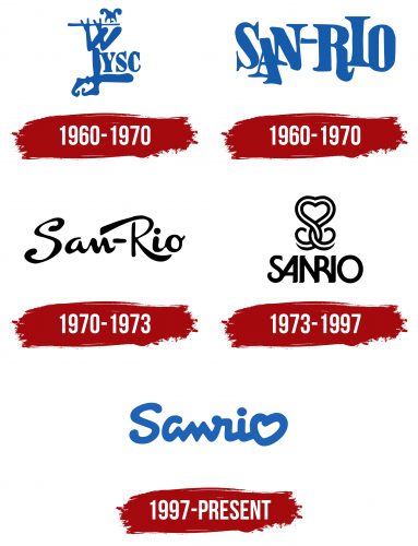
The company’s first emblem is designed in a blue monochrome style, depicting a jester playing a pipe. His legs are crossed, and on the thigh of one leg, the abbreviation YSC is placed, representing Yamanashi Silk Company. The design takes us back to past centuries when jesters were an integral part of royal courts and entertainment, where courtiers dressed in luxurious silk garments. This precious material was only available to the upper class. The jester in the emblem symbolizes dedication and service, which is associated with the company’s mission to meet the needs of its clients. The silk produced by YSC meets the highest standards and continues traditions worthy of the wealthiest and most influential people.
1960 – 1970
The company expanded its product line by adding footwear and decorating flip-flops with images of popular cartoon characters, significantly increasing sales. This success contributed to the brand’s rapid growth under the Sanrio name. The new name is based on an alternative reading of the kanji characters representing Yamanashi—Sanri. The last sound, “o,” can be interpreted as an exclamation of admiration, often uttered by customers upon seeing the company’s products.
Another interpretation of the name is based on the Spanish words “saint” (San) and “river” (Rio). The logo’s design supports this version: the name is split into two parts—San and Rio—with the letters placed very closely together as if they are flowing after one another like river waves or silk fabric. The two parts of the name symbolize balance, like two sandals joined in a single pair, emphasizing the brand’s harmony and unity.
1970 – 1973
The black emblem gives the brand elegance, highlighting its status as a fashionable clothing and footwear manufacturer. The logo is crafted with refined sophistication, making the lettering look stylish. The elongated flourishes in the letters create a sense of lightness and subtlety, adding visual charm and dynamism to the entire design. The choice of script enhances the feeling of exclusivity, emphasizing that the company’s products set their owner apart, making them unique. The emblem reflects the high level inherent in the products and shows that the brand understands aesthetics and strives for perfection in every element.
1973 – 1997
The brand shifted its focus to creating gift figurines and products featuring its images under Sanrio, completely abandoning its former name, YSC. The new logo radiates warmth and evokes positive emotions. The emblem includes a ribbon that, as it intertwines, forms a heart with flourishes resembling the decoration on a gift bow. This symbolizes the care and attention put into each company’s products. The name is written in blue, smoothly and fluidly, with the last letter “o” transforming into a second heart, reinforcing the feeling that each of the brand’s products is a “gift from the heart.”
1997 – today
The Sanrio logo is a simple and expressive visual solution that reflects the brand’s philosophy. The main element of the emblem is the lettering, done in a soft, rounded font, which is associated with the kindness and friendliness the brand conveys through its popular products.
An important emblem element is the heart at the end of the name. This symbol encapsulates the essence of the company’s philosophy, which focuses on creating cute and kind products that bring joy to people worldwide. The heart emphasizes the care, attention to detail, and positive emotion the products give to their fans.
The font of the lettering is simple yet fluid, without sharp lines, making the visual mark even more friendly and pleasing to the eye. The blue logo symbolizes calmness and trust, highlighting that the brand makes cute souvenirs that bring positivity and joy.
The company has always strived to make products that bring happiness to people of all ages, from children to adults. Therefore, the heart in the brand’s mark symbolizes the company’s love and care for its products.


