


![]() Super Smash Bros. Logo PNG
Super Smash Bros. Logo PNG
“The main thing is to select the target and hit it!” The Super Smash Bros logo focuses the player’s attention on the accuracy, which is important in battle. The emblem evokes large-scale battles, and its elements resemble objects used in attack.
Super Smash Bros. began in 1996 at HAL Laboratory in Tokyo, following Masahiro Sakurai’s completion of Kirby Super Star. He tested two prototypes: a stealth game with a remote-controlled robot and a four-player fighter without a standard health bar. The idea for fighting came partly from an arcade match in King of Fighters ’95, where Sakurai kept beating a beginner and felt the genre needed a format open to players of different levels.
The prototype was called Dragon King: The Fighting Game and used unnamed fighters. During a demo, a colleague suggested using Nintendo characters. Sakurai first doubted the idea, then made a version with four Nintendo heroes and showed it to Shigeru Miyamoto. After Miyamoto approved it, full development began.
Super Smash Bros. launched for Nintendo 64 in Japan on January 21, 1999, and in the U.S. on April 26, 1999. Nintendo’s marketing teams doubted the viability of a crossover fighter. At the same time, Capcom’s Street Fighter and Midway’s Mortal Kombat dominated the genre. Smash used another model: four-player platform battles where rivals were knocked out of the arena.
The game became an unexpected hit, leading to Super Smash Bros. Melee for the GameCube on November 21, 2001. Sakurai left HAL in 2003, founded Sora Ltd. in 2005, and then returned after Satoru Iwata pushed for a Wii sequel. Brawl arrived in 2008; the 3DS and Wii U versions followed in 2014, developed by Bandai Namco Studios; and Ultimate launched for Nintendo Switch on December 7, 2018, featuring every past fighter and over 80 characters.
Meaning and History
![]()
In modern versions of Smash Bros., up to eight players can face off in a scrum, while in the 1999 original, there were only four. The list of available characters has also grown significantly from 12 to 74. Moreover, it continues to grow at the expense of heroes from franchises that do not even belong to Nintendo.
The series’s popularity stems from its unusual concept. After all, the participants do not just fight among themselves; they can choose their favorite character from other video games and try to win, using their special skills to attack. With various locations, the fighting game becomes exciting and unpredictable.
Given the incredible popularity of Smash Bros., its logos are familiar to many gamers. We are talking about a round icon shaped like a crosshair, with a wordmark displaying the franchise’s name. These symbols have remained the mainstay of the game’s visual identity since 1999, although the lettering has undergone several redesigns in recent years.
1999 – today
![]()
The round badge with two perpendicular lines debuted alongside the original version of the fighting game, released for the Nintendo 64. It first appeared in the Smash Bros. intro cinematic in 1999. He can now be seen on objects and other objects in all subsequent games in the series. In addition, the crosshair icon is used as a design element. For example, it blinks on the loading screen, appears during pauses, and is displayed next to stage names.
1999 – 2001
![]()
The franchise’s first international logo appeared in 1999. It was featured on Super Smash Bros. for the Nintendo 64. The designers have made the game’s title flashy to mimic the comic book style. In the center was the yellow word “SMASH” with red kennels. The chosen geometric font, ITC Kabel Bold, was created by Victor Caruso in the 1970s.
The sides of the lettering (“SUPER” and “BROS.”) were also yellow. They used a vertically elongated Pritchard typeface – more precisely, its modified version with a rounded “U.” A black base in the form of an explosion reinforced the comic-book resemblance.
2001 – 2008
![]()
Super Smash Bros. was released in 2001. Melee is a fighting game released specifically for the Nintendo GameCube. A shiny logo was created for it with a black-and-red gradient, a white border, and silvery shadows. The modified inscription took two lines. The typeface was unified: typographers developed a single serif with a distinct design for all three words. The letter “O” resembles the franchise’s original circular logo. The three Ss (the first in SUPER SMASH and the last in BROS.) have been slightly enlarged.
2008 – 2014
![]()
With the advent of Super Smash Bros. Brawl, Brawl’s logo was modified again, though it largely echoed the second game’s wordmark. The designers have sharpened the font and repainted the series title in brown with an asymmetrical red gradient. The texture was uneven due to stains of different shades.
The developers have placed the inscription on two silver plates, surrounded by gray shadows along the edges. To balance the geometry, they had to arch the second row.
2014 – 2018
![]()
For Super Smash Bros. 4, a new emblem was created, this time brighter and brighter. As before, the main structure has been preserved: the inscription consisted of two parts. But the letters became tricolored. There was a blue stripe at the top of each word, a white stripe in the middle, and a pink one at the bottom. A black base was used instead of a silver base, with two sharp spikes along the edges and a dark blue gradient.
A fire was added to the right of the text, and not an ordinary one: the red-orange flame gradually turned into frozen blue ice. This image symbolized the battle between two elements, pitting opposing characters with different abilities against each other. The arched shape of the second line did not change. But the creators of the inscription decided to balance it by curving the first word in the opposite direction.
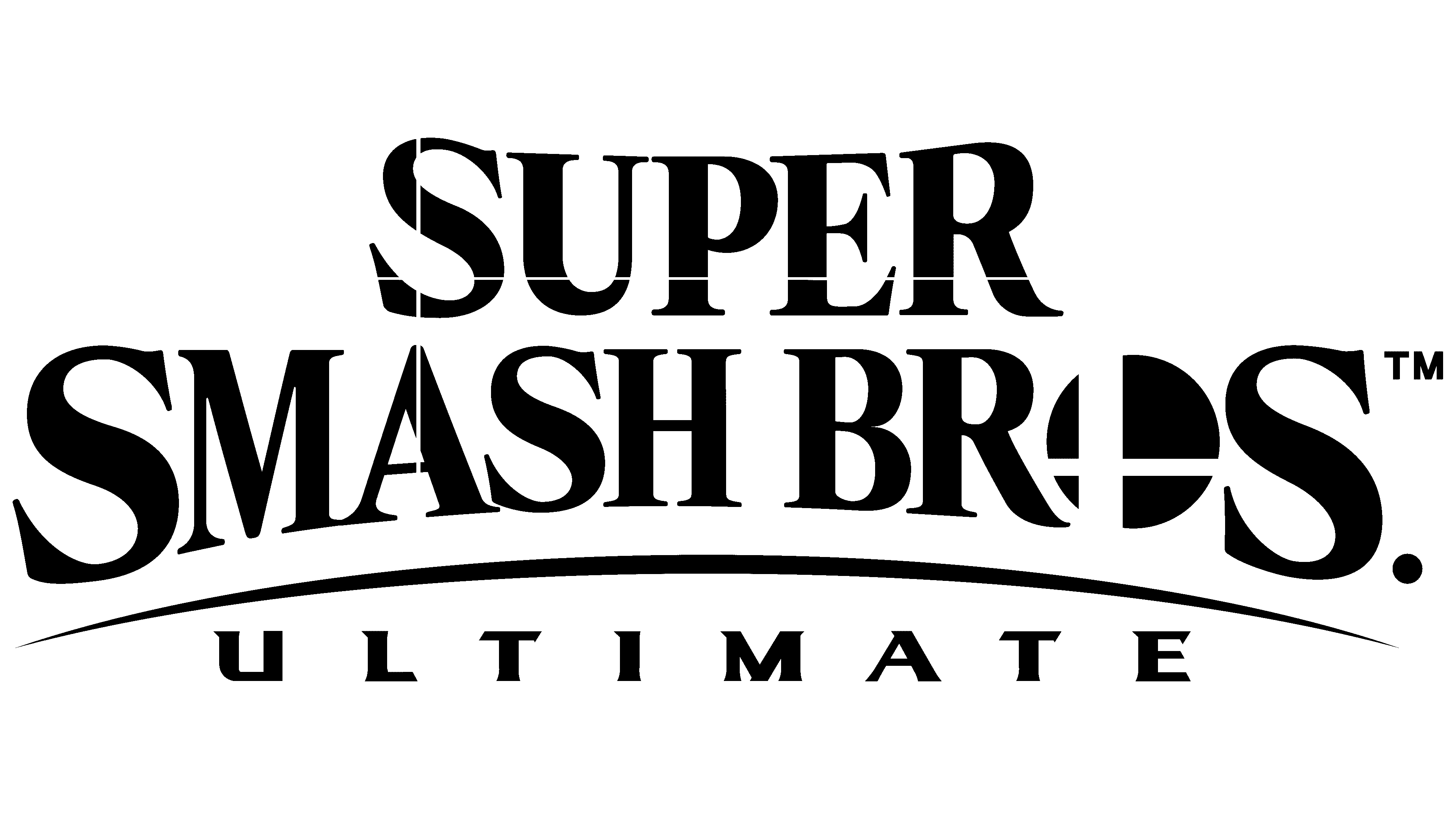
2018 – today
![]()
After Super Smash Bros. Ultimate, the logo was changed again. The fifth part of the series appeared at a time when minimalism came into fashion. Therefore, the designers made the letters solid black and removed all outlines, leaving a white background. The image of fire and ice also disappeared. Another interesting element appeared: two thin, perpendicular white lines running through the entire inscription, both along and across. By the way, thanks to the simplification, “O” now looks exactly like the franchise’s official symbol.
Font and Colors
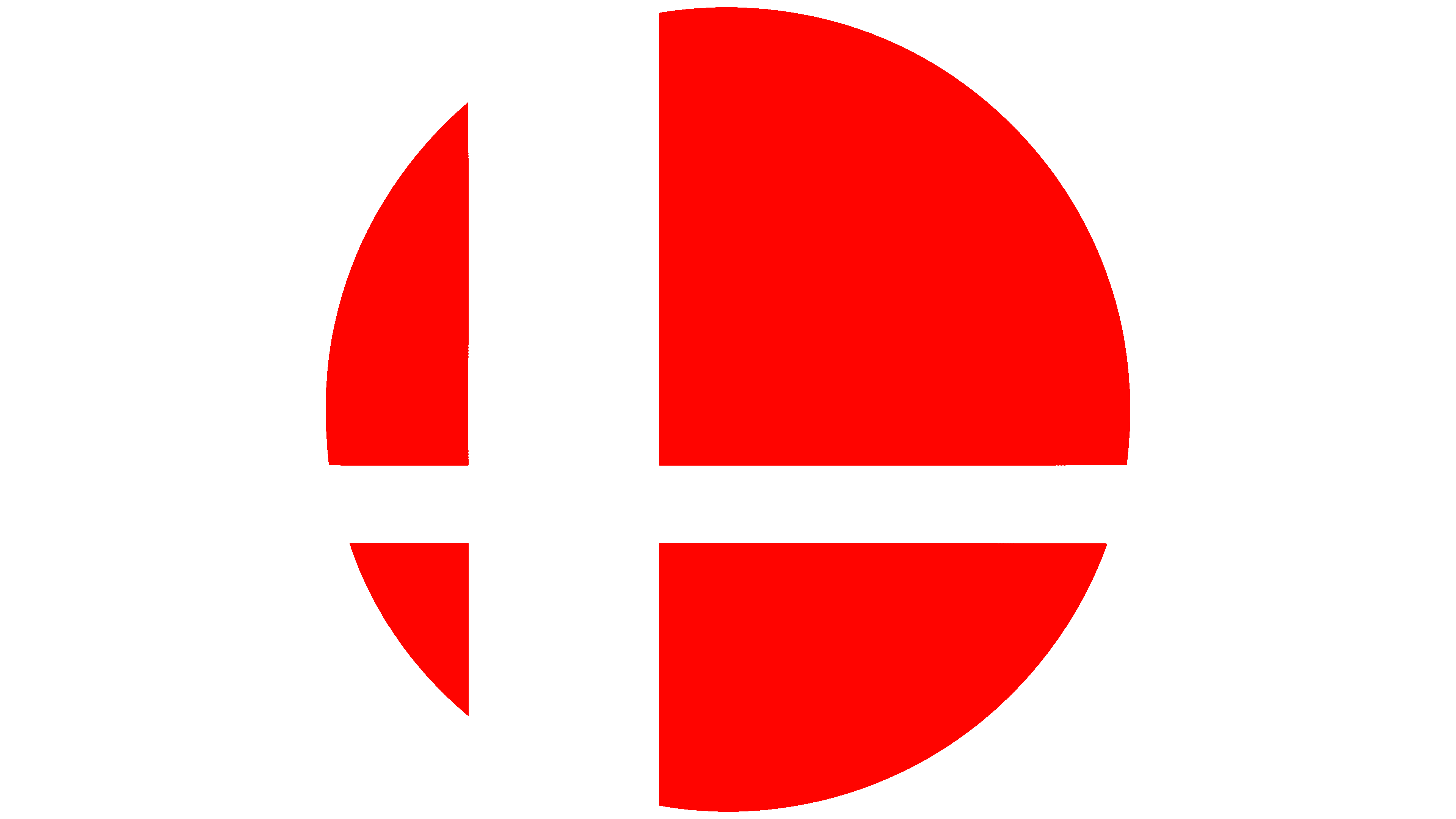
Fighting Super Smash Bros. can be easily recognized by the emblem created in 1999 for the first game. The graphic sign is simple: an even circle divided into four fragments by two intersecting stripes. Fans have speculated a lot about what this geometric figure might mean. Some saw it as a sight or a target, associating it with battles in the arena. Others saw the drawing as an abstract illustration of the sun shining through the window in the N64 intro video. Still others noted the image’s similarity to the Sports Series logo on the NES, which featured a tennis racket, a golf club, and a baseball bat. According to the Hungrybox esportsman, this is an image of an explosion that occurs when you lose.
Super Smash Bros. creator Masahiro Sakurai dispelled all rumors by interviewing Japanese comedians Yoiko for YouTube. In 2018, he revealed that the mysterious emblem means multiplayer. Each of the four circle fragments represents one participant because, at the beginning of the series, a maximum of four people could unite in a battle. Now, this is no longer relevant: in Smash Bros., up to 8 players can fight simultaneously, but the logo’s structure has not changed. At the same time, the two dividing lines symbolize the crossover nature of the fighting game, with characters from different franchises meeting in the arena.
Due to its ‘crosshair’ shape, the Super Smash Bros. once got into a scandal. A student at one school drew it on the blackboard, forcing the school to close briefly. People unfamiliar with the iconic logo thought it was a threat of mass murder.
The title of the fighting game series uses the original serif font based on the game’s old word marks. This is a high-contrast serif with the “O” replaced by a circular Super Smash icon. Both current logos are painted black with added white details. With such a minimalistic palette, the letters in the lettering look clear and easy to read, unlike in past versions with a gradient.