For young performers and composers, a unique service – Soundrop has changed its appearance, becoming even more attractive and appropriate to their tasks. With its help, novice performers of songs, musical compositions, and those trying to take the first steps in creating compositions have the opportunity to acquaint a huge audience of music lovers with their work. Soundrop services simplify the licensing process and provide the ability to distribute your songs to the most popular platforms for music listeners, such as Spotify, Apple Music, YouTube Music, Deezer, Pandora, Instagram, TikTok, etc., and others. At the same time, an opportunity for earning is provided – they listen to music, and the service sends a check to the performer. At the same time, the platform provides an opportunity for future development. This is achieved thanks to the support of real talents from professionals and true connoisseurs of music, with whom Soundrop connects its users. And all this for just $ 0.99 per song.
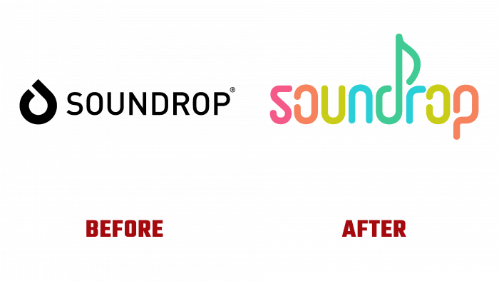
Over the years of its existence, the service has proved its necessity, usefulness, and absolute availability even for those who do not have any income at the moment. For many creative individuals, this way of promoting their talent is especially relevant. As a result of the increasing demand for such offers, developing the platform further and expanding potential users’ reach became necessary. Reflecting on these changes required changes to the overall strategy and the overall visualization of all service components. Changes affected the site, pages on social networks. But most importantly, the logo was changed, which in its past performance did not fully convey the spirit, style, and features of Soundrop.
The new logo is made using a combination of various “fun” shades of color. With their help, the visual essence of the service was conveyed – its work with music, which always represents only its inherent variety of shades of sounds, most fully reflecting the diversity of the gamut of human feelings. The cheerful, almost artistic typeface was designed with the print reflections of musical compositions in mind. Letters have acquired forms that resemble musical signs – notes, keys. Laconicism, minimalism, and a variety of colors provided not only ease of memorization and recognition. Unlike the previous version, the new logo has become very attractive and meets the modern requirements of digital and print technologies and the psychology of information perception by the current generation of users.


