


 Spania GTA Logo PNG
The Spania GTA logo embodies boldness, courage, bravery, uniqueness, and history. Yes, history is the fundamental factor that inspired its design. The emblem looks like an important heraldic symbol that has accidentally entered the world of technology and sports.
Spanish engineer and racing driver Domingo Ochoa founded the company in Valencia in 1994. Known in its early years as GTA Motor, the firm spent its first decade on engineering work rather than public launches. Ochoa and a small technical team developed a new chassis, studied aerodynamic bodywork, and tested lightweight materials for a Spanish supercar project.
From 1994 to 2005, the company worked on suspension systems, body structure, and component selection. In 2005, it presented the GTA Concept, a prototype created as a technical study rather than a production car. The car received press coverage, giving the team a stronger basis for the next phase of development.
Work on the GTA Spano began in 2008. The concept appeared at the Geneva Motor Show in 2011 with an 8.3-liter V10 engine producing 780 horsepower. A revised version followed in 2013, raising output to 900 horsepower and claiming a top speed of 350 km/h. By then, the project had moved from experimental design toward limited production.
The final production GTA Spano was unveiled in 2015 with a twin-turbo 8.0-liter V10 producing 925 horsepower. Its body used carbon fiber, titanium, and Kevlar, while assembly remained largely manual. Limited production began in 2016. Later updates included wider international promotion in 2017, the 950-horsepower GTA Spano R in 2018, composite research in 2019, electronic and cooling upgrades in 2020, a telemetry app in 2021, a hybrid project in 2022, and an anniversary series in 2023.
Meaning and History
What is Spania GTA?
The company, located in Valencia, Spain, specializes in producing supercars. Its focus is on high-performance limited-edition vehicles, and the GTA Spano is its flagship model. By using materials such as carbon fiber, titanium, and graphene in its construction, this supercar features a unique design and advanced engineering. The brand aims to create handcrafted, elite cars that combine luxury and exceptional performance. With outstanding power and acceleration, the GTA Spano competes with other high-end supercars internationally.
1994 – 2005
The key element of the Spania GTA logo is a predator, the Iberian wolf, known as the Lobo. Found in Spain and neighboring countries, it represents a unique inhabitant of the peninsula, significantly different from the common wolf. The automaker aimed to emphasize this uniqueness. Through the image of the wild animal, they showcased several characteristics of their vehicles:
- Lightning speed and agility
- Maneuverability and quick response
- Originality and distinctiveness
- Extravagance and exclusivity
- Authenticity and uniqueness
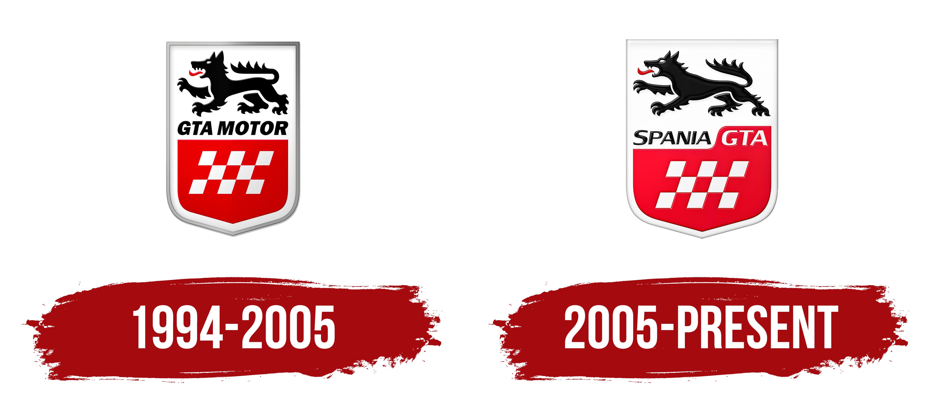
The wild beast resembles a heraldic lion while retaining distinct wolf features. The animal is depicted in profile, facing left. It has furry paws, a bushy tail held horizontally, and a red tongue sticking out of its open mouth. The figure is black, making it stand out against the white background.
Below the Iberian wolf is the brand name GTA Motor, written in bold uppercase letters. The slight rightward slant of the letters contrasts with the predator’s movement, adding dynamism to the emblem. The absence of serifs on the glyphs indicates the sports car manufacturer’s friendly nature.
The bottom part of the shield features a finished flag with red and white squares. These squares also lean to the right, harmonizing with the brand name and fitting well into the sports theme. The checkered pattern evokes the traditional racing flag waved by judges at the finish line. A silver frame runs along the edge of the heraldic shield. The gradient gray color makes the border look three-dimensional.
This design aligns perfectly with the automotive company, as its primary product range includes various sports cars. They are as swift as the Iberian wolf, dashing across fields and maneuvering easily between obstacles.
2005 – today
The updates have not significantly altered the logo: It still has a shield shape, the brand name, and one of Spain’s characteristic symbols, the Iberian wolf. Only the style has been modernized, making the emblem more contemporary and suited for car racing.
The fierce predator has been given a bold look, making it much more dynamic. To achieve this, designers elongated the wolf, added two fangs to the lower jaw, drew the ears back and flattened them, depicted a massive chest, and changed the tail’s angle from horizontal to diagonal. Their efforts paid off: the wolf appeared aggressive and ready to leap forward.
The lettering has also transformed, which was the purpose of the visual identity update. The name Spania GTA is divided by color, font, and background. The first word is mostly lowercase, colored black, and set in white space. The second part of the name (the abbreviation) is in uppercase, white, and positioned on a red racing flag that has been raised to accommodate it.
True to its wild nature, the wolf runs at full speed, which aligns more with a company that manufactures sports cars. The colors have also changed. Bright red has transformed into crimson, and gray steel has turned pearlescent, making the frame thinner. Additionally, all elements now appear three-dimensional due to the added shadows.