


 Sunbeam Logo PNG
The Sunbeam logo embodies the evolution from exclusivity to modesty. The original emblem faded away, just like the company it represented. Now, it reminds us that incredible dedication is required before we can receive any return from the environment.
Sunbeam began in 1887 in Wolverhampton, England, when John Marston, a successful maker of enamelware, founded Sunbeam Cycle Co. Ltd. The company first produced bicycles known for quality and reliability, then began experimenting with motorcycles in 1899. Its first car, the two-seat Sunbeam-Mabley, appeared in 1901 and used an unusual layout with the engine placed beside the driver.
In 1905, Sunbeam moved toward more conventional car production with models such as the 12/16, fitted with a four-cylinder engine. Motorsport soon became part of the company’s development. In 1912, a Sunbeam car set several speed records at Brooklands. During World War I, the factory shifted to military work, producing armored cars and aircraft engines.
After the war, Sunbeam returned to civilian vehicles and racing. In the 1920s, it built several competition cars, including the Sunbeam 350HP, which set a land speed record of 146.16 mph in 1924. In 1920, the company merged with Talbot and Darracq to form STD Motors, gaining wider production capacity and access to new markets. The Great Depression later hit the business hard, and despite models such as the Sunbeam Dawn, it went bankrupt in 1935.
Rootes Group acquired Sunbeam in 1935 and redirected it toward broader market models. The sports image returned in 1953 with the Sunbeam Alpine roadster, followed in the 1960s by the Tiger, a Ford V8-powered sports car often compared with the AC Cobra. After Rootes was acquired by Chrysler in 1967, the name was gradually phased out. The final car to carry the Sunbeam badge appeared in 1976 as a rebadged Avenger, and production ended in 1978 after the European business was sold to PSA Peugeot Citroën.
Meaning and History
What is Sunbeam?
It is a famous British automaker that played an important role in the early development of the British automobile industry. The company started by manufacturing motorcycles and bicycles before deciding to venture into automobiles. Car enthusiasts worldwide have praised the cars’ elegance, performance, and craftsmanship, especially the Sunbeam Alpine and Tiger models. The company’s reputation for engineering excellence has been reinforced by its success in motorsports, including winning land speed records and Grand Prix races. Throughout its history, the company faced financial difficulties and changes in ownership despite its renowned products. Eventually, the company was acquired by the Rootes Group.
1905 – 1935
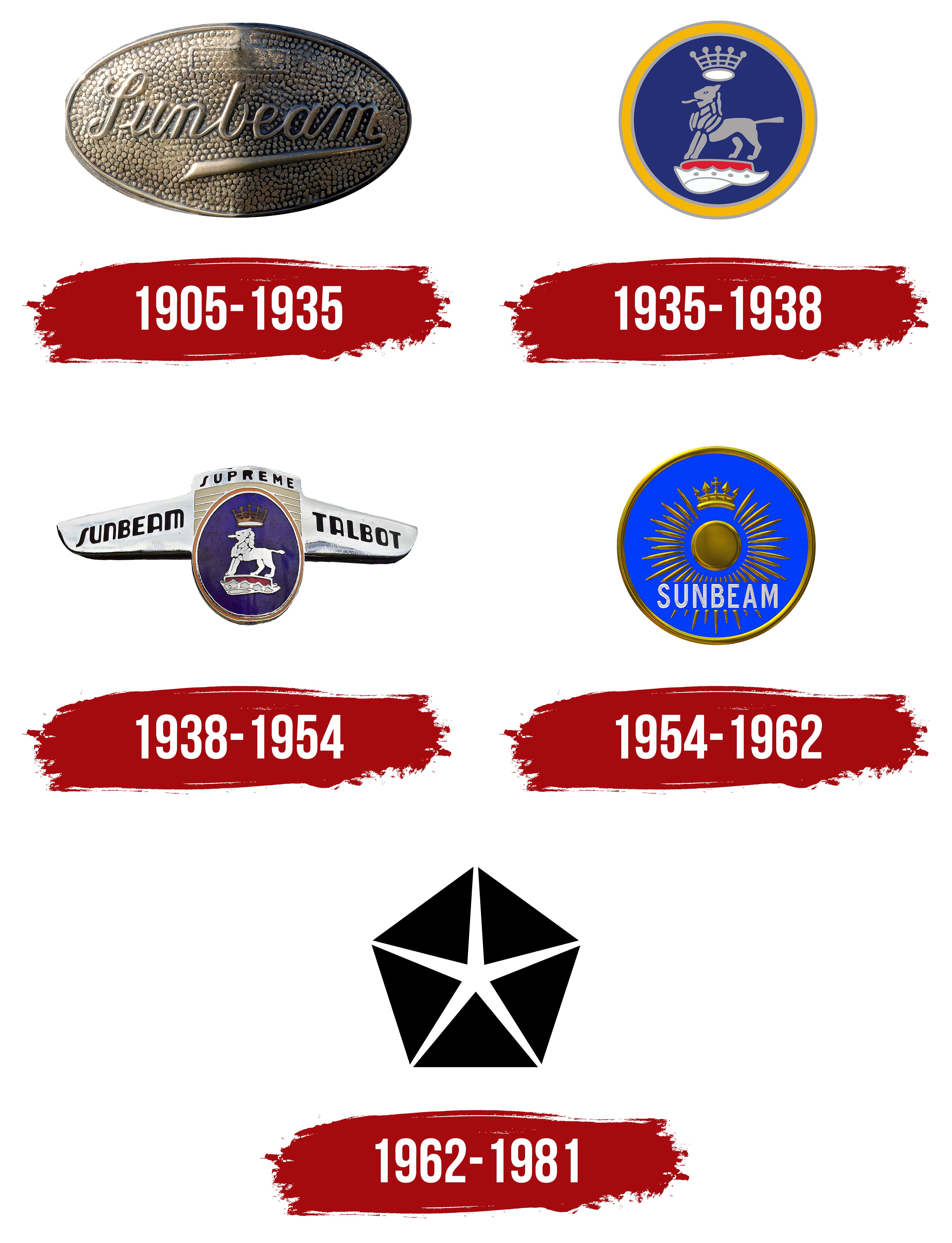
The Sunbeam emblem, with its oval shape and metallic texture, conveyed the reliability of the company’s cars. It effectively complemented racing and luxury cars, impressing with its horizontal ellipse. Inside, on a convex part (like a small elevation), the name of the British brand was displayed, and the logo resembled a badge.
The name was rendered in a script-style font, mimicking a personal signature. The calligraphically smooth letters made a pleasant impression, being smooth and sans-serif. For better readability, they were made semi-bold. This gave the text a noble, elegant, refined look, reminding buyers that the company manufactured luxury cars.
The last letter had a formal tail, elongated and curved to the left, emphasizing the other glyphs. The start of this stroke (at the “m”) was narrow, while the end (under the “n”) was wide. The “S” also drew attention; its winding form was complemented by two curls, making it resemble an uppercase handwritten “L.” The lowercase “b” also appeared open due to the missing top element.
The emblem’s unique style showed that the manufacturer produced exclusive models distinguished by comfort, attractiveness, and security. It conveyed a sense of calm and confidence to onlookers, while the metallic texture indicated the vehicles’ high durability, signifying their ability to withstand any operating conditions.
1935 – 1938
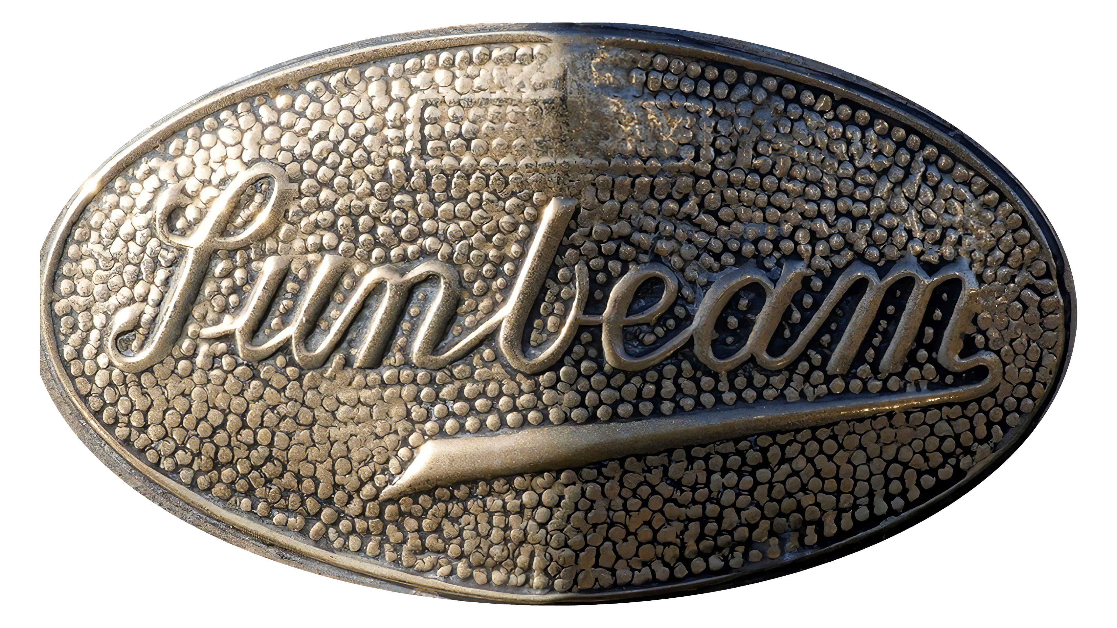
After the successful start of car production, the “royal” era began, reflected in the Sunbeam logo. It indeed featured symbols of supreme authority, a lion and a crown. These elements were harmoniously combined, conveying the imperial nature of the company:
- The place of origin (Great Britain, the land of kings)
- A successful career (popularity of racing and luxury cars)
- Authenticity (belonging to royal “blood”)
Designers embodied the company’s DNA in the emblem: its connection to a country where royal customs, tastes, and traditions prevail. The mythical animal was depicted standing on a pedestal. It had a proudly raised head, a protruding tongue, and a straight tail. The lion symbolized strength, bravery, power, magnanimity, courage, and perfection, qualities the manufacturer endowed on its vehicles. This image characterized them as fit for royalty.
Above the regal beast’s head was a large crown, another symbol of supreme authority. It affirmed the noble status of Sunbeam cars, showing that they were undisputed leaders in their sector. The bottom part of the crown resembled a halo, hinting at the vehicle’s technical perfection and angelic nature, as well as easy handling, quick responsiveness, and smooth driving without any issues.
The heraldic lion stood on a pedestal composed of two parts: a red base and a white jagged ornament reminiscent of part of a mantle. The animal was placed in the center of a blue circle with triple edging: the outer and inner frames were thin and gray-blue, and the middle was wide and yellow. In Great Britain, blue has always been directly associated with royalty, symbolizing stability, confidence, authority, trust, and serenity.
1938 – 1954
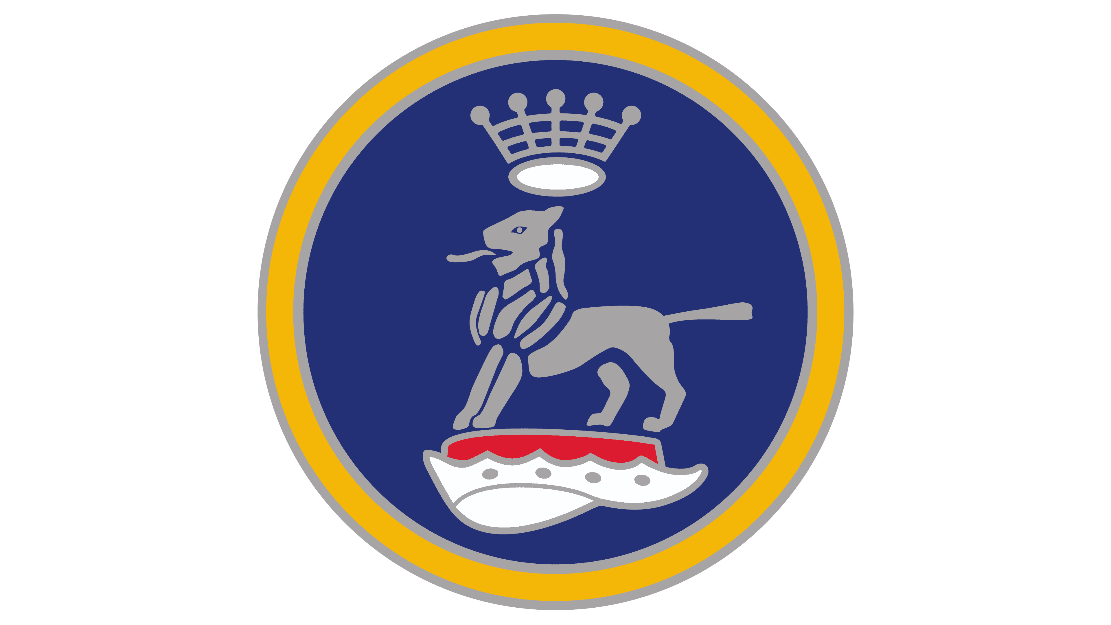
The version with the heraldic lion received additional attributes, making the logo significantly larger. Designers retained the regal animal on a blue background but transformed the circle into a vertical oval, giving it a medallion-like appearance. The gray color became distinctly silver, adding nobility to the emblem. All former gray-blue elements were silver: the lion, part of the crown, the border, and the drape at the bottom.
Among the additional details, the wings stood out the most, as they were positioned on either side of the oval. Thus, the royal lion acquired features of the Scythian lion, a winged mythical creature, a cross between a lion and an eagle, symbolizing speed, sharp vision, endurance, and unparalleled strength.
The inscription “Sunbeam Talbot” was on the protruding elements in an extra-bold, rectangular font with rounded edges. All letters were uppercase, sans-serif, with soft features, lacking both serifs and angles. Above them was the word “Supreme,” highlighting the brand’s high status. This word appears at the top of the logo. Its distinctive feature was the absence of the inner space in the uppercase “R,” though readability remained unaffected.
Additionally, the emblem included several broad stripes overlaid by the medallion with the lion. These stripes were wide and golden, separated by thin silver lines. The crown above the heraldic animal’s head was golden, now adorned with red rubies.
1954 – 1962
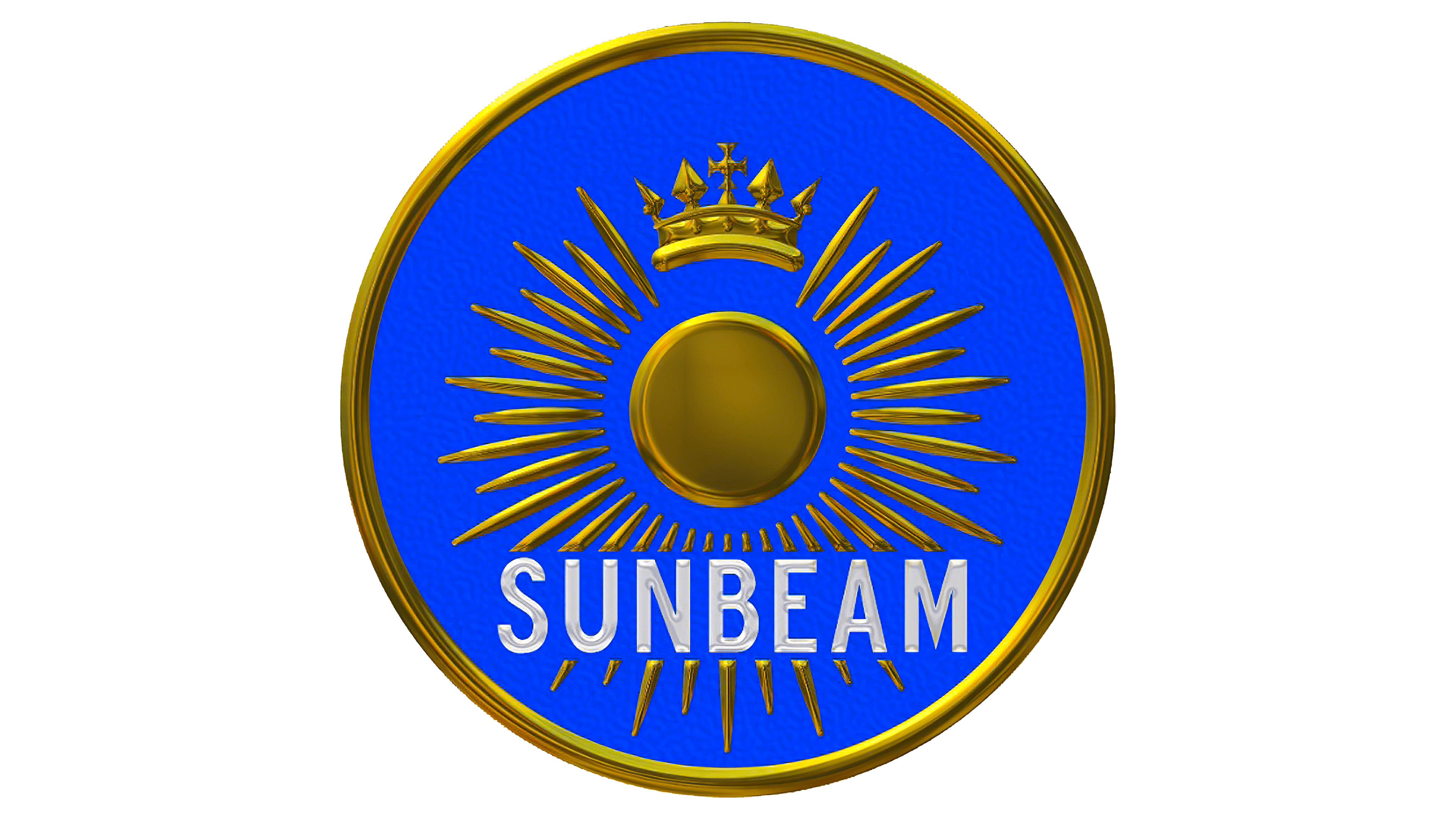
During this period, the era of the lion ended, and the era of the sun began. The golden sun “shone” long on a blue background. It occupied almost the entire central area and was designed originally. In the middle was a circle resembling a metallic plate sparkling with reflections. Long and short rays alternated, radiating outward from this circle. Like the circle, they were golden and shiny.
The name of the British company crossed the bottom, written in tall, grotesque uppercase letters. The balanced ratio of angles and rounded elements in the glyphs reflected a thoughtful approach to car manufacturing, indicating the company’s attention to detail and consideration of every nuance. The inscription’s strict style, with wide spacing between characters, also conveyed this message. The white letters had unique “overlays,” as if the paint on the ends of the glyphs had slightly peeled off. This effect, achieved through a gradient, animated the logo and made it realistic.
Above the sun was a crown, presented in a different style: now it featured peaks and a large Celtic cross. A blue circle served as the background for all these elements, symbolizing the pursuit of perfection and a connection to the automotive industry, as it resembled a wheel and steering wheel. Around the edge was a border in the same color as the sun. This border was three-dimensional and medium-thick. All other details of the emblem were also embossed.
1962 – 1981
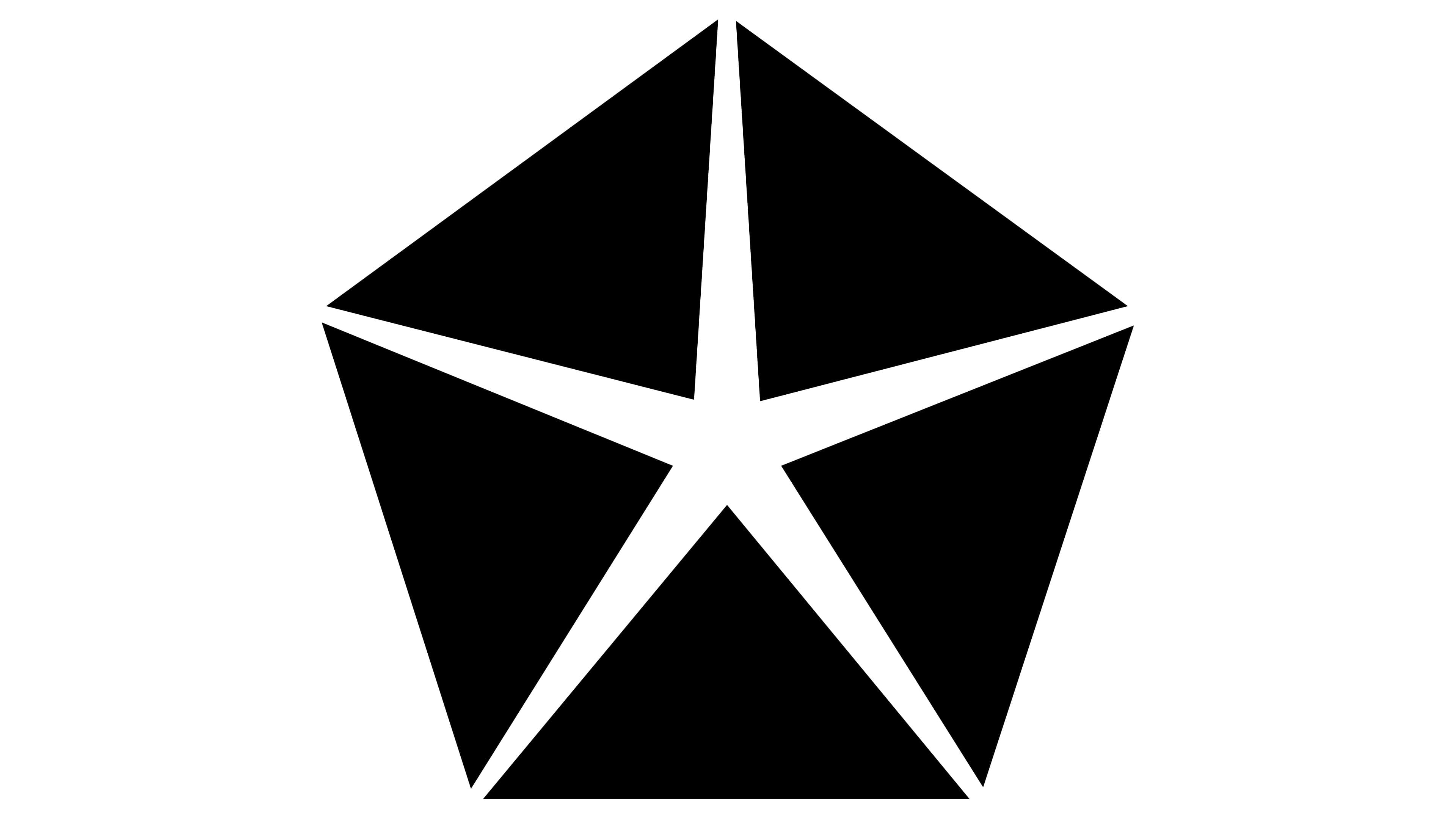
The sun theme remained, but with a different design. It was depicted as a radiant star, spreading light in all directions. The white rays converged in the center and were open-ended, extending beyond the composition without borders. This symbolized the company’s openness and its effort to earn car enthusiasts’ trust, as it was facing a crisis it couldn’t overcome. The redesign did not yield positive results.
The logo was two-dimensional and monochromatic. However, beneath its simple appearance lay considerable complexity: the emblem consisted almost entirely of five black isosceles triangles, creating the effect of sun rays spreading in different directions in the negative space. Restraint, strictness, and two-dimensionality were the key characteristics of the emblem during this period. It lacked authenticity; the sun was abstract, and the colors were monotonous. Even then, it signaled the company’s decline.