 StoneX Logo PNG
The StoneX logo carries positive energy, instilling a sense of calm and confidence. It serves as a marker of its time, keeping you informed without missing any important details. The emblem focuses on achieving positive outcomes and reflects the service’s reliability.
StoneX Group Inc. traces its roots to 1924, when Saul Stone founded Saul Stone and Company in Chicago. The firm began as a commodity brokerage focused on agricultural products, especially grain. Its early clients were farmers, producers, and processors seeking help with price risk at a time when U.S. commodity exchanges were expanding.
The company survived the 1930s and broadened its client base during the Great Depression. After World War II, it entered new areas of global commodity trade as international markets grew in the 1950s and 1960s. In 1981, Farmers Commodity Corporation acquired the business, linking it more closely with agricultural organizations. In 1994, the company merged with FCStone and became FCStone Group.
A new stage began in 2000, when FCStone listed its shares on NASDAQ and gained capital for expansion. In 2007, it acquired Downes-O’Neill, adding dairy market analysis. In 2009, FCStone merged with International Assets Holding Corporation to form INTL FCStone Inc., expanding its geographic reach and financial services. Later acquisitions included Hanley Group, FXDD, Cleartrade Exchange, GX Clarke & Co., Sterne Agee, and ICAP’s EMEA oil broking business.
In 2020, INTL FCStone Inc. became StoneX Group Inc., a name tied to founder Saul Stone and the company’s move from grain brokerage to global financial services. In 2021, the firm acquired Gain Capital Holdings. From 2022 to 2024, it expanded digital asset trading, opened and strengthened offices in Singapore and Hong Kong, and invested in AI and machine learning for analytics, trading platforms, and risk management.
Meaning and History
What is StoneX?
It is a New York-based financial services company specializing in various financial and market services aspects. The company operates in six key areas: commercial hedging, global payments, securities, physical commodities, foreign exchange, and clearing and execution services (CES). It provides full financial services to help clients manage risk, transact, and navigate global markets efficiently. The company evolved from its predecessors, International Assets Holding Corporation and FCStone Group, to become a significant player in the financial services industry.
2020 – today
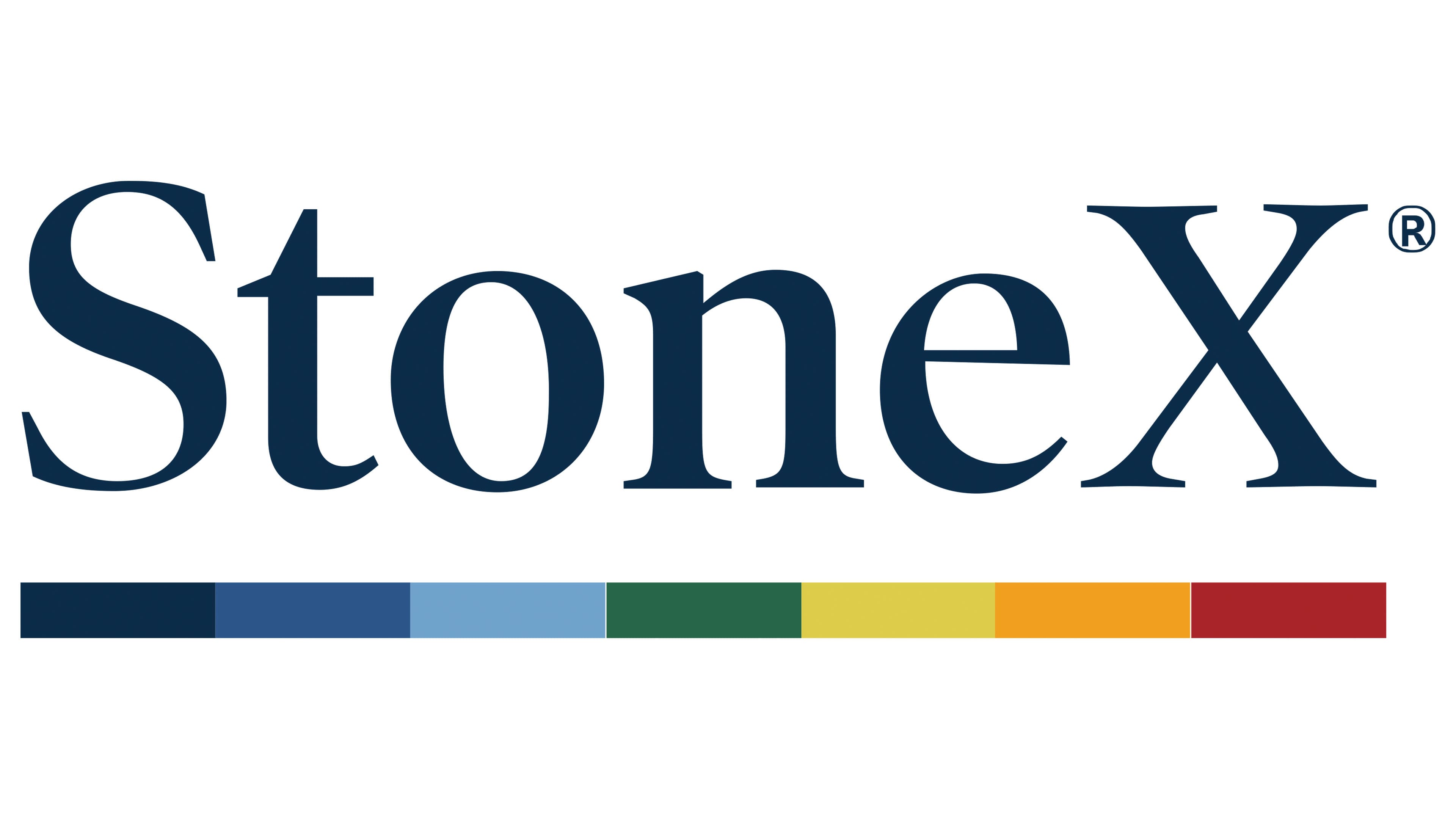
This is a word-graphic mark that upholds a professional atmosphere. However, the most intriguing aspect is its deliberate disregard for spelling conventions. Despite the traditional letterforms, the StoneX emblem features an intentional “mistake” that enhances its visual identity. Specifically, the capital “X” should be lowercase grammatically.
This typographic choice is truly unconventional. When the company first launched, it seemed odd, but over time, it came to be viewed as futuristic, aligning with progressive brands like SpaceX, the aerospace manufacturer. Overall, the uppercase final symbol adds a modern touch to the logo. It serves as a marker of the current times, evoking the secrecy of a classified stamp X. As such, this design choice was highly innovative for the early 2020s.
The rest of the font is traditional: correct, smooth, and proportionate, with no flaws. The serifs balance the bold letters, creating a harmonious transition from thin to thick lines. This gives the glyphs a standard appearance as if they were lifted from the pages of old books. The selection of this font aims to create the illusion that the company has long existed, with a rich history and, therefore, extensive experience.
This style of lettering pairs perfectly with the muted blue-gray color. It’s a businesslike and formal shade that conveys a sense of responsibility. It evokes feelings of peace, harmony, and confidence while calming and reducing anxiety, fitting well with the company’s financial focus.
The StoneX emblem reflects the diversity of its services. How is this manifested? In the rainbow line that underlines the top inscription. All seven colors are present but arranged in reverse order, with red at the end and blue at the beginning, replacing violet. All segments are equal in length and width and evenly distributed along the horizontal stripe. They follow one another in reverse order, starting with a calm palette and ending with a bright one. This approach fits perfectly with the brand’s concept of balance and harmony.