 Teleperformance Logo PNG
Customer service includes handling calls, chats, and online inquiries, and companies often outsource this communication to an external contractor. These services help companies respond to inquiries and stay in touch with users worldwide. The Teleperformance logo is associated with a company that provides customer support services and manages communication between businesses and their customers.
Entrepreneur Daniel Julien founded Teleperformance in Paris in June 1978. It became one of the first companies to offer call center outsourcing services. By 1985, the company had become a leader in the French market. In 1986, international expansion began. The company opened offices in Belgium and Italy. By the late 1980s, with support from partner SRC, the company strengthened its position in Europe and entered the markets of Germany, Sweden, the United Kingdom, Spain, and Portugal.
In 1990, Teleperformance and SRC combined operations under the name SR Teleperformance. In 1993, the company began expanding into North America. By the end of the decade, the company had acquired assets in Mexico, Italy, Switzerland, and Belgium.
In 2000, the company went public on Euronext Paris. After that, it began expanding in Asia, including the Philippines. In 2013, Teleperformance acquired TLS Contact, a company specializing in visa and migration services. In 2014, it acquired Aegis USA, expanding its operations into the United States and Costa Rica.
In 2017, the company received a BBB credit rating from Standard & Poor’s. It issued bonds to finance future acquisitions, including buying LanguageLine Solutions. In 2018, Teleperformance acquired Intelenet, an Indian company.
In 2020, the company transitioned more than 200,000 employees to remote work. This ensured uninterrupted customer service during global restrictions. In 2021, the company strengthened its position in the healthcare and government sectors. Health Advocate and Senture were acquired.
In 2022, Teleperformance purchased PSG Global Solutions and expanded its recruitment services. In 2023, the company completed a major merger with Majorel. As a result, it became an international group and a global leader in digital business services.
In February 2025, the company acquired the American firm ZP Better Together. It specializes in technology for deaf and hard-of-hearing users. This acquisition strengthened the company’s position in inclusive communications and digital services.
Meaning and History
What is Teleperformance?
An international provider of outsourced contact centers headquartered in France. The company operates more than 450 centers. It provides services in 265 languages and dialects. The main areas of activity include customer service, technical support, debt collection, online payment processing, translation, and content moderation. The company also implements projects in marketing, back-office operations, finance, healthcare, tourism, IT, and retail.
before 2018
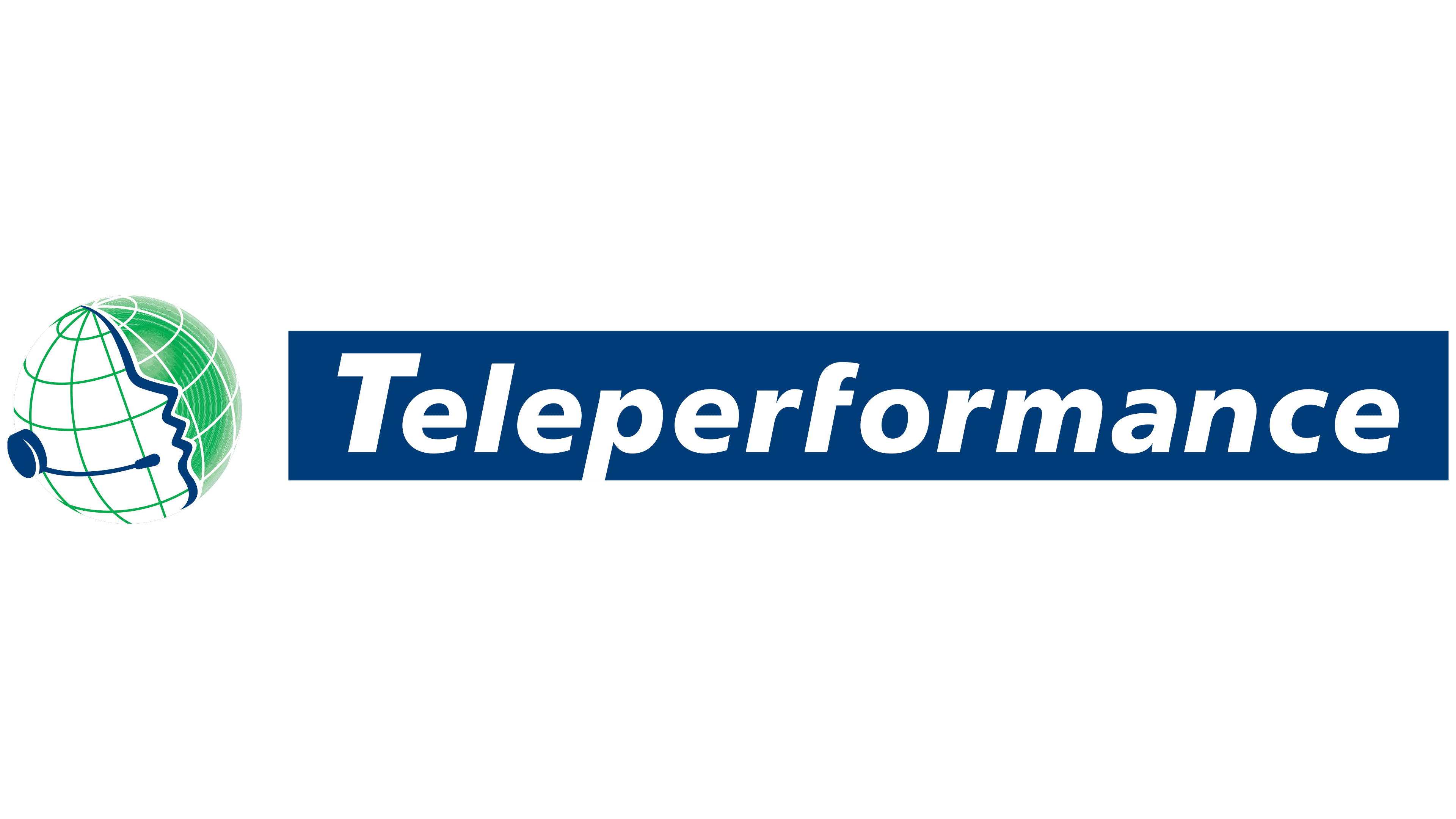
In the Teleperformance logo used before the 2018 update, a telephone headset connected the company’s image to its origins. Daniel Julien founded the telephone marketing business in Paris in 1978. It served French clients by phone and later expanded into customer support, technical assistance, and business process outsourcing. The name Teleperformance combines “tele,” meaning remote communication, with “performance,” meaning how well work is carried out.
The emblem to the left of the name combined a globe, a human profile, and a telephone operator’s equipment. Green meridians and parallels formed a spherical grid. Against it, blue and white contours outlined a face looking to the right. A blue headset sat beside the profile, with a thin arc connecting to its microphone. The green shifted across the globe to create depth, while thin white lines defined the curves. The human profile and headset directly connected the image to customer support work.
A dark blue rectangular panel containing the white word Teleperformance appeared to the right. Only the initial “T” was capitalized. The lettering used a heavy, right-slanted sans-serif style, resembling ITC Avant Garde Gothic or a modified Frutiger Bold Oblique. Unlike the green sphere with its gradients, the background beneath the name had a uniform fill.
2018 – 2025
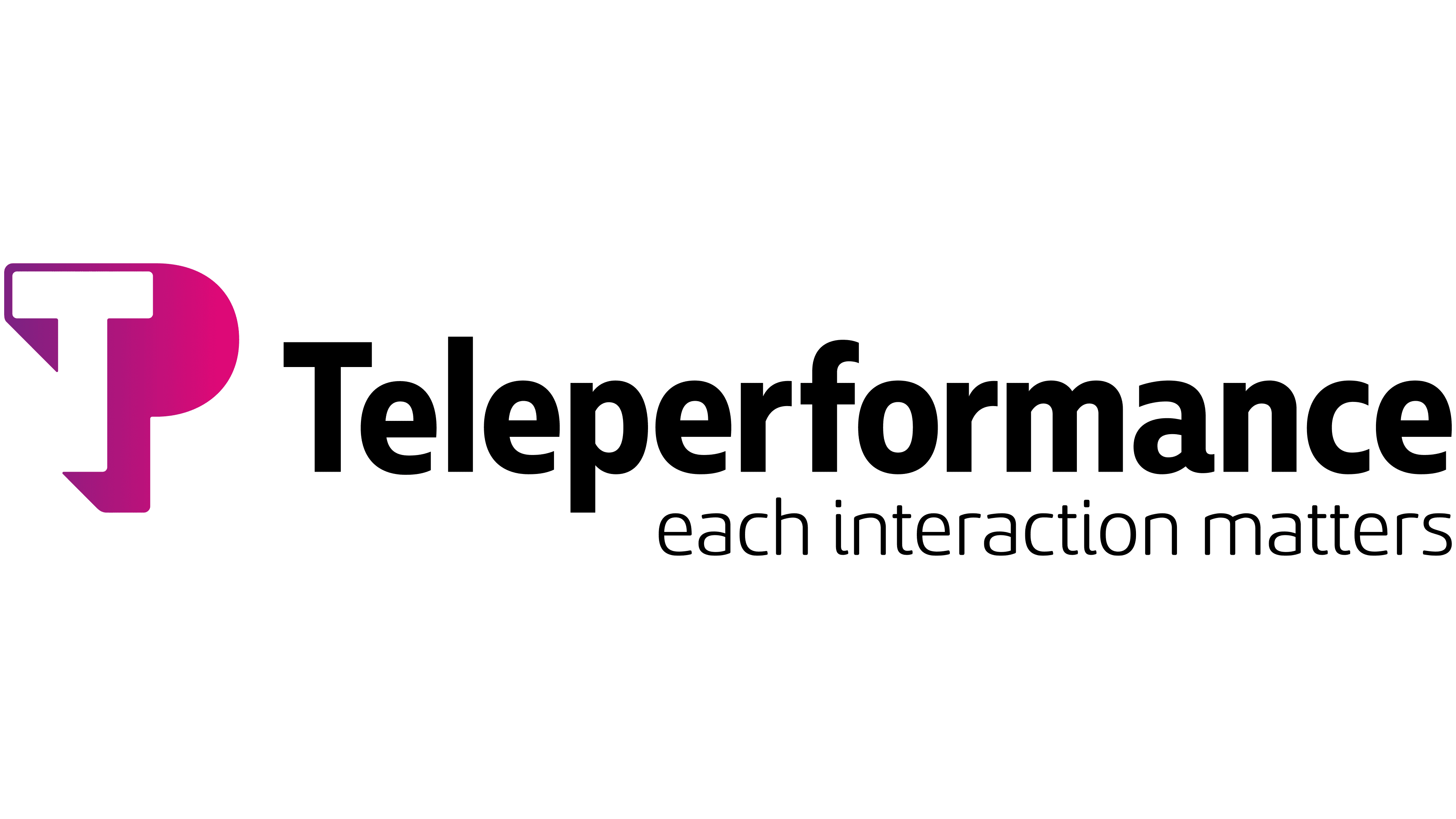
The familiar TP abbreviation became the basis of Teleperformance’s logo when the company updated its identity on September 5, 2018. Brazilian agency Ana Couto Branding developed the project. As the company expanded its digital services, it wanted its identity to convey a blend of technology and human involvement in service delivery. During the presentation, it linked the new emblem to trust, commitment to partnerships, and empathy for employees, clients, and their customers.
A compact monogram replaced the globe and headset. A white “T” emerges from the opening within the colored figure, while the rounded section on the right and the vertical stroke form a “P.” Angled projections along the right and lower edges resemble an offset shadow. The color transitions from purple to saturated pink, including magenta and fuchsia shades. The abbreviation uses two letters to identify the company, while the horizontal version keeps the full name beside it.
Black Teleperformance lettering appears to the right of the monogram, beginning with a capital “T” followed by lowercase letters. An upright sans-serif style replaced the earlier slanted lettering on a blue background. The large letters resemble Helvetica or Arial Rounded. Muller Narrow and Sancoale Softened are listed among the typefaces used in the updated identity. In the extended version, “each interaction matters” appears beneath the name, offset slightly to the right. The lower line uses smaller, thinner lowercase sans-serif letters. The phrase expresses the company’s attention to every customer interaction.
A black version of the monogram was also created. A solid fill replaces the gradient, while the white cutout preserves the “T.” A small triangular section is visible on the left, the rounded portion of the “P” projects on the right, and the slanted vertical stroke ends below. When paired with the full name, both elements share the same color. The “each interaction matters” line is omitted from this version.
2025 – today
On February 27, 2025, TP became Teleperformance’s primary brand. The transition continued the adoption of the shortened name that began in 2018 and accompanied the development of digital business services using artificial intelligence. The monogram became the main brand identifier, although the full name remained beside it in the horizontal logo.
The black symbol on the left combines a “T” and a “P” into a single form. White rectangular openings and vertical edges form the “T,” while the rounded right section creates the “P.” Black Teleperformance lettering appears to the right, with a capital initial followed by lowercase letters. The sans-serif letters have consistent stroke widths, and the typeface resembles Helvetica Rounded or Google Sans.
Alongside its new status, the abbreviation received several interpretations. “Technology” and “Touch” connect technology with human contact, while “Partnership” adds the theme of collaboration. “Transformation” and “Performance” link change to results, while “Thought” and “Passion” reflect developing ideas and enthusiasm for the work. Through these different interpretations of the two letters, the company presented collaboration between people and technology as the foundation of the TP brand.