 Storebrand Logo PNG
Long-term savings, insurance, and personal finance management require years of advance planning. These tasks include retirement planning, investing, and capital protection, and they require consistent fund management. The Storebrand logo is associated with a Scandinavian financial company that provides insurance, investment, and savings management services.
Storebrand’s history dates back to 1767. That year, the insurance organization Den almindelige Brand Forsikrings Anstalt was founded in Copenhagen. In 1814, it opened a branch in Christiania, which was renamed Storebrand in 1847. In 1861, the company Idun was established under its supervision. It became Norway’s first private life insurance company and a key milestone in developing the national insurance market.
In 1982, Storebrand merged with the company Norden to form Storebrand Norden Group. In 1986, the merged structure was renamed AS Storebrand. In 1991, it merged with UNI Forsikring, Norges Brannkasse, and Norske Folk. As a result, the organization became UNI Storebrand. That same year, it attempted, jointly with Skandia, Hafnia, and Pohjola, to establish a large Scandinavian financial group. The project was not realized. In 1992, the state took control of the company. In 1993, it underwent restructuring and returned to trading on the Oslo Stock Exchange.
In 1996, Storebrand ASA obtained a banking license and established its subsidiary, Storebrand Bank. In 1997, it proposed a merger with Christiania Bank og Kreditkasse. 63.38 percent of shareholders supported it, but the merger did not take place. In 1998, the company began developing its health insurance business. In 1999, it temporarily exited the property insurance sector. It returned to this segment in 2006.
In September 2007, Storebrand acquired the Swedish company SPP from Handelsbanken for 18.2 billion Swedish kronor. The transaction was completed in December that year. This acquisition gave the group a strong position in the Scandinavian insurance and pension services market.
In October 2017, Storebrand reached an agreement to acquire the asset management company Skagen for 1.6 billion Norwegian kroner. The transaction was completed in the first quarter of 2018. After that, the company’s share of the private pension savings market increased from 4% to 17%.
In 2024, the company completed a share buyback program. The company purchased 9.785 million shares for 1.1 billion Norwegian kroner. In the same year, the company approved a new 2025 program totaling 1.5 billion kroner. The Solvency II ratio for the fourth quarter of 2024 reached 200%. The company’s long-term plan provides for annual share buyback programs through 2030, totaling 12 billion Norwegian kroner.
Meaning and History
What is Storebrand?
The largest financial group in Norway, headquartered in Oslo, operates in Norway and Sweden. It is one of Scandinavia’s leading insurance providers, offering life insurance, pension programs, asset management, and private banking services. Through its subsidiary bank, it provides investment products and health, property, and accident insurance.
before 2000s
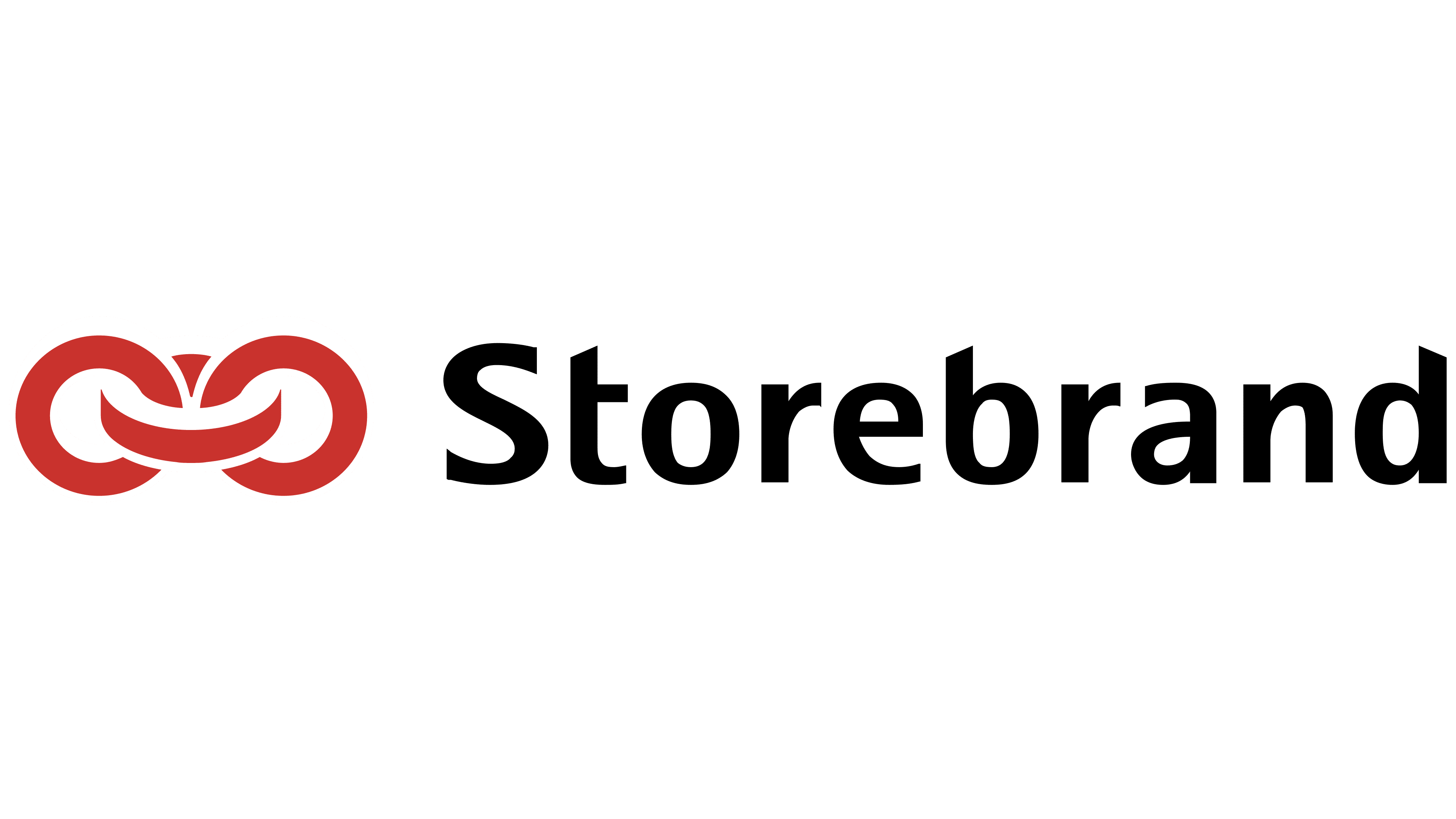
In 1978, Storebrand replaced its earlier image of Saint Hallvard, Oslo’s patron saint, with an emblem called “Lenken,” or “the link.” The change coincided with the adoption of the holding company name A/S Storebrand-gruppen. The interlocking rings were intended to serve as a shared symbol for the group, replacing the saint’s figure.
The name traces back to fire insurance. One branch of the future Norwegian financial group originated in 1767 with the establishment of Den almindelige Brand-Forsikrings-Anstalt in Copenhagen. After Norway separated from Denmark in 1814, the Norwegian portion of the system moved to Christiania (now Oslo). In 1847, private founders established Christiania almindelige Brandforsikrings-Selskab for Varer og Effecter there, an insurance company covering goods and property against fire. It became known by the shorter name Storebrand.
The nickname arose from a comparison between two insurers. Storebrand operated nationwide, while Lillebrand served Christiania and the surrounding area. The Norwegian words “store” and “lille” distinguished the large and small companies, while “brand” referred to fire insurance. Over time, the everyday name displaced the longer one and, in 1925, became part of the official name Christiania almindelige Forsikrings-Aksjeselskap Storebrand. Today, the group provides pensions, insurance, banking, and asset management under its historical name.
In the Lenken logo, the two outer rings face the viewer almost directly and do not touch. A central link turned crosswise connects them. White gaps separate the intersections, keeping all three parts visible. The red had a brick-like shade close to terracotta. The emblem appeared to the left of black Storebrand lettering on the same line. The name began with a capital “S,” followed by lowercase letters. The sans-serif typeface, similar to Frutiger or Myriad, used substantial strokes, slight terminal flaring, and angled cuts at the tops of some vertical strokes.
2000s – 2023

Before the 2023 update, Storebrand used an all-lowercase wordmark. Black sans-serif letters spelled “storebrand,” with thinner strokes. The elongated verticals and rounded interior openings remained. The upright lettering resembled Myriad or Segoe UI.
A bright red emblem of three interlocking rings remained to the left of the name. The two elongated outer links stood vertically without touching, their outlines suggesting an elongated figure eight. A tilted central ring passed between them, connecting the two sides. The established symbol continued to accompany the company’s name despite the change in lettering.
2023 – today
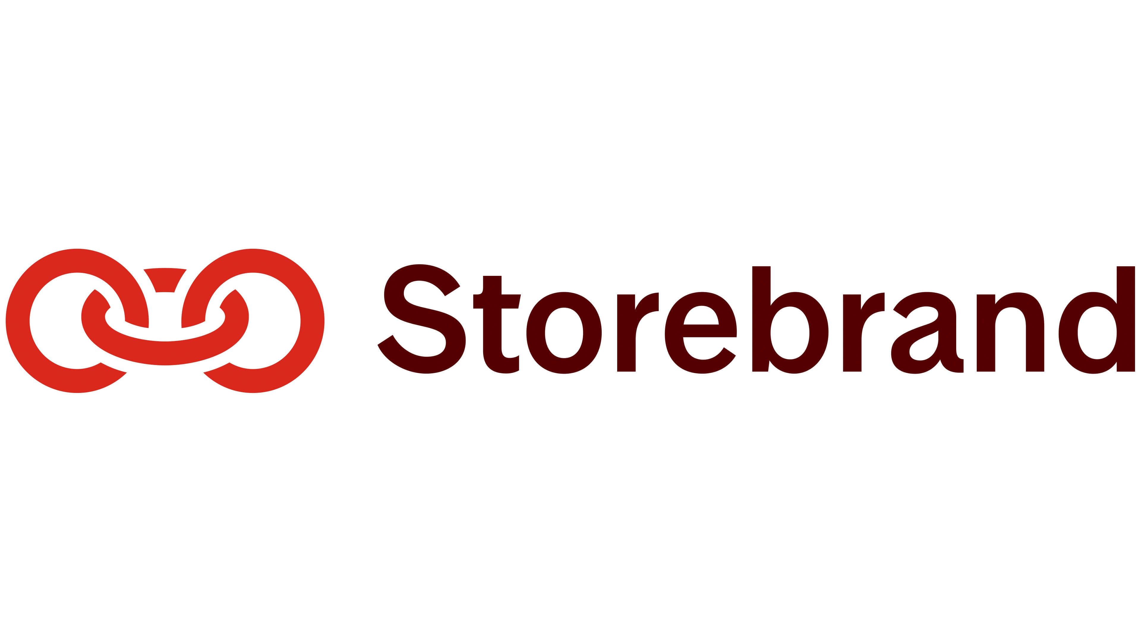
In late 2023, Storebrand introduced an updated logo in Oslo and Stockholm featuring its familiar red rings. The company sought to change perceptions of the brand while retaining its recognizable emblem and historical connection to red. Norwegian agency Knowit Experience, which had worked with Storebrand since 2013, developed the project. Mark Ligeti led the project, joined by designer Mads Evergaard and user experience specialist Silje Blenes. The identity rollout continued in 2024.
The three links to the left of the name grew lighter. Their outlines lost their earlier weight, and the openings within the rings expanded. The outer vertical sections still do not touch, with a tilted central ring connecting them. The designers associated the center with the present and the outer links with the past and future. For a company offering pension and savings products, this interpretation linked today’s financial actions to life in the years ahead. While refining the proportions, the team created a digital tool to compare dozens of variations and save the designs in vector format. It helped them arrive at the emblem’s final shape.
The Storebrand name appeared to the right. A capital “S” returned to the wordmark, while deep dark red replaced black beside the bright, nearly scarlet symbol. The sans-serif lettering used the custom Storebrand Sans typeface, created by Knowit Experience with Copenhagen studio Playtype. Jonas Hecksher developed it. The rounded letterforms matched the rings’ curves while retaining straight stroke endings and a double-story “a.” The overall structure resembles Helvetica Neue or Source Sans. The brand’s expanded color system includes two shades of red. In 2024, Storebrand won a Red Dot award for its identity, and its typeface also won a Red Dot award.