 Taurus Logo PNG
The Taurus logo conveys immense power, determination, and steadfastness, which are characteristics of the products the Brazilian company deals with. The emblem reflects an unstoppable spirit and strength, directly hinting at their mastery.
Taurus began in 1939 in Porto Alegre, Brazil, when Giovanni Piva Adamo, his son Angelo Piva Adamo, and Antonio Hohhheim founded Fábrica de Ferragens e Cutelarias Taurus. The company first worked with metal goods, cutlery, tools, forks, knives, spoons, and other household products, building its early business around practical manufacturing.
In 1941, Taurus moved into firearms production with a .38 Special revolver, responding to rising demand in Brazil. During the 1950s, production increased, and the company began selling to other South American markets. Its revolvers were modernized through the decade, with new functions and higher calibers added to the range.
In the 1960s, Taurus diversified into plastic products, household appliances, and other consumer goods. A major change followed in 1970, when Bangor Punta Corporation, owner of Smith & Wesson, acquired the company. The deal gave Taurus access to new technology and stronger routes into North America. In 1974, it entered pistol production with the PT-92, based on the Beretta 92.
In 1983, Brazilian investors bought Taurus back from Bangor Punta, restoring its independence. A year later, the company opened its first U.S. plant in Miami, Florida. In the 1990s, Taurus expanded in Europe and Asia, then introduced an integrated locking system in 1997. Later milestones included the PT 24/7 polymer pistol in 2005, the São Leopoldo plant in 2008, the G2c series in 2018, the Bainbridge, Georgia facility in 2020, the GX4 in 2021, the Raging Hunter revolvers in 2022, and a new metal treatment process in 2024.
Meaning and History
What is Taurus?
It is a Brazilian firearms manufacturer known for its wide range of pistols, rifles, and revolvers. Founded in Brazil, the company has become one of the biggest players in the global firearms market. It is known for its commitment to quality, offering firearms for military, law enforcement, and civilian use. The products are known for their reliability, durability, and ergonomic design, making them popular among gun enthusiasts and professionals. The company’s range includes well-known models such as the Taurus PT92, Taurus Judge, and various concealed-carry pistols.
Old
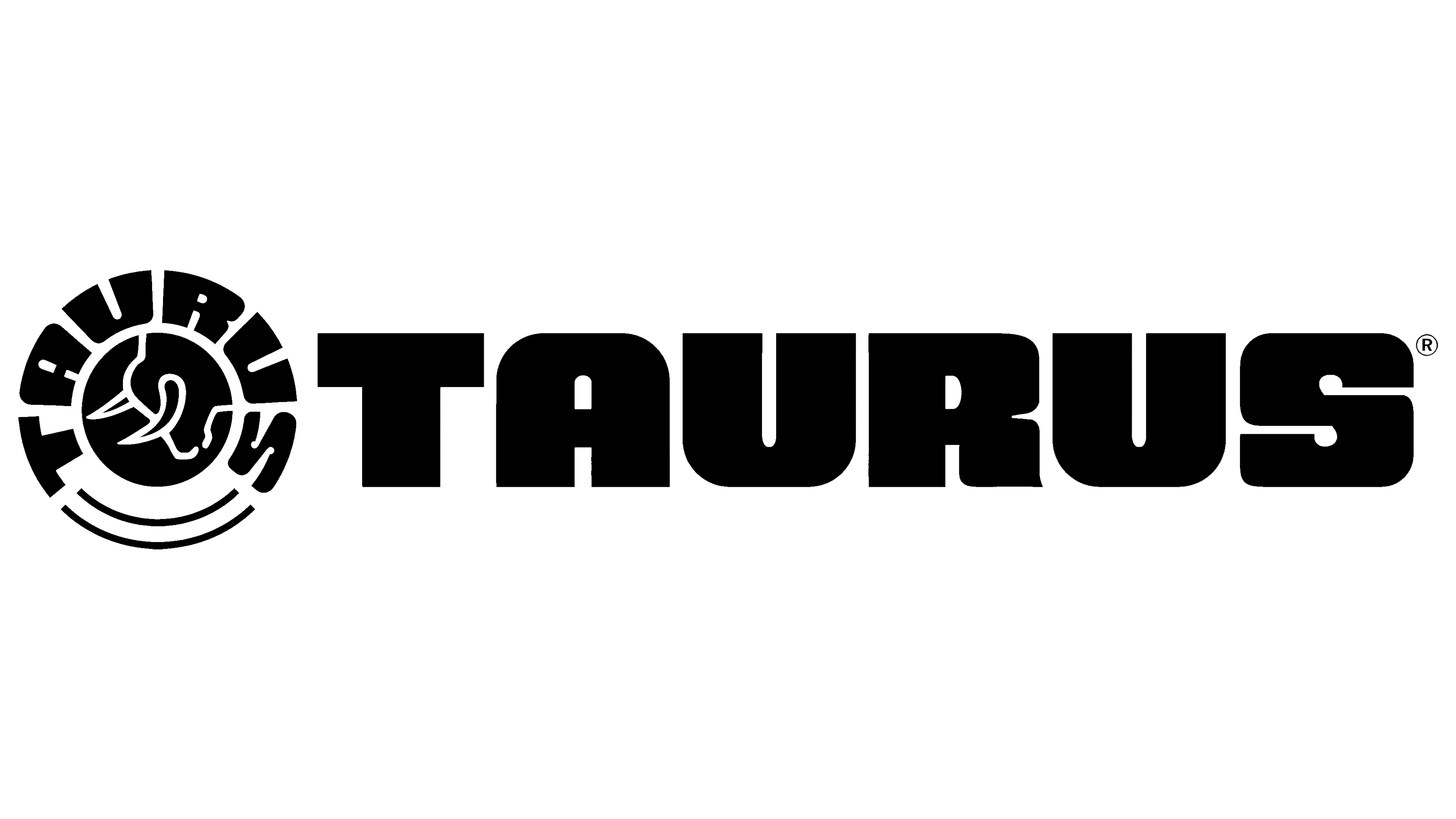
Judging by the name, the driving force behind the Brazilian arms company’s visual identity is the Taurus or bull. It represents the immense power of the products, capable of sweeping everything in their path, overcoming obstacles, defying prohibitions, and captivating with their strength. Awe and determination are the primary emotional factors conveyed through the classic roundel.
The Taurus logo resembles a seal: a prominent center and a wide border with the brand’s details. The central figure is the bull, as suggested by the name. It stands with its head lowered and sharp horns pointed forward. The image leaves it unclear whether this is a defensive or aggressive stance. In any case, the arms manufacturer hints at both, using this to promote its arsenal.
The animal is depicted only partially, with only a portion of its powerful neck and head turned to the left visible. The head is crowned with imposing horns centered within the background circle, indicating that every threat will be met with a response. The bull does not appear defenseless; on the contrary, it exudes significant danger. It is drawn in an outline style, with a thin white contour that clearly reveals the bull’s shape, standing out against the dark background.
The central element is surrounded by a wide band, with the brand name at the top. The text is rendered in a monolithic, block-style font: massive letters resembling a bull’s muscular body. These letters are sculpted, narrowed in some areas (closer to the central element) and broadened in others (at the top, near the edge). This creates an impression of immense strength and readiness for self-defense, as animals typically attack when provoked, a defensive reaction rather than an act of aggression.
The font chosen for this part of the emblem is large, capitalized, and extra bold. It is necessary to showcase the arms manufacturer’s immense capabilities and demonstrate unwavering resolve and confidence in moving forward as planned.
The text is arranged in a semicircle, reaching two upward-curving lower arcs. These arcs add dynamism to the logo and serve as speed lines, infusing the symbol with energy and movement. The monochrome color scheme enhances the bull’s intimidating presence and highlights its uncompromising nature, dividing the world into two halves: black and white. This also ensures high contrast and maintains the text’s legibility, even in a semicircular form.
Next to it is another inscription with the company name. This one is horizontal, with incredibly bold, wide glyphs reminiscent of a bull’s muscular build. For this reason, the internal spaces of the capital letters are narrow, small, and almost invisible. They seem to be covered by a mountain of muscle, alluding to Taurus’s high defensive capabilities. The brand conveys its concept through this approach, creating a positive image that is appealing to customers.
New
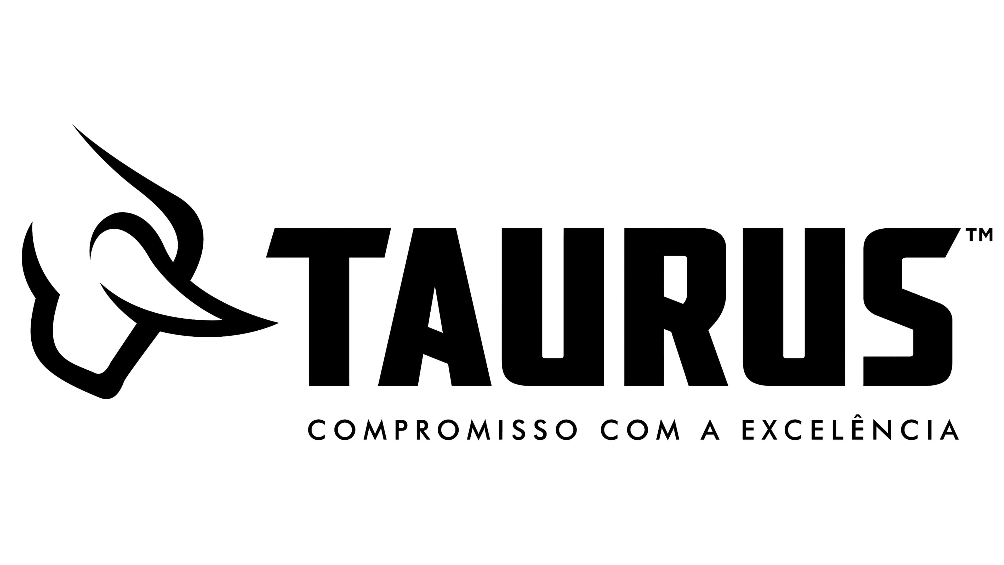
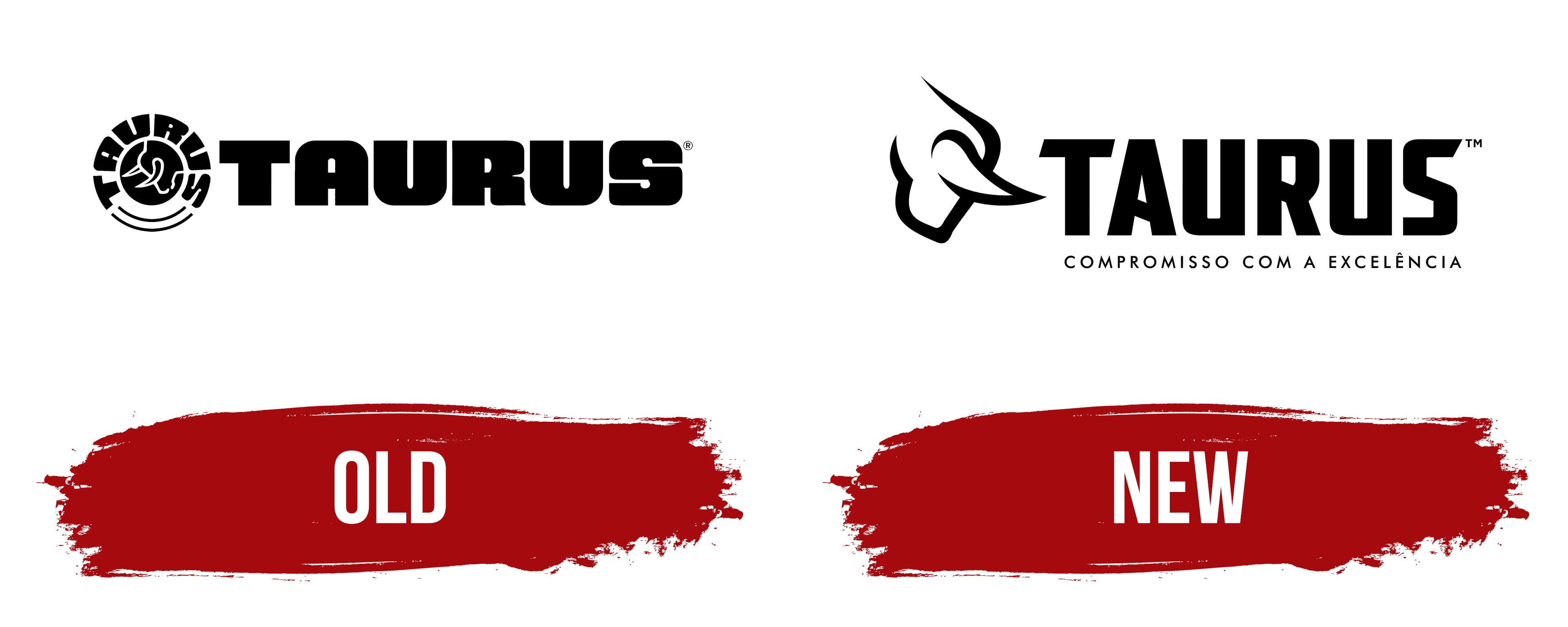
The modernized Taurus logo exudes confidence and contemporary style. It retains the personal emblem and text, now presented in two lines.
- At the top is the name of the Brazilian arms manufacturer. It is rendered in a block font with massive, extra-bold, sans-serif glyphs. The letters are straight, smooth, and tall, with diagonal cuts in certain places (such as in “T” and “S”). The “A” and “R” have angular crossbars reminiscent of powerful bull horns leaning forward.
- Below is the company’s slogan in Portuguese: “Compromisso com a excelência,” which translates to “Commitment to excellence.” This line is composed of thin, small letters. The sharp peaks of “M,” “A,” and “N” and the rounded forms of “C” and “O” stand out. Although they contrast, they convey a unified concept of superior product quality.
Overall, the Taurus logo has preserved the legacy of its previous version while elevating it to a higher level of artistic and expressive meaning. The bull is depicted with its head lowered and horns pointed downward, but now it faces to the right. The bull is drawn with confident, clean lines in an outline style, with smooth, clear strokes. This design conveys masculinity and strength, showcasing immense power and high combat readiness.
The shape of the lowered sharp horns connects the two types of text. In the top line, they echo the slanted crossbars of “A,” “R,” and the slanted top of “S.” In the bottom row, the horns resemble the pointed ends of “M,” “A,” and “N.” They symbolize the brand’s activity, defensive capability, and determination.
The monochrome palette represents the company as an entity that adheres to tradition and strictly follows all necessary rules and requirements, as affirmed by the motto. The combination of black and white creates a sense of confidence and stability.