 Teledyne Technologies Logo PNG
Operating devices in space, underwater, and in aviation requires high precision and stability at every stage. Sensors, cameras, and measurement systems operate in environments where equipment must remain operational under extreme loads and changing conditions. The Teledyne Technologies logo represents a company that develops and manufactures electronic components, measurement instruments, and systems for aviation, space programs, marine research, and the defense sector.
Teledyne Technologies was founded in 1960. That year, engineers Henry Singleton and George Kozmetsky founded Teledyne Inc., a Los Angeles-based company. It manufactured electronic components for the defense and aerospace industries. In 1961, the company went public. Over the next twenty years, it became one of the largest conglomerates in the United States.
In the 1970s and 1980s, Teledyne acquired about 130 companies. These included Continental Motors and Vasco Metals. As a result, it formed a diversified portfolio of assets. Annual revenue approached three billion dollars. After Henry Singleton’s retirement in 1991, the company underwent restructuring. The focus shifted to high-tech sectors.
In 1999, the remaining assets were combined to form Teledyne Technologies. The new structure specializes in digital imaging, aviation electronics, and marine instruments. In 2005, the company completed an initial public offering on the New York Stock Exchange. Annual revenue reached one billion dollars.
Since 2007, Teledyne has been expanding its sensors and camera business. During this period, it acquired Judson Technologies, DALSA, and e2v Technologies. These acquisitions strengthened its position in infrared detectors and industrial machine vision systems.
In 2021, Teledyne purchased FLIR Systems. The deal amounted to $8 billion. After the acquisition, annual revenue exceeded $5 billion.
In 2023, the company introduced a line of infrared cameras for autonomous transport systems. In 2024, it began investing in quantum sensor development.
The company brings together several key areas of activity. These include digital imaging, instrumentation, aerospace electronics, and engineering systems. It supplies technological solutions for industry, defense, scientific organizations, and medical institutions worldwide.
Meaning and History
What is Teledyne Technologies?
An American technology conglomerate that unites about 100 companies operating in measurement systems, digital imaging, aerospace electronics, and engineering solutions. The company produces equipment for industry, medicine, defense, and space, including cameras, sensors, electronic components, and communication systems. Its structure includes divisions focused on oceanography, environmental monitoring, and test facilities. The products include oscilloscopes, water and air analyzers, underwater drones, and sensor systems. Teledyne DALSA, a subsidiary, develops machine vision technologies and produces CCD and CMOS sensors used worldwide.
1960 – 1964

Teledyne was established in Los Angeles in 1960. Engineers Henry Singleton and George Kozmetsky founded the company with investor Arthur Rock’s involvement. The group’s first businesses produced semiconductors, relays, and electronic components for the aviation, space, and defense industries. In October 1960, Teledyne acquired control of semiconductor manufacturer Amelco, followed by other electronics companies.
Singleton coined the name by combining the Greek “tele,” meaning “distance,” and “dynamis,” meaning “force” or “power.” The English interpretations “distant force” and “power from afar” convey power acting over a distance. The name suited technologies for remote measurement, signal transmission, and equipment control. Teledyne later used its products in space, the ocean depths, aviation, and industrial monitoring systems, helping collect data from remote and hard-to-reach environments.
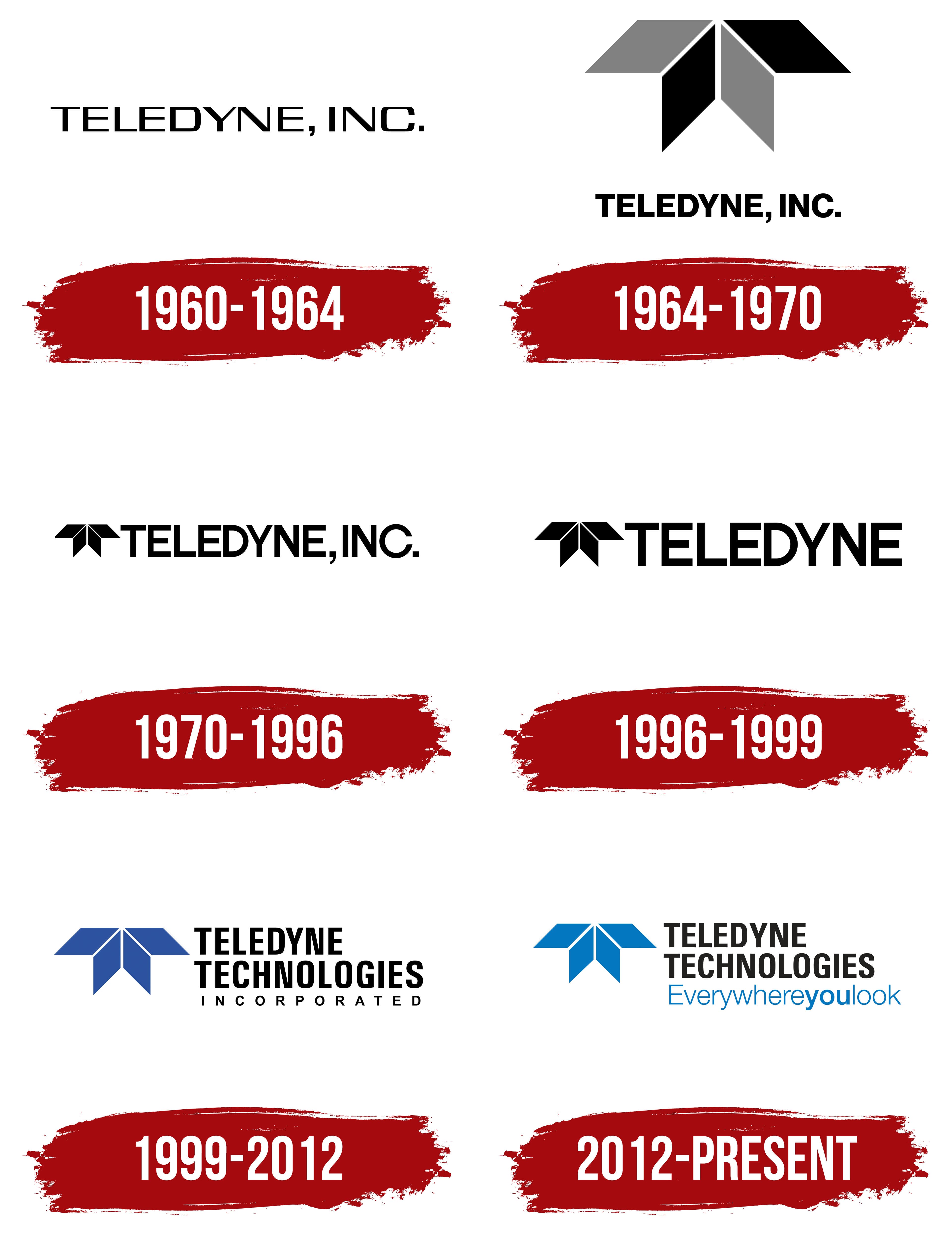
The first logo consisted of “TELEDYNE, INC.” on a single line. Black uppercase letters presented the full corporate designation. A comma followed “TELEDYNE,” and the abbreviation “INC.” ended with a period. The name and its legal designation occupied the entire design.
The wordmark used thin sans-serif lettering with geometric contours. The letters stood upright, with generous spacing between them. Thin strokes gave the long line a light appearance. The identity followed the style of American electronics companies in the early 1960s and accompanied products from the group’s young businesses.
1964 – 1970
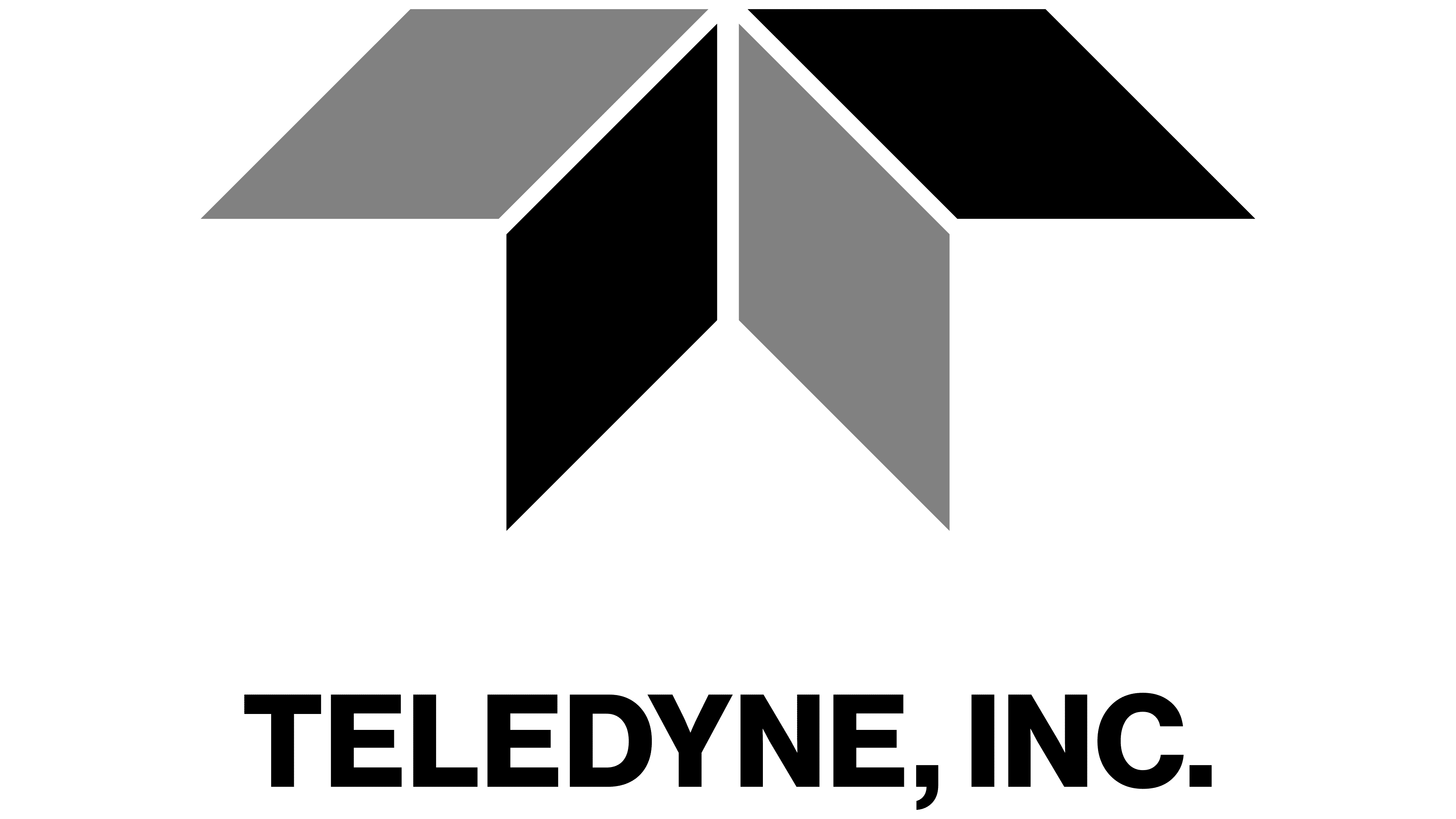
In October 1964, Teledyne introduced a logo with a large emblem above the name. Robert Miles Runyan & Associates developed the project, and Maurice Yanez designed it. Compared with the original version, the lettering became heavier and more closely spaced. A figure of 4 elongated rhomboids led the vertical arrangement.
Their placement resembled a “T” with a short upper crossbar and a forked base. The upper pair extended to the left and right, while the lower pair descended from the center. Their points converged near a shared center, leaving small gaps. White spaces separated the 4 sections, forming a vertical axis and diagonal divisions.
The upper left rhomboid was gray, and the upper right was black. The colors switched places in the lower pair. The alternating tones resembled faces angled in different directions, creating an impression of depth on a flat surface.
The black “TELEDYNE, INC.” wordmark appeared beneath the emblem. The name was set in bold uppercase Helvetica. Uniform vertical strokes and flat terminals complemented the figure’s geometry. The comma after “TELEDYNE” and the period after “INC.” preserved the full corporate form of the name.
Robert Miles Runyan worked on identities for technology and industrial organizations. His projects appeared in design annuals, and the Teledyne logo became one of the firm’s well-known works. Maurice Yanez’s emblem continued to appear in subsequent versions of the brand.
1970 – 1996

In the early 1970s, Teledyne rearranged the logo’s components. A smaller version of the 4-rhomboid emblem was placed to the left of “TELEDYNE, INC.” The name and image now appeared on a single line. The logo became shorter and better suited to applications on instruments, engines, electronic modules, and manufacturer nameplates.
The shapes retained their previous arrangement, while the gray sections became black. White gaps separated the rhomboids. The combination still suggested three-dimensional faces, although the entire emblem was now reproduced in a single color.
The wordmark on the right used heavy uppercase sans-serif letters. Tight spacing brought the name together in a dense line, while the even outer contours complemented the emblem’s geometry. The comma after “TELEDYNE” remained, and “INC.” ended with a period. The shared black color united the name and image.
1996 – 1999

In August 1996, Teledyne merged with Allegheny Ludlum Corporation. The new organization was named Allegheny Teledyne Incorporated. Teledyne, Inc.’s businesses became part of it and remained there until November 1999. At the time of the transaction, Teledyne operated in electronics, aircraft engines, specialty metals, measurement equipment, and engineered systems.
The manufacturing divisions continued using the shortened name TELEDYNE. The logo removed the comma and “INC.” suffix from the previous legal name. The abbreviated wordmark represented the businesses within the combined organization and preserved their connection to their history.
The 1996 logo remained horizontal. The black rhomboid emblem appeared on the left, with the name in the same color on the right. The image was enlarged slightly relative to the wordmark. The letters were enlarged as well, bringing the 2 components closer in height, while letter spacing increased. The short name gained a more open arrangement, retaining the familiar emblem beside it.
1999 – 2012

On November 29, 1999, Allegheny Teledyne split into 3 separate publicly traded companies: Teledyne Technologies, Allegheny Technologies, and Water Pik Technologies. The new Teledyne brought together 19 businesses in electronics, communications, aviation components, energy systems, and engineering services. Leaving the conglomerate allowed the company to develop its technology businesses and independently determine how it would operate in the market.
The full name Teledyne Technologies Incorporated preserved the historic name. “Technologies” identified the engineering businesses’ focus, while “Incorporated” indicated the legal structure. The company used the Teledyne name, emblem, and related marks under a license from Allegheny Technologies. The annual fee was $100,000, and the agreement provided for a subsequent purchase of the rights for $412,000.
In the logo, the name appeared to the right of the emblem on 3 lines. “TELEDYNE” and “TECHNOLOGIES” were set in heavy uppercase sans-serif letters. Beneath them was a smaller “INCORPORATED,” with thin strokes and generous letter spacing. The upper lines presented the main name, while the lower line explained the company’s legal status. Differences in size and style divided the long name into sections and kept the wordmark compact.
The rhomboid emblem that Teledyne, Inc. had used since 1964 remained on the left. The upper pair formed a long crossbar, while the lower pair extended downward. Narrow white gaps separated the shapes. Blue replaced the black fill, marking a new period following the separation from Allegheny Teledyne. The emblem’s historic form preserved the connection to the company’s previous identity.
2012 – today
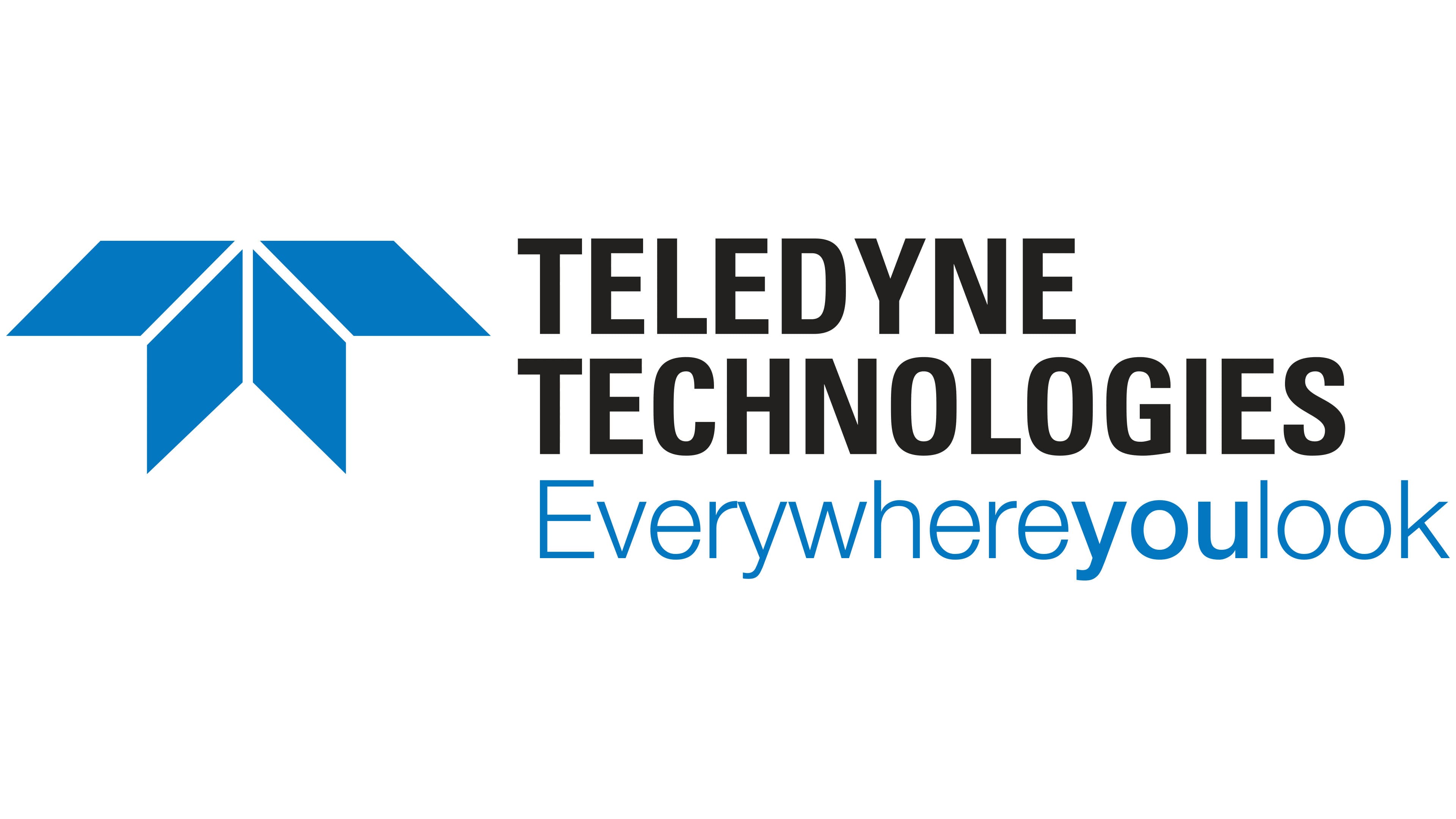
By 2011, Teledyne had brought its different businesses together under the tagline “Everywhereyoulook.” The phrase referred to the company’s technologies used in satellites, aircraft, oceanographic instruments, and industrial cameras. Its products included air and water monitoring systems, medical equipment, and electronic components. The tagline connected these diverse developments to a shared manufacturer name.
In the logo version used since 2012, “Everywhereyoulook” occupied the lower line, replacing “INCORPORATED.” The black name “TELEDYNE TECHNOLOGIES” remained to the right of the rhomboid emblem, divided into 2 lines. Removing the legal suffix made room for a message beneath the main name.
The words “everywhere,” “you,” and “look” were joined without spaces. “Everywhere” and “look” used thin, light blue sans-serif letters. Between them, “you” stood out in bold blue lettering. Differences in stroke weight and shade helped distinguish the 3 words, while the lower line appeared lighter than the heavy name above it.
The rhomboid emblem retained its previous shape and received a lighter color. Teledyne Blue is specified as Pantone 2935 U, CMYK 100, 46, 0, 0, RGB 0, 118, 192, and HEX #0076C0. In addition to the primary color version, we prepared single-color versions in blue and black. Use a white logo on dark backgrounds.