 Telia Logo PNG
Communication and the internet are integral to daily life, from phone calls to streaming video and online work. These services require a stable network and user support in various conditions. The Telia logo is associated with a telecommunications company that provides communication, internet, and digital solutions in Northern Europe and the Baltic states.
Telia Company traces its history back to 1853. That year, Sweden established the Royal Telegraph Agency, marking the beginning of national communications development. In the 1880s, the agency introduced telephone services. By 1920, it had effectively established a monopoly in telecommunications. Since 1953, the organization has operated as Televerket. It played a key role in building the country’s communications infrastructure.
In the 1980s, Televerket launched the NMT mobile system. In the 1990s, the company implemented GSM, strengthening Sweden’s position as a European technological leader. In 1993, the organization was transformed into a joint-stock company, Telia AB. In 2000, part of its shares were listed on the Stockholm Stock Exchange.
The Finnish company Sonera began operations in 1917. It evolved from a state telegraph agency into a modern telecommunications operator. In December 2002, Telia and Sonera merged. The result was TeliaSonera, the largest telecommunications player in Northern Europe.
In the 2000s, the company expanded. It acquired operators in Russia, Kazakhstan, Uzbekistan, Azerbaijan, Georgia, and Nepal. By 2014, its Eurasian subscriber base exceeded 45 million. In 2015, following a corruption investigation related to the Uzbek market, the company decided to focus on the Scandinavian and European markets.
In 2016, TeliaSonera changed its name to Telia Company AB. In 2017, the Sonera brand was fully discontinued. In 2018, the company, together with Ericsson, launched Sweden’s first 5G network. This confirmed its leadership in innovation.
The company remains the largest operator in Northern Europe. It provides mobile, internet, and digital TV services in Sweden, Finland, Norway, Denmark, and the Baltic countries. The governments of Sweden and Finland own the majority of shares.
Meaning and History
What is Telia?
The largest telecommunications group in Northern Europe, headquartered in Stockholm. It provides mobile and fixed-line communication, internet, television, and backbone data channels. Formed after the merger of Swedish and Finnish operators, it focuses on the Nordic and Baltic markets. The company was the first to launch commercial 4G LTE networks in Stockholm and Oslo and to implement 5G in Estonia.
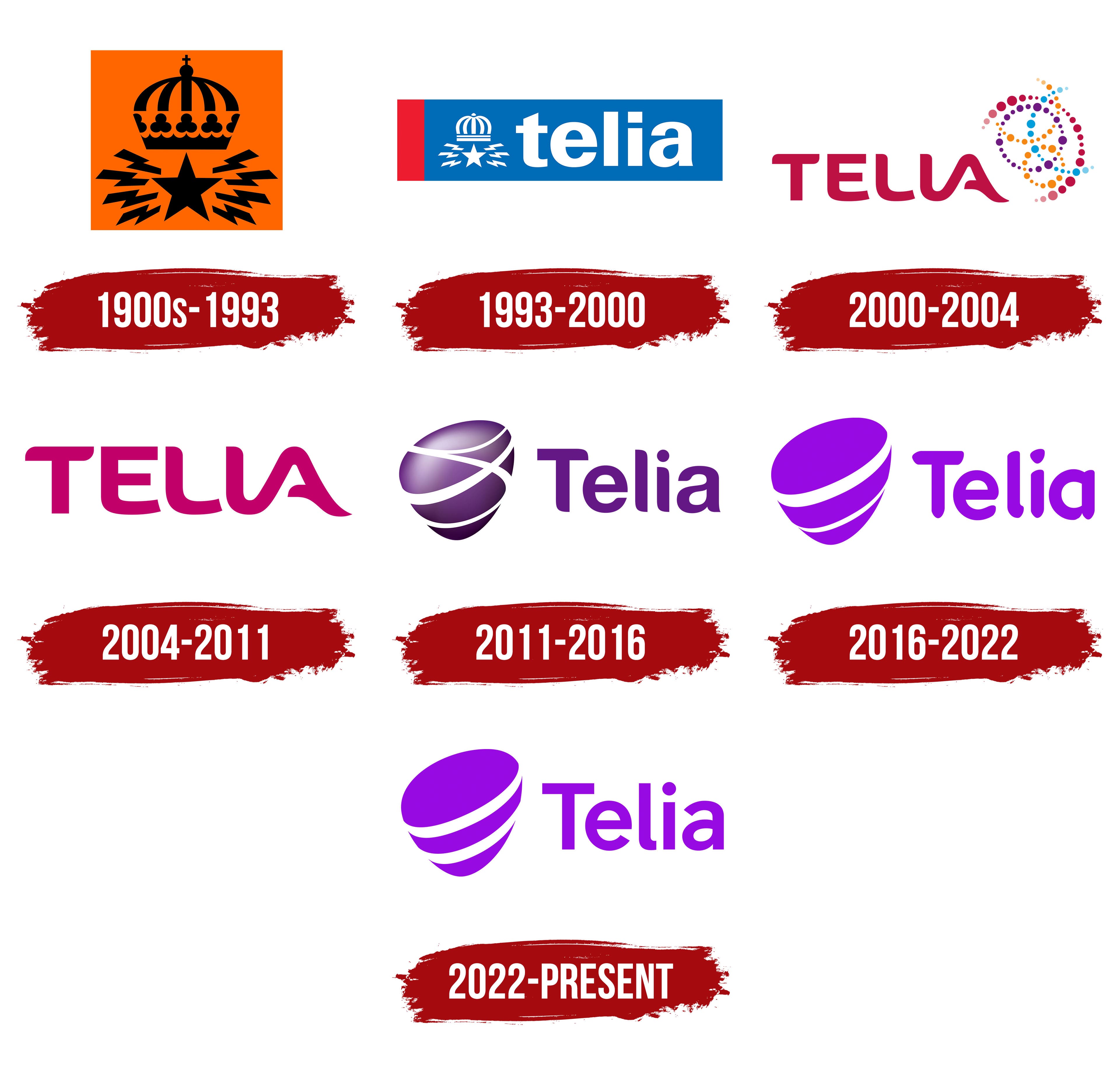
1900s – 1993
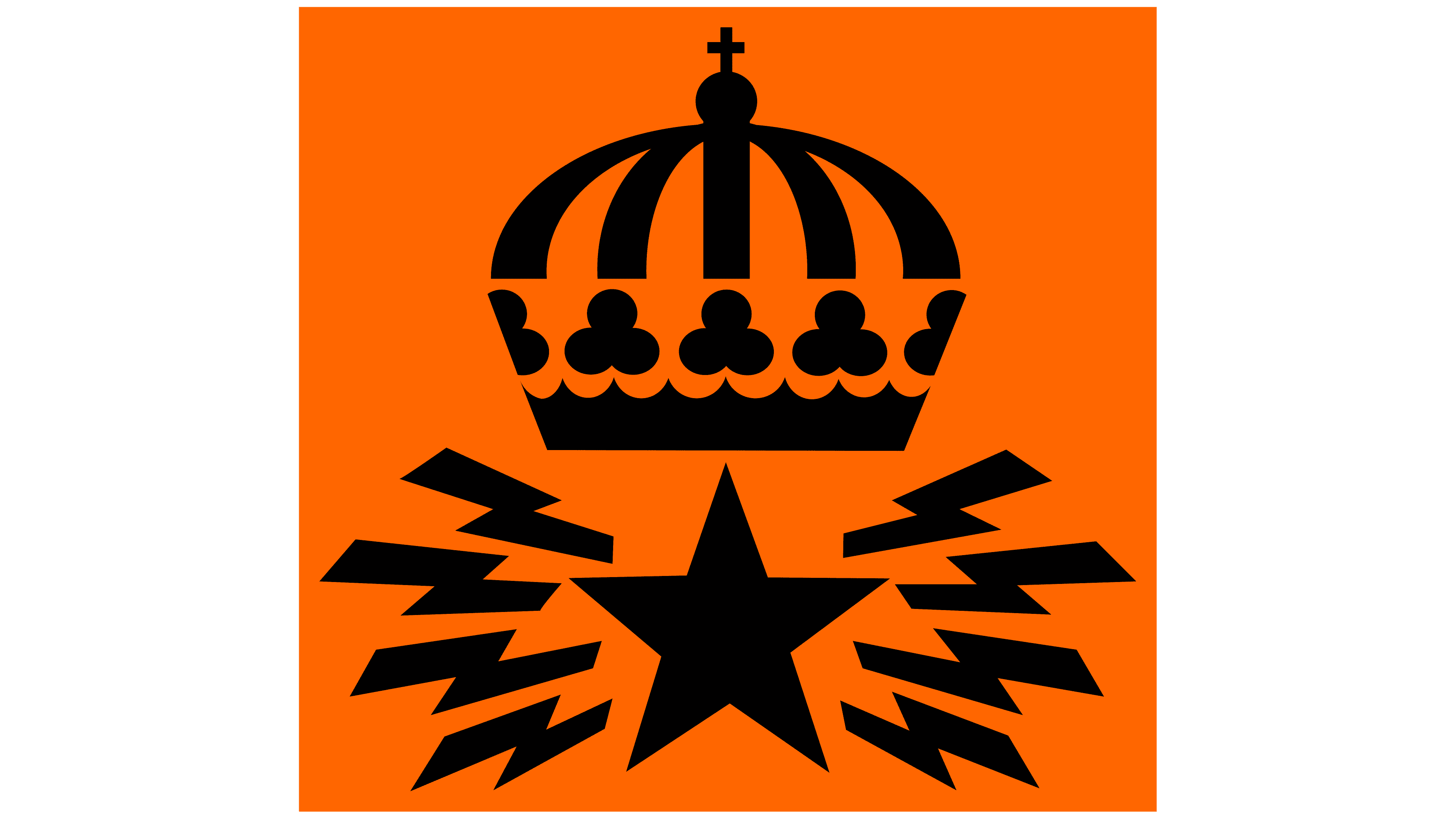
Televerket became Telia AB on July 1, 1993, changing the name and legal status of the Swedish telecommunications organization. The government agency became a state-owned corporation. Telia’s first brand identity retained the former service’s emblem, which had appeared on telephones, tokens, and equipment.
The organization began in 1853 with the establishment of the Royal Electrical Telegraph Agency. Its Swedish name, Kongl. Elektriska Telegraf-Werket, identified its government affiliation and purpose. As telephone service developed, the lengthy name was shortened. In 1946, the reference to royal status was removed, and the agency became Televerket in 1953. That name encompassed both telegraphy and telephone service, which by then accounted for a substantial portion of its work.
Skriptor naming specialists developed the name Telia. Project participant Olof Lindquist recalled a list of 518 proposals, most containing the letters “TEL.” The review considered whether the names could be used internationally and how closely they resembled existing names. Telia was on the list, but management became interested in it after considering other options. The new name retained the root “Tel(e),” referring to telecommunications. The portion identifying the organization as an agency was dropped when it became a corporation.
The emblem preserved three motifs from the service’s history. The crown indicated state ownership, the five-pointed star was known as Nordstjärnan, or “the North Star,” and the lightning bolts referred to telegraphy. In Televerket’s later branding, the design appeared in black against bright orange. The crown, star, and lightning bolts carried over into Telia’s first identity.
A stylized crown with five arches topped the emblem. Five vertical sections with curved outlines gave it volume. A small cross topped a circle at the summit of the middle dome. Closely arranged trefoil-like shapes lined the crown’s base. Below it sat a large star with one point facing upward. Eight zigzag lightning bolts extended from the star, four on each side. Solid black unified the design. The crown above the star and paired lightning bolts maintained the emblem’s symmetry.
1993 – 2000
When Telia was established in 1993, it took over most of the commercial operations of Sweden’s telecommunications agency, Televerket. The logo maintained a link to the former service by combining its emblem with the new name. The crown, five-pointed star, and radiating lightning bolts remained, while the surrounding colors changed.
The logo sat inside a horizontal rectangle. A narrow red stripe ran along the left edge, while the rest of the field was dark blue. The symbol and company name appeared in white against it. The emblem sat to the left of the name, with the crown above the star and lightning bolts extending to either side. Their shared white color against blue brought the historic image and the new name together.
“telia” appeared in upright lowercase sans-serif letters. Heavy strokes, rounded letterforms, and tight spacing. The lettering resembled modified versions of Helvetica Rounded or Frutiger. The white name sat to the right of the emblem, both contained within the blue field.
2000 – 2004
Discussions about replacing the crown in Telia’s logo began well before the 2000 update. As early as 1995, people within the company viewed it as a reminder of a government agency and associated it with an old-fashioned image of the operator. The new emblem was developed with changes in Telia’s business in mind. The company was expanding into the internet and other forms of communication, gradually moving beyond traditional telephone service. Ahead of its stock market listing, Telia wanted to refresh the brand’s appearance.
Marketing director Kerstin Åkerstedt approached four agencies already working with the company. The marketing department reviewed their proposals and submitted suitable designs to management. CEO Jan-Åke Kark recommended the version the board approved. Interbrand won the assignment. Development and implementation took four months, and the logo was unveiled on April 25, 2000.
The crown, lightning bolts, and blue frame gave way to “TELIA” lettering and a pattern of colored dots to its right. The lowercase name became uppercase, with custom letterforms. The main sans-serif strokes were consistent in weight, widening in certain areas, and the edges were slightly rounded. The lower portions of the “E” and “L” curved, and the “L” connected to the “A.” The lettering used a dark raspberry red with burgundy and pink undertones. The company associated the color with warmth and closeness.
To the right, dots formed several intersecting curved lines around a shared center. Circles and semicircles of different diameters created a spiral-like sphere resembling a stylized molecule. Yellow and blue dots appeared in the center, with purple and pink toward the edges. The colors included bright orange, rich blue, lilac, and pale pink. Variations in the dots’ size and color created an impression of pulsation. The dotted lines represented information pathways and interwoven communication, connecting the emblem to conversation and information exchange.
The name and dotted design were intended to be seen as a unified whole, conveying the idea of people communicating in different everyday situations. The rebrand covered Telia’s entire identity. Telia introduced the new look gradually across corporate materials and other applications.
2004 – 2011
After Telia merged with Finland’s Sonera in December 2002, the group’s name combined both companies’ names. The parent company received a separate TeliaSonera wordmark, while local operators retained the brands their customers knew. Telia continued operating in Sweden and Denmark, Sonera in Finland, and NetCom in Norway. The combined name represented the merged group, while the operators’ names maintained their connections to national markets. As a result, Telia and TeliaSonera were used as separate wordmarks for a time.
Telia’s next logo change came in early 2004. The multicolored dotted rings were removed, leaving the Interbrand-created lettering. “TELIA” took on a pinkish-purple magenta color. The geometric, simplified letterforms incorporated custom changes to individual strokes. The capitals retained their curves and the connection between the “L” and “A.” With the adjacent symbol gone, the lettering alone defined the logo’s appearance.
The magenta sparked a dispute with Deutsche Telekom, which claimed rights to the color in the telecommunications industry. Swedish legal publications reported on its claims against TeliaSonera in December 2007. In 2008, the dispute over Deutsche Telekom’s attempt to restrict Telia’s use of the color was resolved in Telia’s favor.
2011 – 2016
A shared emblem let TeliaSonera bring 18 major brands together while keeping their national names. Telia, Sonera, NetCom, EMT, Elion, Omnitel, and other operators adopted the same symbol and purple color to identify them as group members. The group has used the identity for its Eurasian operations since 2009. Developed by Landor Associates, the identity was unveiled at the Stockholm headquarters on May 12, 2011. CEO Lars Nyberg and head of corporate communications Cecilia Edström led the presentation.
The symbol was named “Pebble.” Lars Nyberg linked it to the combination of local and international connections, while purple became the group’s shared identifying color. The emblem had an asymmetrical rounded shape resembling a drop or an ellipsoid. Its upper portion was fuller and tapered toward the bottom. A highlight at the top transitioned into darker purple tones at the base, giving the surface a three-dimensional appearance. White curved stripes crossed at different angles and followed the shape, resembling ribbons wrapped around it.
In Telia’s logo, the Pebble appeared to the left of the name. The lettering was dark purple, set in a sans-serif typeface with clean, even lines. Its forms resembled typefaces in the Neo Sans family. The “T” in “Telia” remained uppercase, while the “e,” “l,” “i,” and “a” were lowercase. The operator’s national name appeared alongside the shared emblem. Customers continued using a familiar brand, while its appearance identified it as part of the group.
Landor worked on the group’s brand architecture, identity development, and rollout. A book introduced employees to the new identity and the company’s vision for the future. Creative director James Pass contributed to the publication. Illustrations helped explain the group’s new image. The book was distributed to employees in different countries through internal programs. The rollout covered more than 300 stores and approximately 1,000 signs.
2016 – 2022
In 2016, the parent company became Telia Company and updated its brand identity. Shareholders approved the new name on April 12. The wording beside the shared emblem varied depending on the logo’s purpose. One version represented the group, while another represented the customer-facing brand. Local operators gradually adopted the Telia name.
Wolff Olins developed the identity. The agency retained the purple Pebble, simplifying its design and its relationship with the name. Gradients gave way to a solid fill. The asymmetrical oval shape resembled a drop, tapering toward the bottom. Two white ribbons crossed it diagonally, with the upper ribbon wider than the lower one. The stripes stood out against the purple field, replacing the earlier gradient-based depth with a flat image.
To the right of the emblem, “Telia” appeared in purple with an uppercase “T” and lowercase “e,” “l,” “i,” and “a.” The sans-serif lettering combined rounded forms, smooth contours, and consistent stroke weight. Its design resembled Avenir Next Rounded or Google Product Sans. The name and symbol used the same color.
Telia Eesti was among the first to introduce the updated identity. Its launch accompanied the consolidation of Estonia’s EMT and Elion brands under the Telia name. Local agency Division worked with Wolff Olins on the project. Norway’s NetCom became Telia on March 1, 2016, followed by Finland’s Sonera on March 23, 2017. After Sonera’s name change, Telia operated all wholly owned operations in the Nordic and Baltic countries under the Telia name.
2022 – today
Telia commissioned Kurppa Hosk to adapt its logo for digital use and align its identity across markets. Work began in 2021, and the updated identity appeared in early 2022. The existing look was retained, with the main changes affecting the letterforms and details of the purple Pebble.
The name remained to the right of the symbol. The uppercase “T” and lowercase “e,” “l,” “i,” and “a” were retained, but their shapes were reworked. The sans-serif lettering moved closer to contemporary neo-grotesque typefaces. The emblem’s outer contour and lower white stripe were adjusted to make its shape easier to distinguish at small sizes. Telia Company’s head of design, Emilie Westerfelt, explained that the update aimed to make the logo accessible, including to people with severe visual impairments.
The new identity was introduced in stages. Store signs were updated as part of scheduled replacements. Guidelines for colors, typography, and digital components were brought together in Voca, a system developed with Nordkapp’s involvement. Shared guidelines governed the use of the updated identity across markets.