 Toray Logo PNG
Aviation, electronics, medicine, and water purification systems rely on high-tech materials that underpin modern devices and structures. Producing these components requires precise calculations and strict control of specifications. The Toray logo is associated with a Japanese company that develops and manufactures materials for various industries, including carbon fiber, films, and membranes.
Toray Industries was founded on January 17, 1926, as Toyo Rayon Company Limited. It was established as part of the Mitsui group and produced viscose, which it had previously imported from Europe. By the late 1930s, the company had become one of Japan’s largest artificial silk producers. During the same period, it began producing nylon, which allowed it to surpass many global competitors.
After World War II, production recovered slowly. In 1957, the company obtained a license to produce polyester and began diversifying its business. In 1958, it developed its own technology for producing acrylic. By the mid-1960s, Toray was among the world’s top three synthetic fiber producers.
In 1970, the company adopted a new name, Toray Industries. This reflected its expansion into the chemical and technological industries. After the 1973 oil crisis, the company began developing petrochemical operations.
In the 1980s and 1990s, the company entered international markets. It opened facilities in Asia, Europe, and the United States. The company devoted considerable attention to producing carbon fiber, which later became a key business area.
In 2013, the company acquired a stake in the American firm Plasan Carbon Composites. In 2015, it purchased European assets from Saati.
By the 2020s, Toray had become a global leader in carbon fibers, polymers, and membrane technologies. In 2023, revenue reached 2.49 trillion yen. In 2024, it fell to 2.46 trillion yen.
The company increased operating profit to 108.8 billion yen. A recovery in demand for chemical materials and strong sales in Asian markets drove this increase. Toray remains one of the largest participants in the global chemical industry.
Meaning and History
What is Toray?
A Japanese chemical corporation in the Mitsui Group, headquartered in Tokyo, began operations as the viscose producer Toyo Rayon and became one of the world’s largest manufacturers of synthetic fibers. Its current structure comprises five business areas with revenue of 2.56 trillion yen: fibers and textiles; chemicals (polyethylene, polypropylene, ABS plastic, semiconductor materials); carbon composites; membrane water purification systems; and pharmaceuticals.
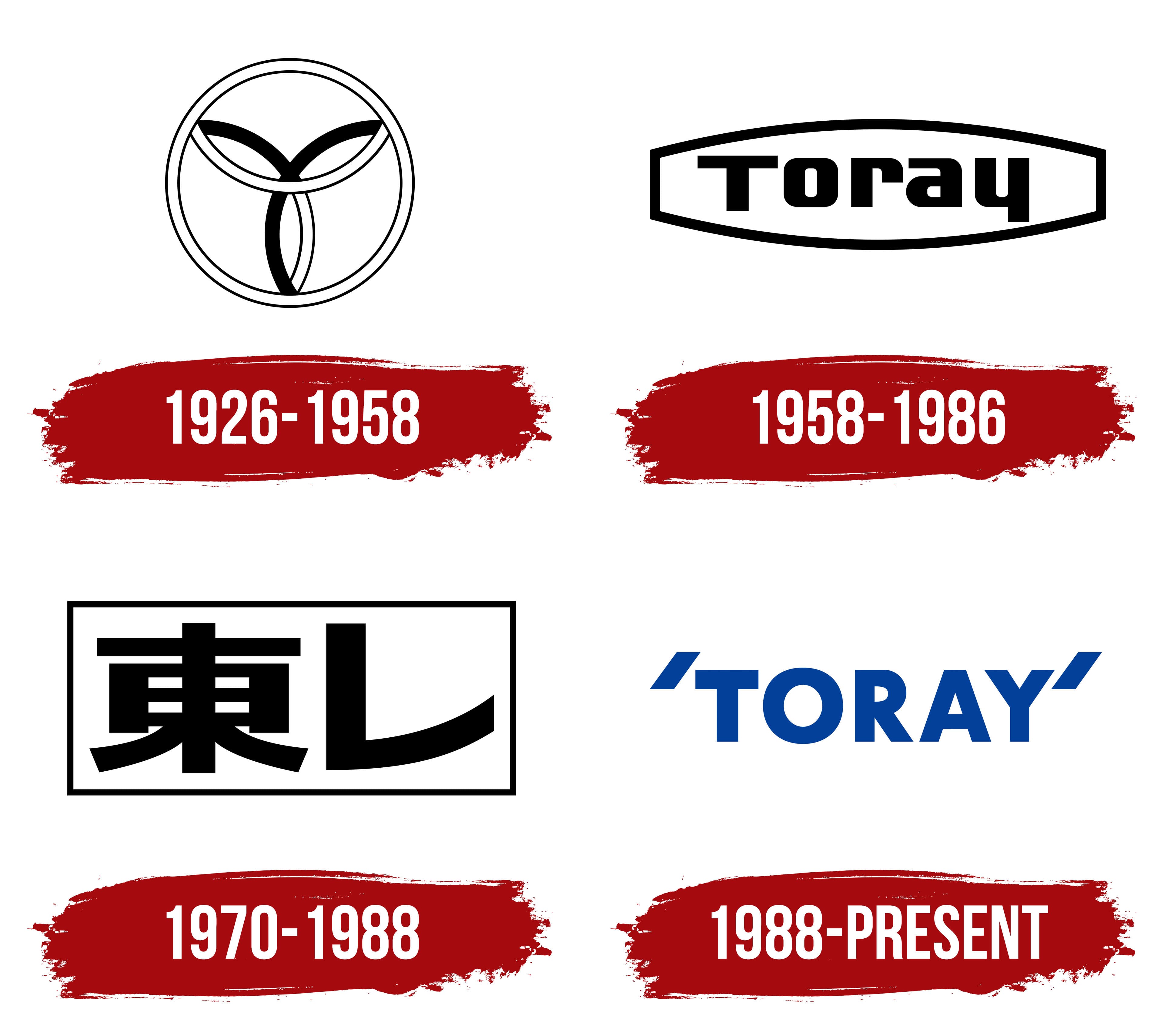
1926 – 1958
Toray used its first emblem from 1926 to 1963, beginning when the company was founded as Toyo Rayon Co., Ltd. The business was established in Japan with Mitsui’s involvement to manufacture rayon, known as artificial silk. Before local production began, Mitsui imported rayon yarn from Britain’s Courtaulds. The shorter name Toray later developed from Toyo Rayon. It entered everyday use after the war, with both Tore and Toray considered as spellings in the Latin alphabet.
The early black-and-white symbol sat inside two thin concentric circles. Its inner design consisted of three interwoven curved sections that met near the center, forming elongated petals. The upper section curved downward and consisted of two thin lines. The lower-left section rose diagonally to the right, with a broad black stroke continuing downward as two narrow lines. The lower-right section extended toward it and included another broad stroke. Alternating solid black areas, thin outlines, and white gaps gave the interwoven design depth.
A stylized “T” appears where the solid lines intersect. The emblem’s construction also incorporated the four letters of TOYO. The double ring carried a separate meaning, representing favorable circumstances, the land’s advantages, and harmony among people.
1958 – 1986
In May 1963, designer Yusaku Kamekura introduced Toray’s corporate emblem. Replacing the letters hidden in the earlier symbol, the name Toray appeared in the center in Latin script. A thread-spool-like frame enclosed it. This preserved a tangible connection to fiber production while making the name a visible part of the logo.
The black outline was horizontally elongated. Its thick upper and lower sides bowed outward and joined at the ends through short vertical segments. Inside the frame, heavy black sans-serif lettering combined a capital “T” with lowercase “oray.” The broad strokes had rectangular forms and rounded corners.
1970 – 1988
By 1970, the reference to rayon in Toyo Rayon no longer reflected the company’s operations. The company ended rayon yarn production in 1963 and shifted to synthetic fibers, plastics, and other chemical industry activities. It adopted the official name Toray Industries, Inc. During the same period, it introduced a logo featuring the shortened Japanese name.
Tadasu Fukano designed the emblem, which was used from 1970 to 1986. Inside a thin black rectangular frame were two large characters, the kanji 東 on the left and the katakana レ on the right. Their thick black strokes filled almost the entire frame. The lower diagonals of 東 spread outward, while the long lower stroke of レ rose at its end. The two characters’ contrasting forms created the compact horizontal name 東レ.
1988 – today
For its 60th anniversary, Toray launched a company renewal program covering management, production, and international group development. Toray unveiled a new corporate logo at the anniversary ceremony in April 1986, with the launch date set for September 9, 1988. British designer Colin Forbes, a Pentagram cofounder, created it. The TORAY name in the Latin alphabet replaced the enclosed frame as the logo’s basis.
Forbes set the name in large blue sans-serif capitals. The lettering matched Futura Bold. Heavy, even strokes combined a circular “O” with angular “A” and “Y” letters, while the rounded upper portion of the “R” led into a diagonal leg. Two slanted blue parallelograms appeared near the beginning and end of the word, slightly above the letters. Their thickness matched the lettering strokes. They functioned as single quotation marks, representing Toray’s openness to dialogue with society. The corporate color, Toray Blue (or Intelligent Blue), was associated with intellectual culture, precision, and refined taste.
In 2006, for the company’s 80th anniversary, the tagline “Innovation by Chemistry” appeared beside the logo. It added a verbal explanation of the company’s direction while preserving the TORAY lettering and Forbes’s quotation marks.
For its 2026 centennial, Toray created a separate anniversary emblem. The commemorative design brought back the original symbol with interwoven rings. A line extending from it represented the century that had passed. At the same time, the numeral “1” became an upward-pointing arrow, representing the next century. “Pioneering Change for the World” accompanied the emblem, expressing the idea of leading change for the world.