


 UiPath Logo PNG
The UiPath logo resembles a perfect packaged solution, ready for immediate use, symbolizing the platform’s simplicity and efficiency. This platform allows users to program robot actions, delegating specific production tasks to them. The emblem reflects the broad range of management capabilities available to clients, enabling the automation of routine processes and optimization of work operations.
UiPath began in 2005, when Daniel Dines and Marius Tirca founded DeskOver in Bucharest, Romania. The company worked on software outsourcing and business process automation for several clients, including projects in real estate and library management. In 2012, the team began developing a workflow automation product based on experience from earlier client work.
DeskOver released its first robotic process automation tool in 2013. The software reproduced repetitive computer tasks normally performed by employees and began attracting corporate users. In 2015, the company adopted the UiPath name, shifted its focus toward RPA, and opened its first international office in London. Seedcamp and Earlybird Venture Capital invested $1.6 million in 2016.
In 2017, UiPath raised $30 million in Series A funding, expanded hiring, opened new offices, and launched a free online RPA academy. During 2018, Series B and Series C rounds brought in $153 million and $225 million, raising the valuation to $3 billion. The company entered Australia, Singapore, Japan, and other markets.
UiPath introduced AI integrations and a no-code robot-building tool in 2019. In 2020, a $225 million Series E round valued the business at $10.2 billion, while a cloud platform expanded its automation products. On April 21, 2021, UiPath listed on the New York Stock Exchange at a $35 billion valuation. During 2022 and 2023, the platform gained machine learning features and new partnerships with major technology and consulting firms.
Meaning and History
What is UiPath?
This provider of cutting-edge software specializes in robotic process automation (RPA), offering companies a virtual workforce to perform routine tasks. This platform allows businesses to automate rule-based, repetitive processes across applications and systems, freeing employees to focus on more strategic and creative work. Thanks to its intuitive interface, business users and developers can easily create and deploy software robots capable of performing human-like tasks from data entry to decision-making and invoice processing. With AI capabilities, these digital workers can learn and adapt over time, handling increasingly complex tasks. The platform impacts various industries, including manufacturing, retail, healthcare, and finance, helping companies improve processes, reduce errors, and accelerate digital transformation.
Before 2014
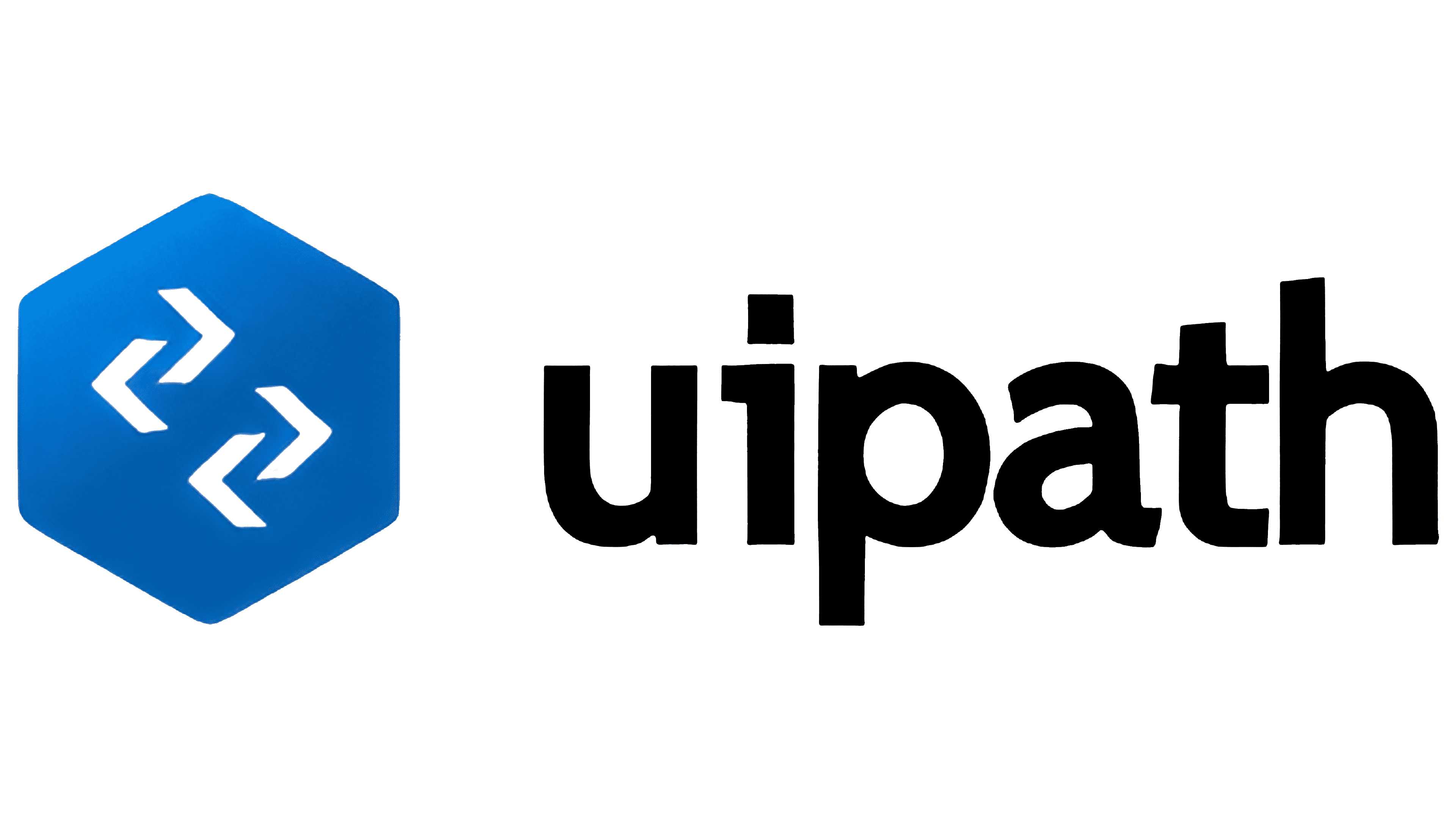
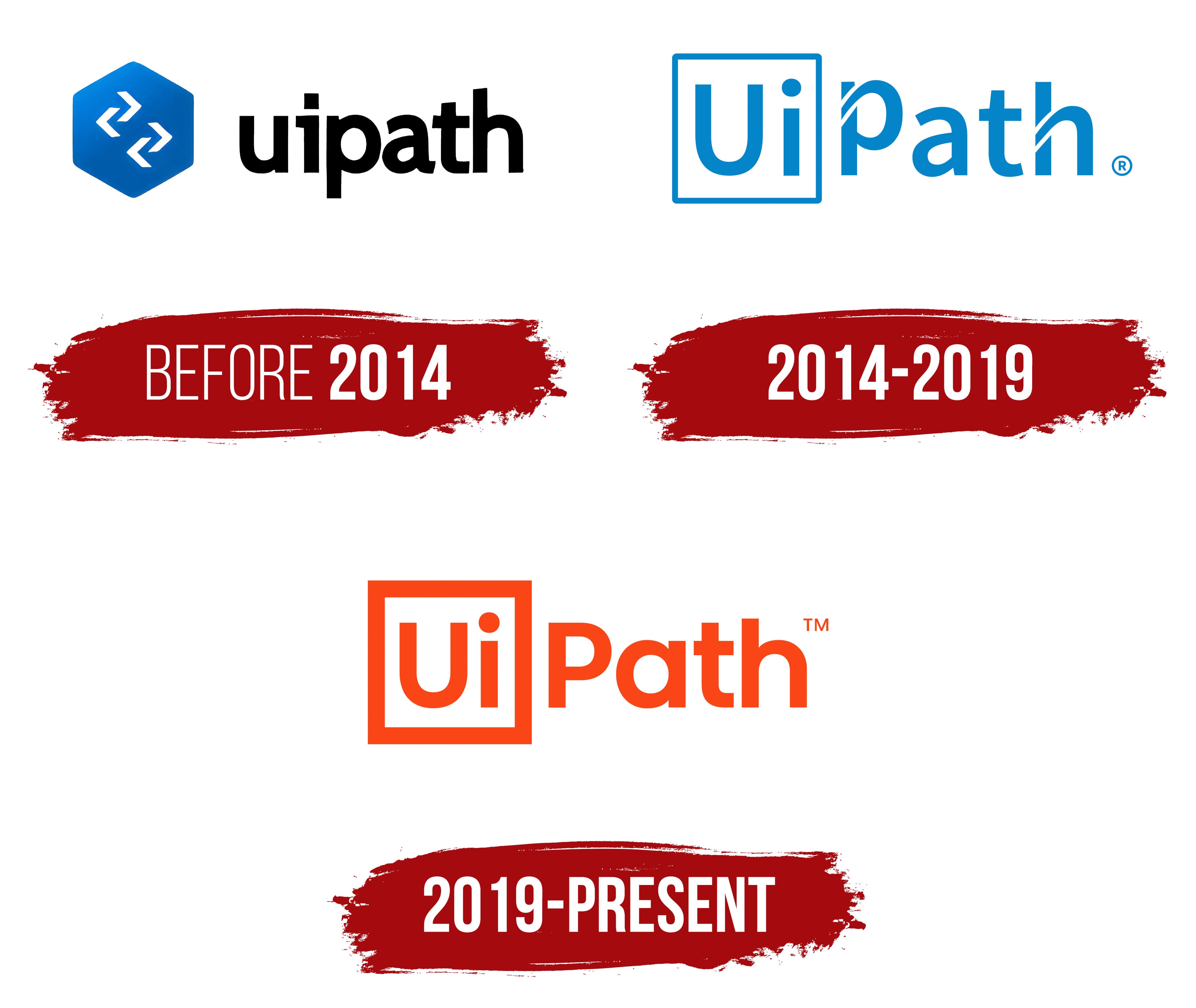
The application’s first logo features a bolt, symbolizing the workflow, tools, and mechanisms. The five-sided head is associated with important production elements, such as nails, screws, and bolts, which are fundamental components of any product. The creators drew a parallel between digital robots and physical machines, emphasizing the connection between online and offline technologies. The blue color, traditionally associated with technology and engineering processes, reinforces the technical theme.
On the surface of the bolt’s head are two interlocking arrows resembling chain links. This element symbolizes integrity and interaction, as the company’s programs initiate complex processes interconnected through commands. The arrows also point to active data exchange, highlighting the system’s dynamic nature.
The system’s name is positioned some distance from the bolt image, symbolizing remote control. The font used for the text consists of flexible black letters with small serifs, reflecting automated processes and the system’s technological nature. The absence of capital letters emphasizes that the utility is an auxiliary tool designed to control the main mechanism or program, with a focus on its functionality and practical use.
2014 – 2019
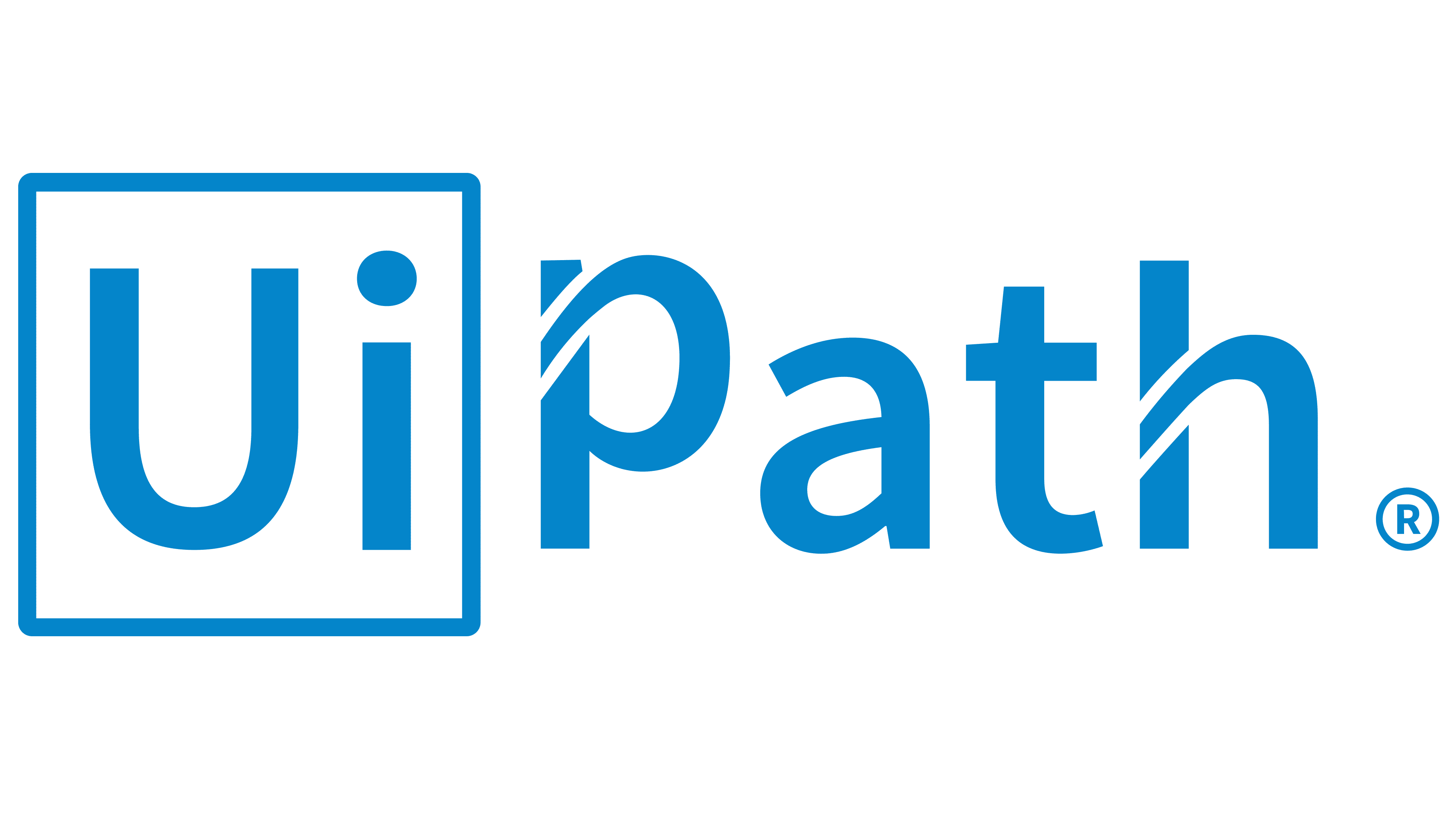
Since 2014, the company’s logo has focused on the name, which changed from DeskOver to UiPath, reflecting the main product. The “Ui” and “Path” are intentionally separated to emphasize their significance.
“Ui” stands for “User Interface” and is enclosed in a square with a blue border. This enclosed shape symbolizes a comprehensive solution, offering all the necessary programs and tools for managing processes. The platform helps users control robots and automate tasks through an easy-to-use interface. The square shape resembles a computer application icon associated with digital technologies and modern software.
The second part of the name, “Path,” highlights that the platform allows users to pave a path and create an action algorithm for the robot. The letters “P” and “H” use rounded lines with a white outline, emphasizing the route that automated processes follow. This design choice enhances the visual contrast and emphasizes the importance of an orderly structure and clear direction in the system’s operation.
2019 – today

The UiPath company logo has retained the core structure of the previous version but has become bolder and more modern. The main difference is the thicker lines and a richer orange color. This choice emphasizes the company’s growth and resilience, securing the top spot in the RPA (Robotic Process Automation) market and third place in the Forbes Cloud 100 ranking. The thick and clear lines symbolize the stability and reliability of the company’s technology offerings.
The orange color of the emblem represents friendliness, dynamism, and innovation, aligning with the spirit of the times when product functionality and ease of use are paramount. This shade creates a sense of openness and underscores the company’s focus on the user. In this case, orange is associated with the platform’s simple, intuitive interface, helping people automate routine tasks and enhance productivity.
The letters “Ui” are framed by a square, which may symbolize the structure and order of the platform’s processes. The clean and concise font, without unnecessary decorative elements, emphasizes the company’s technological focus and commitment to progressive solutions. The slogan and bold logo design reflect the brand’s market position and its desire to stay at the forefront of digital transformation, simplifying complex user processes worldwide.