![]() Valve Logo PNG
Valve Logo PNG
The Valve logo is iconic yet modest. It stylishly conveys the idea of creativity, which helps the company develop some of the most sought-after video games in history. The simple and powerful emblem is an excellent identifier, allowing users to recognize their favorite products among competitors quickly.
Valve: Brand overview
On August 24, 1996, Gabe Newell and Mike Harrington, two former Microsoft workers, created Valve Corporation in Kirkland, Washington. The concept of developing cutting-edge video games drew both founders, who decided to contribute their money to the startup.
Half-Life, Valve’s first game, took up the first two years of the company’s existence. The business bought a license to use id Software’s Quake engine and made substantial modifications to suit its requirements. When Half-Life was first released on November 19, 1998, it quickly gained popularity and won multiple accolades, including praise from critics for its inventive gameplay and compelling plot.
Half-Life’s popularity allowed the firm to grow. In 1999, the corporation started developing Team Fortress Classic after acquiring Team Fortress Software, the creator of the well-known Quake mod.
Originally developed by unaffiliated developers as a Half-Life update, Counter-Strike was released by the company in 2000. The enterprise hired the mod’s makers, who then made it into a stand-alone game that swiftly rose to prominence as one of the most well-liked multiplayer shooters ever.
2003 was noteworthy for the brand because it saw the introduction of Steam, a digital game distribution platform. Although Steam was first created to make upgrading games easier, it has since grown to become the biggest online game retailer.
The producer finally released the eagerly anticipated Half-Life 2: The Second Chapter in 2004. The game’s graphics, physics, and plot won it over from critics, cementing the firm’s position as one of the top developers in the business.
The Orange Box, a 2007 collection of Portal, Team Fortress 2, and Half-Life 2: Episode Two, was particularly noteworthy. Portal’s inventive puzzle game created a cult following and many memes.
2009 the developer released a zombie-apocalyptic cooperative shooter called Left 4 Dead Two. It quickly gained popularity and solidified the company’s position in the multiplayer game market.
When Portal 2, which built on the first game’s idea, was released in 2011, it won multiple accolades for its creative puzzle design and lighthearted plot.
In addition to announcing the idea of Steam Machines—gaming PCs for the living room—the firm also revealed that its operating system, SteamOS, was built on Linux in 2012.
Dota 2, a multiplayer online battle arena (MOBA) game, was released in 2013 and quickly became one of the most well-liked esports competitions globally.
In addition to launching SteamVR, the company said in 2015 that it was working with HTC to produce its own VR device.
The Lab, a compilation of virtual reality mini-games demonstrating the potential of VR technology, was released in 2016.
Artifact, a collectible card game set in the Dota 2 universe, was released in 2018 after the firm resumed active game development.
The company’s VR headgear, the Index, was released in 2019 and well-received for its comfort level and technological features.
The first major game in the Half-Life world made especially for virtual reality, Half-Life: Alyx, was released in 2020.
2021 saw the release of Steam Deck, a portable SteamOS gaming device from the company. With this news, the enterprise took a big stride forward in the hardware industry. The purpose of Steam Deck was to enable players to play games from the Steam library on the go. The gadget had an ergonomic design, comfortable controls, and powerful technology that could run recent games.
The company released the Steam Deck in 2022. When the device went on sale in February, it attracted much attention from gamers and earned favorable reviews from reviewers. The enterprise kept trying to make SteamOS more portable and to make games operate better.
In the same year, the firm further advanced virtual reality technology. The business unveiled improvements to motion tracking and visual quality for its VR headgear, Index.
The developer concentrated on creating cloud gaming services in 2023. Gamers can now stream games from their home computers to various devices, including smartphones and Steam Deck, thanks to the company’s expansion of Steam Remote Play. Thanks to this upgrade, users’ game libraries are now considerably easier to access.
In 2023, the producer continued enhancing VAC (Valve Anti-Cheat), its anti-cheat system. New machine learning algorithms were implemented to detect and prevent online game cheating more efficiently.
The brand announced in 2024 a significant overhaul to the Steam platform, including a revised UI and new social features. This upgrade was intended to improve user experience and solidify Steam’s standing as a top digital game distribution platform.
Meaning and History
![]()
What is Valve?
It is an American video game developer, publisher, and digital distribution company. Founded by Gabe Newell and Mike Harrington, it is best known for creating popular video games such as Half-Life, Counter-Strike, Portal, Left 4 Dead, and Dota 2. The company also created Steam, the leading digital distribution platform for PC games. Steam allows users to buy, download, and play various games and offers features such as social networking, game updates, and cloud storage.
1996 – today
![]()
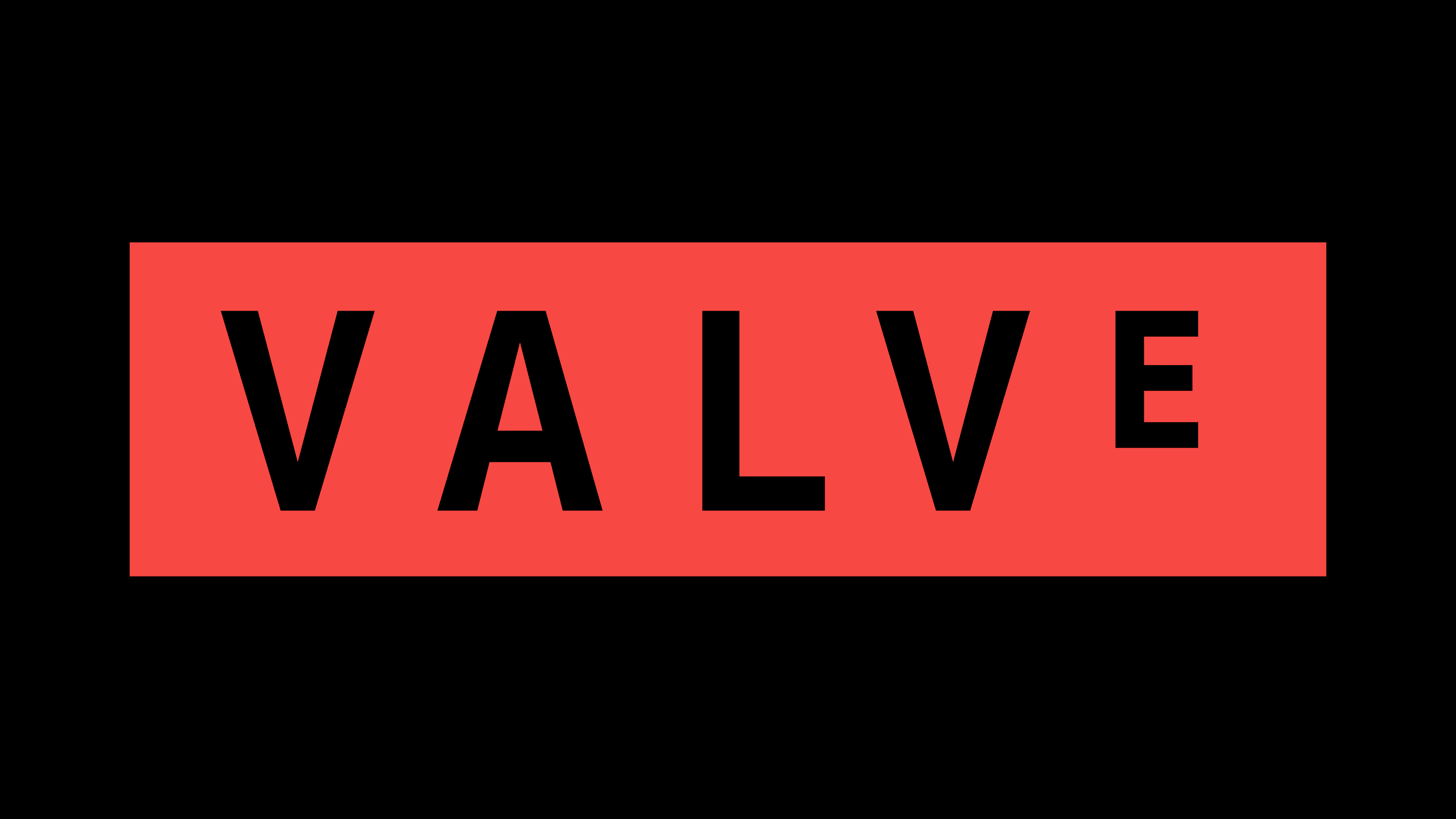
The Valve logo’s monochrome and minimalist design, introduced in 1996, perfectly captures its essence. Despite its simplicity, the logo embodies strong energy and a promising future, representing a company that has made waves worldwide. The key is straightforward – about the high-quality work the video game developer offers. Valve’s lineup includes titles such as Counter-Strike, Portal, Dota 2, Half-Life, and many more. Given the style and themes of these games, the choice of such an emblem makes sense.
The logo’s main feature is its graphic precision, crucial for products derived from computer technologies. It is also characterized by clarity, a decisive factor in video games that must be accessible to people of all ages. Thirdly, it reflects a tendency toward pixelation, which is closely linked to the virtual world and development.
The icon is very serious: it only includes the company name, enclosed in a wide rectangular frame. This frame symbolizes the boundary between the real and virtual worlds and the line separating fiction from reality and the ordinary from the extraordinary. In this way, the developers emphasize the importance of having a “sanctuary” where one can escape the hustle, immerse in fantastic events, recharge, and enjoy the excitement.
Inside the horizontal rectangle is the “heart” of video games – the name of the leading developer that has delighted the world with many unforgettable experiences. The precise geometric shape conveys an atmosphere of caution, vigilance, and practicality, essential for any high-quality digital product. The frame highlights Valve’s key role in creating engaging video games and underscores its serious approach to the craft.
The text is set in bold uppercase letters. All letters are capitalized and feature no serifs, making them appear both practical and modern. The smooth, straight lines make the name highly legible. The wide spacing between the letters contributes to the text’s lightness, giving it an airy and fresh feel. The placement of the text directly in the center makes it seem to float.
The black color used for both the letters and the outline does not detract from the sense of lightness. It maintains an atmosphere of solidity, elegance, and a businesslike approach. At the same time, the playful mood is captured in the tiny glyph of the “E,” which is so small that it reaches only two-thirds of the size of the other characters.
2018 – today
![]()
The new Valve logo is more uplifting. It radiates energy, good mood, and positivity. This is achieved through the emblem changes, which remain simple and concise, aligning with the brand’s core concept. In its view, visual identity should meet several criteria:
- Fit well on the products (compactly mark them).
- Serve as an identifier of original goods (for user convenience).
- Confirm the origin of video games (to prove their authenticity).
- Represent the company and its range in advertising (effectively promote them).
- Be readable on displays of all electronic devices (maintain clarity).
Additionally, the logo conveys the idea of enjoyable pastimes and a positive outlook on life. It energizes and invigorates. For this purpose, the designers changed the background where the text is placed, coloring it in a more attractive hue – red. However, it’s not a bold red to avoid a sense of aggression but a coral shade with a pleasant pastel tone.
On this background, the large white letters stand out clearly. They are uppercase, grotesque, and have clean and straight lines in a geometric style. Their tops are trimmed to avoid sharp ends—smooth edges replace them, as seen in the “A” and “V.” The designers left ample space between the characters for text lightness and airiness.
The brand name is centered within the bright rectangle to draw attention. The underlying idea remains the same: the company offers a chance to enjoy time in a “sanctuary” of carefree joy, recharging energy, escaping daily life, and changing experiences. The light text generates positive emotions, just like its new background. The outline is now absent to prevent users from associating it with limitations or restrictions.
The textual sign uses a font resembling Arial Bold, with a distinctive feature of the game developer—a reduced “E.” The last glyph in “Valve” seems to float in the air because it is shorter than the others. This visual approach is intriguing and evokes curiosity. It reflects the company’s desire to present clients with a new, unconventional, imaginative perspective. Combined with the soft coral rectangle, the text feels innovative, transforming a simple logo into something unique and progressive.