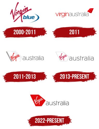
The Virgin Australia logo resembles a wind-filled sail gliding across the country’s lands. The emblem is full of energy and dynamism. The company has brought a powerful new surge into the country’s air transport market.
Virgin Australia: Brand overview
Virgin Australia’s story begins with the launch of Virgin Blue in August 2000. Conceived through a partnership between Richard Branson’s Virgin Group and Australian tourism executive Brett Godfrey, the airline aimed to disrupt the Australian market dominated by Qantas and Ansett Australia with a low-cost model.
On August 31, 2000, Virgin Blue inaugurated its first commercial flight, a Boeing 737-400 connecting Brisbane and Sydney. Starting operations with just two aircraft and seven daily flights, the airline quickly garnered attention for its casual service style and vibrant brand personality.
In September 2001, following the collapse of Ansett Australia, the airline seized the opportunity to expand rapidly. It swiftly grew its fleet and route network, capitalizing on the gap Ansett’s exit from the market left.
The airline began its international journey in 2003 by launching Pacific Blue, followed by the establishment of Polynesian Blue in 2004 in partnership with the Samoan government. These ventures marked its steps towards international expansion.
2008, the company entered the long-haul market by announcing V Australia, a new airline designed to operate between Australia and the United States, signaling ambitions beyond regional travel.
May 2010 marked a significant transformation period for the airline, as it sought to transition from a budget model to a full-service carrier, aiming to rival Qantas across all market segments.
On May 4, 2011, the airline rebranded itself as Virgin Australia. This change included introducing a premium product line, new aircraft livery, and enhanced in-flight services, reflecting its upgraded market positioning.
Between 2012 and 2013, the airline forged strategic alliances with international airlines like Singapore Airlines, Etihad Airways, and Air New Zealand, expanding its global footprint through these partnerships.
In 2013, Skywest Airlines was acquired, bolstering the company’s presence in the regional aviation market within Australia and enhancing its service capabilities in less populated areas.
The airline faced financial challenges during 2014 and 2015, driven by fierce competition and economic pressures. Cost-cutting measures and business restructuring were implemented to navigate the tough period.
By 2016, the airline began modernizing its fleet by delivering Boeing 737 MAX aircraft, aiming to improve operational efficiency and passenger experience.
Focused on financial recovery, the company spent 2017 and 2018 optimizing its route network and reducing expenses to strengthen its economic position.
In 2019, a new strategic plan to return to profitability was unveiled. This plan involved reassessing the route network, optimizing the fleet, and concentrating on key markets to drive sustainable growth.
The beginning of 2020 brought severe financial turbulence, leading to the airline entering voluntary administration on April 21, 2020. Following a sale process, Bain Capital emerged as the new owner, ushering in a new chapter amidst challenging times.
Meaning and History
What is Virgin Australia?
This is the second-largest airline in Australia, based in Brisbane. It offers full-service flights across an extensive network of domestic and international routes. The company operates a modern and diverse fleet of narrow-body and wide-body aircraft, such as the Boeing 737, Airbus A330, and Boeing 777, ensuring high comfort, service, and efficiency.
2000 – 2011
Established in 2000, Virgin Australia chose a logo that reflects its corporate spirit and business philosophy. The central element of the logo is the word “Virgin” in bright red, written in ascending letters to symbolize the company’s aspiration for growth and development. This word has become a recognizable emblem for Virgin Australia and other Virgin-branded companies, embodying their shared values of innovation, entrepreneurship, and a creative approach to business.
The logo’s dynamic arrangement of the word “Virgin” conveys a spirit of exploration and pioneering. The continuous script emphasizes the brand’s unity and integrity, and the red color highlights the brand’s active life stance and drive to be at the forefront of innovation.
A blue arc with the inscription “Blue” complements the main red element, enhancing the visual perception of the logo. The blue color of the arc is associated with the sky, directly related to aviation. Blue represents tranquility and reliability, which is crucial for an airline striving to create an atmosphere of confidence and safety for its passengers. The inscription “Blue” strengthens the association with flights and emphasizes the company’s mission to provide high-quality air transport.
2011
In 2001, the company underwent significant changes, including a rename to Virgin Australia. This transition was marked by introducing a new emblem, reflecting the company’s enthusiasm for renewal and growth. The new logo features a slender, elegant inscription in two colors. Combining both parts of the company name into one word represents unity and a comprehensive connection, highlighting Virgin Australia’s ambition to link all corners of Australia.
Additionally, the red part of the logo, reminiscent of an airplane’s keel, includes four dots. Each dot represents one of the cardinal directions: west, east, north, and south. This design element emphasizes the company’s role as a unifier of the continent, with Virgin Australia’s planes connecting various parts of the country, making Australia more accessible and integrated.
The modern and streamlined font used in the logo’s name further draws attention to a new beginning under a new name. This font is visually pleasing and reflects the company’s forward-looking approach to the aviation industry and its focus on the future. Virgin Australia expresses its dedication to innovation, quality service, and continuous customer experience enhancement through its visual identity.
2011 – 2013
The same year Virgin Australia updated its name, the company completely transformed its logo to reflect its renewed identity and strategic objectives. The new logo design features the image of a white sail, which resonates with sailing and travel and resembles an airplane wing, symbolizing the aviation industry, where the company holds a leading position.
The sail is depicted as if lifted above the surface, creating the impression that the wind of adventure has filled it, preparing it for new ventures and discoveries. This visual representation emphasizes Virgin Australia’s dynamism and ambitions and its commitment to providing memorable experiences to its passengers.
The word “Virgin” is stylishly scripted on the sail itself, further enhancing associations with adventure and new horizons. The name invites passengers to new shores and adventures, highlighting the company’s mission as a guide to a world of unexplored cultures and remarkable places.
The composition is completed with a light gray inscription “Australia,” which outlines the travel region of the brand’s aircraft. This color is deliberately chosen: it symbolizes confidence, stability, and professionalism. The light gray color harmoniously combines with white, creating a sense of tranquility and reliability, which is important for an airline.
2013 – today
During the rebranding process, Virgin Australia made significant changes to its logo design, which now has a more modern and stylized appearance. The sail, a key element of the brand’s symbolism, was redesigned into a more schematic and two-dimensional form. This made the logo appear clearer and more recognizable, emphasizing its identification functions and improving visual consistency with the company name.
The text’s color was updated with the change in the sail’s shape. The red “Virgin” inscription received darker shades, adding richness and depth to the logo. This modified color palette creates a more pleasing and harmonious impression. The combination of gray and deep cherry colors in the logo now looks more elegant and luxurious, reflecting the premium level of service offered by the airline.
2020 – today
The Virgin Australia logo reflects the international corporate identity standards established by the Virgin Group, operated by the Australian airline. When the logo was developed, the company aimed to strengthen its market position and emphasize its connection with the international Virgin brand. The logo embodies the company’s service quality, innovation, and dynamic growth philosophy.
The logo comprises two main elements: the diagonal “Virgin” text and the word “Australia” to the right. The word “Virgin” is white on a bright red background shaped like a hexagon with rounded ends, reminiscent of a stylized airplane tail section. This shape symbolizes the aviation industry and underscores speed and dynamism.
The word “Australia” is in gray, providing visual contrast with the bright red background. The font is similar to Wiescher-Design’s Dylan Thin, with a modified “t” that gives the logo a unique and modern appearance. The diagonal placement of the word “Virgin” and the curved stripe emphasize speed and dynamism, aligning with the adventurous spirit of the airline.
The red color symbolizes energy, passion, and attention to detail, the Virgin Group’s core values. The white text of “Virgin” contrasts and highlights the design’s purity and simplicity. The gray color of the word “Australia” adds modernity and elegance to the logo.
