 Wilson Combat Logo PNG
The Wilson Combat logo embodies strength, courage, and patriotism. It effectively represents the firearms company, which chose the most common symbol for its visual identity. This emblem symbolizes protection, security, and love for the homeland, perfectly aligning with the brand’s area of expertise.
Wilson Combat was founded in 1977 by Bill Wilson in Berryville, Arkansas. The business began in the basement of his home, where he modified 1911 pistols. Wilson was active in practical shooting and saw demand for higher-grade custom pistols, so the early workshop focused on improving existing 1911 models with better sights, trigger systems, and related parts.
In the 1980s, the company moved into its own production of 1911 components, including hammers, magazines, recoil spring guides, and other parts. A major shift came in 1988, when Wilson Combat began building fully customized 1911 pistols by hand. In the 1990s, the line expanded into shotguns through Scattergun Technologies, which found buyers among law enforcement users and sport shooters.
In 1996, the company introduced the KZ-45, its first pistol designed and built in-house on the 1911 platform. In 2000, it added its first AR-15 rifle. The product range kept growing with the EDC X9 in 2010, a compact pistol for concealed carry, and a .308 Winchester rifle in 2013. A 2015 collaboration produced the Beretta/Wilson 92G Brigadier, followed by in-house optics in 2018 and the WCP320 on the SIG P320 platform in 2020.
The SFX9 arrived in 2021, combining 1911 traits with a newer compact format. In 2022, Wilson Combat expanded production with a new precision metalworking facility. In 2023, it introduced rifles chambered in .300 Blackout. In 2024, the company added composite materials, a new optics line, and a training center near its Arkansas manufacturing site.
Meaning and History
What is Wilson Combat?
It is an American firearms manufacturer known for its guns and gun accessories. The company manufactures 1911 pistols, AR-15 rifles, shotguns, and tactical pistols for law enforcement, military, and civilians. Founded by Bill Wilson, it is known for its craftsmanship and attention to detail, delivering superior performance. In addition to firearms, the company offers various parts, accessories, and gunsmith services, making it a reputable name in the firearms industry.
1977 – today
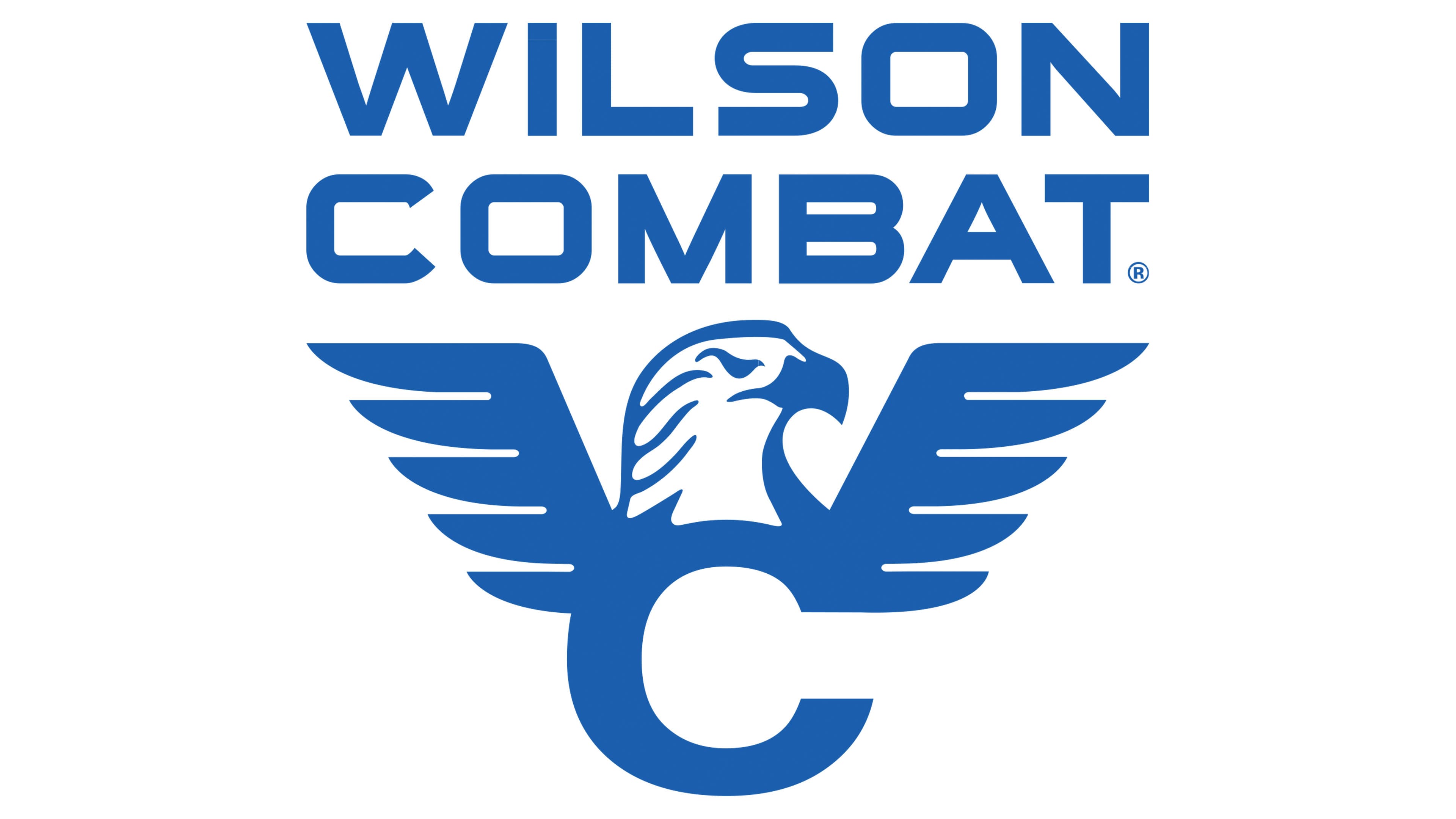
The key figure in the Wilson Combat emblem is an eagle’s head with wings spread above it. The bird proudly looks to the right, staring intently ahead as if searching for prey, since eagles are renowned for their sharp vision and can spot a target even from high altitudes. Moreover, this is not just any bird but one of the United States’ main symbols, the bald eagle. It inhabits the entire North American continent and is significant in local culture and traditions. In 1782, the bald eagle was designated the national bird of the United States, and since then, it has appeared in logos. The company emphasizes its individuality and clearly expresses its authenticity through its use.
The eagle’s gaze is stern and cautionary. It threatens anyone who dares to encroach on its habitat, the territory of the country it represents. In this matter, high-quality, accurate firearms from the American company are indispensable. In this way, the brand promotes the idea of protection, confidence, and security. The designers connected the bird’s head to the first letter of the firearms manufacturer’s name, resulting in a highly patriotic image that symbolizes freedom and courage.
The “C” represents the eagle’s chest, as the rounded glyph harmoniously complements the head. The unifying factor is the color: white and blue form an optimal combination, conveying the United States’ centuries-old heritage, with independence being the central theme. This combination signifies purity of intent, sincerity, self-control, faith in the future, and limitless possibilities. The company expresses hope for the future and a drive toward new heights.
The eagle’s head is highly detailed: the narrowed eye, sharp hooked beak, and smooth feathers tightly covering the neck are all visible. In contrast, the wings, which spread out from the letter “C,” appear unnatural and disproportionate, smaller than the head. Essentially, the wings serve as a platform for the name positioned above.
The text portion of the Wilson Combat logo is rendered in a classic, bold, grotesque typeface, which adds reliability and confidence to the design. The capital letters feature clean strokes, straight edges, and precise contours, eliminating ambiguity from the emblem: everything is strict and exact, like a well-tuned machine. However, the symbol’s composition is complex because the name spans two lines, aligned in width. The ends of the letter “C” are diagonally cut, adding a unique touch to the logo.
The blue-and-white color scheme reflects an authoritative, forward-thinking manufacturer with strong values, a well-thought-out concept, and a promising future. At the same time, this palette looks welcoming, evoking a sense of reliability and safety. It demonstrates the company’s loyalty and high responsibility to its customers.