 Yara International Logo PNG
Agriculture depends on soil health and plant nutrition, where fertilizers help ensure crop growth and yield. Producing and supplying agricultural chemicals requires precise formulation and quality control. The Yara International logo is associated with a company that develops and supplies fertilizers and agricultural solutions.
Yara International traces its history back to 1905, when Kristian Birkeland and Sam Eyde founded Norsk Hydro to produce nitrogen fertilizers. In 1907, the first plant began operating in Notodden. In 1913, the company adopted the Haber-Bosch process and became a pioneer in synthetic ammonia production.
In the 1920s, Norsk Hydro expanded its fertilizer exports. During World War II, its Vemork plant produced heavy water. In 1943, the Norwegian resistance destroyed the stockpiles and disrupted German research. After the country’s liberation in 1945, the company rebuilt and modernized the facility.
In the 1950s and 1960s, the company diversified its business by adding aluminum and petrochemical production. In the 1970s, the company began international expansion. In the 1980s and 1990s, Norsk Hydro strengthened its position in the European market. In the early 2000s, company management decided to spin off the fertilizer division into a separate entity.
In 2004, the company adopted the new name Yara International. In 2005, the company acquired Canada’s Saskferco for $ 350 million. In 2007, it purchased Brazil’s Adubos Trevo. In 2008, the global food crisis brought record profits. In 2009 and 2010, the company reduced production and optimized costs.
In 2011, an ammonia plant was opened in Australia. In 2014, the company acquired CF Industries’ assets in Argentina and Panama for $ 1.4 billion. In 2016, it announced plans to build a plant in Texas. In 2018, it bought Tata Chemicals Brazil.
In 2019, Yara launched the digital platform Atfarm. In 2021, the company began investing in green ammonia production. In 2022, the European energy crisis forced temporary shutdowns at some facilities. In 2023, Yara directed investments toward modernization and improved energy efficiency.
In 2024, the company announced plans to develop autonomous ammonia-powered vessels.
The company operates production facilities in sixty countries and is among the world’s largest fertilizer producers.
Meaning and History
What is Yara International?
A Norwegian mineral fertilizer producer with an office in Oslo. After separating from an industrial conglomerate, it became a global leader, with revenue of about $12.9 billion. It produces more than 28 million tons annually across 20 plants. The main products include NPK fertilizers, urea, nitrates, ammonia, and nitric acid. The company is Europe’s largest natural gas consumer.
1900 – 1910
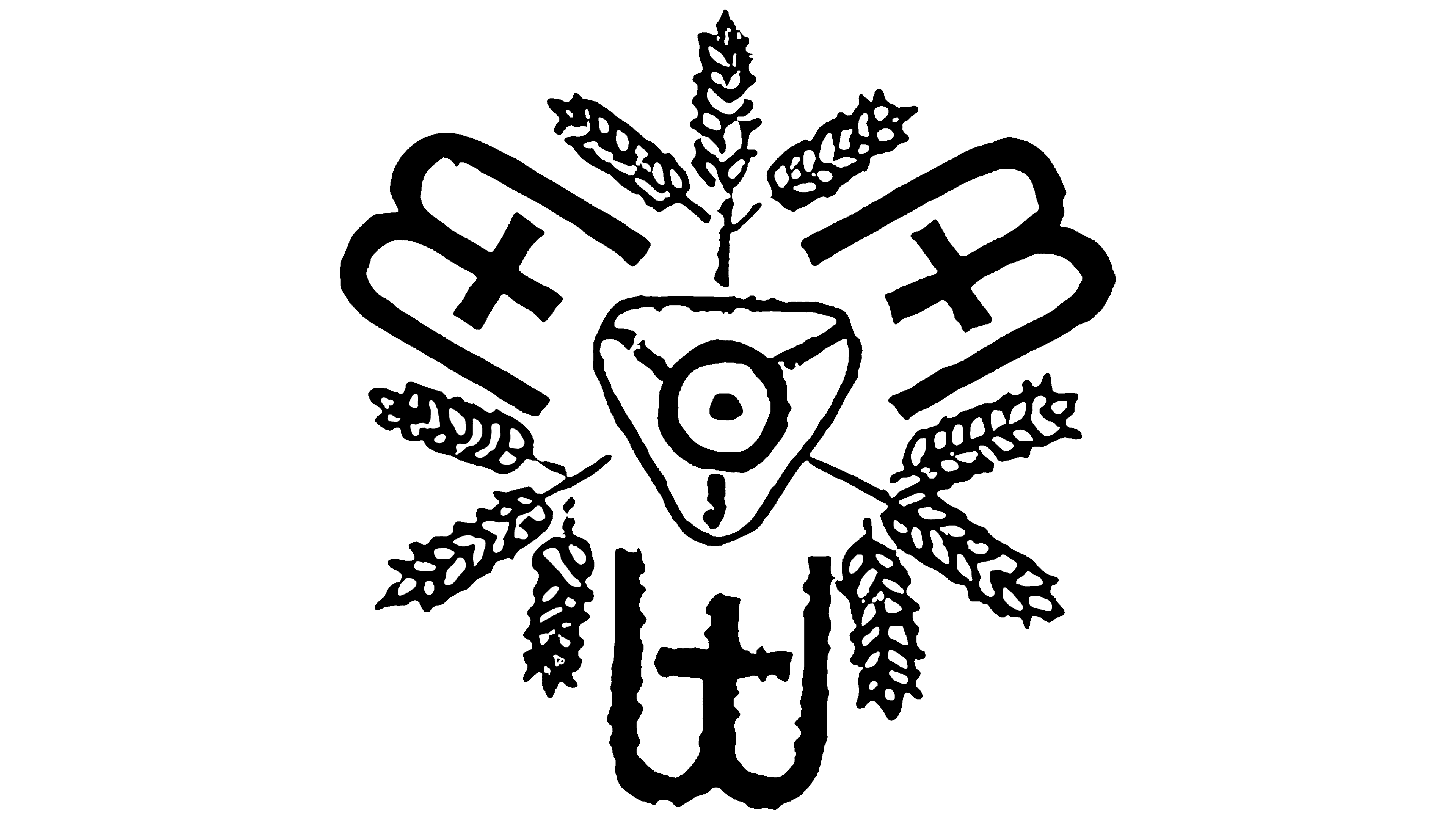
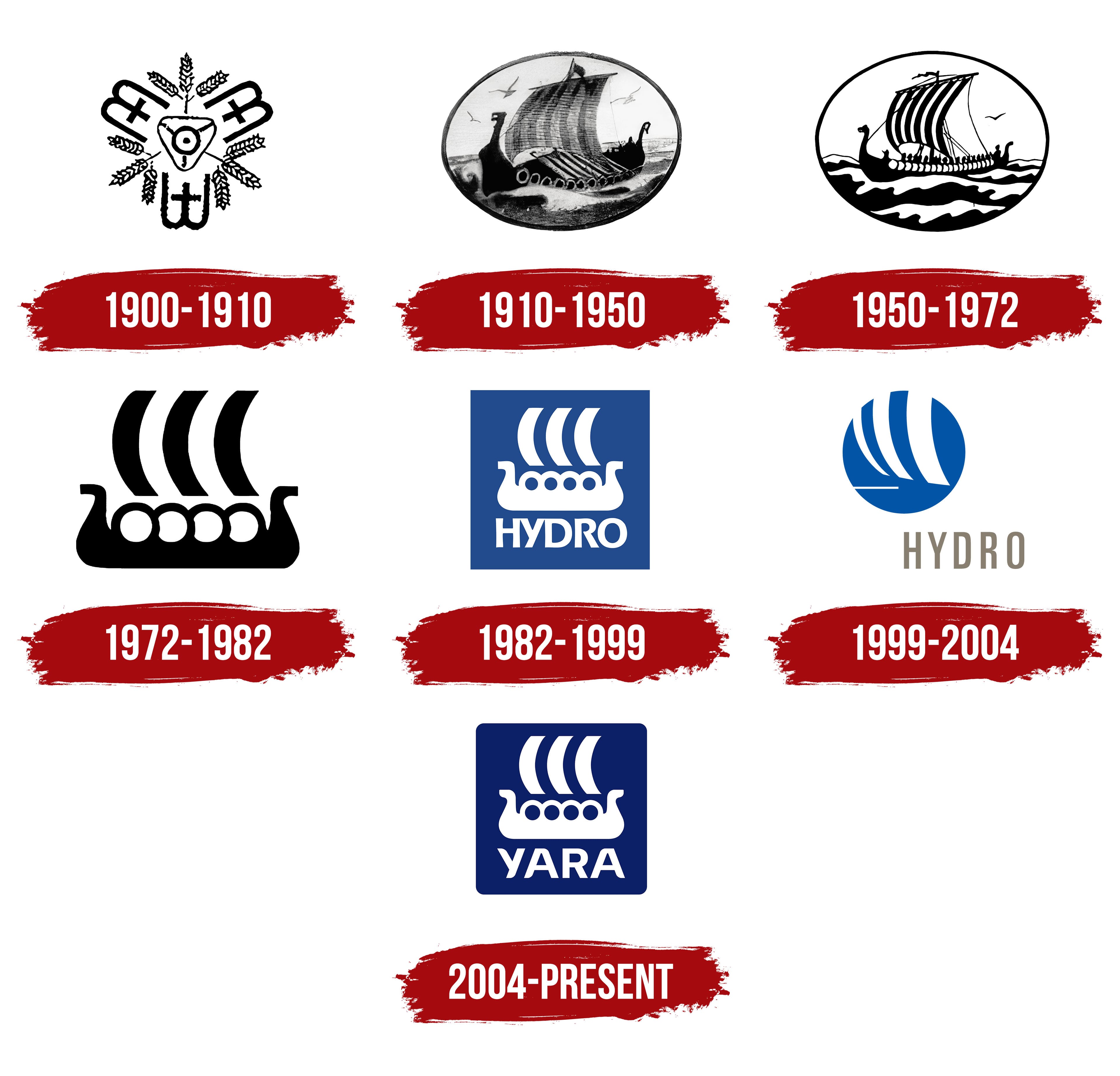
Yara’s early emblems are tied to Norsk Hydro’s fertilizer business. Sam Eyde and Kristian Birkeland founded the company in 1905. They relied on their electric-arc process and Norway’s hydropower to produce nitrogen fertilizer. The first emblem combined the founders’ initials, an electric furnace, and heads of grain. Together, they described the company’s origins, its production technology, and the agricultural use of its products.
The black-and-white emblem was symmetrical, with three sections radiating from the center. An equilateral triangle pointing downward represented the electric furnace. Inside it was a circle with a black dot, connected by lines to the triangle’s corners. Interwoven “B” and “E” initials surrounding it referred to Birkeland and Eyde. One letter pattern occupied the lower portion, while the other two sat on either side, tilted slightly outward.
The repeated patterns consisted of three vertical lines. The middle line was shorter and crossed by a horizontal stroke. At the same time, semicircular arcs connected the outer lines on one side. Nine wheat heads appeared between the letter groups, three in each gap. Kernels angled in different directions along both sides of the stems. The emblem featured interwoven letters and wheat heads, with no separate line spelling out the company’s name.
A Viking ship later replaced the wheat heads and served as Hydro’s emblem for many years. Yara International, the Norwegian producer of mineral fertilizers and plant nutrition products, inherited the ship along with the business. The company was established under its current name on March 25, 2004, when the Hydro Agri agricultural division was separated from Norsk Hydro.
1910 – 1950
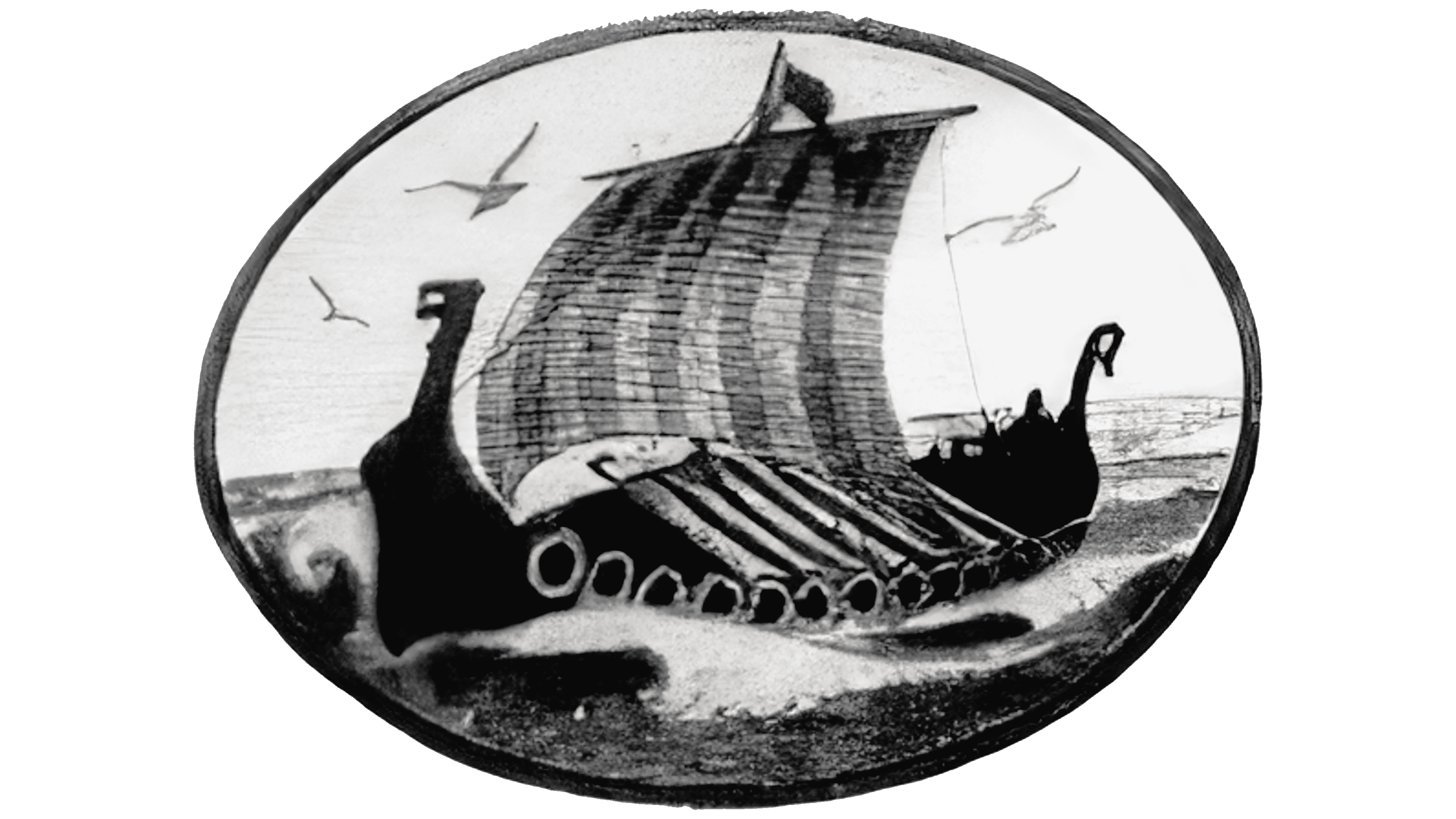
A Viking ship entered Norsk Hydro’s emblem in 1910. Norwegian artist Thorolf Holmboe created it. The first version placed a maritime scene inside an oval medallion. Using black-and-gray lines, Holmboe rendered the longship, sail, and surrounding water in detail.
The long hull had a high bow and stern, with curved ends shaped like dragon heads. Shields lined the side, and a thick hull outline separated the vessel from the waves and spray. A tall, slender mast rose above the deck, carrying a large rectangular sail. Vertical hatching conveyed the fabric’s texture, while alternating light and dark areas gave it depth. A small flag extended to the right above the sail. A flat shoreline stretched behind the ship, and birds flew overhead. Fine strokes filled the sail and the sea’s surface.
The abundance of detail made the design difficult to print on coarse fertilizer bags. Reproducing it on packaging required simpler linework. A revised ship emblem therefore appeared in 1913.
1950 – 1972
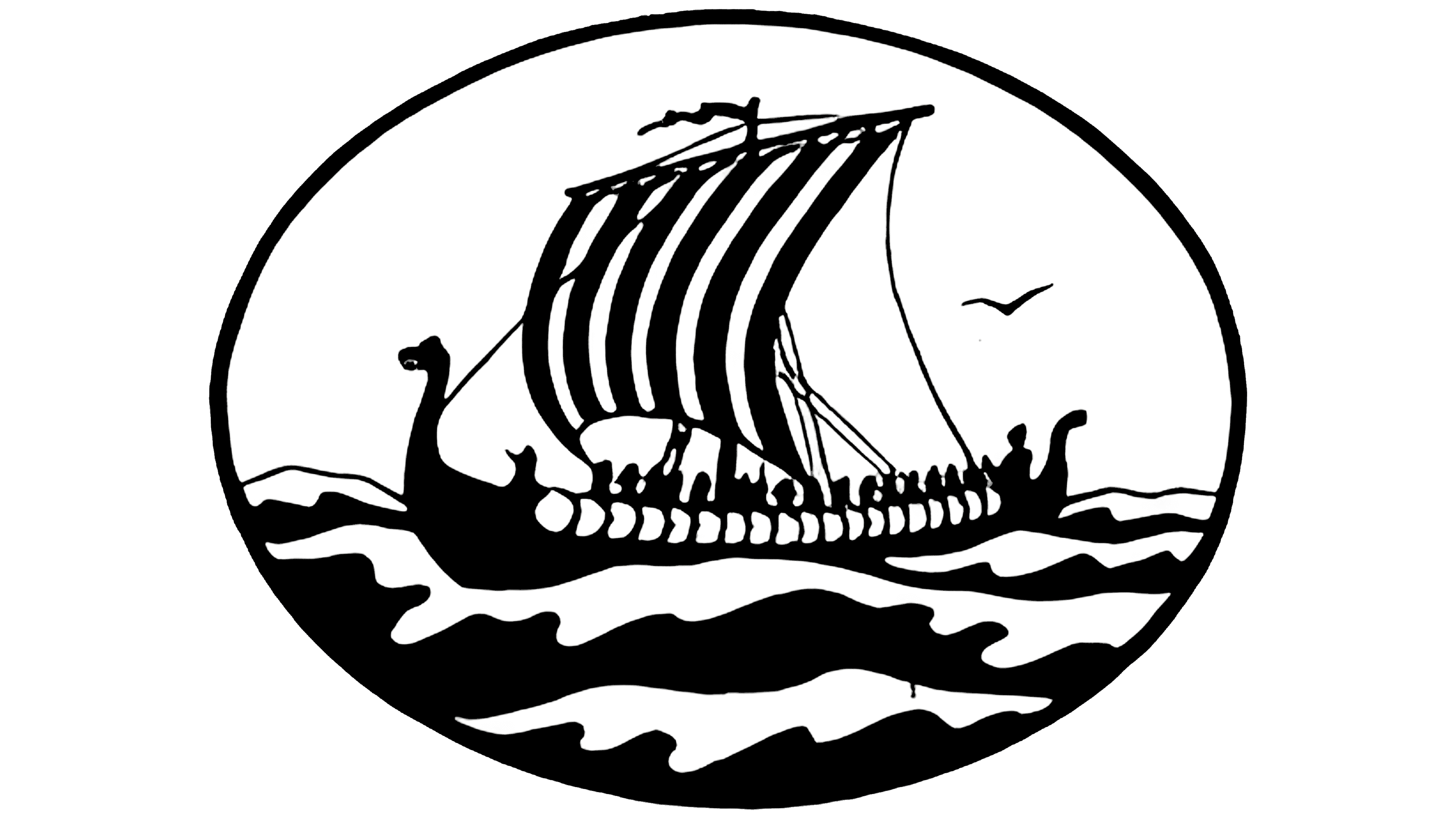
In a later line-art version, Norsk Hydro’s ship retained its oval frame and maritime setting, while large black-and-white areas replaced the fine hatching. The more stylized drawing suited packaging printing. The longship’s elongated hull ended in a high bow and stern, each carved with dragon heads. A row of round shields with varying outlines ran along its side. Seated rowers were visible behind them.
A mast rose from the ship’s center, carrying a large, wind-filled, curved sail. Alternating vertical black-and-white stripes divided its surface. A flag at the top pointed to the left, and rigging connected the sail to the hull. Winding black-and-white bands represented waves in the lower part of the oval. The upper portion remained lighter, with the silhouette of a single bird above the horizon.
As the ship emblem spread, protecting it and keeping the design consistent became harder. Other businesses used similar ship images, forcing Hydro to defend its rights in court. Within the company, divisions adapted the drawing to local preferences. By the late 1950s, roughly 20 versions of the ship had emerged from this informal handling of the shared emblem.
1972 – 1982
In 1972, Norsk Hydro’s ship emblem was redesigned as the silhouette later inherited by Yara. Leif Frimann Anisdahl created the new version. The oval frame and maritime scene, including birds, rowers, and waves, were removed. The new image featured the hull, four shields, and three sail bands.
The heavy hull had a raised bow and stern. At either end, they became short rectangular projections that turned outward and ended in angled cuts. Four round white openings within the solid hull represented shields along the side. Above the hull were three elongated bands, equal in shape and size. They curved to the left, suggesting a sail filled by the wind. Gaps separated the bands, and the mast and rigging were removed.
In the black version, the hull and bands used solid fills, while the shields appeared in white. The original color version combined green and black. In 1975, blue and white replaced them.
1982 – 1999
In 1982, the company added “HYDRO” to the ship emblem, linking the image to the company’s name. The white longship occupied the upper portion of a blue square, with the name beneath it. The ship filled most of the space, while the smaller lettering completed the design at the bottom. The sans-serif capitals matched the silhouette’s white color.
The hull retained its elongated horizontal shape, with a raised bow and stern that turned sharply outward. Four circular openings along the side represented shields. Above the hull, three equally sized vertical bands curved to the left to form the sail. Open space separated the bands from the hull. The simplified hull-and-sail silhouette carried over from the previous emblem.
The lettering resembled Futura Bold or Gill Sans Heavy. All the letters were uppercase and sans-serif.
1999 – 2004
The separation of the businesses sent the ship emblem and Hydro name in different directions. The agricultural division took the rights to the traditional ship. At the same time, Gene Grossman of Siegel & Gale created a new logo for Hydro. The company unveiled it in Oslo on December 11, 2003, and it became its official emblem at the start of 2004. The update accompanied the separation of fertilizer production and Hydro’s shift toward two main businesses, aluminum and energy.
An abstract sail inside a blue circle replaced the longship. Three white vertical shapes curved to the left across the circular field. Similar in outline, they widened from left to right. Equal gaps separated them. A short horizontal white band ran beneath the sails. The circle represented the company’s international presence, while the sail forms continued the maritime motif of the previous identity.
Gray-beige “HYDRO” lettering appeared beneath the emblem. The sans-serif capitals had elongated proportions and upright strokes, resembling Univers or DIN. Wide letter spacing made the horizontal line beneath the blue circle appear open.
2004 – today
The Yara name was announced in December 2003, ahead of the agricultural business’s separation from Norsk Hydro. Hydro Agri head Thorleif Enger introduced the short name to connect the company’s work to Norway’s cultural heritage. In 2004, the independent, publicly traded company became known as Yara International.
The naming process drew on Old Norse vocabulary and the runic alphabet. “Jardar” connected the name to the earth and its cultivation. Another source was Jara, the 12th rune, representing the year. In the company’s interpretation, it referred to a good harvest. The initial “J” was replaced with “Y” to encourage consistent pronunciation across countries. The “Y” also connected to the English word “yield,” meaning a harvest or production output.
In the 2004 logo, “YARA” appeared beneath the traditional white ship. Both sat inside a dark blue square with rounded corners. The ship retained its three sail bands, four round shields, and raised bow and stern. The inherited emblem connected the new company to the Hydro fertilizers customers already knew. Yara interpreted the ship as a symbol of Norwegian heritage and the pursuit of knowledge.
The name used four large, sans-serif capital letters. The triangular openings in the two “A” letters were widened. Their diagonals echoed the strokes of the “Y” and the leg of the “R.” “International” remained in the full corporate name. At the same time, the logo used the shorter “YARA.” PMS 281 was specified for the blue field. A white border separated the square from its background across different applications. The height of the “Y” determined the clear space around the emblem.
“Knowledge grows” became part of the brand’s messaging. The phrase connected the accumulation of scientific knowledge with crop growth. Luke Dixon worked on the brand concept and copy. The idea of growth brought together research, agronomic expertise, and the application of knowledge in agriculture.