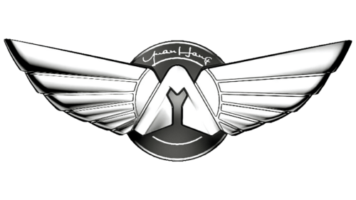
The Yuanhang logo embodies the dream pursued by its owner, the Dayun Group, which founded this brand. The emblem is simple and complex, with a straightforward color palette yet intricate detailing. This principle perfectly reflects the uniqueness of the brand’s vehicles.
Yuanhang: Brand overview
In 2022, nestled in the Shanxi province, the Chinese Dayun Group gave birth to its new electric vehicle subsidiary, Yuanhang Auto. The brand was introduced to the public at the Chengdu Auto Show that year, revealing an impressive lineup of four electric vehicles, encompassing an SUV, sedan, minivan, and pickup truck.
Drawing inspiration from its name, which translates to ‘Far Navigation’ or ‘Voyage’ in English, Yuanhang embodies the spirit of innovation and forward momentum. The Dayun Group envisions Yuanhang as a high-end electric vehicle entity, tailoring its offerings to the discerning Chinese market. These vehicles are anticipated to be long-haul runners and boast cutting-edge technology, integrating intelligent connectivity and paving the way for autonomous driving.
As part of its infrastructure developments, Yuanhang has built a state-of-the-art manufacturing hub in Yuncheng, slated for completion in 2023. The brand is poised to roll out its inaugural models, the Voyage One SUV and Voyage Granse sedan, in the same year. With its entry into the market, Yuanhang has set its sights on rivaling Chinese EV giants like Nio, Xpeng, and Li Auto.
Although the company has aspirations to etch its name on the global electric vehicle map, for now, Yuanhang’s strategy zeroes in on carving a niche within its home territory.
Meaning and History
What is Yuanhang?
In 2022, the respected Dayun Automobile Group presented the world with Yuanhang, a groundbreaking brand aiming to transform the luxury electric vehicle sector. Leveraging their vast experience in the commercial vehicles, trucks, and buses arena, Dayun Group ventured into creating a luxurious and eco-friendly transport alternative, successfully realizing their vision with Yuanhang. Operating from its base in China, Yuanhang is a global brand with an ambition to share its luxury electric vehicles with customers worldwide. Recognizing the significance of international visibility, they are devoted to broadening their global footprint, ensuring that their vehicles bring joy and satisfaction to clients worldwide.
2022 – today
Everything in this logo has a dual meaning, making it multifaceted and profound in its message. Among these characteristics, it is important to highlight that:
- The company is young, yet its emblem appears very old as if it was created in the early 20th century.
- The logo design is modern yet based on the classic image of wings, often used in branding.
- The mark is restrained and monochromatic, as if from the era of black-and-white films, yet it conveys a vast spectrum of vivid emotions.
This contrast is intentional, containing symbolism and a marketing approach to business. It aims to intrigue customers, excite them, and encourage them to purchase a product that outwardly looks like an ordinary car. Still, it internally belongs to next-generation technology, an innovative means of transportation.
The inscription is in a handwritten-style font at the top of the emblem. The word “Yuanhang” is divided into two parts, each starting with a lowercase letter:
- “Yuan” translates from Chinese as “distant.”
- “Hang” translates as “voyage” or “navigation.”
Together, they carry important conceptual meaning, embodying a “distant voyage,” presenting the brand’s vehicles as means for long trips and journeys. It becomes clear that the wings, occupying almost the entire logo, represent a forward drive. Additionally, they signify high speed, the ability to overcome obstacles swiftly, and the sensation of flying.
It is no coincidence that the parent company presents this brand as a manufacturer of high-class electric vehicles. These vehicles are designed for long-distance travel, equipped with innovative equipment, and allow integration with intelligent technologies for autonomous driving.
The emblem features large white-silver wings with a gradient. Each side has six feathers of varying lengths, originating from a curved element resembling a triangle with a rounded top. This suggests the safety of the equipment under intensive use. In the middle of this structure (in the negative space) is a cutout in the shape of a “Y” – the first letter of the Chinese brand’s name.
The background is a large dark gray circle. Inside, a thin white ring separates the center from the edges, making the circle resemble a car wheel and hinting at the product type. This makes the logo professional and easily recognizable.


