


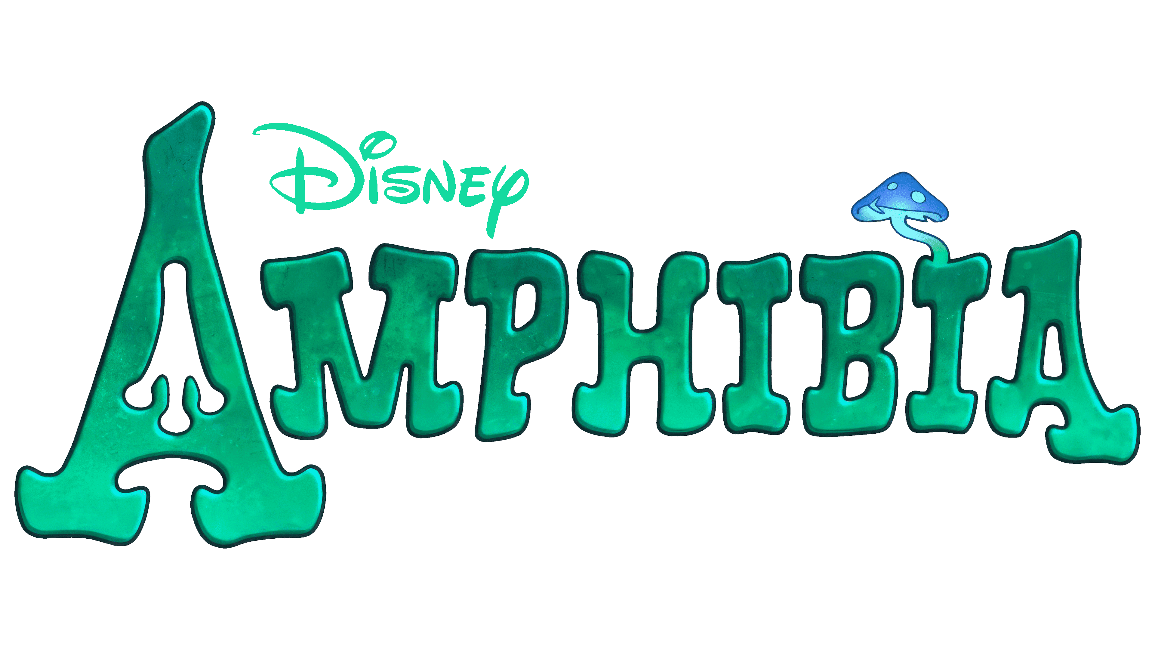
 Amphibia Logo PNG
The “Amphibia” logo looks unique and magical, reflecting the story’s unusual atmosphere. Every emblem element, from the font to the shades, creates the feeling of a mysterious world set in a swampy area. This effect gives the impression that viewers are being transported to a strange space where the main action will unfold. The carefully chosen colors emphasize the damp, mossy environment and hint at the adventures awaiting the characters.
The logo’s originality is enhanced by its visual appeal, which points to the setting and conveys the series’ emotional tone. The image invites viewers into a world where frogs, humans, and various creatures live side by side, encountering amazing situations. The presence of mythical creatures highlights the story’s fantasy element, making it even more captivating for the audience.
Amphibia began in 2015, when animator Matt Braly started developing an animated adventure series shaped by his Thai heritage, fantasy stories, and the experience of growing up between cultures. Before creating the show, Braly had worked on Gravity Falls and We Bare Bears. He built the story around Anne Boonchuy, a 13-year-old Thai-American girl who is transported to a strange world inhabited by anthropomorphic frogs.
In 2016, Braly pitched the concept to Disney Television Animation. The studio approved production after seeing its mix of comedy, drama, adventure, and teen-focused storytelling. Over the next year, Braly and his team developed the world of Amphibia in detail, from character designs and locations to the culture and ecosystem of the frog society. Anne was written as a modern teenager dealing with fear, adaptation, friendship, and cultural shock.
Disney Channel announced the series in 2018, creating interest among animation fans before the premiere. Amphibia debuted on June 17, 2019. The first season followed Anne as she adjusted to an unfamiliar world and formed bonds with the Plantar family. In May 2019, before the season had finished airing, the show was renewed for a second season because of early ratings and positive response.
Season two premiered on July 11, 2020, expanding the story, the world, and the relationships between Anne and the people around her. In November 2020, a third season was ordered. It premiered on October 2, 2021, and was planned as the final chapter. The finale aired on May 14, 2022. By 2023, Amphibia remained available on streaming platforms, with fan discussions, awards attention, and recognition for its animation, representation, and emotional storytelling.
Meaning and History
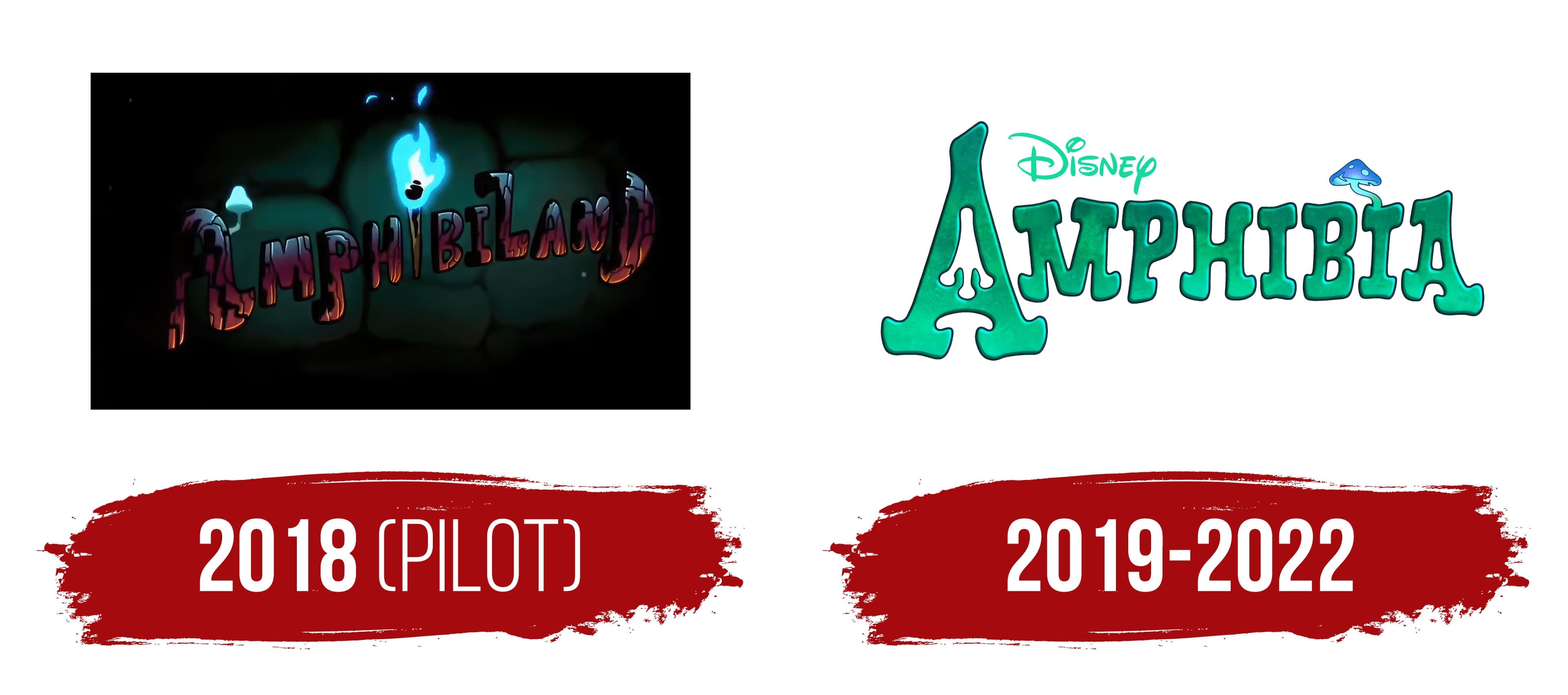
What is Amphibia?
This colorful animated series takes viewers to a fantastical world inhabited by talking frogs and strange creatures. The main character, Thai-American teenager Anne Boonchuy, finds herself in the kingdom of Amphibia, where she makes new friends among the Plantars, a frog family. Together, they face numerous adventures and dangers as Anne tries to find her way home. The series stands out for its complex world, skillfully blending fantasy elements with themes of cultural identity, friendship, and self-growth. Mixing heartfelt humor with real stakes, the show tells an engaging story that captivates viewers of all ages.
2018 (PILOT)
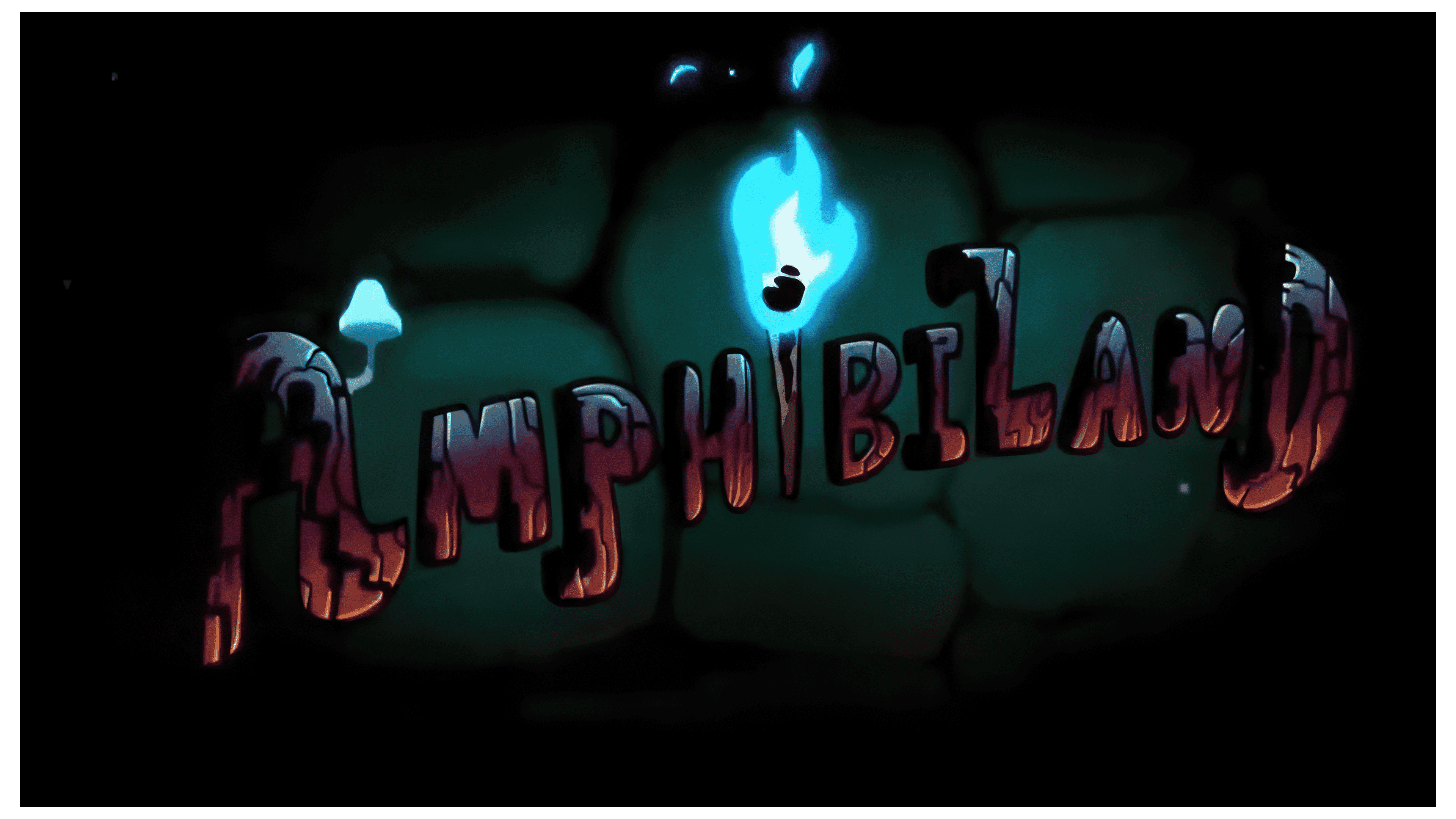
The cartoon was originally planned to be called Amphibiland, as the plot takes place on a tropical, swampy island inhabited by anthropomorphic frogs and toads. The show’s logo appears as though its letters are carved from cracked earth, symbolizing this world’s ancient and primal nature. The letters are set against a background depicting green islands, highlighting this realm’s isolated and unusual nature.
The dark tones of the logo create an ominous atmosphere, hinting at the dangers that await the heroines. It’s no coincidence that the magical box that transported them to this strange place was called the Calamity Box, pointing to the troubles ahead. In this world of frogs, there is a tough struggle against terrifying creatures, adding tension to the plot.
The emblem’s elements also emphasize the theme of adventure. The torch in the letter “i” and the glowing mushroom growing from the “A” symbolize hope. These light elements seem to guide the friends, who are separated in different parts of this mysterious world, toward finding a way back to each other and home.
2019 – 2022
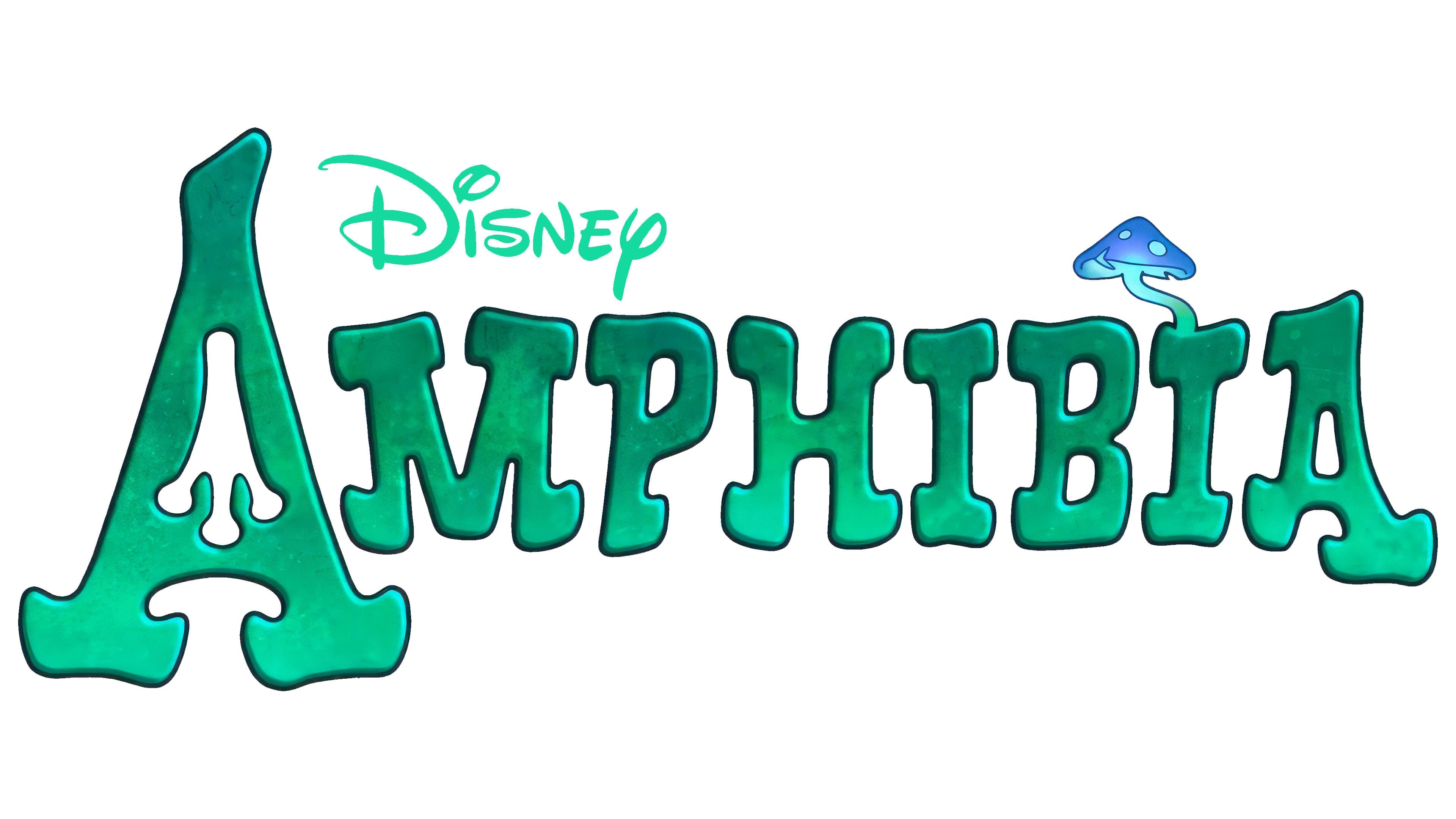
For the official release, the logo shifted away from the darker style toward a more magical, fantastical design. The murky greenish tint of the letters perfectly conveys the atmosphere of the swampy areas where the events unfold, emphasizing the natural connection to the world where frogs and toads, the series’ main characters, live. This color reflects the conditions the heroes find themselves in and hints at their appearance.
The capital letter “A” stands out by featuring a frog’s footprint instead of the standard opening, giving the emblem uniqueness and connecting it to the series’ natural world. This small detail makes the visual symbol more “alive” and closely tied to the characters, as if conveying their presence in every design element.
Meanwhile, the dot over the letter “i” was replaced with a glowing mushroom, further enhancing the fantastical and mystical atmosphere. The glow from the mushroom creates a sense of magic and adventure, which permeates the entire world of “Amphibia.” It reminds viewers that wonders and unexpected twists lie ahead.
The word “Disney” at the top of the logo is in the same swampy green tone as the other letters. This subtle hint suggests that, despite the world’s uniqueness, the story was created by the same studio long associated with magical tales and adventures.