 Avery Dennison Logo PNG
Product labeling includes labels, price tags, and RFID tags used in retail and logistics for inventory management and product tracking. These elements facilitate the transfer of information about the product and its movement. The Avery Dennison logo is associated with a company that produces materials and technologies for labeling, packaging, and product management.
Avery Dennison Corporation was founded in 1935. Ray Stanton Avery founded it in Los Angeles. He invented the first self-adhesive label and founded Kum Kleen Products. By 1937, the company changed its name to Avery Adhesives and focused on producing adhesive materials. In 1946, the enterprise was registered as Avery Adhesive Label Corporation. From then on, the company expanded into the United States and Europe.
In 1953, the company created the Fasson division. It produced self-adhesive materials under the Fast Stick-On brand. In 1967, the company was listed on the New York Stock Exchange. In 1976, the organization adopted the new name Avery International and joined the Fortune 500 list.
In 1990, it merged with Dennison Manufacturing, founded in 1844. The merger created Avery Dennison Corporation. The new structure combined the expertise of two leading manufacturers in labeling and office solutions.
In the late 1990s and 2000s, the company strengthened its position through a series of acquisitions. In 1999, it purchased Stimsonite, a transportation solutions provider. In 2007, Avery Dennison acquired Paxar, a global leader in RFID technology. In 2012, the company acquired China’s Yongle Tape, strengthening its position in the Asian market. In 2014, it added Vestcom International, an American company specializing in retail network solutions.
In 2018, the company entered the healthcare market by acquiring Finesse Medical. In 2019, Avery Dennison purchased Smartrac Technology Group. This made it one of the world’s leaders in RFID and digital identification.
In 2022, the company received the ASC Innovation Award. The award recognized the development of acrylic technology for producing high-performance adhesives.
Avery Dennison operates in fifty countries. The company employs more than thirty-six thousand people. It holds leading positions in materials science, labeling, and digital identification technologies.
Meaning and History
What is Avery Dennison?
A corporation from Pasadena, California, that produces self-adhesive materials, labels, graphic films, and branding solutions. R. Stanton Avery, the inventor of the self-adhesive label, founded it. The main areas are pressure-sensitive materials and retail branding solutions, including RFID tags and decorative textile elements. Company brands include Fasson and JAC. The material Asphalt Art was developed for printing on rough surfaces. After acquiring Taylor Adhesives, the company strengthened its position in the adhesives segment.
1935 – 1937
The first name of the company that would become Avery Dennison, Kum Kleen Products, played on the English phrase “come clean.” It promised that a label could be removed without leaving residue. In the logo, the 2 parts of the name were joined by a hyphen and written as “Kum-Kleen.”
The company was founded in Los Angeles in 1935. Ray Stanton Avery, usually known as Stan Avery, assembled the first machine for making die-cut, self-adhesive labels from used parts and a saber saw. A $100 loan from his fiancée, Dorothy Durfee, helped launch production. The first products were round price labels for stores.
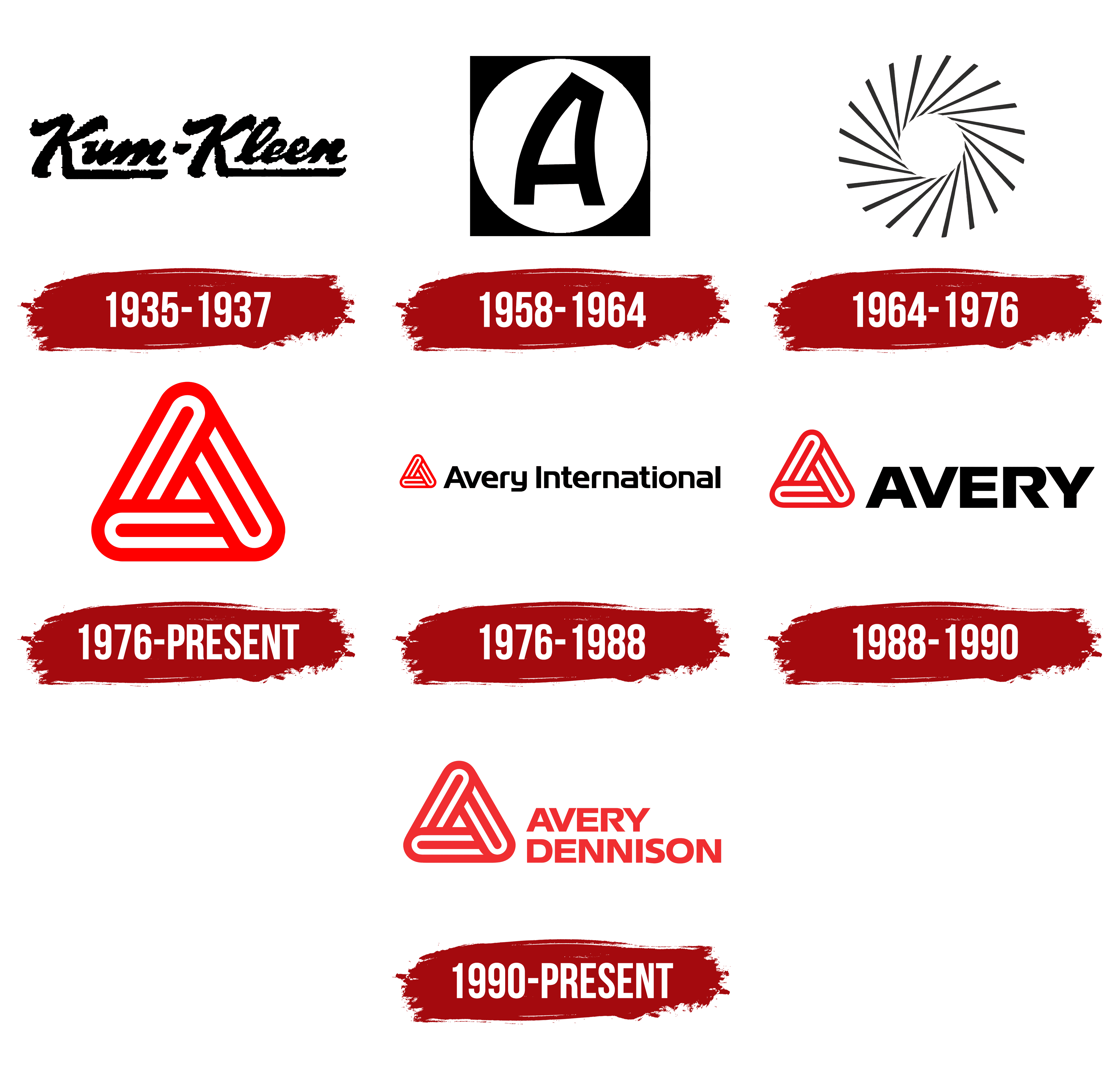
The Kum-Kleen name used black, right-slanting script lettering. Both parts began with tall uppercase “K” letters followed by lowercase letters. Extensions of the “K” letters formed horizontal lines beneath “um” and “leen.” These flourishes connected the large initials to the rest of the wordmark and complemented its calligraphic forms.
In 1937, the business became Avery Adhesives. The founder’s surname became part of the name, while “Adhesives” identified its adhesive materials. The emphasis shifted from a product feature to the inventor’s name and the company’s manufacturing specialty.
1958 – 1964
Avery had operated as Avery Adhesive Label Corporation since 1946. In 1958, “Label” was replaced with “Products.” By then, the range included finished labels and adhesive materials. Hence, the name Avery Adhesive Products described the company’s activities more accurately.
A large black “A” represented the founder’s surname in the corporate emblem. The letter stood in the center of a white circle placed on a nearly square black field. The white circle separated the initial from the dark border.
The side strokes of the “A” slanted and curved to the right, while its top had a sharp cut. The letter’s angular contours contrasted with the circle’s smooth boundary. The initial and the 2 geometric shapes made up the entire image.
1964 – 1976

In 1964, the company adopted the name Avery Products Corporation, reflecting its expansion beyond adhesive materials. On April 3, Gould & Associates introduced a new abstract emblem. It replaced the previous letter-based mark and accompanied the growth of Avery’s product range and its listing on the New York Stock Exchange.
The emblem consisted of 20 identical black bands with equal spaces between them. The bands radiated from a white center toward the outer edge, and their slant gave the ring a twisting form. The outer contour remained rounded, while the inner edges outlined a polygonal opening.
The geometric figure was used on its own, representing Avery Products in place of the previous initial. Black bands alternated with white spaces to form the emblem’s design.
1976 – today
In the mid-1970s, Avery commissioned a new emblem from Saul Bass & Associates. The design was prepared in 1975 and introduced on April 1, 1976. Saul Bass was already known for film titles and identities for Bell System, United Airlines, and Warner Communications. For Avery, his studio combined the first letter of the family name with a paper clip image.
Three elongated, enclosed bands with rounded ends intertwined to form an equilateral triangle and an uppercase “A.” Oblong loops appeared along the sides. The internal strokes ended short of their edges, leaving a small triangular opening in the center. Lines of equal thickness and rounded outer corners united the design.
The figure resembled 3 connected paper clips and was associated with Avery’s labels, marking products, and office supplies. Red replaced the previous black-and-white treatment. Large openings and the line weight suited reproduction on small stickers, building facades, and manufacturing equipment. In the Avery International identity, the emblem stood apart from the name, drawing on the Avery name’s established market recognition.
1976 – 1988

Avery opened its first overseas division in 1955. In 1976, the company changed its name from Avery Products Corporation to Avery International, reflecting the international scope of its operations. Saul Bass & Associates developed a shared horizontal logo for regional divisions and corporate materials. It was introduced on April 1, 1976.
In the logo used from 1976 to 1988, a small red emblem in the established form appeared on the left. A long black “Avery International” wordmark sat on the right. The name occupied most of the space, while differences in size and color distinguished it from the symbol.
The wordmark used Handel Gothic. The bold sans-serif typeface combined rounded forms with heavy strokes. The initial “A” and “I” were uppercase, while the remaining letters were lowercase. “International” referred to operations in different countries, bringing numerous divisions together under the company’s full name.
1988 – 1990
In 1988, Landor Associates shortened Avery’s corporate wordmark by removing “International.” “AVERY” remained beside Saul Bass’s emblem. The update affected the brand’s presentation, while the company’s legal name remained unchanged.
The short name was set in Eras. The black uppercase sans-serif letters had bold strokes, a pronounced slant, and cut-off terminals. One compact word replaced the previous long wordmark to the right of the symbol.
The triangular “A” on the left retained its original construction. The red shade became slightly darker, and the emblem’s height was brought closer to that of the letters. Both parts appeared in a single horizontal row, combining Bass’s form with the updated wordmark.
1990 – today
In 1990, the merger of Avery International and Dennison Manufacturing Company created Avery Dennison. The 2 surnames preserved connections to families involved in manufacturing. Dennison’s history began in Brunswick, Maine, in 1844. Jeweler Andrew Dennison began making cardboard jewelry boxes, and his son, Aaron Lufkin Dennison, expanded the operation that became the foundation of Dennison Manufacturing.
Landor Associates developed the new corporation’s identity. The agency retained Saul Bass’s triangular emblem, which has been used since the 1970s. An interwoven “A” made from 3 overlapping elongated outlines appeared on the left. The full name occupied 2 lines on the right, with “AVERY” above “DENNISON.” The wordmark used bold uppercase letters in the sans-serif typeface Eras.
Both lines were left-aligned. The longer “DENNISON” made the lower portion of the text block wider than the upper portion. The red lettering matched the emblem. Setting the name on 2 lines allowed both surnames to fit beside the compact triangular symbol.
In 2013, Avery’s consumer business was sold to CCL Industries. After the transaction, the 2 brands developed separate identities. Chermayeff & Geismar & Haviv later created an identity for the consumer Avery brand. Avery Dennison Corporation continued using Bass’s emblem with the two-line name. They provided red and single-color versions of the logo.