 Arkema Logo PNG
Specialty chemical materials are used in electronics, construction, transportation, and energy, influencing product properties at the material level. Production includes developing polymers, additives, and coatings for various industries. The Arkema logo represents a company that creates chemical materials and supplies them for industrial applications.
Arkema was established in 2004 after spinning off the chemical division of the French company Total. It inherited the assets of Elf Aquitaine and Petrofina, including the production of acrylates, vinyl chloride, and fluoropolymers. In May 2006, the company went public on the Paris Stock Exchange and became an independent public company. By 2007, Total had fully exited its ownership stake.
In 2006, under Thierry Le Hénaff’s leadership, the transformation began. Arkema reduced its basic chemicals share and shifted its focus to specialty materials. In 2010, the company sold its vinyl chloride business to Ineos. In 2011, it acquired the Chinese company Hipro Polymers, strengthening its presence in Asia.
In 2015, Arkema purchased the American company Bostik, a manufacturer of adhesives and sealants. It became the largest acquisition in the company’s history. In 2017, Arkema exited the acrylic monomers segment, reinforcing its focus on high-value-added products.
Since 2018, Arkema has been developing polyamide and composite production for the automotive and aerospace industries. In 2020, the company acquired the German firm Polytec PT. In 2021, it announced plans to build a polyamide plant in Singapore.
In 2022, the company acquired the American firm Pi Advanced Materials. In 2023, it invested in expanding its fluoropolymer production capacity for electronics and batteries. In 2024, Arkema began investing in bioplastics and materials made from renewable resources.
Arkema has become one of the world’s leading producers of specialty polymers and adhesive solutions. The company operates more than fifty-five sites in various countries and serves the transportation, construction, and electronics markets.
Meaning and History
What is Arkema?
A French chemical group headquartered in Colombes is one of the largest producers of specialty and industrial materials. Its production network includes over 100 facilities in 55 countries. The business is divided into four segments: Bostik adhesive materials, advanced polymers and fluoropolymers, coatings for paint and cosmetics industries, and intermediates for chemical and pharmaceutical applications. The products are used in construction, packaging, automotive, electronics, energy, food, and medical sectors.
2004 – 2012
The Arkema name appeared 2 years before the group became legally independent. Total began restructuring its chemical operations in October 2004. The new organization included Atofina businesses built from the assets of Total, Elf Aquitaine, and affiliated chemical companies. Arkema introduced its name and first logo during the same period.
The legal separation was completed on May 18, 2006, when Arkema shares began trading on Euronext Paris. The year 2004 therefore marks the group’s creation and the introduction of its identity, while 2006 marks the start of its operations as an independent public company.
The new name separated the chemical group from the Total, Elf Atochem, and Atofina names. It united the businesses under a shared brand while preparations for the stock market listing continued. The logo served a similar purpose by presenting Arkema as an independent company.
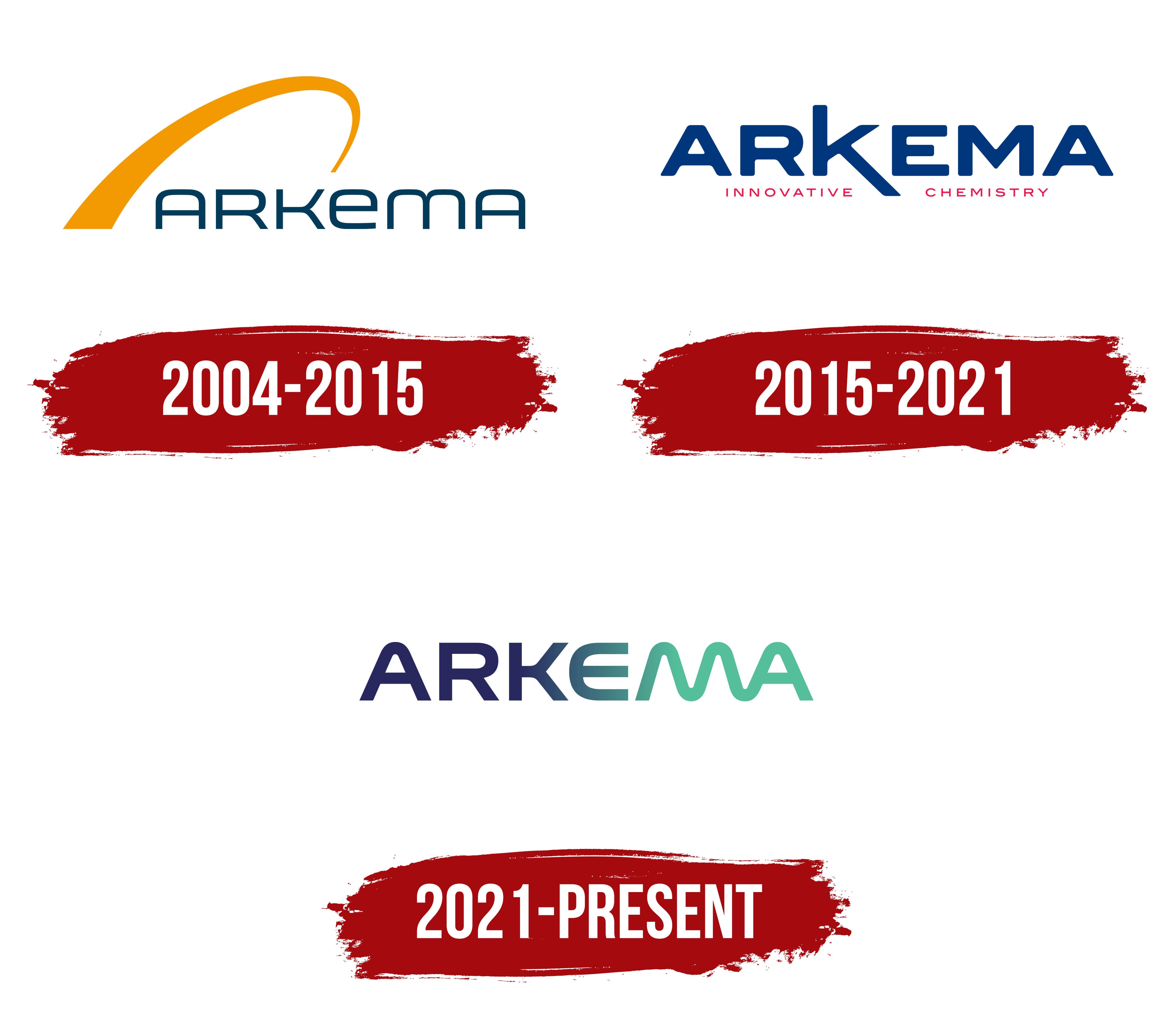
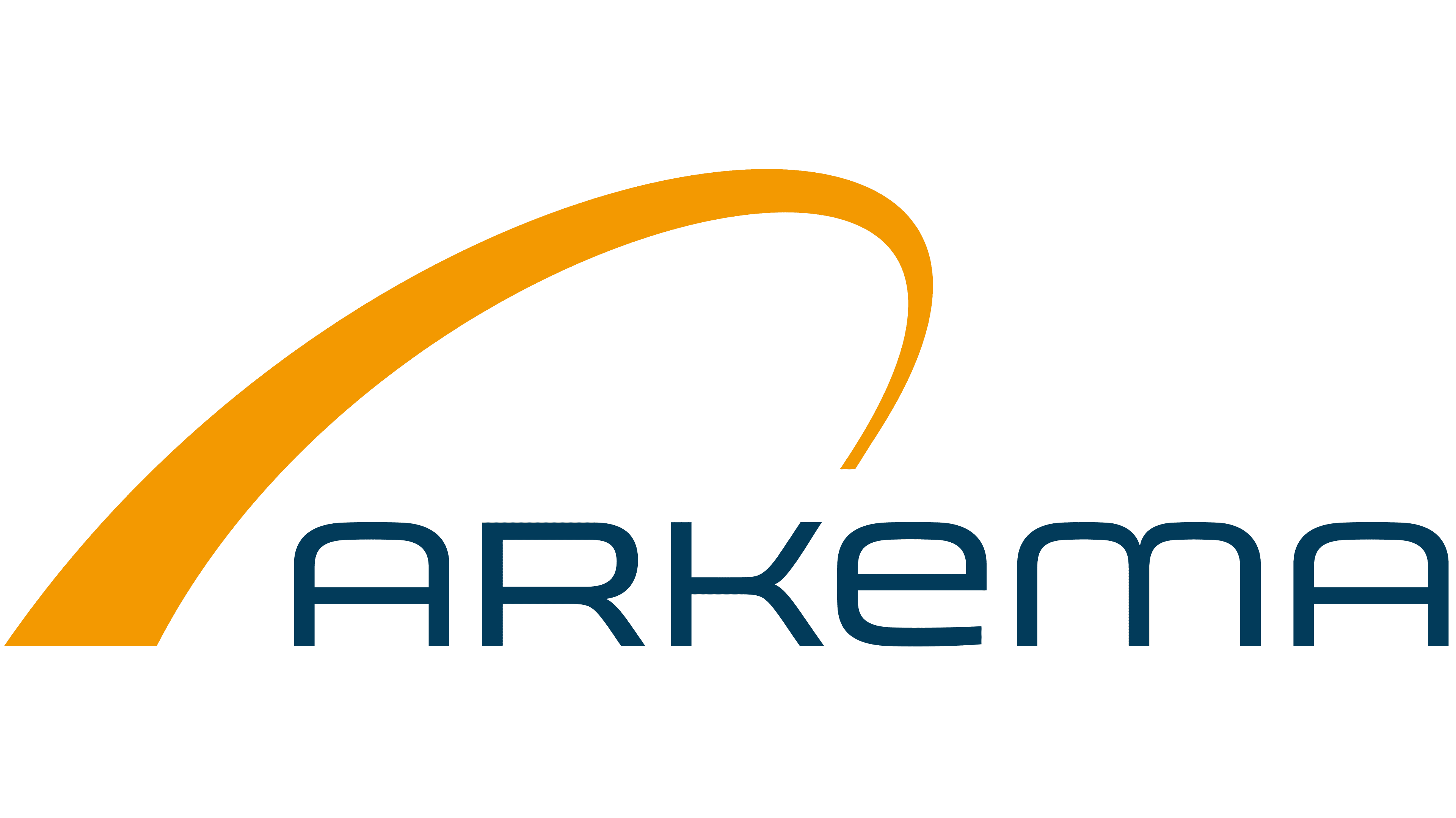
The logo centered on the Arkema wordmark in a dark blue-gray color with a turquoise undertone. The rounded sans-serif letters had soft curves, open forms, and thin horizontal strokes. The name resembled uppercase lettering, though the stylized “E” and “M” leaned toward lowercase forms. The combination gave the wordmark a custom appearance.
A large ocher-yellow arc with a saffron-orange undertone passed above the beginning of the name. It started with a broad base on the left, rose above the letters, and gradually narrowed. Its thin curved end reached the area between the “K” and “E.” The line resembled a semicircular arch, like an orbit.
The broad part of the arc stood near the first letter, while its narrow end extended toward the middle of the name. Its placement connected the figure with the wordmark. The arc’s warm color contrasted with the lettering’s cool tone. The version remained in use from 2004 to 2015, including Arkema’s transition from a Total chemical division to an independent group.
2012 – 2021
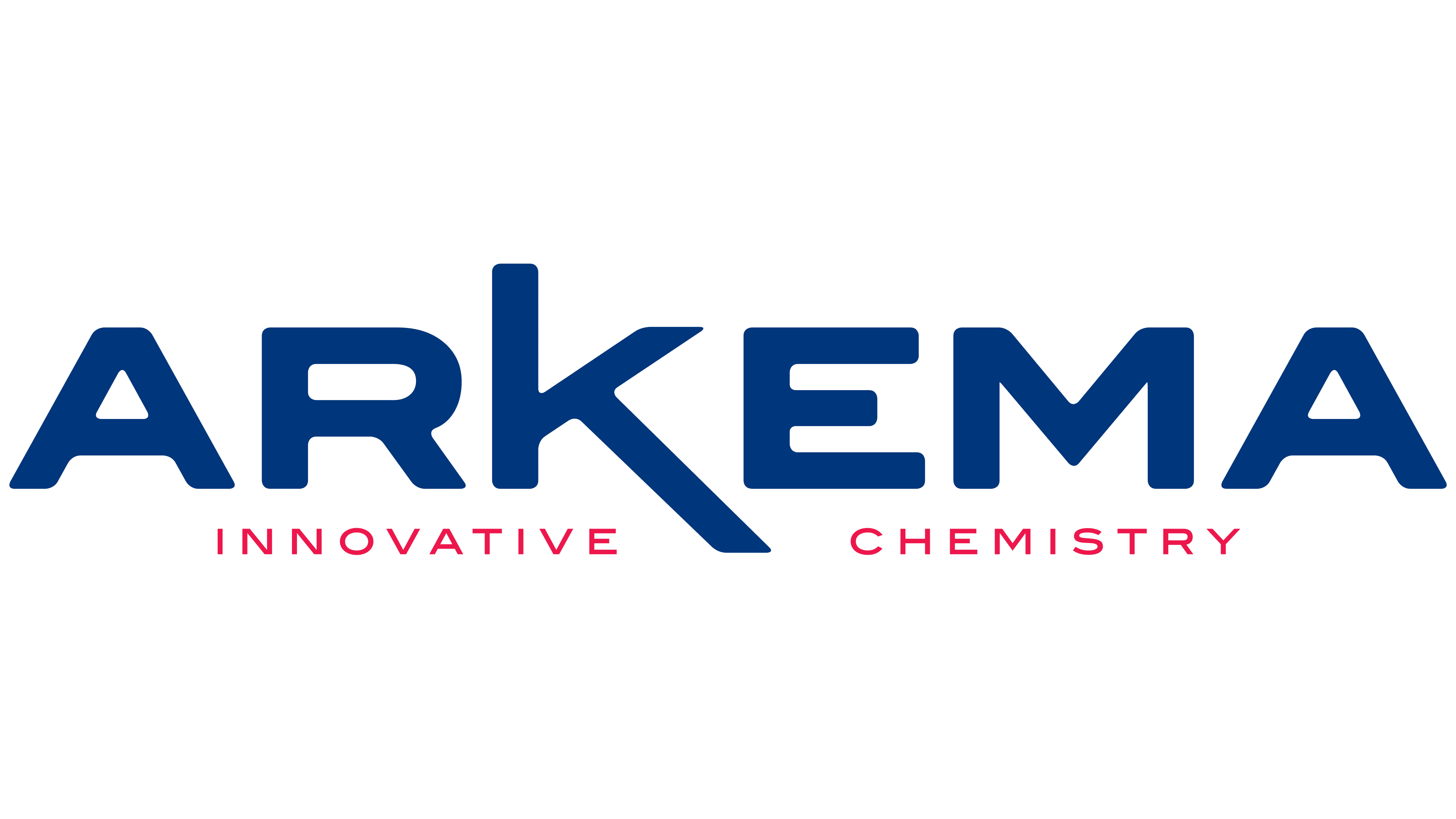
Arkema introduced an updated identity on September 18, 2012. The redesign followed a business restructuring and the sale of its vinyl operations. The company shifted its focus toward higher-value chemical products, and the new branding reflected the group’s revised business portfolio. The tagline Innovative Chemistry was introduced with the logo, along with a shared identity system for subsidiaries and product brands.
The orange arc from the previous version gave way to a 2-level wordmark. Arkema appeared on top, with the thin line INNOVATIVE CHEMISTRY below. The corporate name, custom lettering, and combination of dark blue with raspberry red became the principal features.
ARKEMA appeared in heavy uppercase dark blue letters. The upright sans-serif characters formed a compact row. Angled terminals and rising diagonal strokes added tension to the lettering. Arkema linked the heavy type to modern chemistry and the upward lines to innovation and bold thinking.
The enlarged letter “K” became the primary feature. Its vertical stroke rose above the remaining letters, while a long diagonal extended downward to the right and reached the lower line. The spreading sections of the “K” connected the name to the tagline and divided it into 2 parts. INNOVATIVE appeared on the left and CHEMISTRY on the right.
The tagline used narrow uppercase letters with expanded spacing. Thin strokes distinguished the lower line from the heavy ARKEMA name while preserving the shared sans-serif style. It appeared in a vivid raspberry red close to fuchsia. The company associated the rich blue with purity and the red with creative energy.
Following the update, Arkema became the shared identity for the company’s subsidiaries and product lines. Different brands received a consistent connection to the parent group. At the same time, the Innovative Chemistry tagline identified its focus on chemistry and higher-value materials.
2021 – today

The transition from the “K” to the “MA” combination became the main conceptual device in Arkema’s identity, introduced on November 8, 2021. The letter construction represented a new stage in the history of a major chemical group shifting its business toward specialty materials. Arkema planned to focus its portfolio on Specialty Materials by combining adhesive solutions, advanced materials, and coatings.
The ARKEMA name retained its uppercase spelling and sans-serif typeface. The updated letters gained rounded contours and smooth color transitions. The corporate name became the company’s complete identifying mark. The opening ARKE section consisted of balanced forms arranged closely at the same height. Rounded edges distinguished the wordmark from the previous angular version.
The letters “ARK” appeared in dark indigo with a purple undertone. The color shifted toward green turquoise between the “K” and “E,” with the “E” connecting the 2 sections of the name. The transition passed through the middle of the letter and continued to the final “A.” The entire wordmark progressed from dark blue at the beginning to mint green at the end.
The most extensive changes affected the “M” and “A.” A continuous line joined the 2 letters. The “M” received a wave-shaped form with rounded curves. Its legs and inner bend flowed into the final “A.” Mint green united the 2 characters and separated the end of the word from the blue “ARK” letters.
According to Arkema, the letter “K” referred to chemistry, while “MA” represented materials. The interpretation reflected the company’s transition from a general chemical profile to specialty materials. The blue-to-green gradient represented the group’s transformation and its growing focus on innovative high-technology development. The color transition became a meaningful part of the logo.
The identity included the tagline Innovative materials for a sustainable world. The phrase connected the Arkema name with its updated specialization and stated direction of development. The rebranding was accompanied by the The Wave of Change communication platform, built around the transition from chemistry to materials and the wave-shaped line within the “MA” combination.
A creative team developed the project with the support of W Conran Design and French specialists in rebranding and communications. The work covered the logo, tagline, and The Wave of Change platform. The new system presented Arkema as a producer of adhesive solutions, advanced materials, and coatings under a unified corporate name.