 Bank of Ayudhya Logo PNG
Financial services in Thailand include money transfers, loans, and account management, which are handled through branches and digital apps. The bank combines traditional banking operations with modern financial management tools. The Bank of Ayudhya logo represents a Thai banking institution that serves individual and business clients and offers accounts, loans, and mobile banking services.
Bank of Ayudhya was founded in 1945 in Bangkok. A group of Thai and Chinese entrepreneurs established it to support trade and industry in postwar Thailand. The bank’s name refers to the ancient capital of Ayutthaya. In its first decades, Bank of Ayudhya served small and medium-sized businesses. In the 1970s, it began expanding nationwide as the economy grew.
In the 1990s, the bank modernized its operations by introducing IT systems and ATMs. However, the 1997 Asian financial crisis brought it to the brink of bankruptcy. In 1998, the government nationalized Bank of Ayudhya and restructured it. By the mid-2000s, the bank had recovered and returned to profitability.
In 2007, General Electric Capital acquired a 25 percent stake for $ 3.8 billion. Under the Krungsri brand, the organization began developing auto loans and credit cards.
In 2012, the Bank of Tokyo-Mitsubishi UFJ bought GE’s stake for $5.6 billion. A year later, ownership increased to 75 percent. After that, Bank of Ayudhya became part of the international MUFG Group and began implementing Japanese technologies and corporate standards.
Since 2016, the bank has been developing digital channels. The bank launched the Krungsri Simple mobile bank and the Krungsri Nimble platform, which features artificial intelligence. In 2020, the bank introduced payment holidays and increased reserves to support borrowers.
Since 2022, Krungsri has been strengthening its integration into the MUFG network. The bank is expanding international services and wealth management operations. It ranks among Thailand’s five largest financial institutions. Bank of Ayudhya combines traditional banking with modern digital solutions.
Meaning and History
What is Bank of Ayudhya?
One of Thailand’s largest commercial banks, headquartered in Bangkok. It operates a network of branches and ATMs across the country, serving millions of individual and corporate clients. Abroad, it operates through subsidiaries in Cambodia and the Philippines, as well as representative offices in Laos and Myanmar. Japan’s Mitsubishi UFJ Financial Group owns the controlling stake. The bank offers deposits, loans, mortgages, auto financing, credit cards, investment and insurance products, digital solutions, and the venture unit Krungsri Finnovate.
1970 – 2007

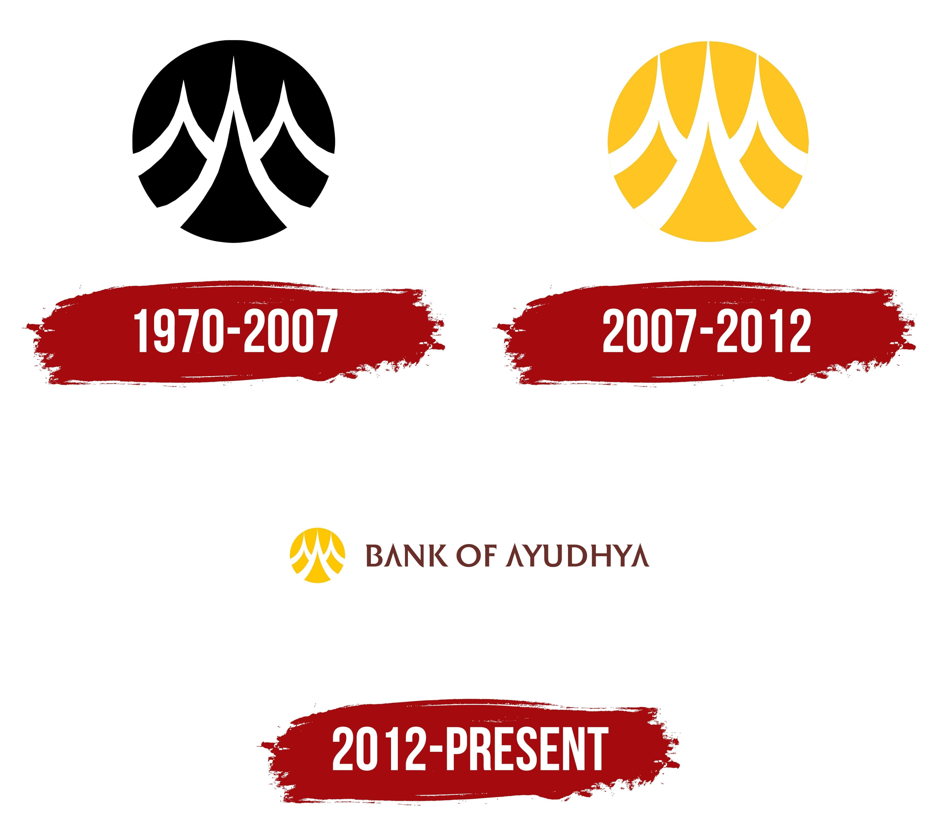
Bank of Ayudhya received a royal warrant on May 15, 1970, allowing it to display the government Garuda on its buildings and documents. During the same period, the head office moved to Ploenchit Road, and the circular Prasart Sung emblem became part of the bank’s identity. The Garuda represented the status the monarch granted. The bank’s own emblem referred to the institution’s origins and the architecture of ancient Ayutthaya.
The bank was established on January 27, 1945, in Phra Nakhon Si Ayutthaya Province. Accounts identifying Bangkok as the place of establishment conflict with the organization’s history. Operations began on April 1 with registered capital of 1 million baht. Bank of Ayudhya means “Bank of Ayutthaya”. It refers to the city that served as Siam’s capital from the 14th through the 18th centuries. The Thai name ธนาคารกรุงศรีอยุธยา contains the form Krung Si Ayutthaya. The shortened name Krungsri later became the group’s primary commercial brand. “Krung” means a capital or city, while “sri” is associated with grandeur and prosperity.
The circular emblem had a dark field containing a white ornamental figure. Inside were 3 symmetrical pointed forms facing upward. The middle section was taller and wider than the 2 side sections, creating a silhouette with a high central spire. The neighboring forms balanced the design and created broad outer curves. Their edges widened near the base and gradually narrowed toward pointed tips. Thick white lines separated the ornament from the dark background.
Prasart Sung means “high palace.” The 3 elongated spires resembled towers from a temple complex, linking the bank’s image to Ayutthaya’s architectural heritage. Their outlines resembled flames, petals, or peaks, though the original interpretation referred to a palace structure. The circle united the 3 sections into a complete figure suitable for seals, signs, documents, and other banking materials. Symmetry and the limited number of lines kept the emblem recognizable at different sizes.
From 1970 to 2007, the logo most often appeared in single-color versions. Early materials featured black, white, brown, and other dark variations. The black background represented one of several color treatments used during the period. The emblem appeared with the Thai name or the English form Bank of Ayudhya. Its main structure remained consistent across different inscriptions and printing methods.
The emblem remained in use when the bank listed its shares on the Stock Exchange of Thailand in 1977 and expanded its branch network. The pointed towers connected the brand with its place of origin, while the circular format suited documents and exterior applications. After 2007, the Prasart Sung outline remained part of the Krungsri identity as the historic emblem of Bank of Ayudhya.
2007 – 2012

Yellow became the foundation of Bank of Ayudhya’s new image during the transition to the commercial name Krungsri. In 2007, a bright yellow version containing a white Prasart Sung replaced the dark circle. The update coincided with the beginning of the bank’s partnership with GE Capital on January 3, 2007. The new color marked another stage in the bank’s development. At the same time, the palace motif maintained historical continuity with the previous identity.
The emblem retained its circular form and 3 upward-pointing towers. The central spire remained taller than the side sections, preserving the silhouette’s symmetry. The contours were refined, and the spaces between the white components were enlarged. The revised geometry separated the towers against the yellow field and worked across signs, documents, and materials for different divisions. The main changes involved color and interior spacing.
Prasart Sung means “high palace.” The white spires referred to the architectural heritage of Ayutthaya, where Bank of Ayudhya was established on January 27, 1945. Retaining the motif connected the new corporate system with the bank’s place of origin. Yellow represented warmth, accessibility, and energy. A dark brown-burgundy background separated the bright emblem from the surrounding space.
Beginning in 2009, the yellow circle received a group-wide role through the One Krungsri program. Its launch followed the acquisition of several consumer finance businesses. The bank brought its subsidiaries under the Krungsri name and introduced shared identity guidelines throughout the organization. Prasart Sung became the financial group’s identifier, connecting its different operations under one organization.
Communications introduced large yellow fields, dark backgrounds, and Krungsri Supergraphic patterns. The system covered divisions that had previously operated under different names and identities. The yellow circle unified them, while Krungsri became the group’s primary commercial name.
2012 – today
By 2012, Bank of Ayudhya occupied most of the logo, while the circular emblem became smaller and moved to the left. The yellow Prasart Sung retained the connection with Ayutthaya. At the same time, the English wordmark presented the bank’s full name to international audiences. The version appeared as acquired banking products were being consolidated under one group brand.
The emblem consisted of a yellow circle containing a white architectural figure. The 3-pointed Prasart Sung forms resembled the towers of a “high palace” associated with Ayutthaya’s heritage and the bank’s place of origin. The circle was reduced, leaving most of the available space for the name. The white ornament retained its symmetry, tall central spire, and 2 side peaks.
BANK OF AYUDHYA appeared on the right in upright uppercase dark brown letters. The serif typeface featured wedge-shaped interior cuts in the “A,” “N,” and “Y.” The pointed cuts repeated the direction of the Prasart Sung spires. They connected the typography with the architectural form inside the circle. The difference between yellow and dark brown separated the emblem from the name within the horizontal block.
The bank used its English name, Thai version, and shortened Krungsri brand. Krungsri is a shortened form of Bank of Ayudhya’s Thai name. It became common in retail banking and connected banking services with acquired products. The full English form retained its legal and corporate role.
Bank of Tokyo-Mitsubishi UFJ acquired a controlling stake in Bank of Ayudhya in December 2013. The legal name remained unchanged, while Krungsri appeared more frequently in market-facing materials. Beginning in 2014, the shortened name became the primary commercial identifier. Some logo versions included the line Member of MUFG, indicating the bank’s affiliation with the Japanese financial group. BANK OF AYUDHYA remained in use across corporate and legal materials.
Krungsri updated its brand and introduced the promise “Make Life Simple” in February 2023. The project covered its communication style, service presentation, and customer interaction system. The yellow circle containing the white Prasart Sung retained its established structure and continued to appear beside the Krungsri name.