The Brisk logo conveys freshness and coolness, delight and pleasure. Its refined beauty evokes pleasant memories of delicious, refreshing drinks. It seems incredible how one word can encapsulate the company’s philosophy and the charm of its products. The logo creators had to put in much effort to achieve this.
Brisk: Brand overview
The well-known tea manufacturer Lipton decided to enter the ready-to-drink tea industry in 1965, which marked the beginning of Brisk’s history. He was introduced as an iced tea brand to compete in the expanding soft drink industry.
The brand was first available as a traditional lemon-flavored iced tea. The drink’s convenient taste and refreshing quality helped it become popular very quickly. When it started, the product was mostly marketed to adults as a glass bottle substitute for carbonated drinks.
The brand started extending its range of flavors in the 1970s. New varieties were released, such as peach and raspberry tea. Because of this, the product was able to draw in more customers and solidify its place in the beverage industry.
The company experienced substantial growth in the 1980s. The firm started aggressively promoting its wares on television. During this period, the product was marketed as a beverage for active people, highlighting its cooling qualities.
A significant development in the brand occurred in 1991 when the company joined the Pepsi-Lipton Partnership, a joint venture between Unilever, which owns Lipton, and PepsiCo. This collaboration gave the product’s marketing and distribution more avenues to pursue.
For the company, the 1990s were a time of innovation. The firm debuted its well-known commercial campaign with animated pop culture figures in 1996. The brand became a cult favorite and attracted a younger audience thanks to this funny ad.
Throughout the 2000s, the company continued growing. Larger bottles and cans were among the new tastes and packaging styles released. Around this time, the firm also started experimenting with limited-edition tastes frequently associated with well-liked films or occasions.
The brand underwent a rebranding in 2010. The beverage has a fresh marketing plan targeted at young people and a new logo and container design.
The company’s first crowdsourcing initiative, “Brisk Bodega,” was introduced in 2012. It invited fans to contribute by designing packaging and street art.
The brand celebrated its 50th anniversary in 2015. In honor of its illustrious past, the company unveiled a limited edition line of retro-styled goods to commemorate.
In 2016, the firm continued working with well-known brands by releasing a limited edition line of figures centered around the film X-Men: Apocalypse. This promotion included special packaging with movie characters and interactive augmented reality components.
In 2017, the Zero Sugar product line was introduced in response to the increasing demand from consumers for sugar-free beverages. Through this campaign, the company could draw in health-conscious consumers without compromising the distinctive flavor of the product.
In 2018, the brand and Marvel Studios collaborated to launch “Cans of Steel,” an inventive marketing campaign for Black Panther. As part of the campaign, fans could participate in an interactive experience, and collectible cans were released.
For the firm, 2019 was a year of expanding flavors. The company released several new varieties, including unusual fruit combinations, to attract a younger audience interested in trying new flavors.
In 2021, a new fizzy tea drink called Dragon Paradise Sparkling Iced Tea was introduced, fusing the traditional flavor with the popularity of sparkling drinks.
In 2022, the firm launched a campaign based on a well-known video game, continuing its history of working with the entertainment sector. This campaign involved releasing digital content and unique packaging to draw in gamers.
The brand began concentrating on digital marketing in 2023. The company developed a massive social media campaign featuring influencer partnerships and user-generated content to better engage with the youth demographic.
While preserving its fundamental character as a revitalizing and refreshing beverage, the product continuously adjusts to shifting consumer preferences and industry developments.
Meaning and History
Choosing colors and fonts that would appeal to modern youth while retaining the older target audience was crucial. The lettering was graceful and bright, with a noticeable element of dynamism.
Blue, reminiscent of ocean waves, emphasized the high quality of the products, natural flavors, and originality. The brand name, rising upwards, symbolized the company’s reliability and high authority.
The brand always highlighted its remarkable qualities by offering refreshing drinks and original tea. The products were well-received by a wide audience in America and Canada, boosting demand. It is worth noting that PepsiCo and Unilever established the brand under the Lipton brand, reinforcing trust. Anyone who saw the shining light-blue Brisk logo instantly wanted to buy this drink.
What is Brisk?
It is a beverage brand created by a joint venture between PepsiCo and Unilever. The brand specializes in the production of ready-to-drink iced tea and juice drinks known for their bright flavors and attractive packaging. It targets a youthful audience through vibrant marketing and a wide range of flavors including lemon iced tea, raspberry iced tea and lemonade. With two industry giants, working together, the brand enjoys a wide distribution network and marketing expertise, making its products widely available in supermarkets, convenience stores and online retailers. The brand’s focus on quality and taste has made it a popular choice for refreshing, flavorful beverages.
1993 – 2000s
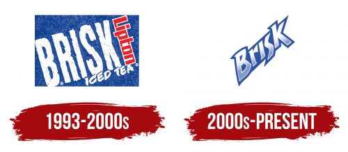
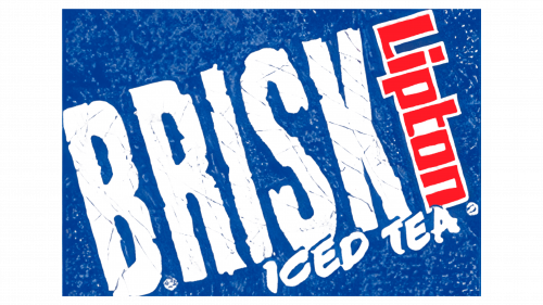
The first logo was informative and clear but somewhat overloaded with details since it was necessary to inform customers about new products; the key points were highlighted in the identity.
Brisk’s brand name was written in white capital letters on a blue background. It occupied a central position, slightly shifted to the left, making room for the word Lipton. This arrangement emphasized the unity of perspectives, customer orientation, and the main goal — to create a delicious treat for beloved customers through joint efforts.
The word Lipton was written in red, standing out not only by its color but also by the shape of the letters. Merging in one area, the two words flowed into each other, creating an interesting and presentable combination that symbolized strength and reliability.
A detailed hint, consisting of the words “iced tea,” indicated the product’s originality. Initially, the manufacturer delighted customers with various flavors and their uniqueness. The marketing campaigns for each new product were very effective and strong.
2000s – today
The new era shapes changing perspectives and consumer demands. The priorities of all generations shift slightly, necessitating a transformation of identity. In this new phase, various industries evolve to align with contemporary style and fashion trends. Like a snake shedding its skin, the Brisk logo eliminates all excess. Specificity and minimalism prevail. Color schemes, graphics, and presentation elements take center stage.
There was no longer a need to discuss product types, ingredients, and benefits. Familiar and new flavors pleased customers. Their quality, energy boost, and aroma impressed everyone. Refinement of the brand was only necessary.
The letters became expressive using a shimmering blue-gray tone close to a blue tone. The dark, contrasting background effectively highlighted the brand name.
Many competitors noted the logo’s remarkable dynamism. The perception of the word was unconventional. On the one hand, certain letters’ sharp angles and arrangement resembled a lightning bolt; conversely, they seemed to reach skyward.
The clarity and volume of the letters convey the manufacturing company’s leadership qualities, while the background contour highlights the brand’s charm.
